This is the ultimate list of company career site features and ideas. And let me be clear about something: This is NOT your average “5-10 ideas” post. Yes, I’ll cover the must-have features for you career site. But you’re also going to see more creative features that are catching our attention. So if you’re looking… Read more »
Posts about Company Career Site
15 “Must-Have” Features For Your Company Career Site
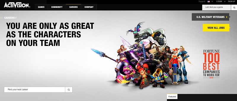
If you’re building a new company career site, here are 15 features for you to consider to attract, engage and convert candidates. 1. A Compelling Headline— It’s a shame that most company career home pages use just “Careers” or “Jobs” as their headline. Boring. Instead, write like a copywriter and be attention-grabbing (Huge Inc.) or Activision (pictured… Read more »
8 Ideas To Visually Optimize Your Company Career Site
Fostering candidate engagement and attracting potential candidates to your career site is easier said than done. Some ways your company can succeed in doing this is having a visually attractive career site that include features like eye-catching images, short and descriptive videos, and popular/enticing color schemes. We’ll go over 8 ideas that will help you… Read more »
5 Attractive Company Career Pages
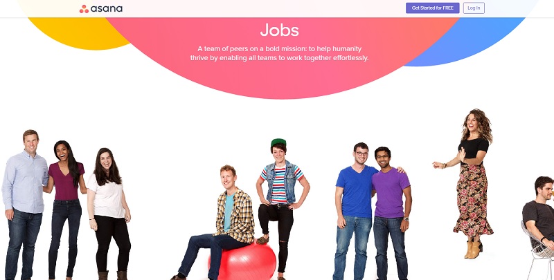
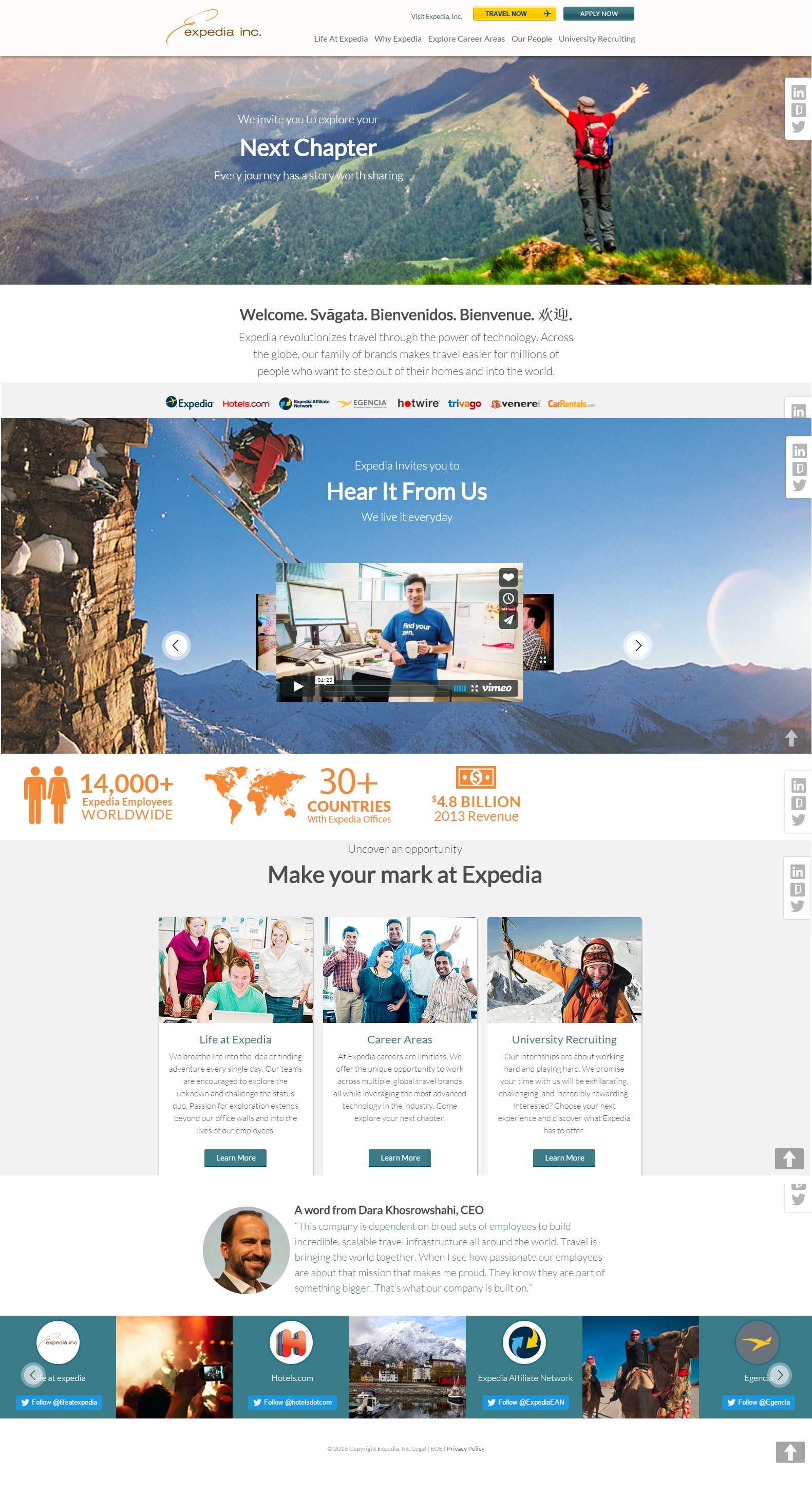
We took a look at a bunch of company career pages over the past couple of days and there were a few that stuck out and caught our attention. Based on images, design, and copy. Comcast (@ComcastCareers) Comcast emphasizes images on their career page. These images contain employees and the workplace, giving potential candidates a feel of the… Read more »
Jobvite/LinkedIn Customers: Don’t Lose Your Best Candidates this Way
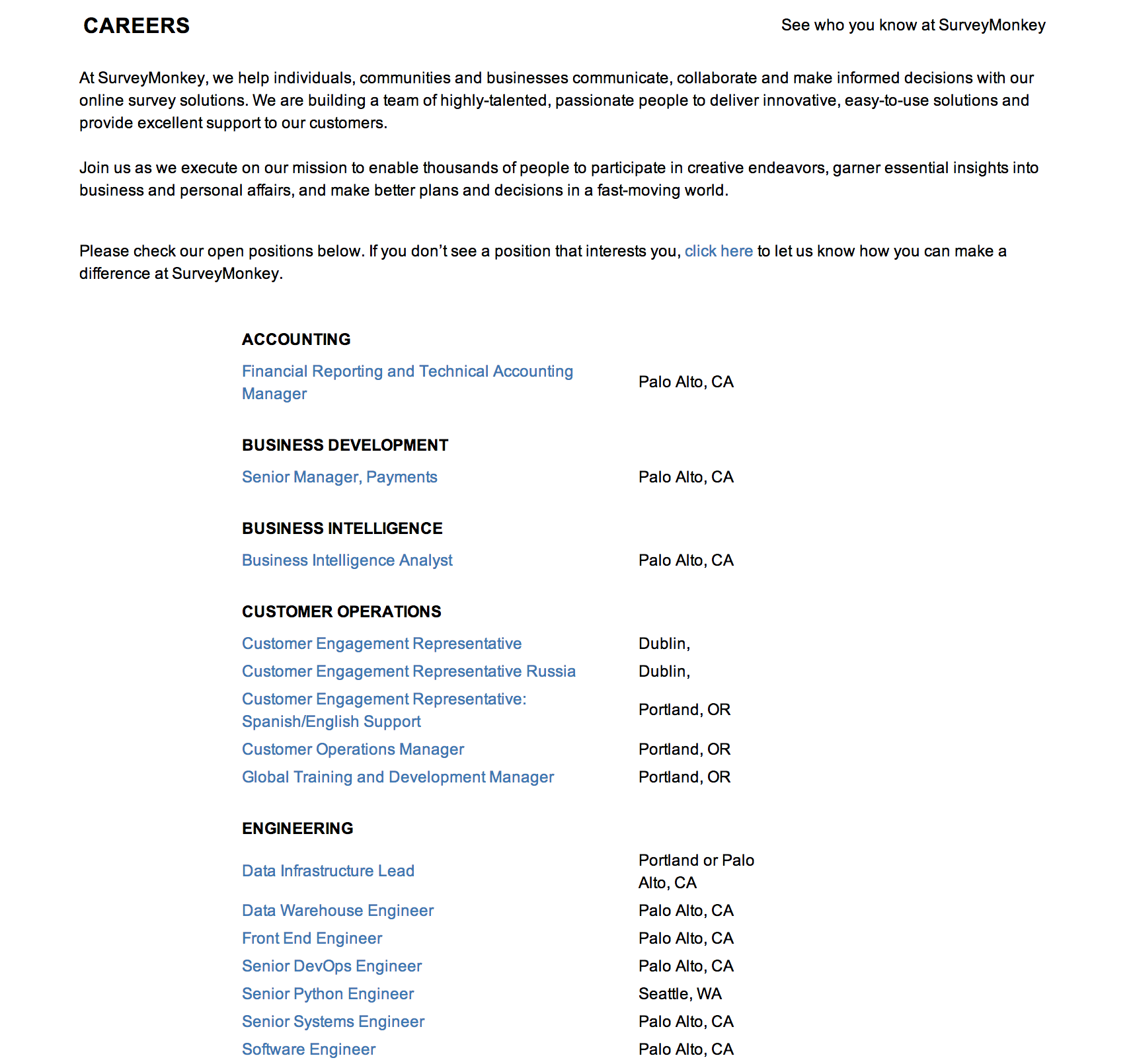
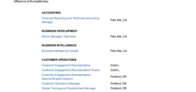
You’ve spent thousands of dollars, and hundreds of hours, on your new careers site. You also spend thousands of dollars paying to advertise your jobs on sites like LinkedIn. The problem is that this is not a unified strategy. An example comes from SurveyMonkey. They are a Jobvite user, and a company we greatly admire…. Read more »
Which Technologies Are Candidates Using And When
The buzz in recruiting over the last few years has been centered on mobile. Certainly it’s true that mobile is on the rise, and businesses should be preparing for that. However, Talent Leaders still want to keep track of every method a candidate may use to view their job descriptions online. Talent Leaders can use this… Read more »
7 Cool and Effective Tips for Your Careers Site
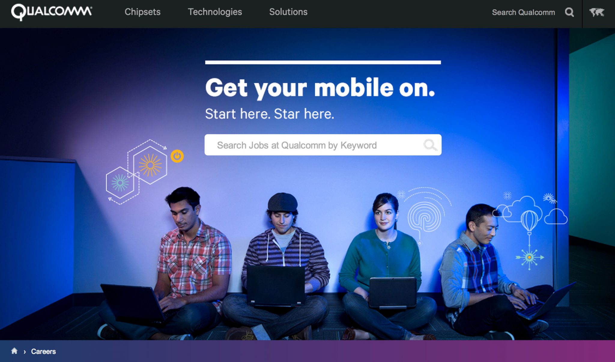
I look at a lot of careers pages and wanted to pass along seven ideas I ran across lately that might help you move the needle on driving candidate experience. 1) Use a Headline Qualcomm grabs your attention with a simple and eye-grabbing headline: “Get Your Mobile On”. Reason this is important: Copywriting is key… Read more »
Recruiting Q&A: Analytics with Groupon & Charles Schwab
Last week we wrote about the 5 basic metrics for your careers site. The article was inspired by two talent leaders we talked to who are using Google Analytics to better understand their careers site and candidate experience. As a follow up, we invited these two talent leaders to share more about how they got… Read more »
“Little Data”: 5 Basic Metrics For Your Careers Site
Being a recruiting nerd, I was excited when two separate talent leaders told me last week that they spend several hours each month in Google Analytics. During hundreds of conversations with talent leaders over the last two years, this has been a rarity. To have two in one week was refreshing. Refreshing because Google Analytics… Read more »
Why Your Careers Site Should Be The Center Of Your Recruiting Universe
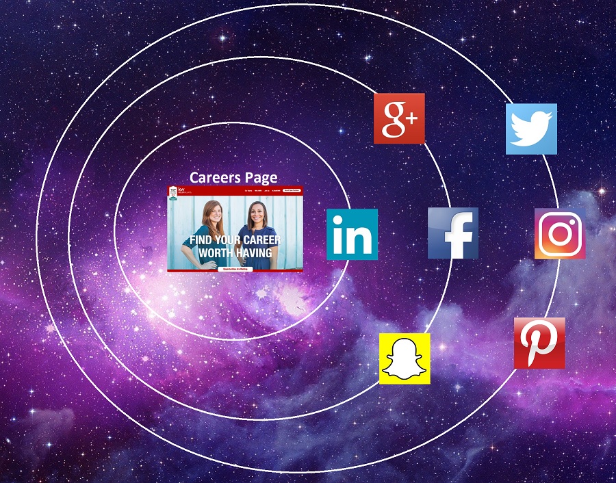
I was inspired recently when reading an article by Lisa Jones published on The Undercover Recruiter. The title of her article was “Why Your LinkedIn Company Page Is Still More Important Than Your Website“. The article caught my attention as I’m looking at careers sites daily, and breaking down the data on how they perform…. Read more »
Up to 20%+ of Your Candidates Will Click the “Talent Network” Button
We’re impressed with the high percentage of candidates clicking “Join Our Talent Network” on some of our clients’ Career home pages. A Careers home page like La Jolla Group (parent of O’Neill Sports) that places their “Join Our Talent Network” call-to-action button in a prominent position (above-the fold) can easily see 20% or more of… Read more »
10 Awesome “Careers Page” Ideas You Might Have Missed
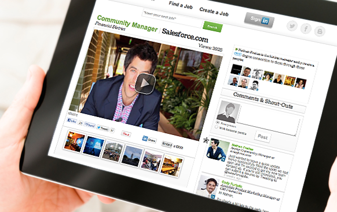
Most Careers pages are boring. As we pointed out last month, some remind you of a visit to the DMV. On the flip side, some employers do an outstanding job of making their Jobs section stand out. Here are 10 solid ideas worth considering. 1) Show Your Hiring Manager Once a candidate knows the industry, role… Read more »
3 Mistakes that Could Make Your Jobs Page Look Like the D.M.V.
I look at a lot of jobs/careers pages. So you can imagine my surprise when I was perusing the “Jobs” pages of the Forbes Magazine Most Innovative Companies In The World — and found that many of them are sub-standard. In particular, some of these innovative companies have jobs pages that remind me of the… Read more »