Latest posts by Nick Misa (see all)
- Top 10 Helpful Augmented Writing Tools for Job Descriptions (2026 Update) - March 9, 2026
- Top 18 Employer Reviews & Ratings Sites for 2026 - February 27, 2026
- 7 Examples of Awesome Employee Testimonials And Content (2026 Update) - January 20, 2026
Today I’m going to reveal the best job ads examples in 2019.
You’re bound to find some job ad ideas to draw inspiration from.
First, Let’s look at what the best job ads contain:
- Consistent Branding — Clear logos at the top of the page and throughout the job ad. The page’s color scheme is consistent and matches company colors.
- Engaging Hero Media — Whether it’s an image of the team or video make sure it reflects the culture, beliefs and values of your company.
- Clear Call-to-Action — Apply buttons are prominent and have their own standalone color to catch the eye of candidates.
- Job Ad Format — Two column job ads are becoming more popular. They are easier to read on desktops and tablets than one column (if a candidate is on mobile, your job ad should be responsive and snap into a single-column).
- Rich Recruitment Content
- Maps/Location Info — Candidates don’t just want to read where the job is located, they want to see it on a map. What neighborhood is it in? How far is it away from their house? Maps help provide the context that text can’t, plus they make your job ads more engaging.
- Talent Community Opt-Ins — 10-20% of your candidates are going to apply to your jobs. How about the other 80-90%? Don’t you want a chance to capture their email for future job opportunities?
- Similar/Recommended Jobs — Don’t let candidates be one-and-done on your job ads. Present similar jobs to re-engage them.
- Benefits — Candidates want to know what’s in it for them. Showcasing benefits on your job ads help paint that picture.
- Employee Testimonials — Candidates want to hear from your employees. A great form of social proof.
- Employer of Choice Awards — Another form of social proof that engages candidates. The more awards the merrier.
- Employer Review Site Widgets — Candidates are going to look at employer review sites. Why not give them that information right on your job ads?
- Diversity and Inclusion Content — Whether highlighting your diversity statement and/or diversity and inclusion initiatives “64% of candidates say that diversity and inclusion is an important factor in their decision.” – Yello. It’s important to get this content on your job ads.
- Compensation/Salary Range — The #1 thing candidates want to see on a job ad. A sign of transparency in the eyes of candidates because most employers don’t show off the bat.
- Commute Information — A convenient, easy commute ranked 2nd (47%) in what would make Americans more inclined to submit a job application.
Now, let’s look at the job ads examples.
List of the best job ads examples in 2019
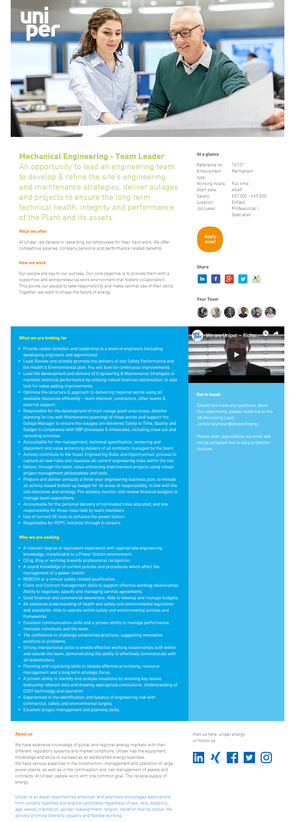
Uniper Energy Job Ad
- Nice and clear hero image.
- Great color scheme using multiple company colors. This makes the headers and text pop.
- Salary range information.
- Employer branding video featuring an employee with experiences in and out of the office. View the video here.
- “About Us” section is located at the end of the job ad which is where it should be. Here’s Why Starting Your Job Postings with “About Us” is Usually a Mistake.
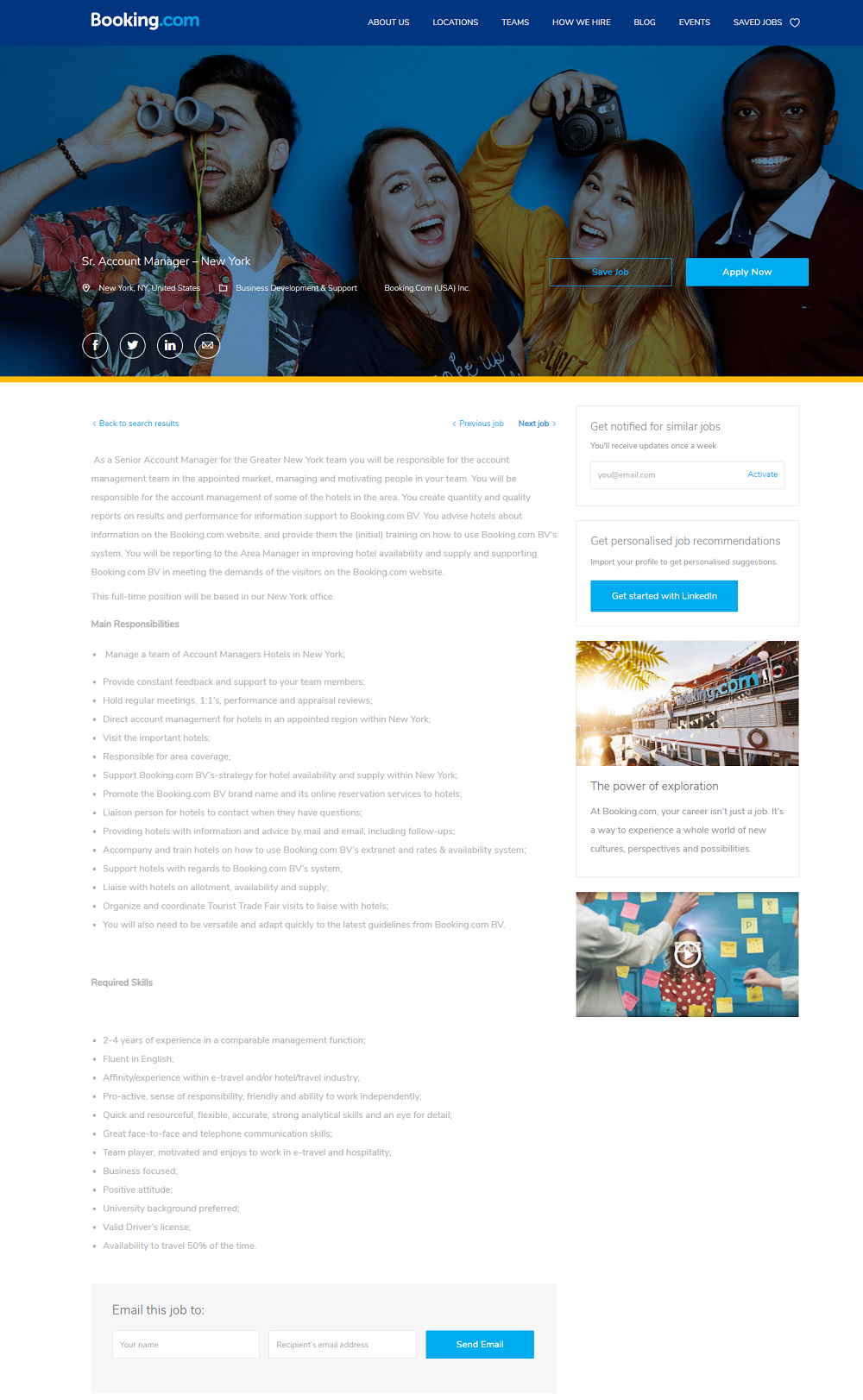
Booking.com Job Ad
- Awesome hero image of a diverse group of Booking.com employees.
- Branded apply button coated in the Booking.com blue.
- 2-column format allows for more recruiting content (job alert opt-in, employer branding video, etc.)
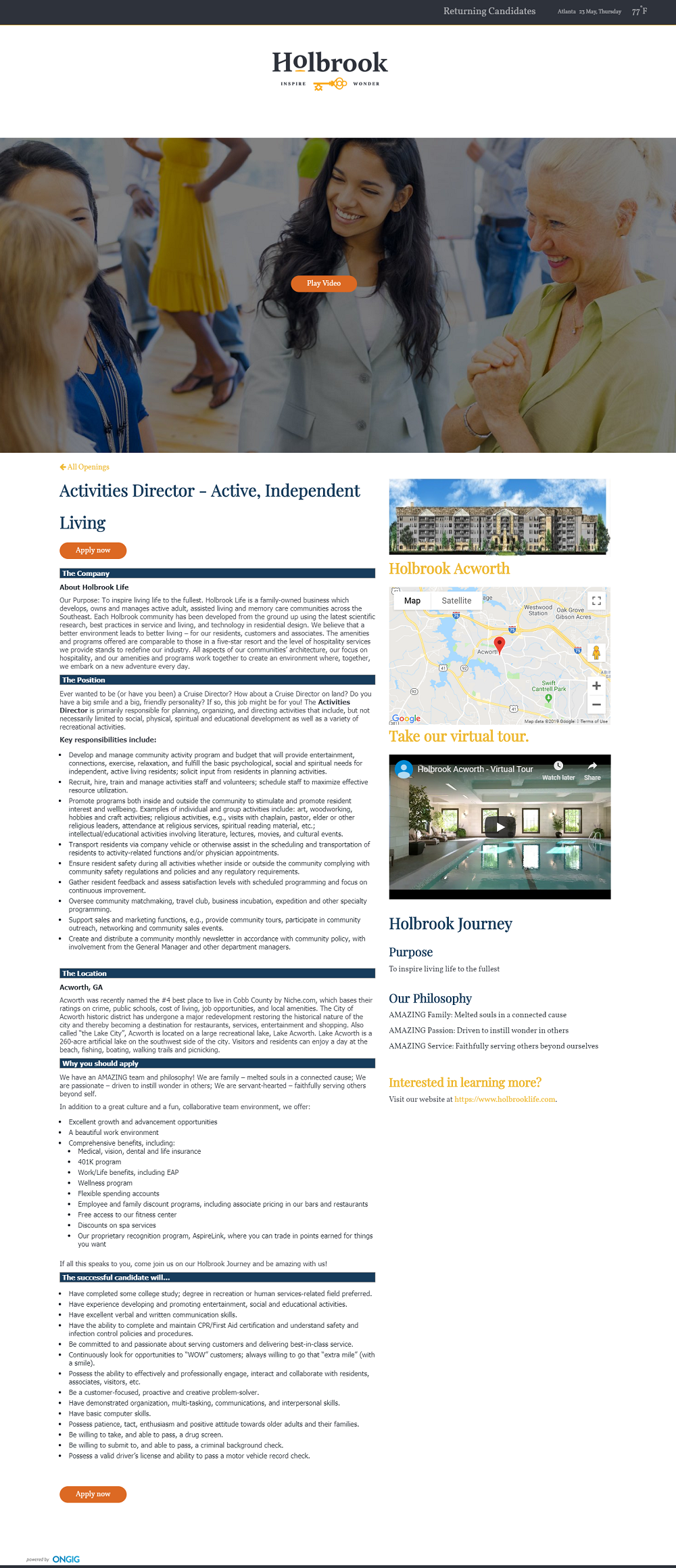
Holbrook Life Job Ad
- Nice hybrid of a great pic with a video behind it.
- 2-column format with content-rich right-hand rail.
- A virtual tour video of their location.
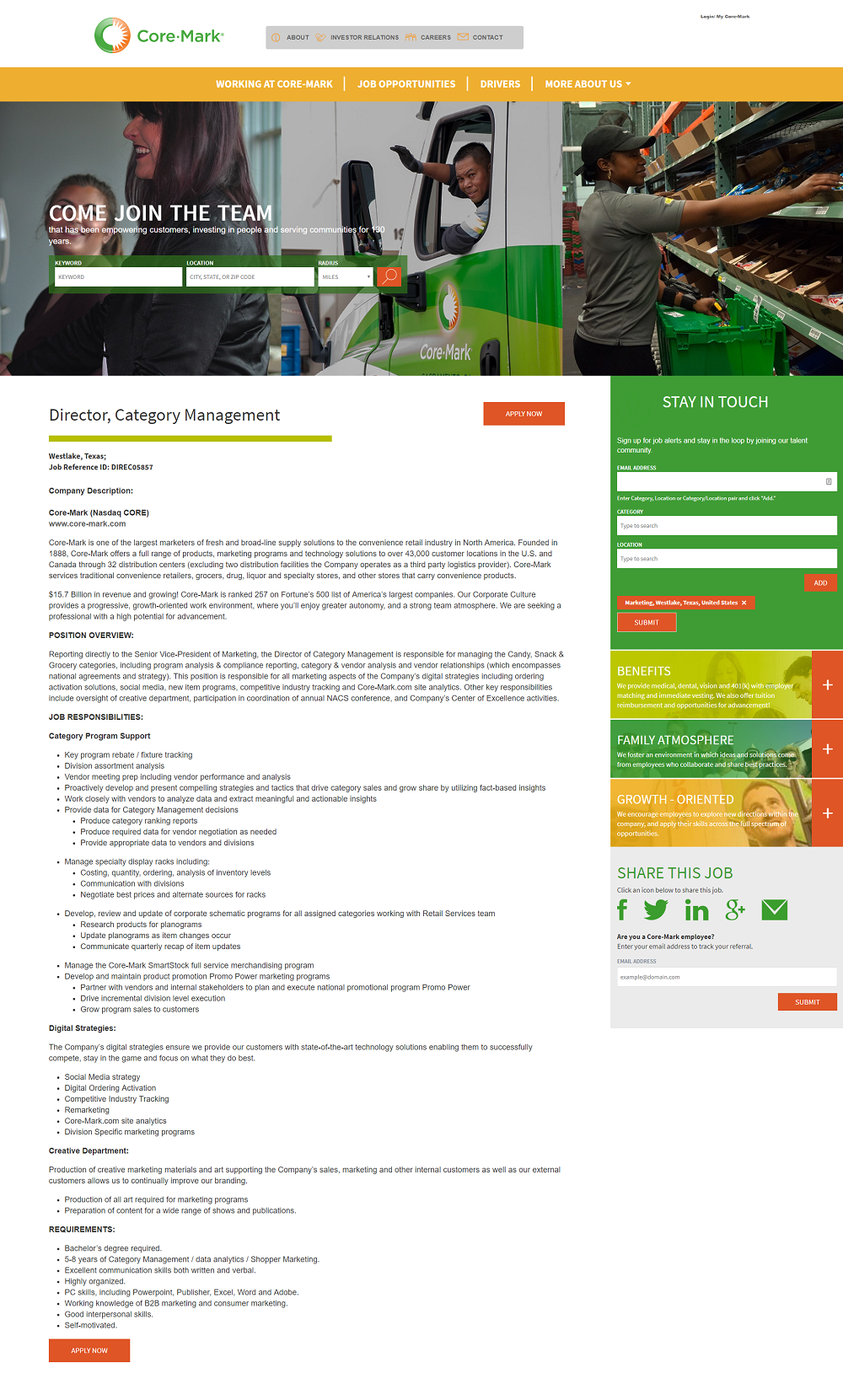
Core-Mark Holding Job Ad
- Strong hero image showing 3 types of core roles.
- Consistent color scheme using multiple company colors. Color scheme is also consistent with the Core-Mark logo.
- Expandable benefits, culture, and values section on right-hand rail.
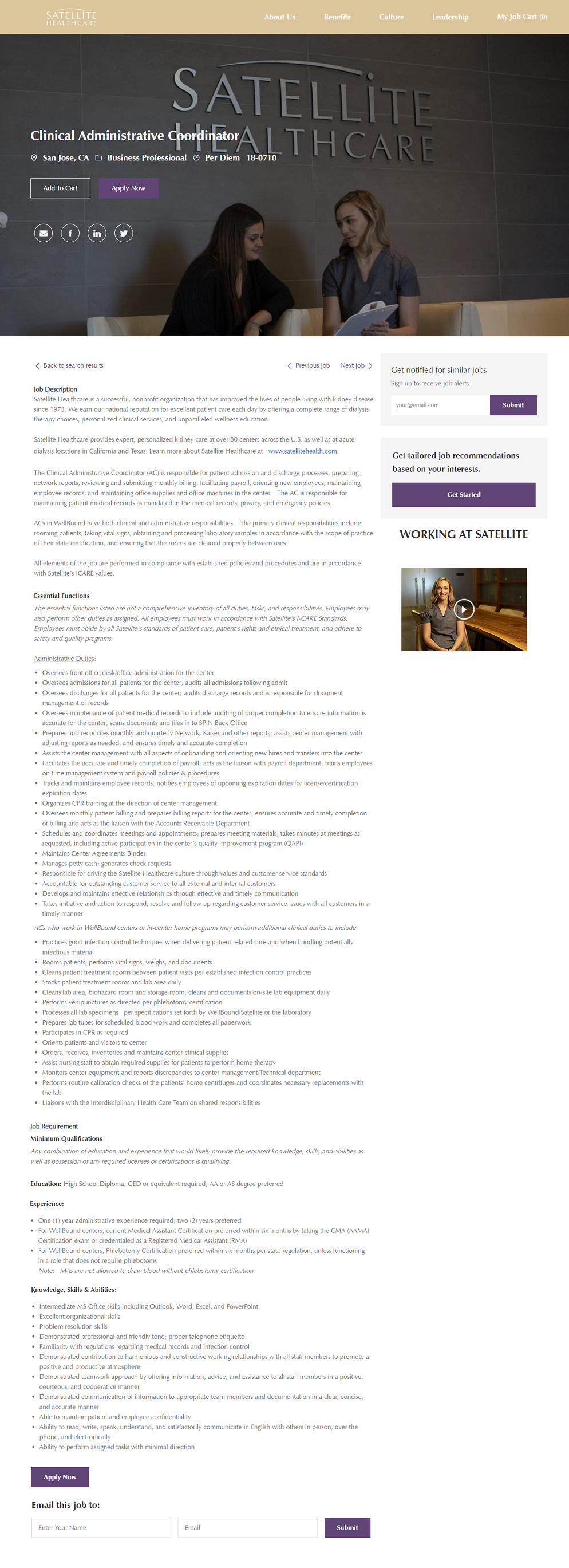
Satellite Healthcare Job Ad
- Branded hero image with an accurate depiction of Clinical Administrative Coordinator.
- Working at Satellite recruiting video in the right-hand rail.
- Good use of brand colors
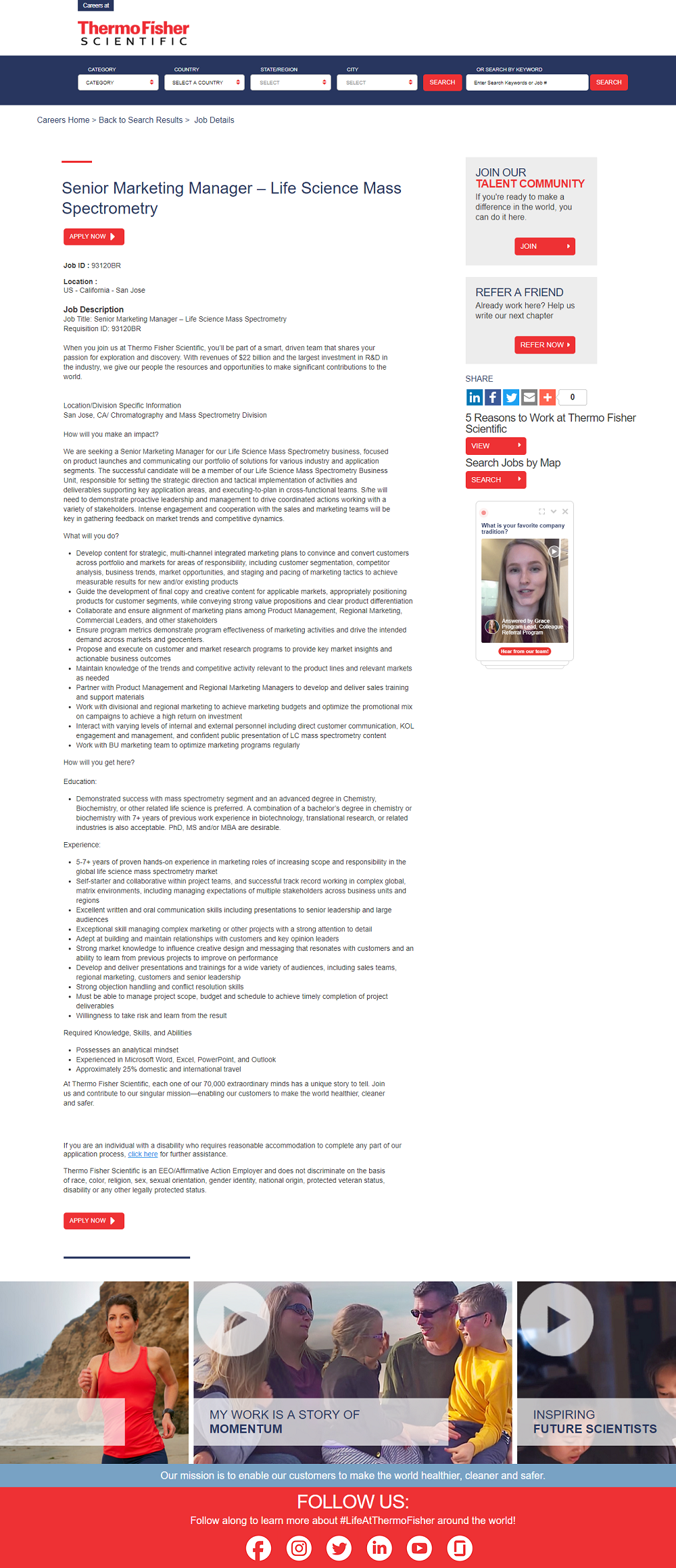
Thermo Fisher Scientific Job Ad
- Their consistent color scheme of blue and red reinforces their brand.
- Unique short employee videos that answer a specific question. They pop-up in the bottom right-hand corner when you first land on the page. Questions include:
- What is your favorite company tradition?
- What makes the company culture unique?
- As a fresh graduate, how do you enjoy work at Thermofisher?
- Refer A Friend option in the right-hand rail is creative. Employee referrals are proved to increase retention rate, reduce time and cost to hire, and more.
Elastic Job Ad
- Group hero image of smiling team members is almost always a great idea.
- Glassdoor ratings and reviews in the right-hand rail.
- Talent community opt-in.

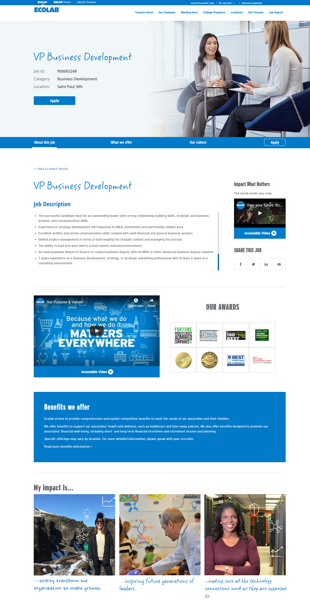
Ecolab Job Ad
- Apply button prominent and clear.
- Efficient use of space with tabs: “About this job”, “What we offer”, “Our culture”.
- Great use of fonts to add personality to the job ad.
- 8 listed employer of choice awards. Like we said above, the more the merrier.
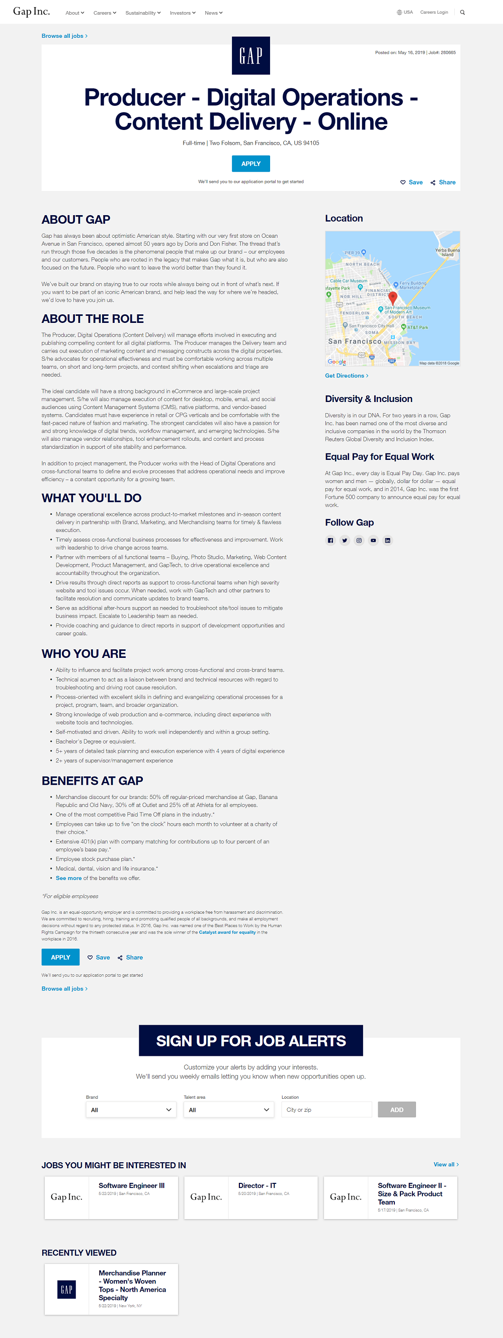
GAP Job Ad
- Job Title is large and front and center. Looks more like a magazine article headline…in a good way.
- Apply call-to-action is also front and center. No question what they want the candidate to do. They also have one at the bottom of the page so you don’t have to scroll all the way back up.
- Great formatting of section headers: The “About Gap”, “About Role”, etc. They treat them like section headings in a press article… in an effective way.
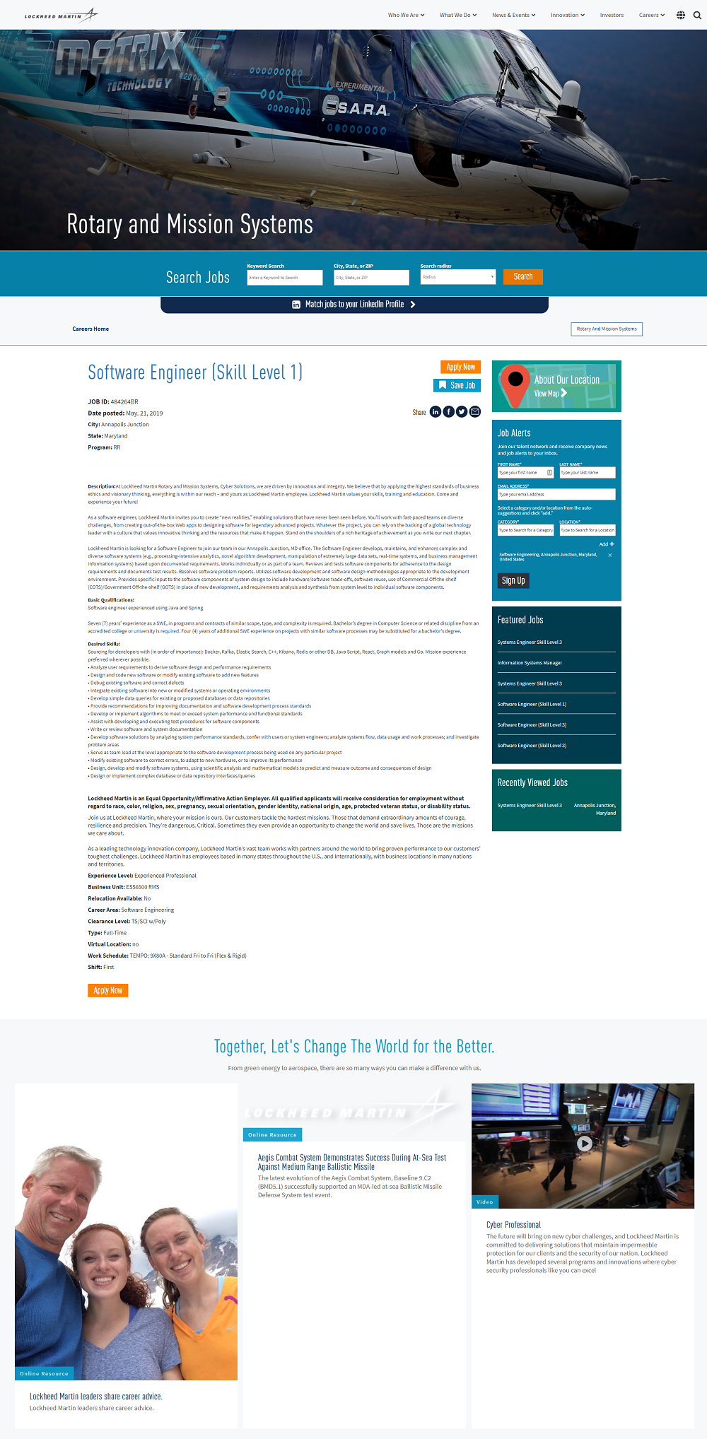
Lockheed Martin Job Ad
- Dramatic hero image that catches your attention.
- Clear job alerts opt-in. The only critique here is too lower the number of fields the candidate has to fill out.
- Employee career advice at the bottom of the page offers supplemental content to help convert the apply.
Comcast Job Ads
- Benefits has its own unique section which really makes it stand out.
- A “360 View” of the office is a unique feature we haven’t seen on many job ads.
- A commute widget shows how long it’ll take to get to work. A key factor in a candidate’s decision to apply or not.

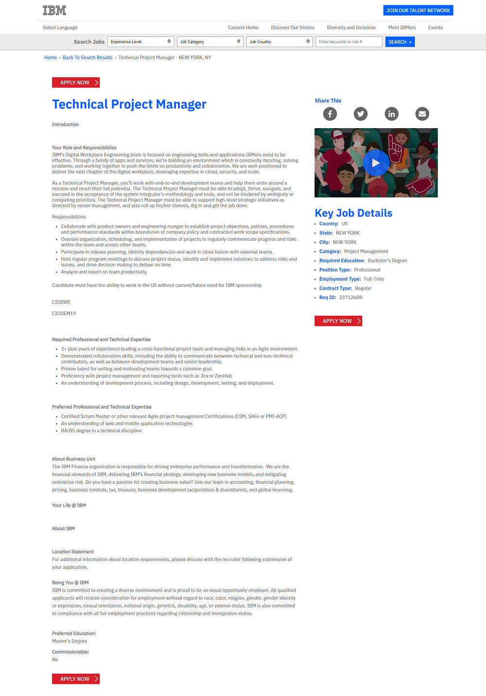
IBM Job Ad
- Strong use of IBM blue on section headlines.
- Apply buttons stand out because they are the only red elements on the page. They also 3 apply button at the beginning, middle, and end making sure candidates see it wherever they are.
- Video in right-hand rail provides a nice secondary call-to-action
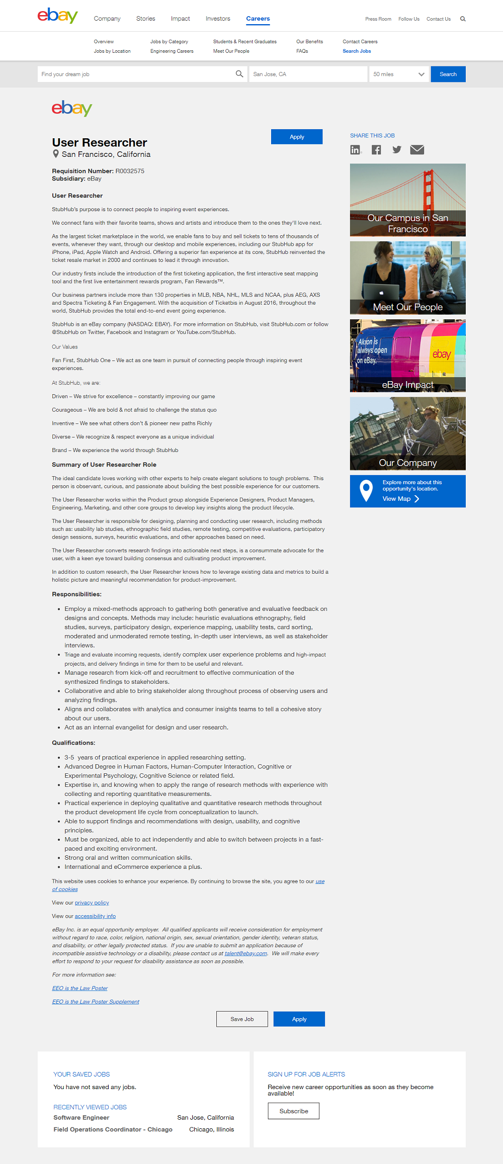
eBay Job Ad
- Strong use of logo
- Branded right-hand rail with nice content
- Job search bar is available at the top of every job ad
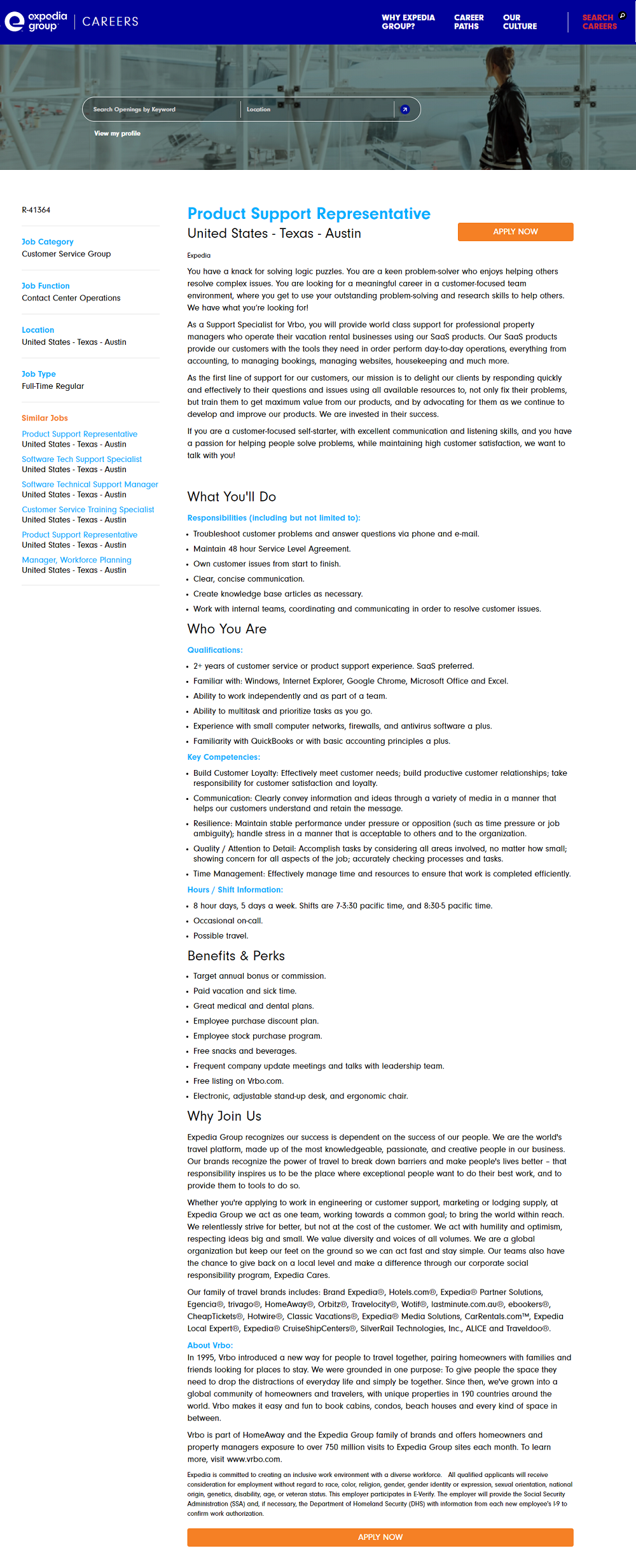
Expedia Group Job Ad
- Clean layout with dual-column format makes it easy to read.
- Prominent apply button with its own standalone color.
- Section headers make the job ad conversational through using 1st/2nd person language (e.g “What You’ll Do”, “Who You Are”, etc.).
Why I wrote this?
Job ads are an important part of the digital candidate experience. They are often the last piece of content the candidate sees before they click apply. Check out Ongig if you’d like to create creative and effective job ads.
