- Top 10 Helpful Augmented Writing Tools for Job Descriptions (2026 Update) - March 9, 2026
- Top 18 Employer Reviews & Ratings Sites for 2026 - February 27, 2026
- 7 Examples of Awesome Employee Testimonials And Content (2026 Update) - January 20, 2026
Looking to revamp your diversity recruiting strategy?
A great place to start is with your diversity page.
After combing through 200+ diversity pages I found 12 that caught my attention and stood out the most.
Here’s a table of contents to help you navigate:
- What is a diversity page
- Adidas
- AT&T
- Dell
- Netflix
- Hubspot
- IBM
- Proctor & Gamble
- ViacomCBS
- Apple
- Accenture
- GoPro
But first let’s define a diversity page.
What is a diversity page?
A diversity page is a page on your corporate or company career site that focuses specifically on diversity and inclusion. It’s pretty much a recruiting microsite for diversity.
Some benefits of a diversity page include:
- A more targeted experience for candidates who want to apply to diverse companies.
- A more detailed/complete way to articulate your stance on D&I.
- Increased organic traffic for D&I keywords around your company name.
- More entries (pages pointing) to your job openings.
Now let’s get to the diversity pages!
Adidas Diversity Page
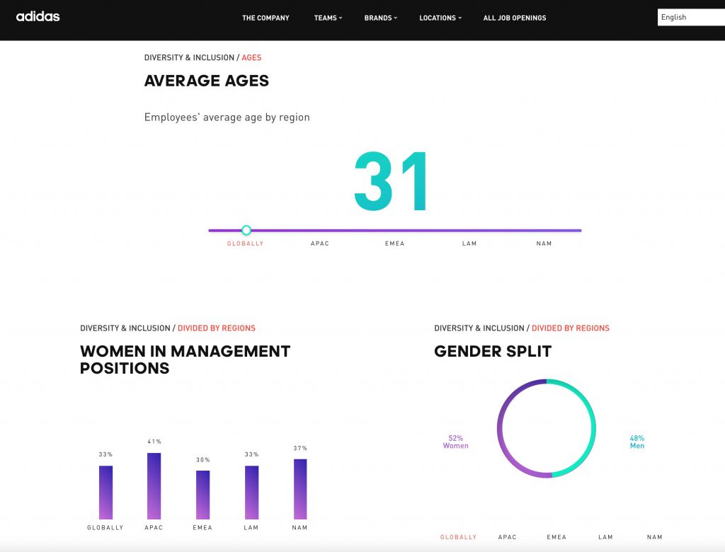
- Interactive Diversity Statistics: As you scroll through the diversity website, diversity stats populated for things like nationalities, average ages, women in management, and more.
- Job Openings Highlight: At the bottom of the diversity web site, Adidas has a colorful way of showing the % of job openings they currently have.
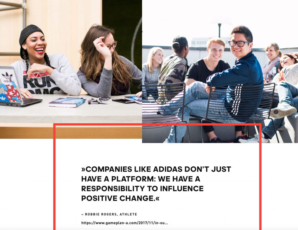
- A Link to a Blog Post: A shout-out from a famous athlete with a clever name “In our Locker Room You can Be Whoever You Want”.
AT&T Diversity Page
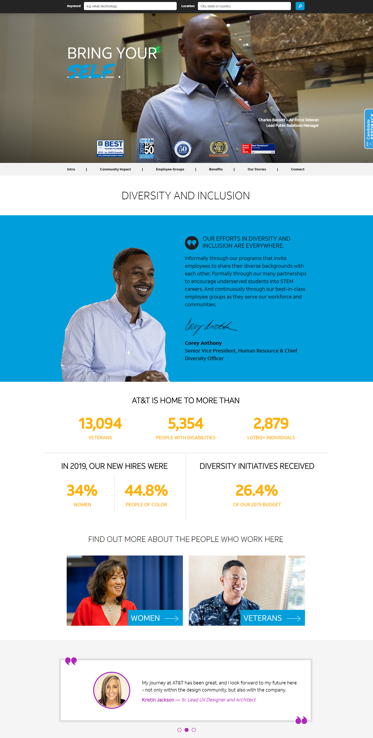
- Job Search Bar: Located at the top of the page and makes it convenient for candidates to search jobs right away.
- Diversity Awards: They do a great job showcasing these front and center. You want candidates to know you’re an employer of choice, especially for diversity and inclusion.
- Diversity Officer Quote: Quotes from leadership are always a nice touch.
- Workforce Diversity Stats/Numbers: One of my favorite features on AT&T’s diversity recruiting page. It shows candidates transparency. They even give the percentage of their budget allocated to D&I initiatives!
- Other sections include: Diversity report, employee groups, diversity and inclusion blog content.
AT&T Diversity Website [2021 Update]
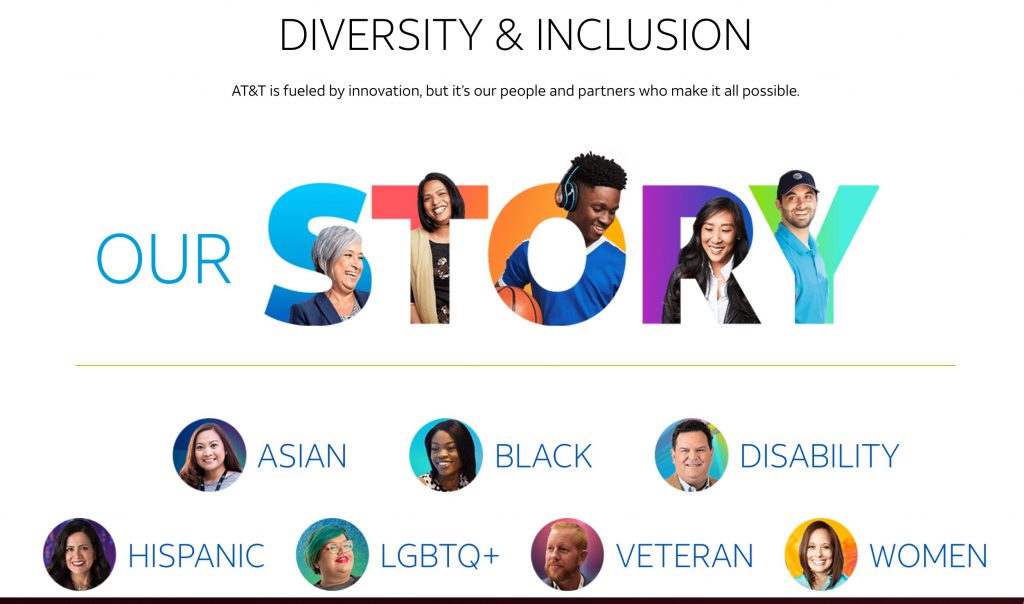
AT&T and other top tech companies have updated their diversity websites since last year. This AT&T diversity web site update caught our attention because it puts real employee faces to underrepresented groups employed at AT&T. And you can click on each to see a dedicated landing page for each.
Dell Diversity Page
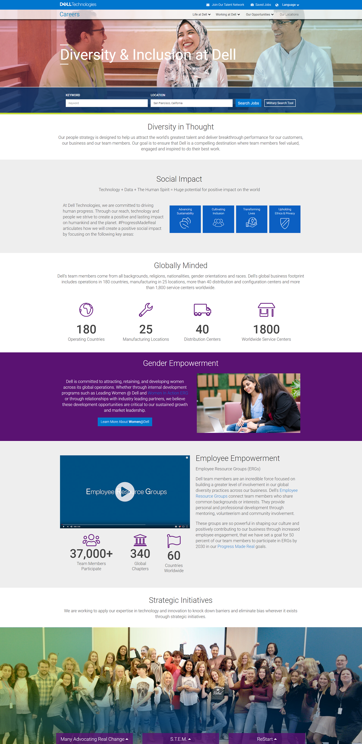
- Job Search: Like AT&T, Dell makes it easy for candidates to search jobs. This should be one of the main calls-to-action on any recruiting page.
- Great Diversity Copy: Notice the short, well-written sections on page. The shorter and to the point your copy is the better the chances are of candidates actually reading it.
- Employee Resource Groups: If you have them, it’s a must to include them on your diversity page. Employee resource groups are employee-led groups that promote a diverse, inclusive workplace. Dell’s employee resources groups include: Asians in Action, Black Networking Alliance, Pride, Women in Action, and more. Here is Dell’s ERG video:
- Gender Empowerment: Diversity doesn’t mean just race. It means race, gender, sexuality, and neurodiversity. It’s a good idea to cover all of these types of diversity.
- Team Stats/Numbers: These numbers focus on company numbers (operating countries, manufacturing locations, etc). I’d like to see numbers more focused on diversity numbers like AT&T did above.
- Other sections include: Empowering LGBTQ team members, empowering veteran team members, empowering people with disabilities, diversity awards and recognition.
Netflix Diversity Page
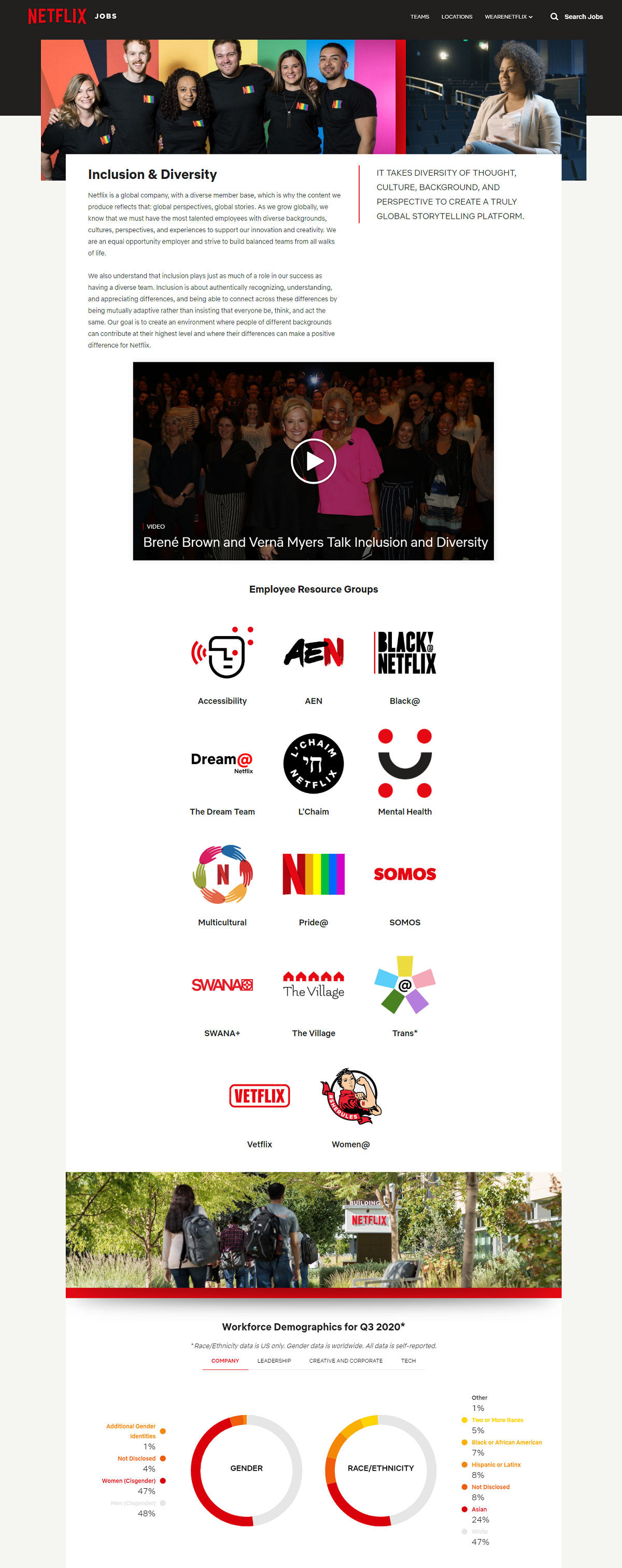
- Feature Image: I love the diverse image of team members up top.
- Diversity and Inclusion Video: Different from other diversity recruiting pages Netflix shows a long-form video (45 mins. long) on their culture and diversity strategy. Here’s the video:
- Employee Resource Groups: We mentioned these the Dell section above. This gives candidates a sense of belonging no matter what group they identify with.
- Workforce Demographics: One of the most complete sets of data I’ve seen on a diversity recruiting page. First notice the relevance of the data (Q3 2020), this isn’t just data from 2018 or 2019, it’s current. Then notice the amount of data. They offer gender % and race/ethnicity % for the whole company, leadership, creative and corporate, and tech. Transparency is key for candidates and Netflix more than checks this box.
Netflix is a top pick for inclusion websites [2021 Update]
Netflix recently published its 2020 Inclusion report and it’s featured on their inclusion and diversity website. Highlighting new inclusion reports on diversity websites is definitely trending. Check out our blog, 7 Takeaways from Netflix’s First-Ever ‘Inclusion Report’, for some unique ideas around inclusion and diversity strategies. 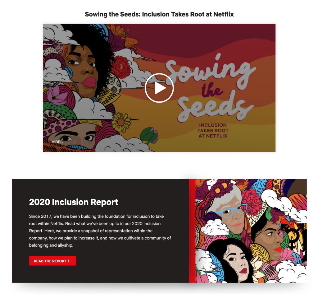
HubSpot Diversity Web Site
- The Latest Diversity Report: Like other diversity websites, HubSpot’s opens up with their latest report on Diversity from 2020. It’s good to highlight this for diversity transparency.
- A #BlackLivesMatter Statement: A link to a letter from HubSpot’s CEO shows their stance on equity and justice.
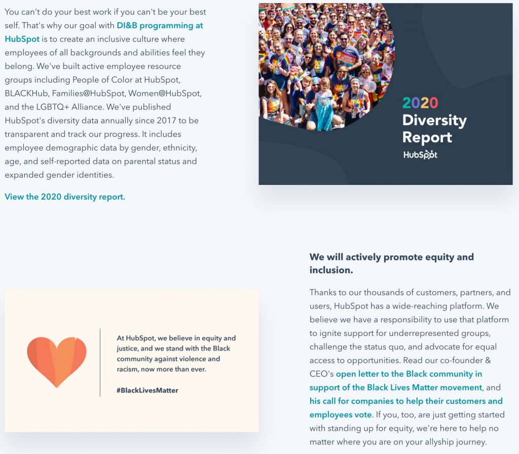
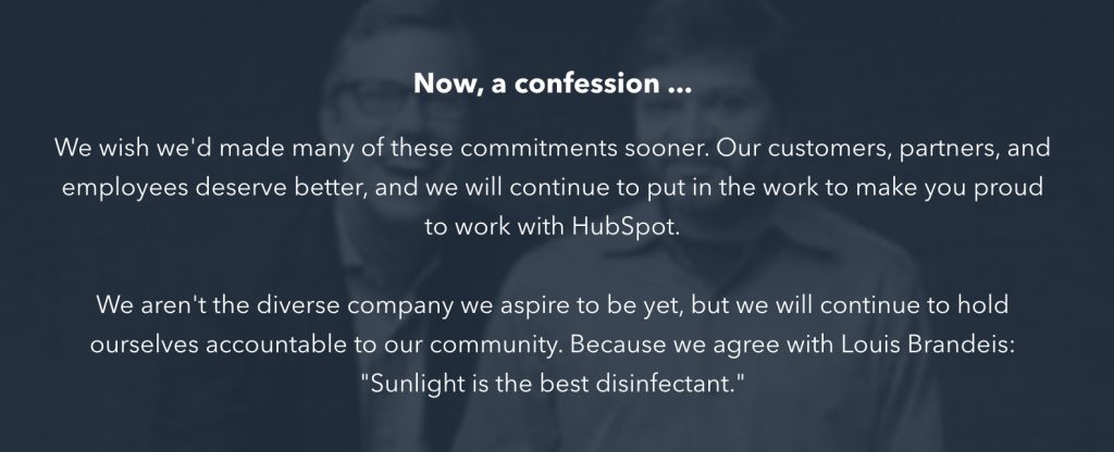
- A Confession: At the bottom of HubSpot’s inclusion, belonging, and diversity website, there’s “a confession” from the company. They say they wish they made diversity commitments sooner and have work to do. Very cool, very honorable!
IBM Diversity Page
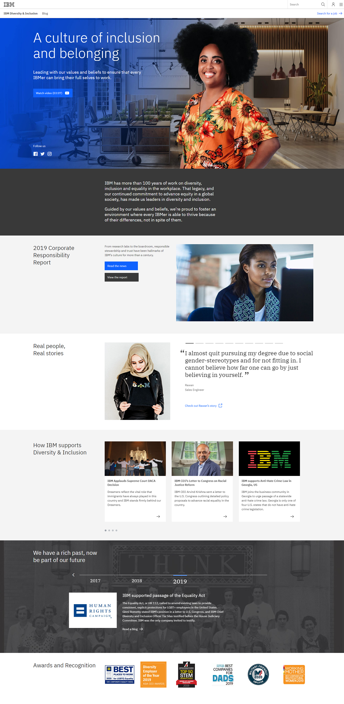
- Feature Image: Covers the whole top half of the page when you land on it. This helps engage candidates off the bat. The image also doubles as a playable diversity and inclusion video:
- Corporate Responsibility Report: It’s great to have this available for candidates to view, but it’s a long report. Let’s keep it real candidates most likely won’t read through it. A better idea would be to give candidates a “greatest hits” of the report in 3-5 bullets.
- Diversity and Inclusion Content: If you have a careers blog, you probably have some diversity and inclusion content. Why not showcase them on your D&I page?
- Interactive Timeline: This is a creative idea and one I think would engage potential candidates. Clicking on different years will show some D&I accomplishments and initiatives.
A new diversity website for IBM recruiting [2021 Update]
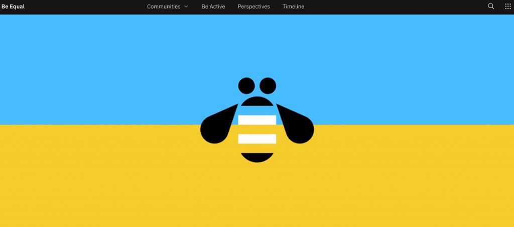
Since last summer when we wrote this blog, IBM has done a full overhaul on its diversity website…and we are impressed. The top half of the diversity web site shows movement filled with inclusive colors and then a bee with the “=” in the middle. The tagline is “Be Equal”.
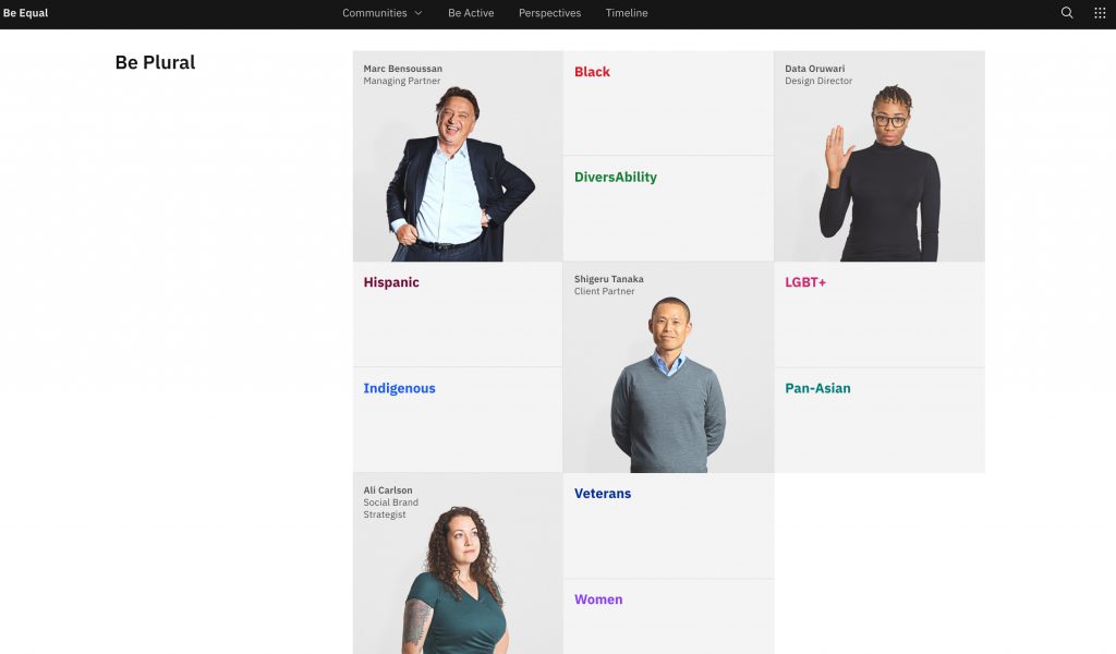
When you scroll further, there are other cool nuggets about diversity and inclusion at IBM. Each section starts with “Be…” with a message. Many diversity websites list the underrepresented groups they want to make feel more included. This is how IBM takes a creative spin on list them in their diversity website:
Procter & Gamble Diversity Page
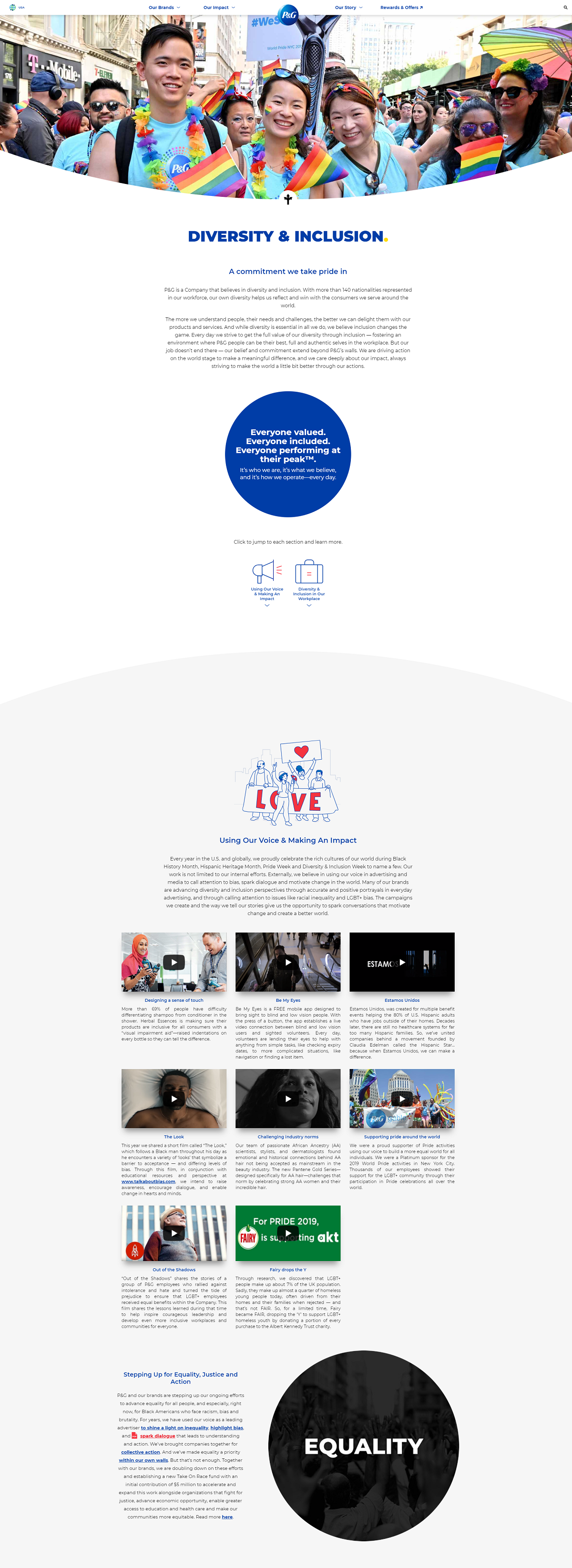
- Feature Image: A cool, colorful, and authentic team pic.
- Diversity and Inclusion Commitment: A great way to set the tone of your diversity recruiting page.
- Campaigns/Initiatives: Candidates want to know what you’re doing right NOW. An awesome way to fulfill this want is to list off diversity and inclusion campaigns/initiatives you’re currently working on. Procter & Gamble shows candidates some very thought-provoking campaigns including this #talkaboutbias video:
- Other Sections Include: Chief Diversity Officer quote, workplace diversity and inclusion strategy, affinity groups, neurodiversity strategy.
What’s new on the P&G diversity web site [2021 Update]
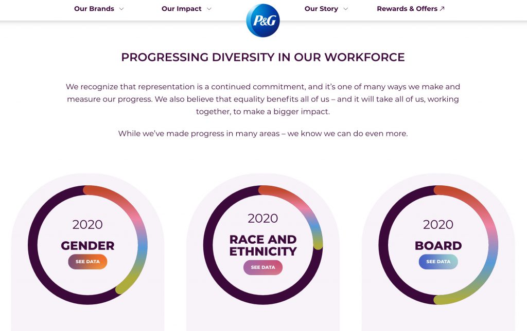
Proctor & Gamble’s diversity website is updated with 2020 diversity statistics. They even break it down by gender, race & ethnicity, and board. The layout is colorful and clean, making it stand out as one of the most inclusive pages we’ve seen.
ViacomCBS Diversity Website
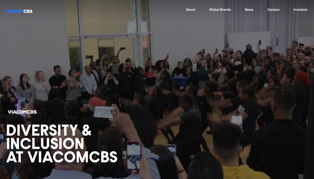
- Feature Video: A high-energy video on the homepage that kicks off the tone of their diversity web site.
- Notes from DEI Leaders: Messages from both the EVP, Global Head of Inclusion, and the CEO show ViacomCBS’s stance on diversity. The letters outline their inclusion goals moving forward and highlight diversity initiatives across the company.
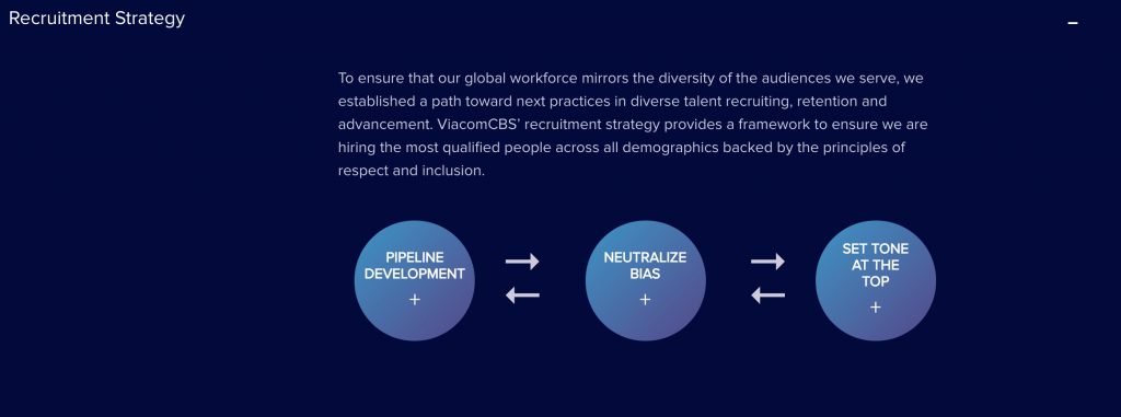
- Interactive Roadmap: Highlighting recruitment strategy on a diversity website is key. VicamCBS does this well with an interactive roadmap showing quick facts for pipeline development, neutralizing bias, and setting the tone in leadership.
Apple Diversity Page
How killer is Apple? I know: a bunch of us are fanboys (and fangirls!), but Apple comes right out with a sweet-looking diversity page with hard data on their diversity hiring. They admit they have a ways to go — Ggood for you, Apple! Some highlights:
- Diversity Data — It starts with the data. Sharing it publicly shows transparency. Good candidates love this!
- Hero Media — Great full-screen pics of employees talking about diversity
- The Diversity Chief — If you’ve got a diversity chief, make sure to mention her front and center. A quote helps

Google Diversity Page
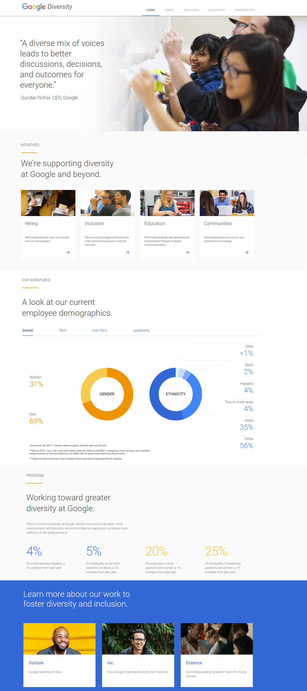
- CEO Quote — If diversity really matters, the CEO should be involved, right? They lead with a quote from their CEO
- Breaking Down Diversity — They have a nice breakdown of how they see the different pieces of diversity (hiring inclusion, education, communities). This shows more thought that the average employer
- Data — Candidates love this (even if the #s need improvement)
- Social Proof — They have 3 magazines discussing Google’s commitment to diversity
Accenture Diversity Page
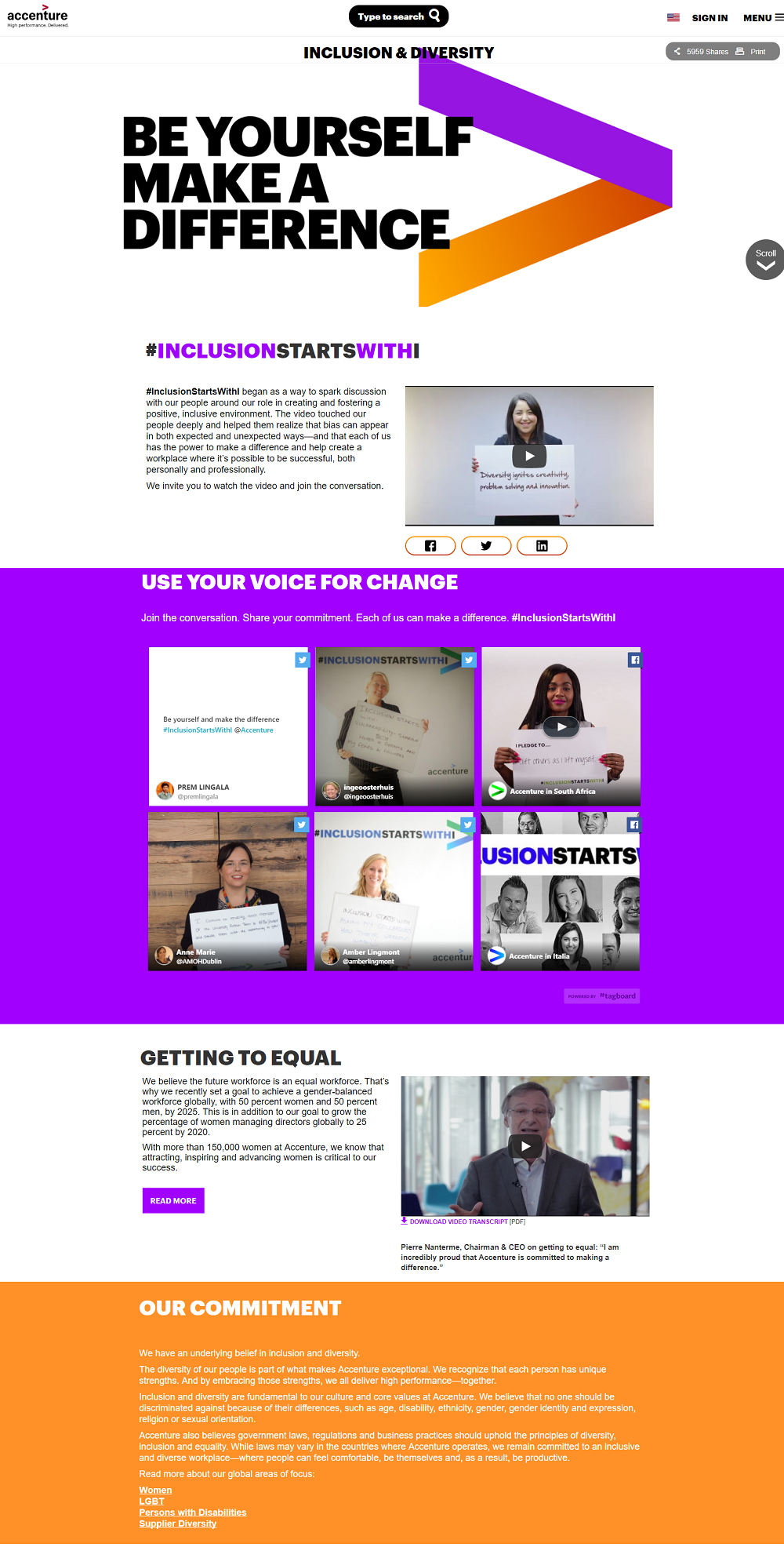
- Good Headline — The page doesn’t look like brochure-ware (good!) and it leads off with a headline that looks like something out of a magazine. That’s good copyrwriting/marketing
- Social Proof — They show through the tweet thumbnails that the employees are really behind this diversity
- CEO Quote — Again, it starts at the top
GoPro Diversity Page
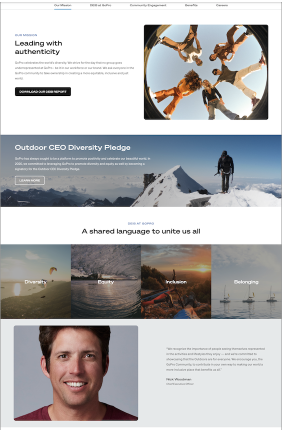
- Good Mission Statement — most candidates like to know what your mission is, especially when it comes to diversity. GoPro’s mission of “Leading with Authenticity” is relatable. And there’s a summary of how they are focused on being authentic and inclusive.
- A highlighted Diversity Pledge — There are lots of CEOs signing diversity pledges, but not everyone highlights it on the diversity page like GoPro.
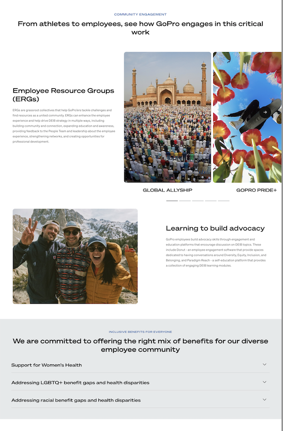
- Image-focused — not surprising that GoPro has loads of images on its diversity page. But they aren’t just placeholders. The images are people-focused and help candidates understand the different types of people who work at Gopro.
Why I Wrote This
With Diversity and Inclusion in the spotlight employers need to be optimize their diversity recruiting strategy. Ongig gives employers the ability to create landing pages/microsites like those listed above.
