Latest posts by Rob Kelly (see all)
- Action Verbs for Job Descriptions: A Comprehensive List for 2026 - May 11, 2026
- 20 Examples of Helpful Diversity Statements [2026 Update] - April 21, 2026
- 15 Great Tips on Job Posting Wording for 2026 - February 25, 2026
There wasn’t enough room in our previous Best Company Career Sites of 2017 (Vol. 1) piece, so we did a Volume 2!
Here are some of the best company career sites with an emphasis on the careers home page.
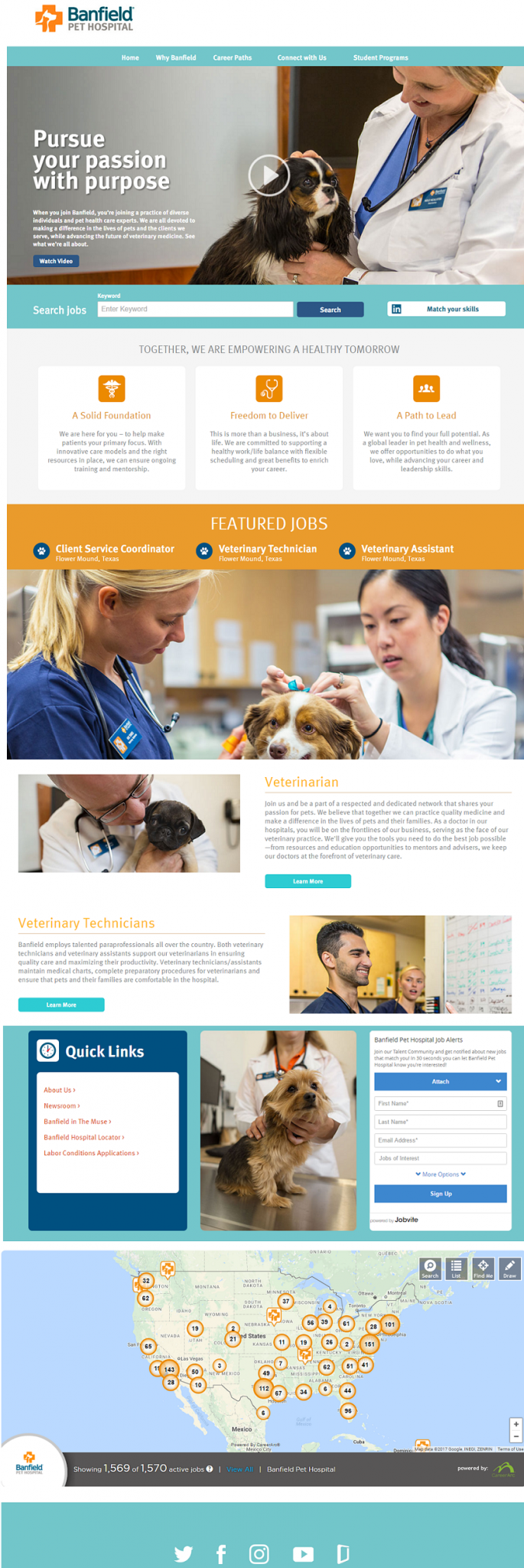
Banfield Pet Hospital
- If you have anything that tugs at a candidate’s heart, show it. Banfield is masterful at showing pics and videos of cute puppies.
- Easy to digest info, including visually showing that you could work just about anywhere in the U.S. (a map is most valuable to show when you have a nationwide presence (all chains should use a map).
Toggl
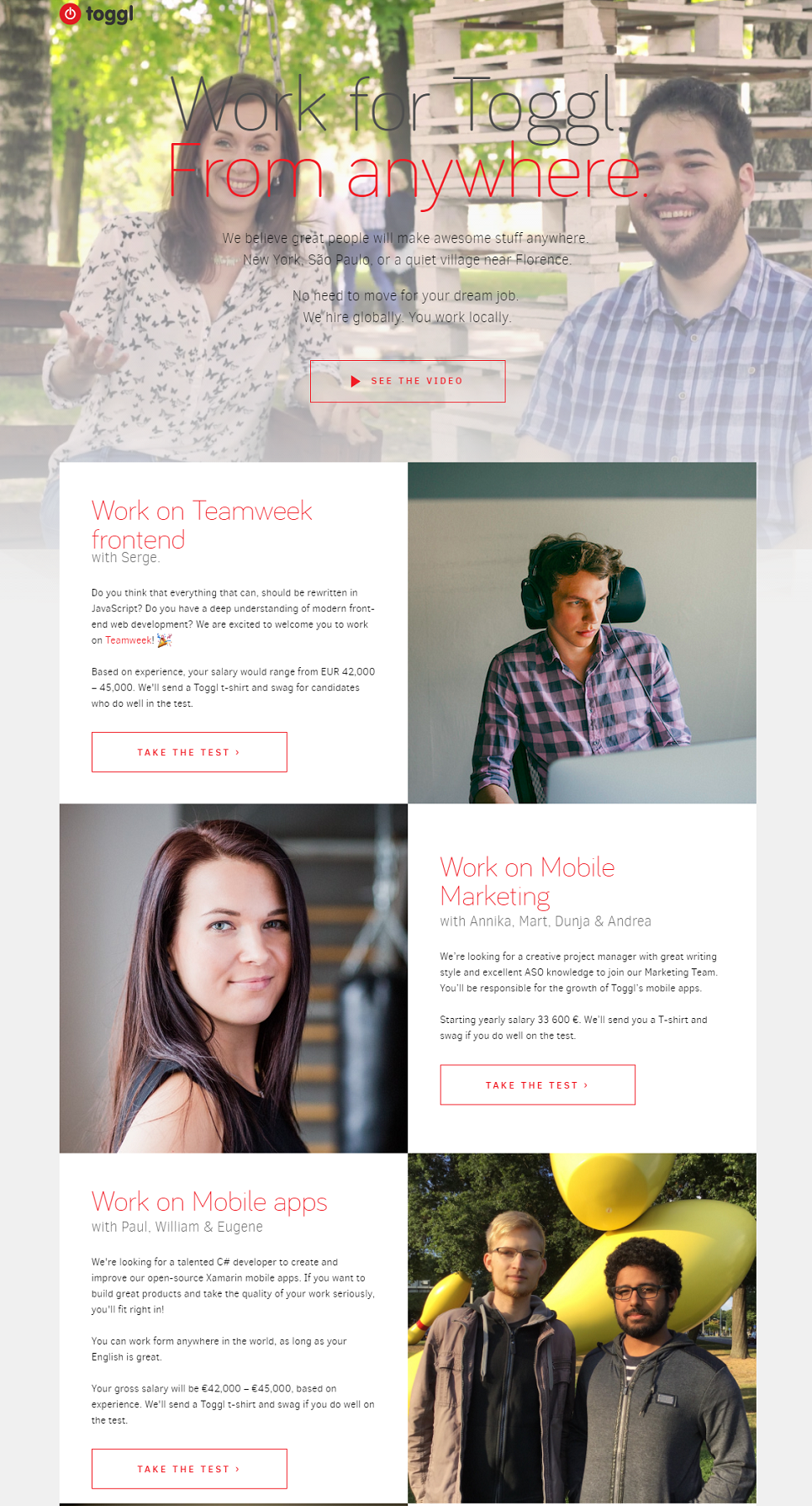
- If quality is a priority, check out Toggl’s approach in which they use their careers home page to list every department they have with a persona of who they’re looking for along with a 20 minute test for each job.
- They include salary ranges for each department — “No salary info” was the top reason why candidates had a negative candidate experience.
Brightview
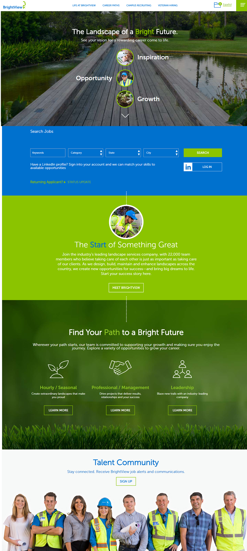
- Awesome visuals, branding, and career site homepage layout.
- Great talent community opt-in — The image definitely accentuates the opt-in
- Status update link for returning applicants link — An under-utilized feature that can increase candidate experience
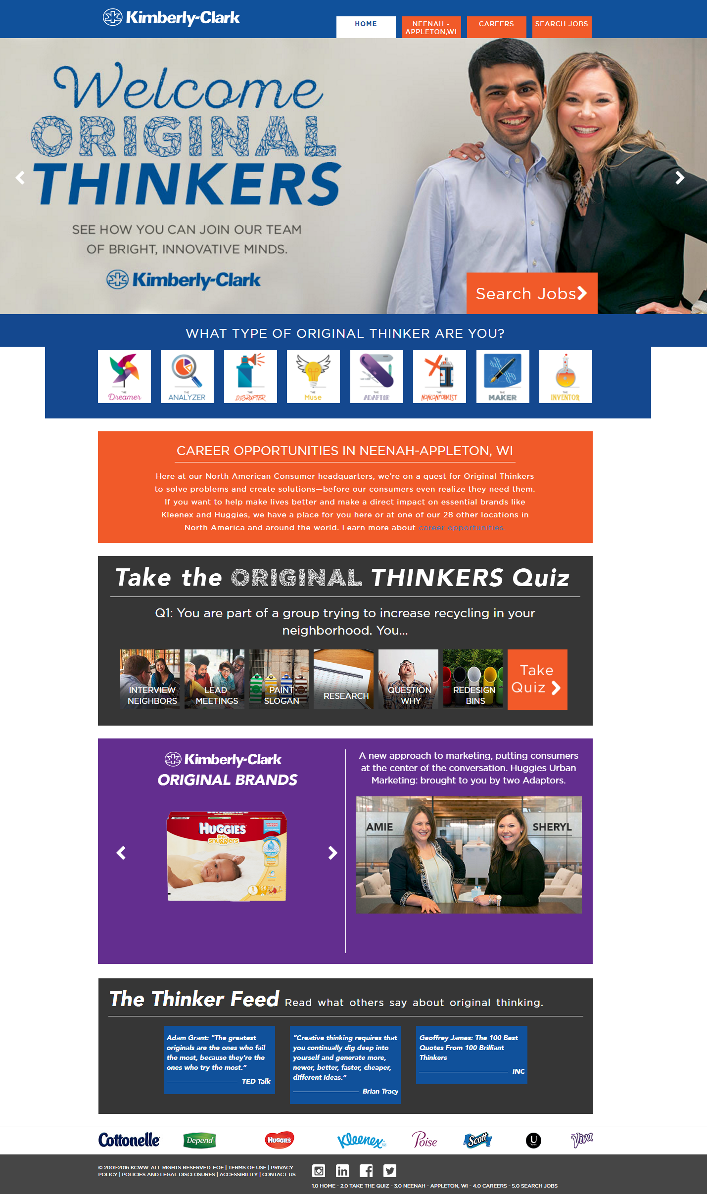
Kimberly-Clark
- Branded URL (welcomeoriginalthinkers.com)
- A quiz showing you your personality type and how that might be a good fit at Kimberly-Clark (see a sample of the quiz we took!)
- Emphasis on job and/or location needs — Make sure candidates know your needs. Kimberly-Clark does this by emphasizing Neenah Appleton, WI jobs with its own tab and enlarged link (middle of page).
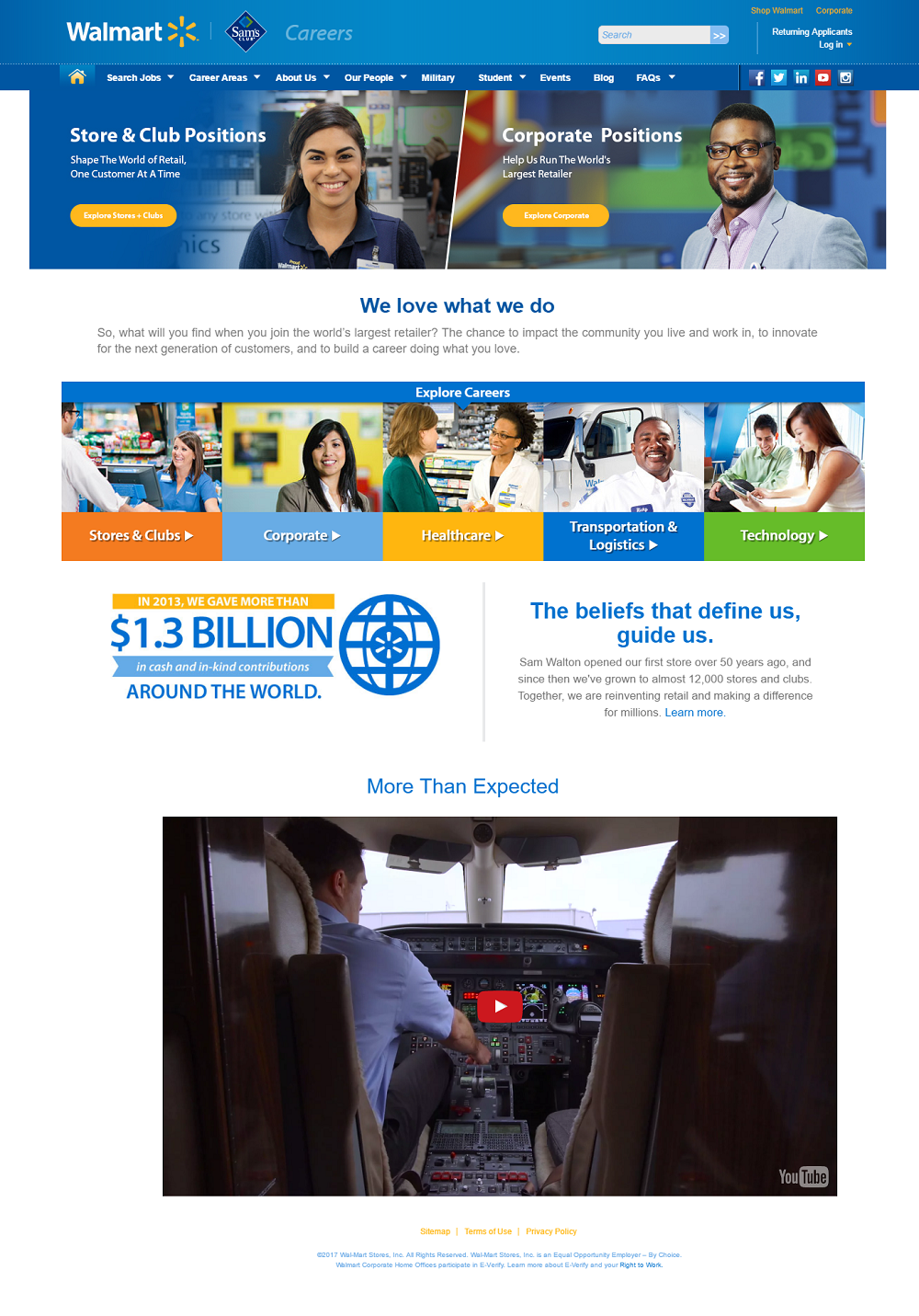
Walmart
- Clean, easy-to-navigate for such a big company
- Unique employer branding video that tells you some things you probably don’t know about the retailing giant (diversity, military/veteran recruiting, etc.)
Roblox
- Killer sub-headline — Talking directly to the candidate.
- Great Employer Branding and employer of choice award
- Useful company stats with a cool looking counter.

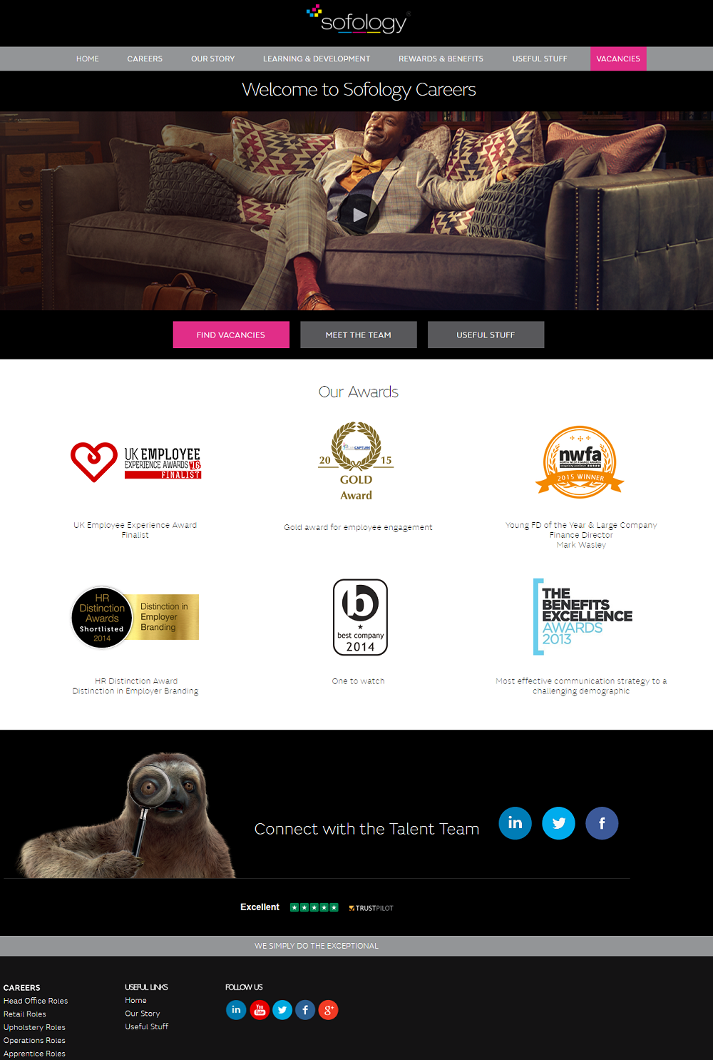
Sofology
- Killer hero video media
- 3 easy call to actions
- Employer of choice awards (6 of them!) above the fold
- Enlarged talent community opt-in at the bottom of page
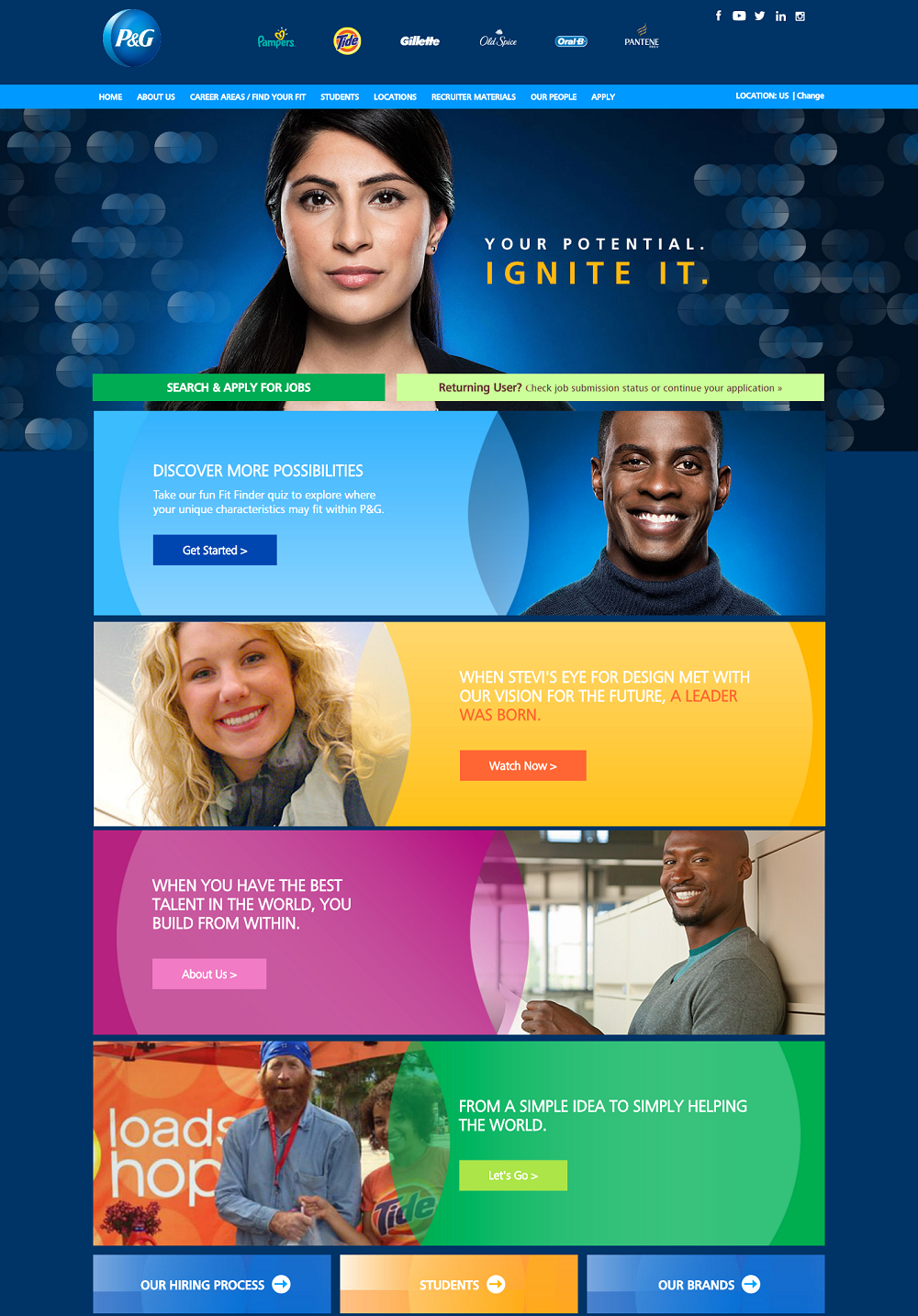
Procter & Gamble
It’s great to see an company who is as good at employer branding as they are at product branding. Check out:
- The clear mention of their brands
- The overall color scheme (I feel like they took the best colors from each brand to craft this company career page)
- A dynamic headline — Strong and bold (literally and figuratively)
- A mix of diverse people throughout the career homepage
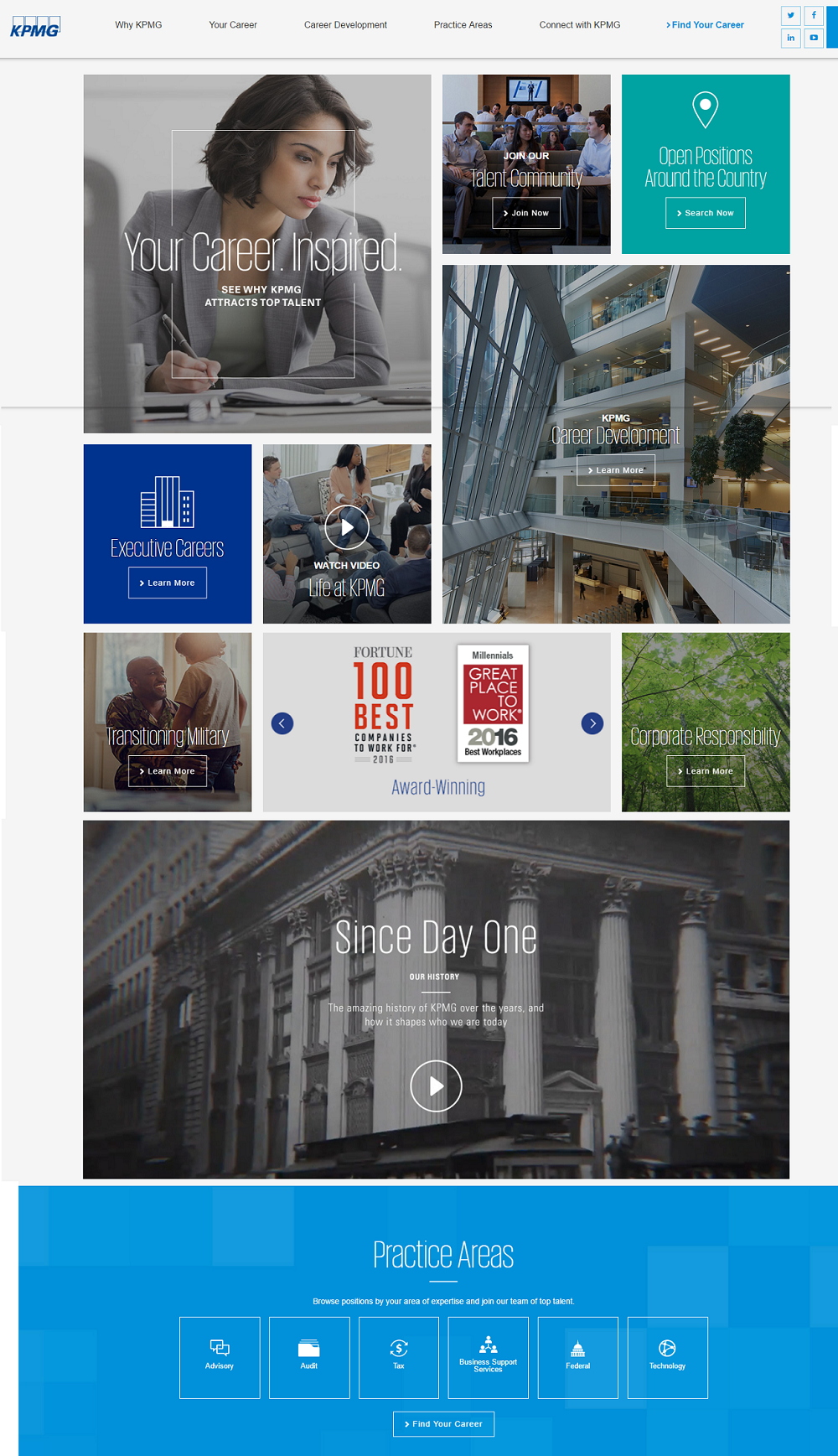
KPMG
A nice mix of:
- Recruitment Videos — Multiple videos are showcased, KPMG history and Life at KPMG
- Answers to “why” a candidate should work there
- Employer of Choice Awards — Rotating carousel of awards, this can also be utilized for images and/or video
