Latest posts by Nick Misa (see all)
- Top 10 Helpful Augmented Writing Tools for Job Descriptions (2026 Update) - March 9, 2026
- Top 18 Employer Reviews & Ratings Sites for 2026 - February 27, 2026
- 7 Examples of Awesome Employee Testimonials And Content (2026 Update) - January 20, 2026
If you’re looking to revamp or create new job descriptions, check out this list of the best job descriptions we’ve seen in 2020.
We also highlight things that we like including design, employer branding content, layout, and more! For tips on writing job descriptions, check out How to Write a Job Description — Best Practices & Examples.
So let’s get to it:
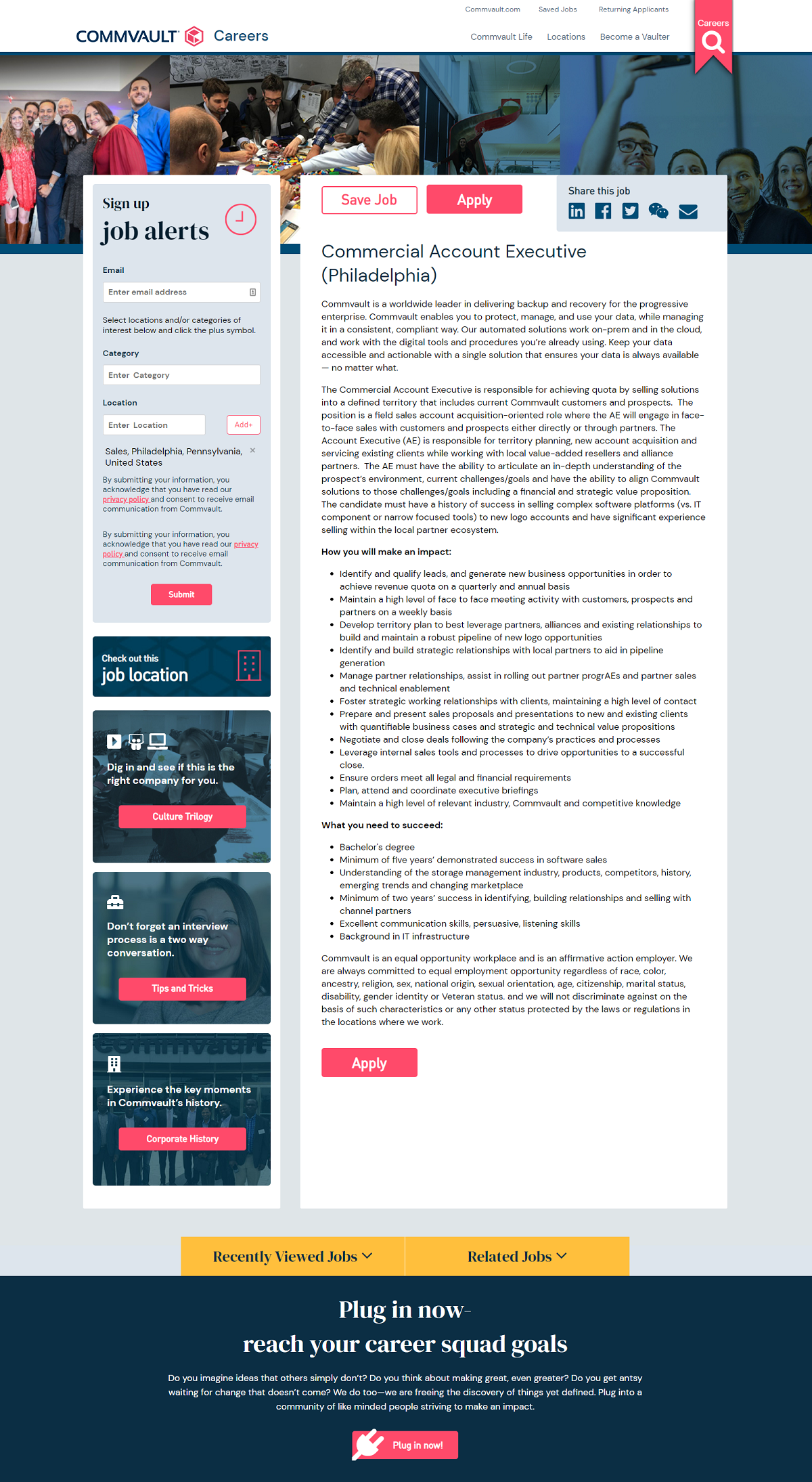
Commvault
- Hero Image — Team picture collages give the page a nice feel. Team type pictures are some of the best to use on your job descriptions.
- Color Scheme — Job page is nicely branded with company colors.
- Text Colors — Utilize 3 different colors for text (black, red, white). It makes the job page look more detailed than it really is.
- 2-Column Format — Makes everything more readable and keeps at a reasonable length.
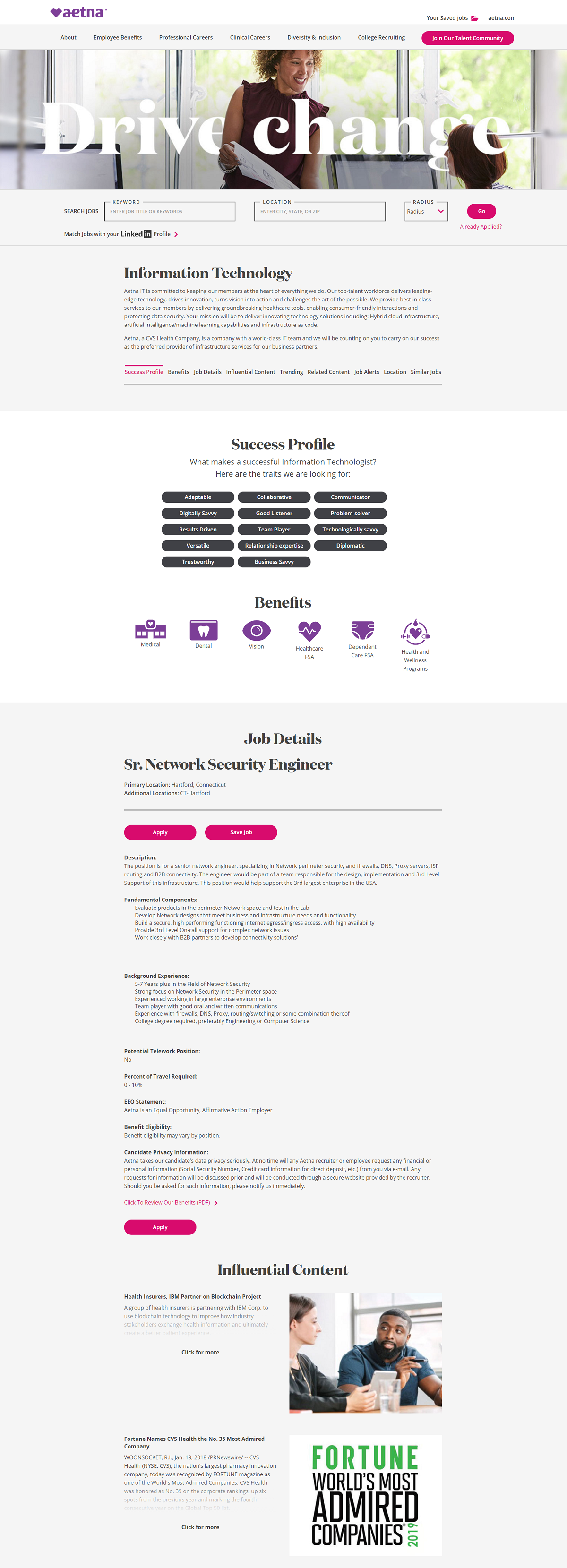
Aetna
- Hero image — A positive/high energy woman.
- Success Profile — Presents skills, characteristics, and traits in a unique list.
- Calls-to-Action (Apply, Save Job, Join Our Talent Community, etc.) — These red colored buttons pop and stick out.
- Background color — Simple light gray background makes text very readable.
- Font — Unique for a job posting, it looks magazine-like.
Aptiv
- Color Scheme — Nice and simple with black and white.
- Above The Fold — No hero image, but a big job title is also a solid option.
- Apply Now Button — A prominent button above the fold helps maximize apply clicks.
- Qualifications — Written out as must-haves and nice-to-haves
- Company videos — Horizontal scrolling collection of company videos at the bottom of the page.

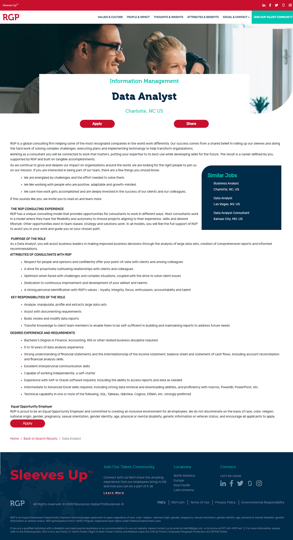
RGP
- Clean Look — Media with dark text on white background;
- Headline — They treat the job title as the headline which is what all job descriptions should do.
- Team and Location — Notice how they neatly tuck the team and location above/below the job title. They act as sub-headlines.
- Similar Jobs — This helps break up the text of the job description (a good “eye-break”).
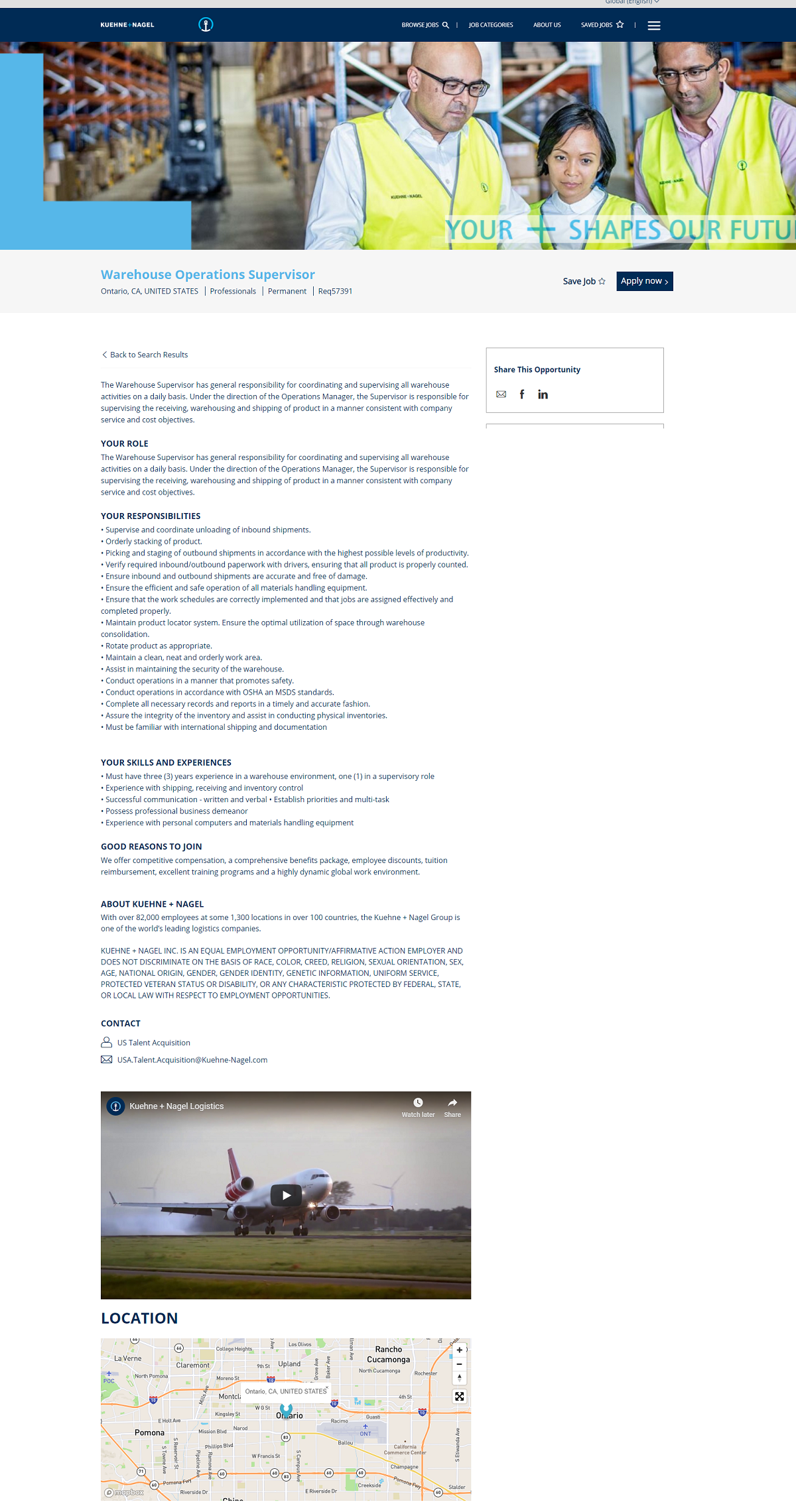
Kuehne + Nagel
- Specific Hero Image — Warehouse hero image is shown on this Warehouse Operations Supervisor. A lot of companies keep 1 default picture for all job pages.
- Branding — Consistent colors with shades of the K+N blue
- Video — Although it’s at the bottom it’s still there. We’d like to see it on the right hand side under “share this opportunity”.
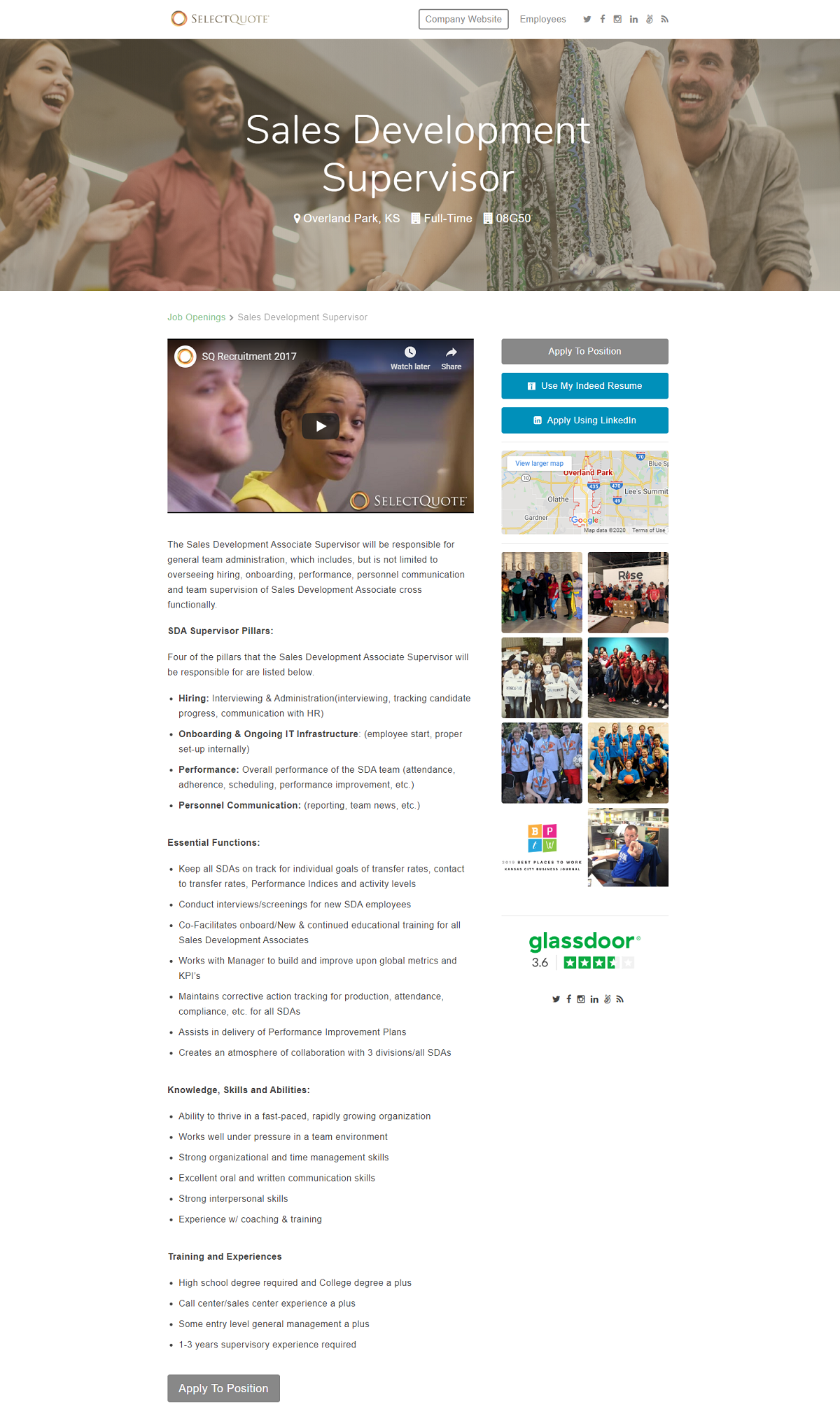
SelectQuote
- Hero Image — An awesome diverse team image.
- Recruitment video — Great placement and leads into the beginning of the job description.
- 2-Column Format — Allows you to fit more content on your pages in an organized way.
- Team pictures — 8 team pictures in the right hand rail, utilize as much team media as you can!
- Glassdoor Rating — Save the candidate a click and also show candidates you’re transparent.
Signify
- Hero image — Features a woman for a coding/developer job.
- Apply Button — Blue apply button sticks out. You instantly know what the primary call-to-action is.
- In-Job Description Links — Notice in the 3rd paragraph they have hyperlinks to specific content. It’s a different and great idea.
- Apply Process — Presented at the bottom of the page Signify gives you a simple overview of the apply process.
- Why join us — Every job description/page should have this. We’d also like to see this in a more prominent position rather than the last thing on the page.

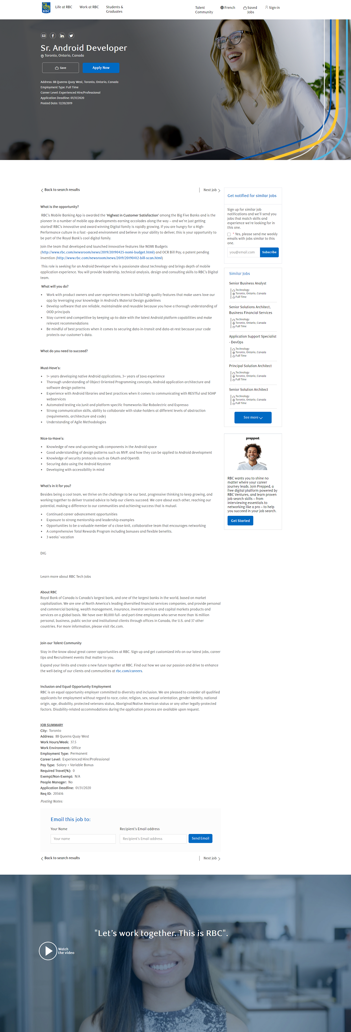
Royal Bank Canada
- Hero Image — An awesome image that is very clear. We often see pixelated hero images that hurt job pages.
- Similar Jobs — RBC also lists the department, location, and job type.
- “Prepped” Digital Platform — Cool platform to help candidates with their job search journey.
- Employer Branding Video — Has an awesome thumbnail with a quote, but at the very bottom of the page. It’d be great to see this video tested above the fold or as the feature media of the page.
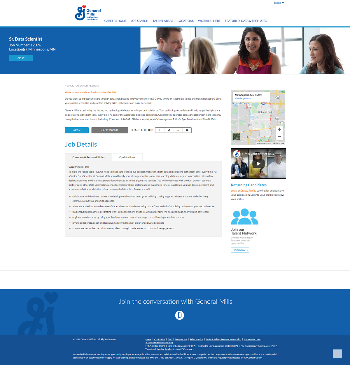
General Mills
- Hero Image — Nice hero image.
- 2-Tap Job Description Text — A great idea to keep the job description/page short and engaging. We see a lot of job pages that feel like they keep scrolling forever.
- Recruiting Video — Video makes job descriptions more engaging.
- Career-Focused Header Nav Bar — Makes it easy to find any pillar page on their career site.
Why I wrote this
Ongig’s mission is to help employers create the best job descriptions. We love to highlight companies that are doing job descriptions right!
