- 10 Attractive Job Posting Examples - December 23, 2024
- Top 18 Employer Reviews & Ratings Sites for 2024 - September 20, 2024
- Recruiting Microsites: The Ultimate Guide for Better Recruiting - September 6, 2024
We review 100’s of company career pages and found these 14 that really stand out. Check out each career page idea we highlight that makes these among the best.
You can create awesome career site features like below through Ongig’s Branded Candidate Experience Software.
Everlane
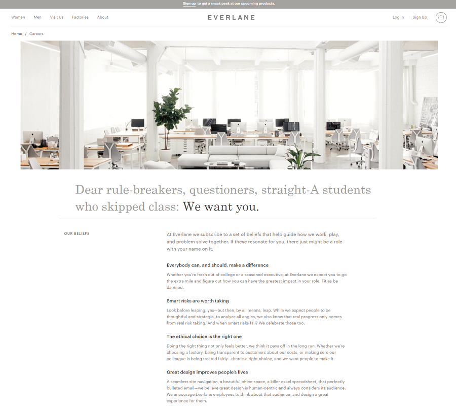
- Creative headline — They use a written letter approach (e.g. “Dear rule-breakers…”) which immediately differentiates them.
- They alienate the non-prospect — Bravo! They leverage the the marketing technique Rob Kelly and a few others call “alienate the non-prospect”. What this means is that they define WHO they want (rule-breakers, questioners, Straight-A students who skipped class) and thus they are telling others (rule-followers, ones who answer (not question), etc.) that they DON’T want them. This is bold but it’s plain good marketing. Don’t waste your time attracting the types of candidates you don’t want. Their approach also leverages the principle of scarcity.
- They list all their jobs on their home page. That’s a time-saver for candidates.
Sephora
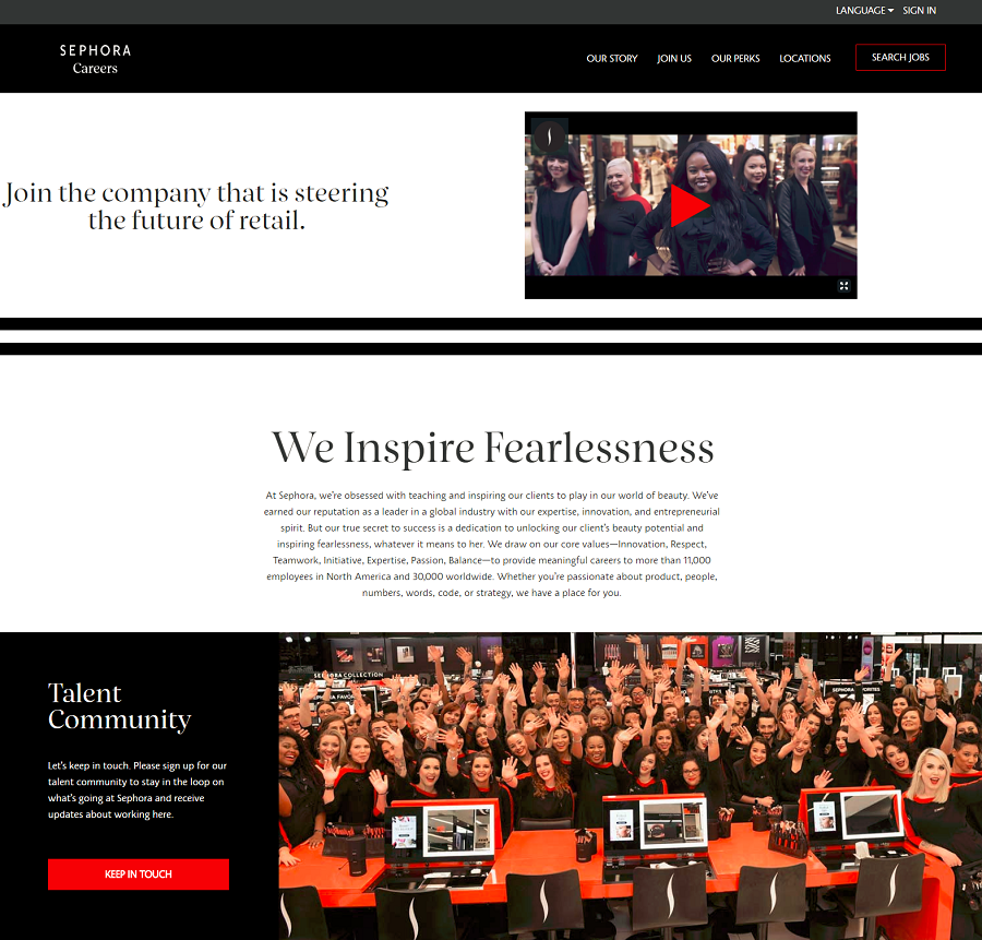
Sephora makes this list for one simple, but powerful, reason: branding. Check out their:
- Consistent use of the colors black, white and red.
- The confidence their team exudes in the thumbnail of the video and the Talent Community picture.
Their copywriting (specifically use of words) is excellent too. Check out the language in their headline: “Join the company that is steering the future of retail” as well as the “We Inspire Fearlessness” and how much “we” and “you” language they have.
MyWebRoom
- Hero media — A picture of a fluffy cute little dog is going to draw in many candidates.
- Happy people — When in doubt, show pictures of happy employees. It works.
- MyWebRoom presents their unique culture and perks with awesome, clickable visuals.

American Woodmark
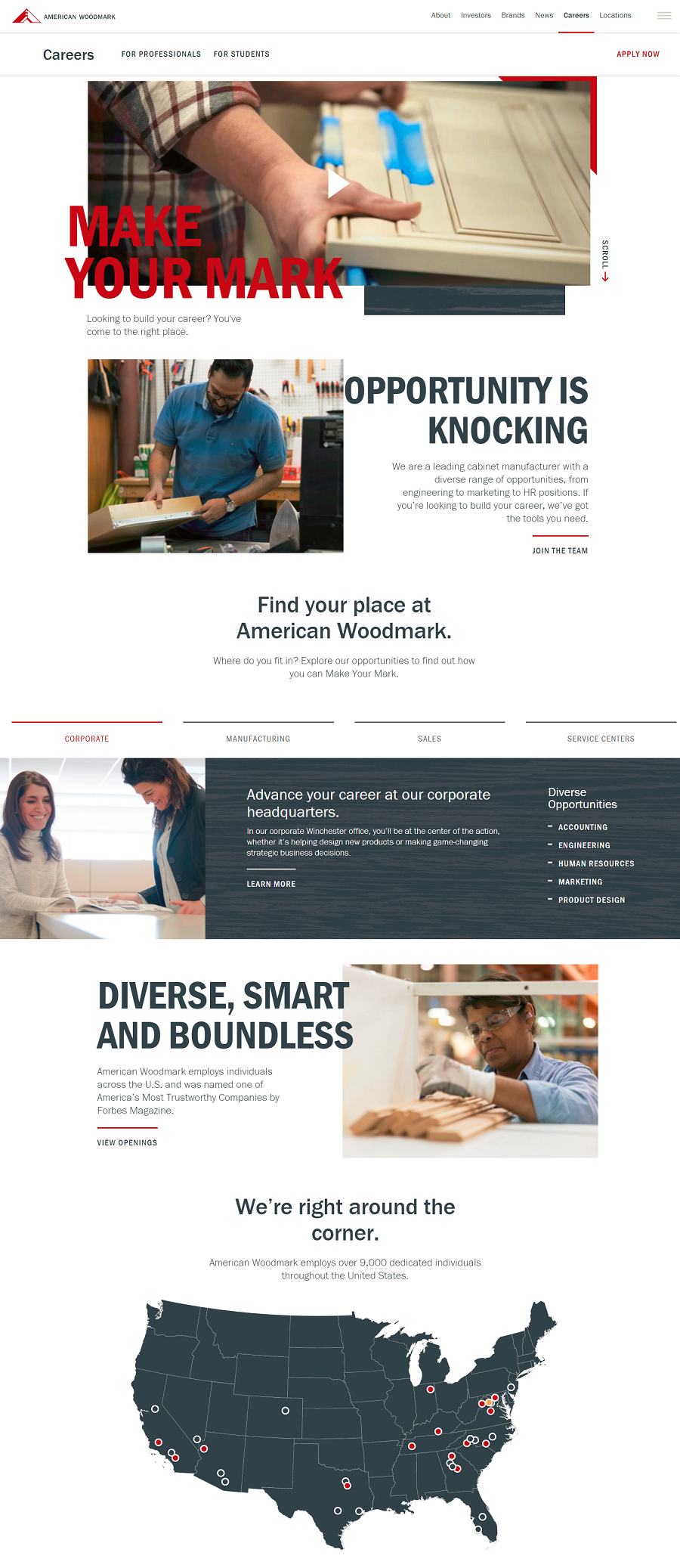
- Large headlines — Large type can be compelling. A large headline like “Make Your Mark” helps the candidate know what to read first. And the rest of the headlines below it tells a nice little narrative — and candidates (and humans) find a quick story of words natural to consume.
- Map of job locations — Easier for candidates to pick a job location rather than searching through a list of locations.
Lettuce Entertain You Restaurants
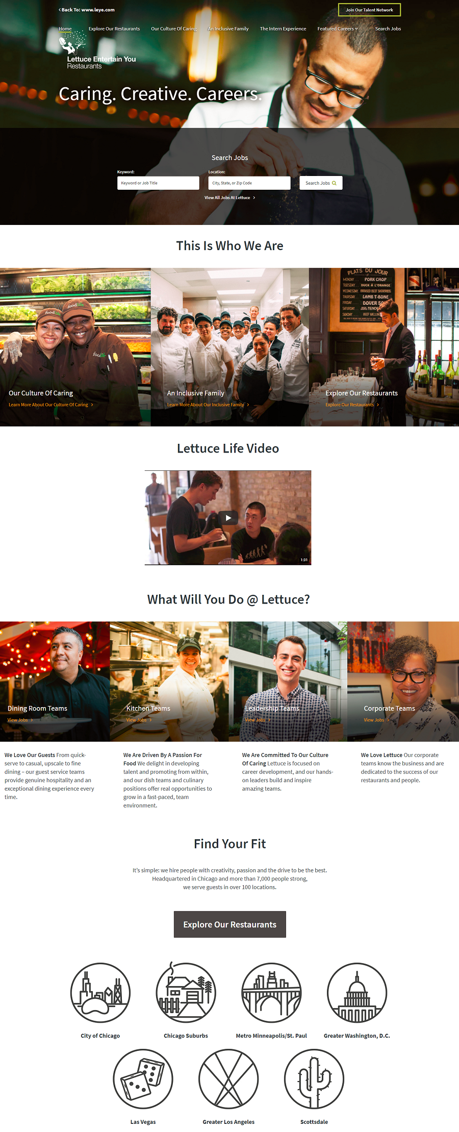
If you wanted a quick template of a company career site home page to emulate, this restaurant biz has a good one:
- Logo/Company Name — The logo of the waiter uncovering a plate along with their punny company name immediately says “fun” and what they do (food!).
- A quality hero image
- Job search above the fold
- Smiling employees
- A summary of the different teams
oscar
Many employers complicate things with a lot of colors and media and competing elements. Oscar has a more simple design. Highlights:
- Black on white — It’s been proven that the most readable type is typically black on white. When in doubt, use it black type on a white background. It’s just plain easy-to-read.
- Simple but powerful headline
- Job search is above the fold
- Hero media has smiling people and acts as both picture and video

zulily
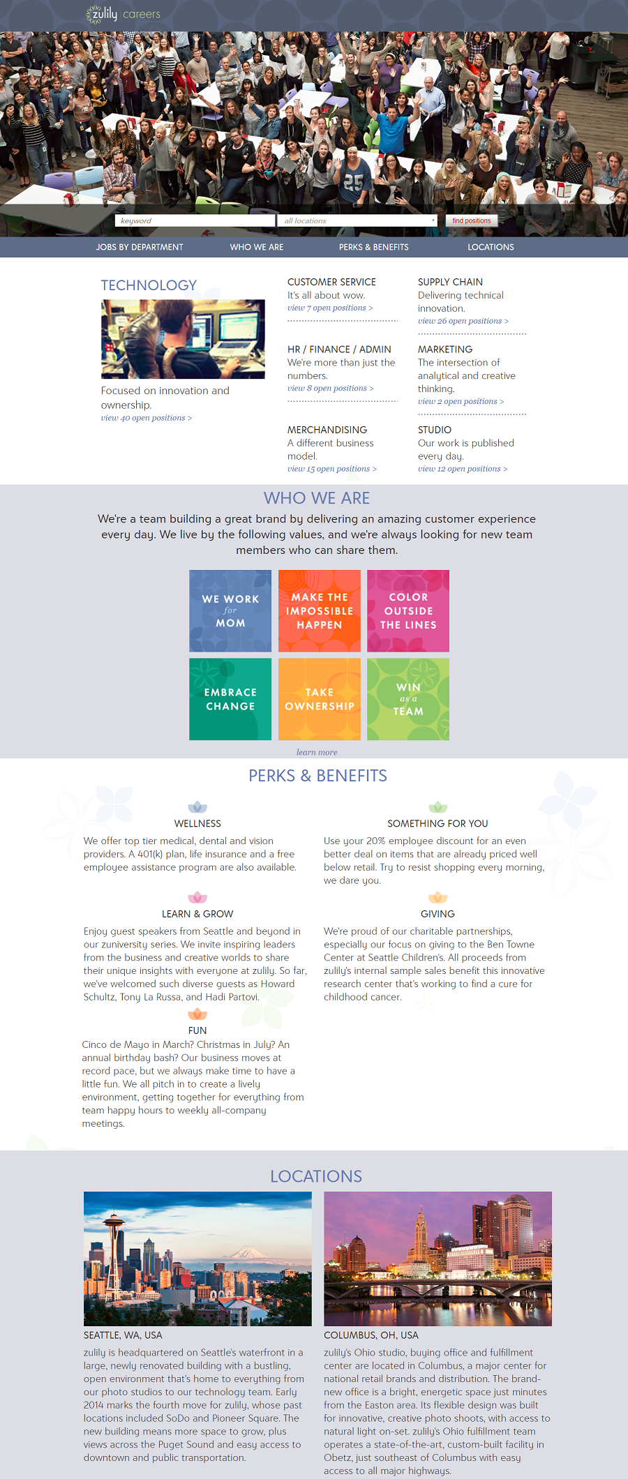
When in doubt, use a straight-forward approach like Zulily does for their career home page. It includes:
- A hero pic of positive people
- A search box of jobs
- # of jobs — This a more creative feature: they mention how many jobs they have per department. This does 2 things beyond making it easy for the candidate to dive into job listings: 1) It shows you are in growth mode and 2) It shows the candidate which teams power the company (e.g. Supply Chain has the most jobs and that explains a bit about zulily’s biz).
WillowTree
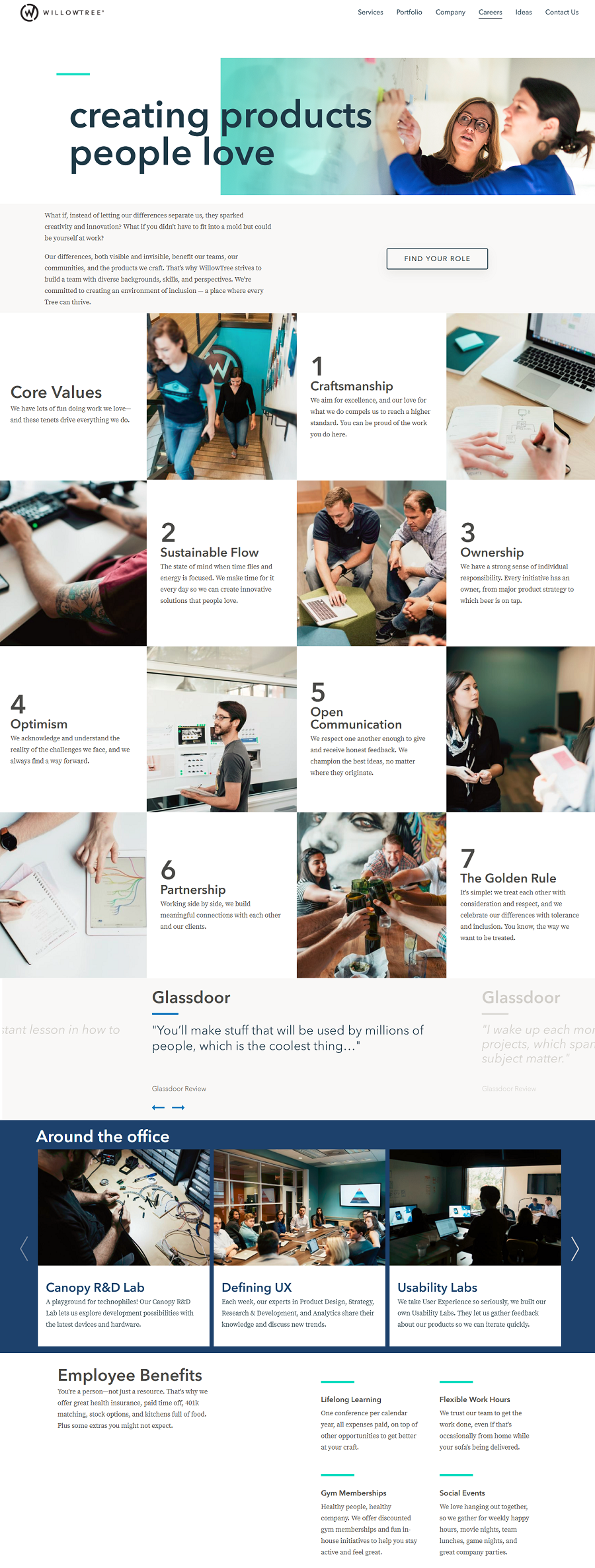
- Their headline “creating products people love” is a benefit to the candidate. That’s just plain good ol’ copywriting
- Their first call-to-action (“Find your role” button) is above the fold (i.e. candidate doesn’t have to scroll”. Remember to always do the squint test (squint your eyes and see what button pops out) — that should be the call to action button you want the candidate to click.
- Their career home page has pictures of their offices.
- Social Proof — Glassdoor reviews carousel
AT&T
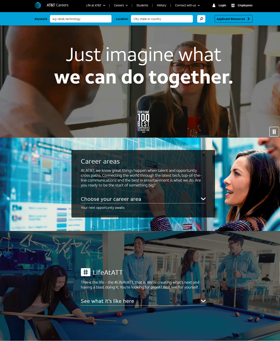
A number of massive co.s look, well, big and bloated. AT&T looks different. Check out their:
- Headline — Their taking an asset they have (their hugeness) and in a few words turning it into a positive for candidates (“Imagine what we can do together”) — clever.
- Social Proof — They put a Fortune 100 Best logo above the fold. They’re not just large…they’re the best!
- Branding — They’re consistent with their color scheme of black, blue and white. You feel like you’re at AT&T.
- #LifeAtATT — Leverage a hashtag campaign on career site that has over 31,000 posts on Instagram illustrating life at AT&T.
Burton
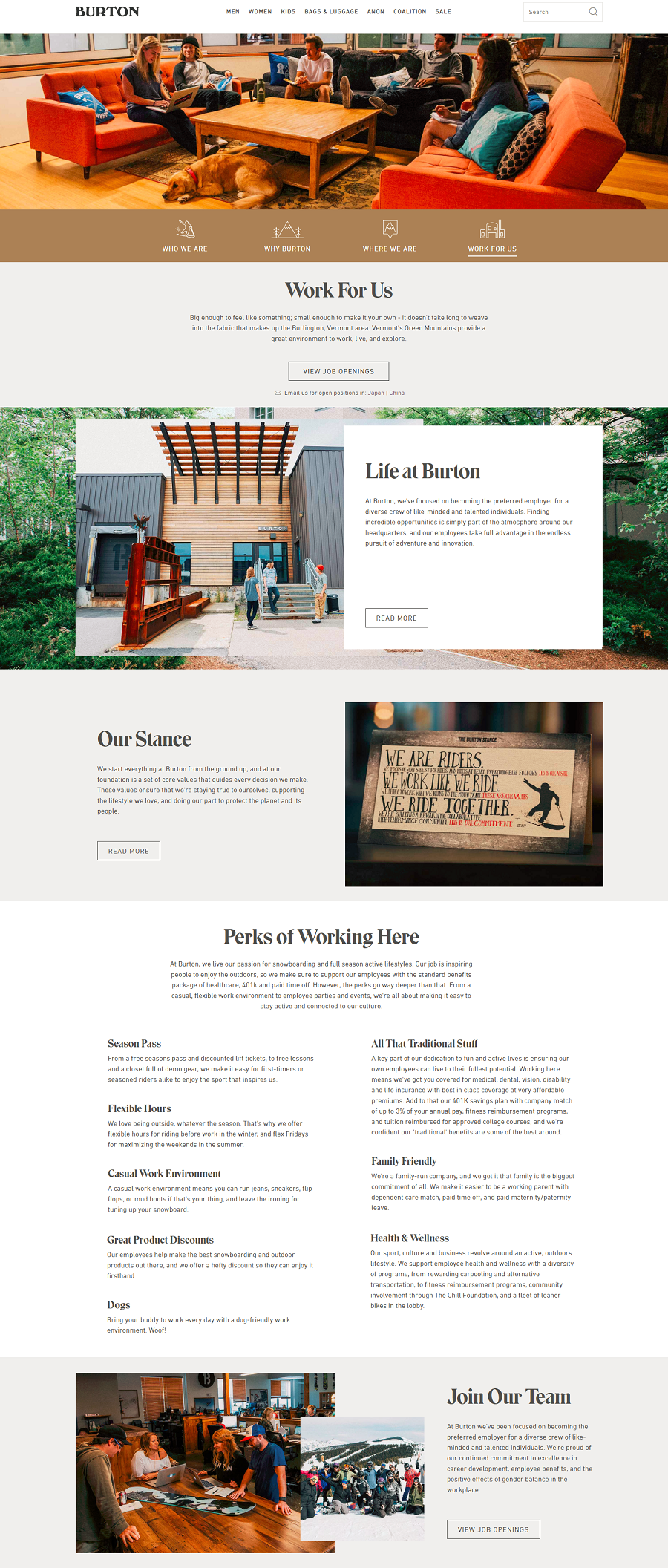
- A single hero media pic that says a whole bunch (dog-friendly, youthful, eco-friendly (bike in background), collaborative (looks like a fun meeting).
- 3 W’s — They have links to answer the Who, Why and Where
- Perks — They know the interests of their employees and candidates, notice that perks include a free season pass and discounted lift tickets as well as bringing your dog to work.
Bonobos
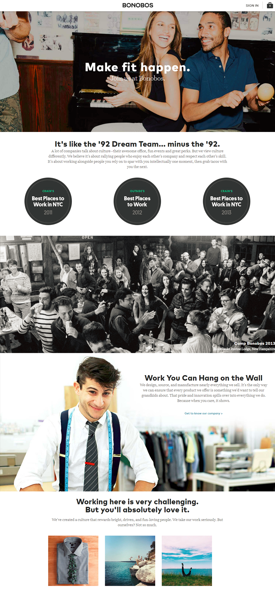
- Simple headline that hints at what they do.
- Use of an analogy (“like the ’92 Dream Team…”) — analogies help people visualize you.
- Social Proof — 3 employer of choice awards above the fold
Droga5
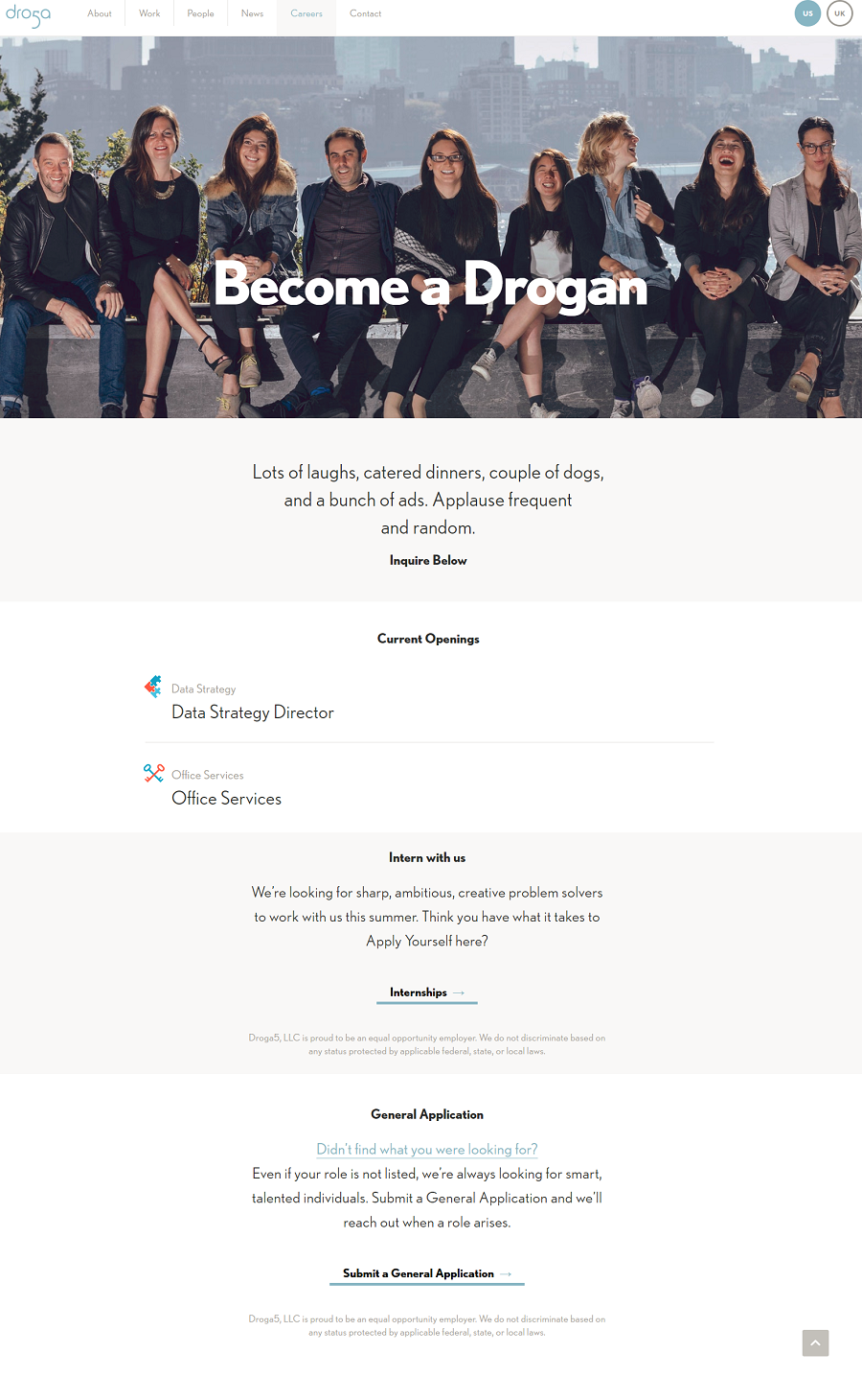
- Tribe — Their headline “Become a Drogan” shows they’re a tribe…again, people like to belong to tribes.
- Easy entry to jobs — They have 3 sets of jobs (2 live listings, a link to Intern and finally a General Application). The power of 3 — candidates like just a few choices.
- Simple — Awesome hero image, a headline, and straight to the job openings.
Dollar Shave Club
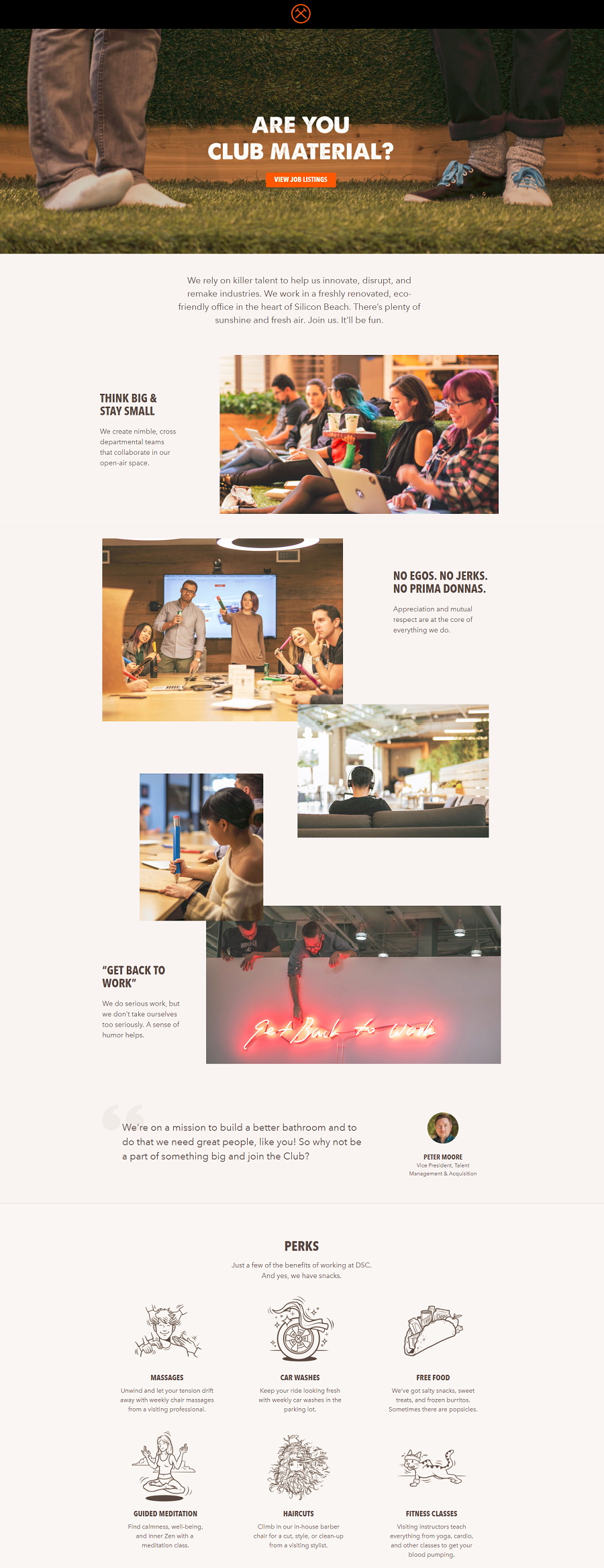
- Clubby Tribe — The “Are You Club Material?” headline is effective for 2 reasons: 1) It’s a question (those are useful in having a dialogue) and it mentions their “Club” part of their Dollar Shave Club brand.
- Values — They list their values in a fun way (Think Big & Stay Small, No Egos…, Get Back to Work) with simple photos next to each
If you’re thinking about a new company career site, you might consider Ongig’s drag-and-drop career site builder. It gives you an artificial intelligence-based search, instant microsite pages and dynamic job descriptions. Clients report big boosts in quality applications once they turn it on!
