- Top 10 Helpful Augmented Writing Tools for Job Descriptions (2026 Update) - March 9, 2026
- Top 18 Employer Reviews & Ratings Sites for 2026 - February 27, 2026
- 7 Examples of Awesome Employee Testimonials And Content (2026 Update) - January 20, 2026
Make sure to avoid these 5 common mistakes on your career site — doing so will vastly improve your digital candidate experience:
1) No Category and Location Pages (Candidate Experience)
If you could make the job search easier for a candidate, wouldn’t you?
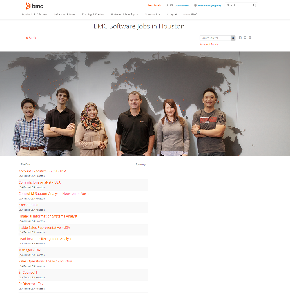
You’d be surprised how many companies, large and small, don’t have department and/or location specific pages set up. Not only do these “microsites” boost SEO, it’s easier for the candidate to get to where they want from Google (a lot your organic traffic).
Here’s an example of a location specific microsite Google result:

and here is the Houston jobs microsite:

2) Not Having Talent Community Opt-In on Every Page (Talent Pool)
Only 3% of the best candidates are really “buying”.
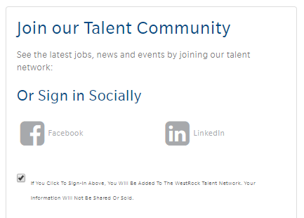
Maximize your chances of converting the other 97% of candidates by inserting talent community opt-ins on every page of your career site. Being able to nurture and send recruiting content to candidates creates yet another recruiting funnel to pull from.
Here’s an example of a talent community opt-in:

3) Using iFrames on Career Site and Job Pages (SEO)
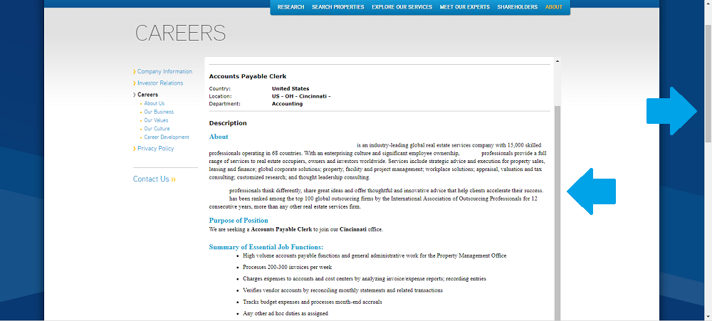
If you want an optimized career site and job pages, iframes are NOT the way to go. We see tons of company’s still using these and the truth is they will hurt a candidate’s ability to find your jobs.
iframes are not crawled by search engines and can actually confuse search engine bots — anything inside of those iframes (which is probably your whole job description) has zero value from an SEO perspective.
Here are some problems iframes can present to candidates:
- Double scroll bars – confusing functionality
- Page navigation problems
- Increased amount of error messages
Here’s an example of using an iFrame on job pages (notice the double scroll bars):

4) Putting Multiple Job Descriptions on Single Page (Design)
A running list of endless job description text separated by job titles is definitely not a good look for your careers page, yet many companies use this format.
Having a separate webpage for every job opening is essential both from an SEO and candidate experience standpoint. Google values specificity.
Most companies using the multiple JD/single-page layout have homegrown applicant tracking systems.
5) Letting Applicant Tracking Systems Own Your Favicon and/or URL (Branding)
We’ve emphasized this many times before and we will keep enforcing it. Your branding isn’t complete without having a clearly branded URL and favicon. Many applicant tracking system-hosted pages don’t have a favicon or promote their own brand in the favicon instead of their client’s favicon.
Here are some favicon examples (these are all job search landing pages for companies):
This happens on URLs too where the employer’s brand does not appear in the URL. E.g.:
- SAP/SuccessFactors: https://career4.successfactors.com/career?company=pinnaclefoods
- Taleo: http://chp.tbe.taleo.net/chp01/ats/careers/searchResults.jsp;jsessionid=09AEF806E7F146A3BF58DEB3F051BB9C?org=APC&cws=1
- ADP: https://workforcenow.adp.com/jobs/apply/posting.html?client=tbicom&ccId=19000101_000001&type=MP&lang=en_US
Bonus Company Career Site Problems
- Not having an “All” option for Location and Category Search: Some times you are forced to pick a location when you instead just want to see the whole list of jobs. Having an “All” option allows candidates to browse your jobs without any location or category restrictions.
- Forcing Candidates to Choose between 2 types of positions (usually corporate or retail): Some companies make candidates choose between roles in order to start their job search. This could result in an exit from your career site.
