- Top 10 Helpful Augmented Writing Tools for Job Descriptions (2026 Update) - March 9, 2026
- Top 18 Employer Reviews & Ratings Sites for 2026 - February 27, 2026
- 7 Examples of Awesome Employee Testimonials And Content (2026 Update) - January 20, 2026
Are you doing a career page redesign or creating a new one altogether? Our 15 Best Careers Pages (2019) is here to help!
Remember: the goal of a company career page is to get the candidates’ attention so that they dive into your job postings.
Below, you’ll find the 15 best career pages we’ve found this year. We also include a list of career page content and features from those 15 best immediately below.
The Best Company Career Pages Include:
- Awesome Headline — Too many career pages skimp on the headline. Don’t. A good rule of thumb on headlines is to do one of the following: write the headline first (yes, before you do anything else on the page — what are you trying to convey!?). Listen to what ad guru David Oglivy once said of ads:
“On the average, five times as many people read the headline as read the body copy.”
- Hero Media — Video and pictures are the most engaging types of content and a great way to articulate employer brand. Greet candidates with media once they land on your career page.
- Easy Way to Find Job Openings — Part of great digital candidate experience is easy navigation. It’s hard to find where the job openings are on a lot of career pages. Sometimes you have to scroll to the bottom of the page or read into a lengthy paragraph to find the link to the job list.
- Readable Type — Make sure your text is easy to read. When in doubt, go with dark type on light background (it’s the easiest).
- Department and Teams Content — You have departments and teams too, don’t you? A great option for featured content on your careers page and an efficient way to get candidates to a specific set of jobs (i.e. marketing, sales, engineering).
- Employee Testimonials — There’s a reason testimonials are used in marketing. They usually work. It’s social proof. Make sure to include a picture, full name, and title. In this day and age, there’s too much “fake news” to believe a testimonial without details.
“Employees rank as the most trusted influencers when communicating about their company’s engagement and integrity.” – Glassdoor Essential HR and Recruiting Stats
- Perks & Benefits — Listing benefits increases apply rates! Check out A List of 20 Awesome Employee Benefits if you need ideas.
“Nearly half of U.S. workers/job seekers (48 percent) cited attractive benefits and perks (e.g., gym memberships, paid time off, etc.) as a top factor that would drive them to apply.” – Glassdoor Report
- Key Numbers — A section of numbers about the scope of your business is an efficient use of career page content.
- Core Values/Company Culture Information — If you’re a values-driven company, I recommend you begin describing your values above the fold on your career page.
- Office Locations — Like listing departments, it’s a great option for career page content and helps get candidates to a specific set of jobs (i.e. St. Louis, San Francisco).
- HQ — If you have an impressive headquarters, it’s the central hub of your company, show it off.
- Employer of Choice Awards — This is more social proof (see Testimonials above). If you have any employer of choice awards, they are an easy addition to a career page. Here’s a Comprehensive List of Employer of Choice Awards
- Meals/Food — If you provide meals for your employees you should definitely highlight that on your careers page. It’s an underrated perk that candidates and employees weight heavily.
“Along with flexitime and home office, a lunch program is among the favorites.” – How Team Lunch Improves…
15 Best Career Pages in 2019
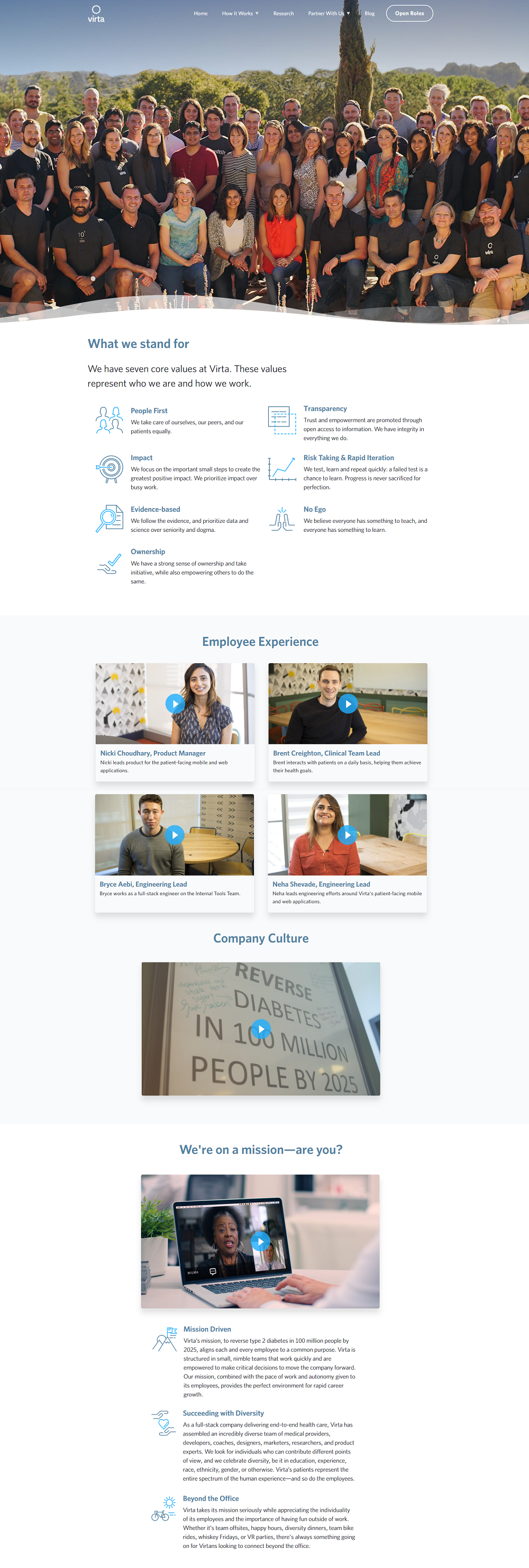
- Awesome “Team” Hero Image — A team picture of everyone smiling in a cool outdoors environment. This hero media is so good that it almost doesn’t need a headline
- Core Values — Virta puts their values (“What we stand for”) front and center. They let the candidate know they’re value-driven.
- Employee videos section — Good “Employee Branding”
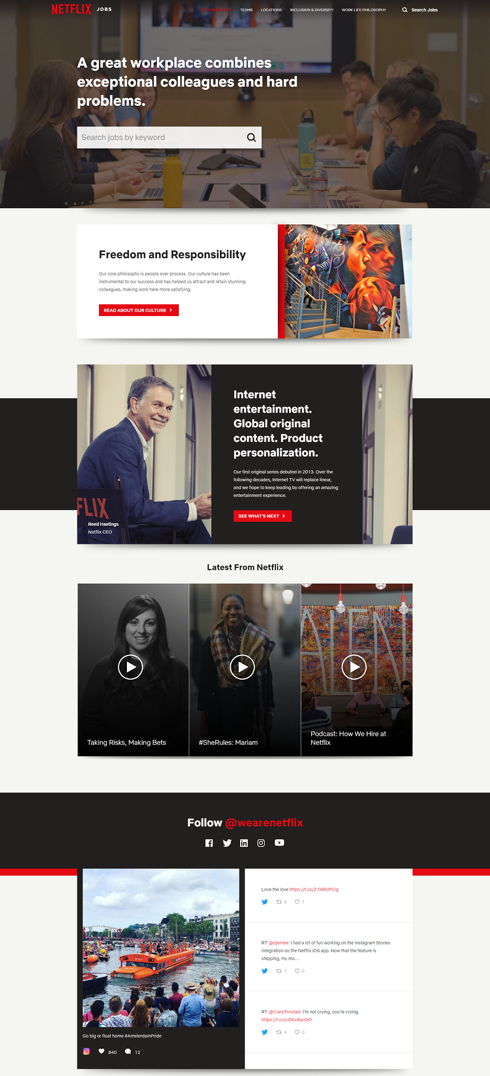
- Easy to find job search box — The job search box is right under their headline. It’s “above the fold” as we say in advertising. The candidate cannot miss it! They use the Elastic Swift search with a major search box (like finding a Netflix movie!).
- “Freedom and Responsibility” values are front and center
- Cool recruiting media — 2 recruiting videos and a podcast on how Netflix hires.
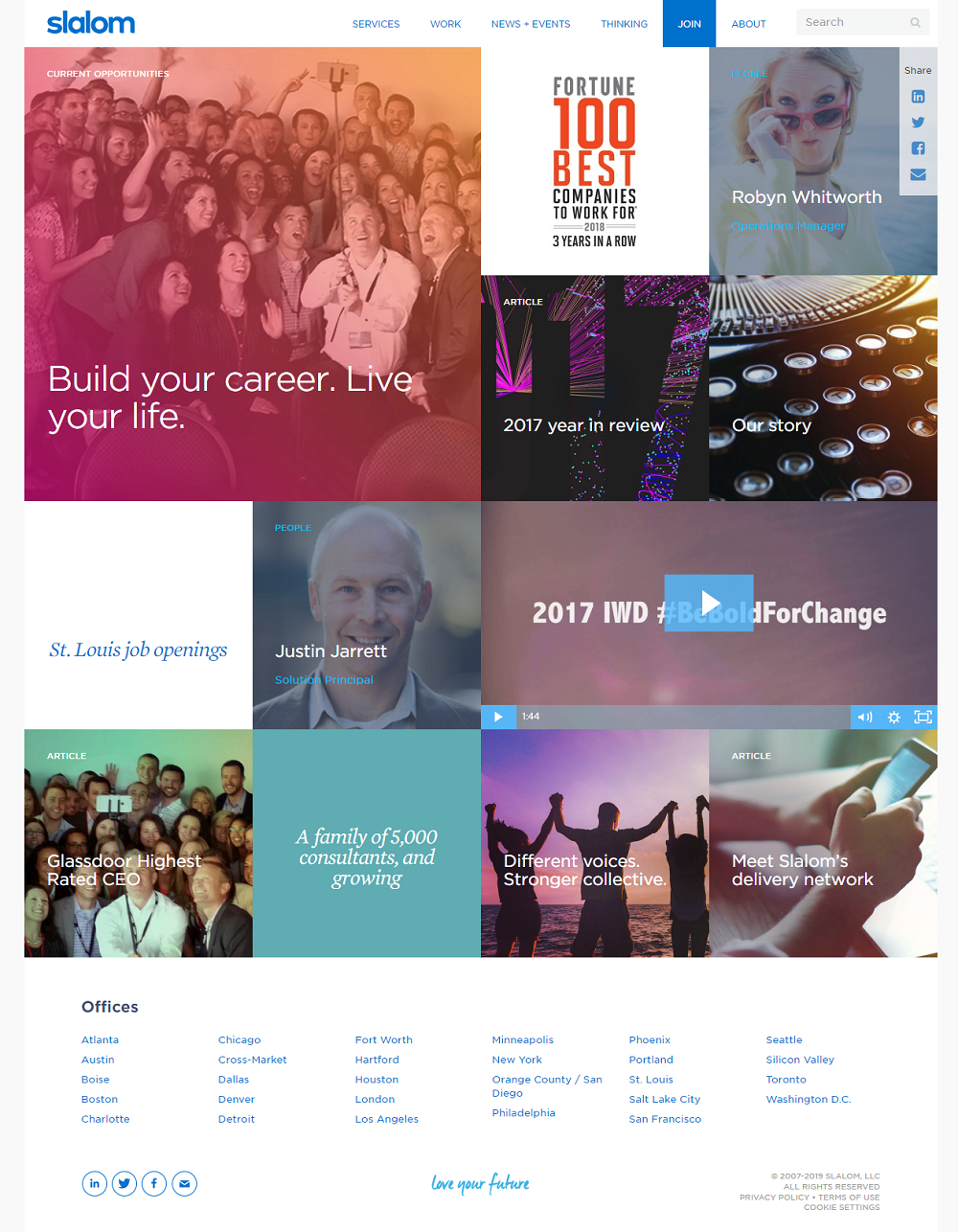
- Cool tile design — All tiles are clickable and link off to different recruiting content
- Complete list of offices on the footer (bottom of page) — Each location links off to a location-specific recruiting microsite
- Simple career page design — Not a forever-scrolling page, almost everything is above-the-fold.
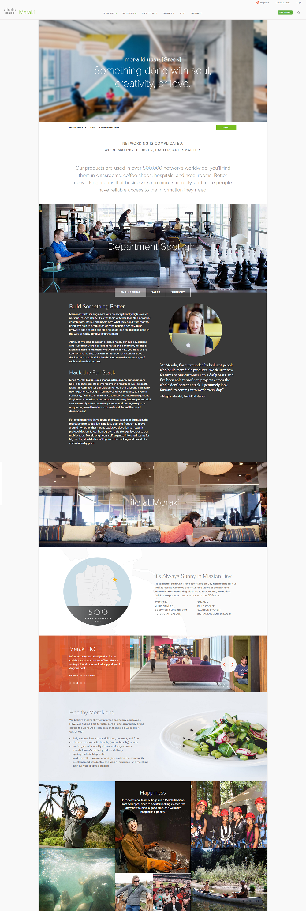
- Awesome headline — They define the word “Meraki”. Darn good! Or try to pique curiosity.
- Department Spotlight — Have a couple of unique paragraphs and an employee testimonial for their 3 main departments: Engineering, Sales, and Support. (Notice their engineering spotlight features a testimonial from a female engineer)
- HQ Photo with description — They also highlight notable places around their HQ (AT&T Park, Philz Coffee)
- Cool perks section — Highlighted by food, they list a handful of awesome perks.
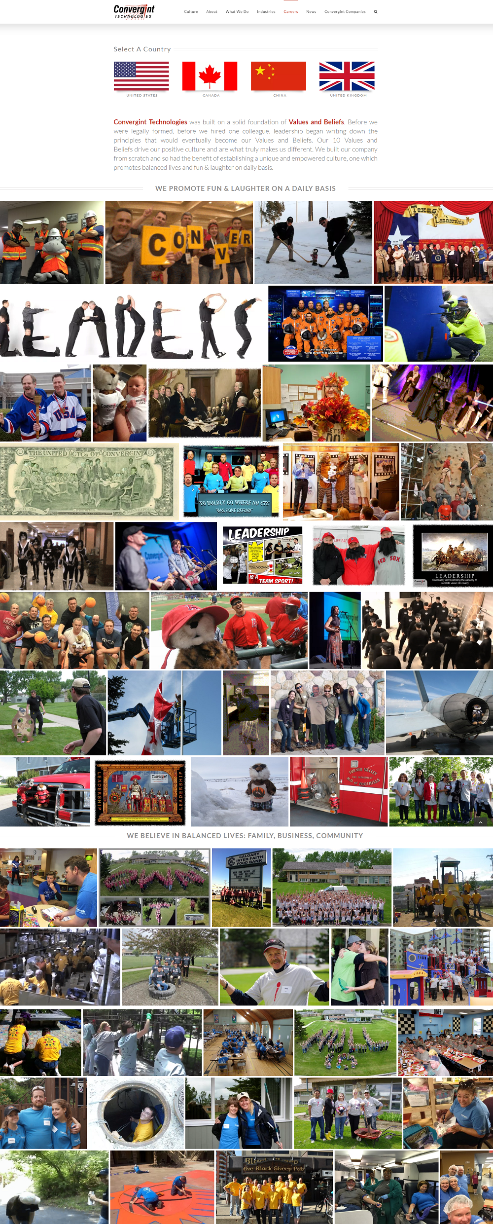
- Image-focused microsite — Pinterest style approach with a slew of pics tiled together. Not a lot of career pages are designed like which makes it stand out. If you remember a couple things from this article I bet you’ll remember “that one career page that was all pictures” ; )
- Select a Country — They have it above the fold and route you to a relevant set of jobs based on the country you click. This is important for global companies.
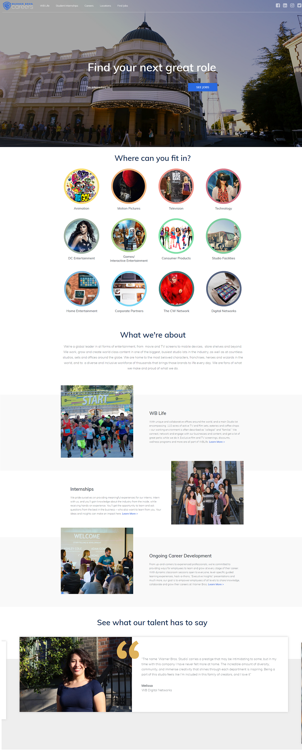
- Fast-motion video in their hero media — This will get the attention of any viewer.
- Front and center job search box — Easy to find job search and job openings are a best practice of great digital candidate experience.
- List of department options to choose from — WB presents the list with pictures of characters and products they are known for. Choosing a specific department (i.e. animation, motion pictures, etc.) triggers a pop-up that gives a department overview and option to go straight to that specific set of jobs.
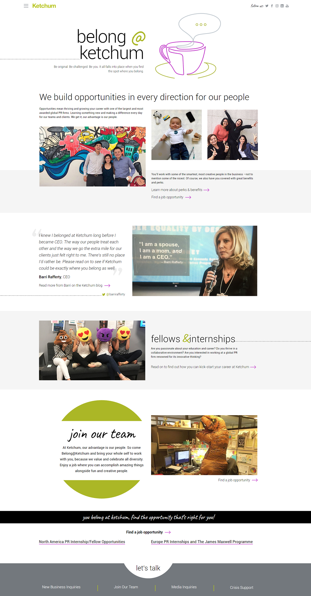
- Great branding — A lot of different fonts and colors, looks fun!
- Their dark type on light background is also easier to read than most career websites that have darker backgrounds.
- They highlight fellows and interns — All of your candidates won’t be experienced hires, make sure interns know they are welcomed.
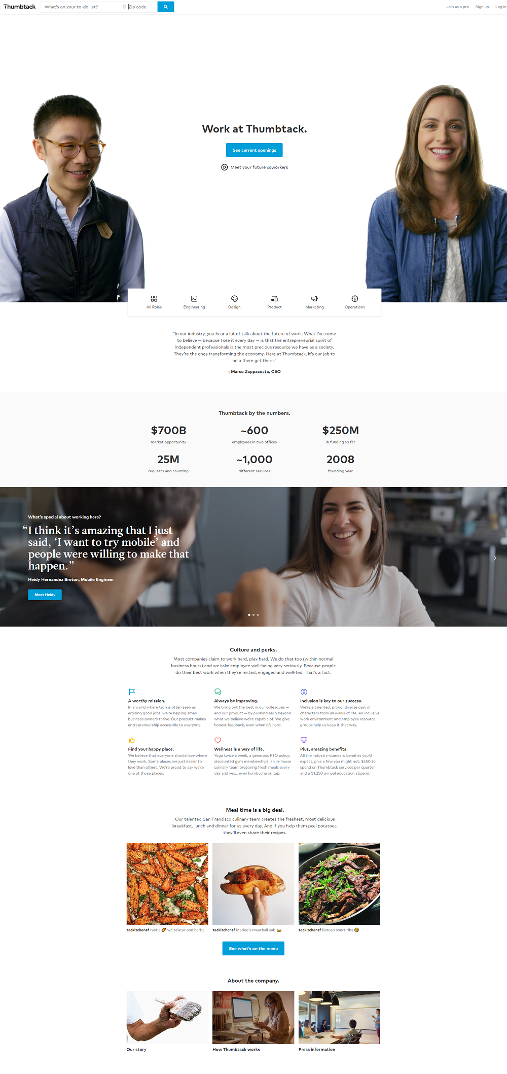
- Full-screen hero video — When played the video is full screen and very clear (not pixelated). I found it very engaging.
- Key company numbers — Great way to get add company details without taking up a bunch of space.
- Meal time is a big deal section — This caught my attention and also links off to Thumbtack Kitchen’s own Instagram account (@takcitkitchen).
- Headline and Media — Great combo, also nice thumbnail image.
- Why SAS? — Clever way to get in the candidate’s mind. This is a key question every candidate has: Why [your company]?
- Map of Office Locations — A cool interactive map that highlights all office locations.
- Social Proof — Employer of choice awards located near bottom of page.
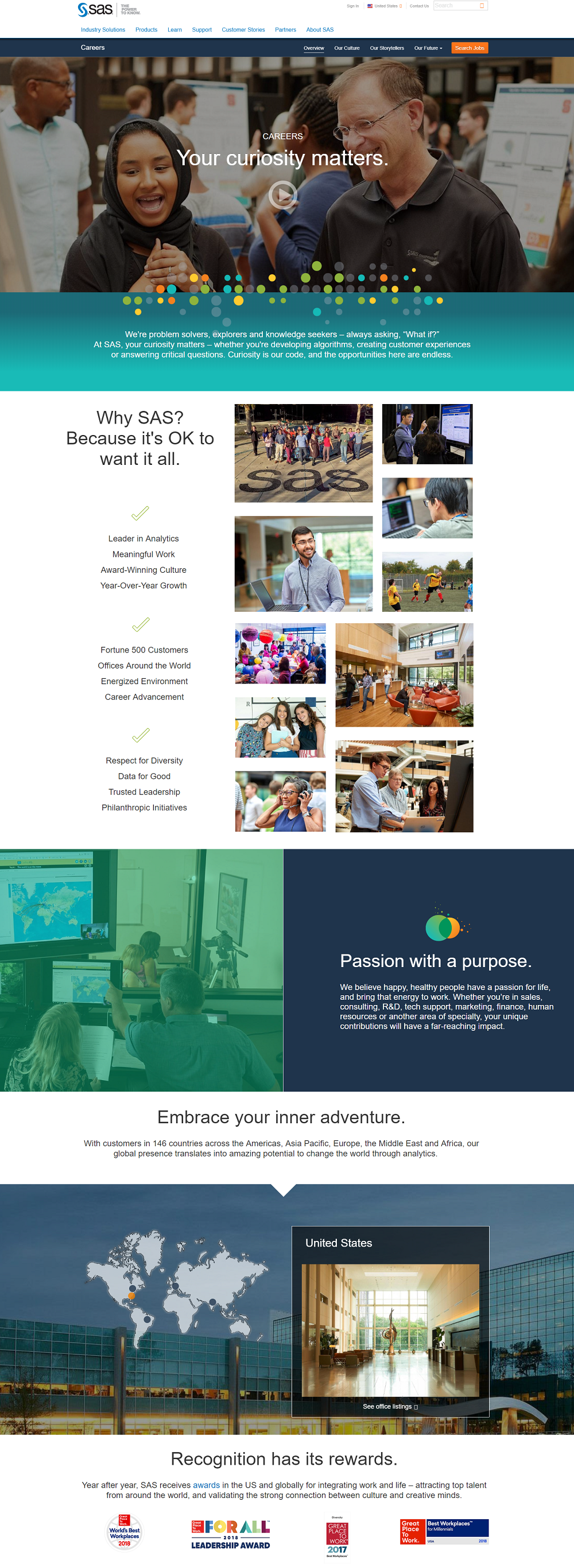
- Auto-play feature video — Automatically plays once candidate lands on the career page. A great way to engage candidates without them having to click something.
- Job search bar — Front and center is a great place to put this.
- Other brands — Walmart gives candidates separate entry links for Sam’s Club. It’s good to distinguish the difference for candidates.

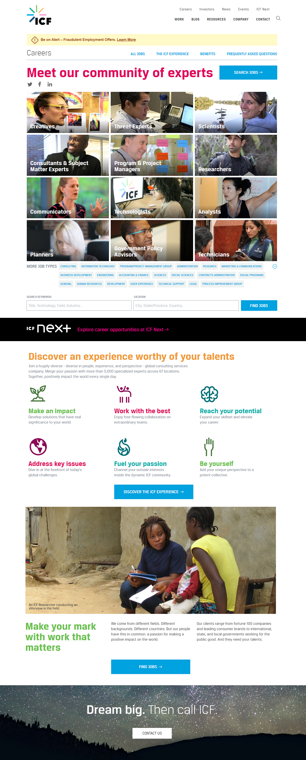
- “Meet our community of experts” — They lead off with their people in a unique way.
- Clickable job types — Another way to get candidates to a relevant set of jobs faster.
- Careers navigation bar — Notice how candidates can reach any part of your career site from the navigation bar. This creates a better experience for the candidate.
- Great Headline — “best place to work” a top buzzword for both sides, employers and candidates.
- Use of Mascot — They connect consumer branding with employer branding by utilizing their mascot seen on TV commercials.
- Meet our Recruiters — It’s always good to put some faces to names especially to the people who will be communicating with candidates.

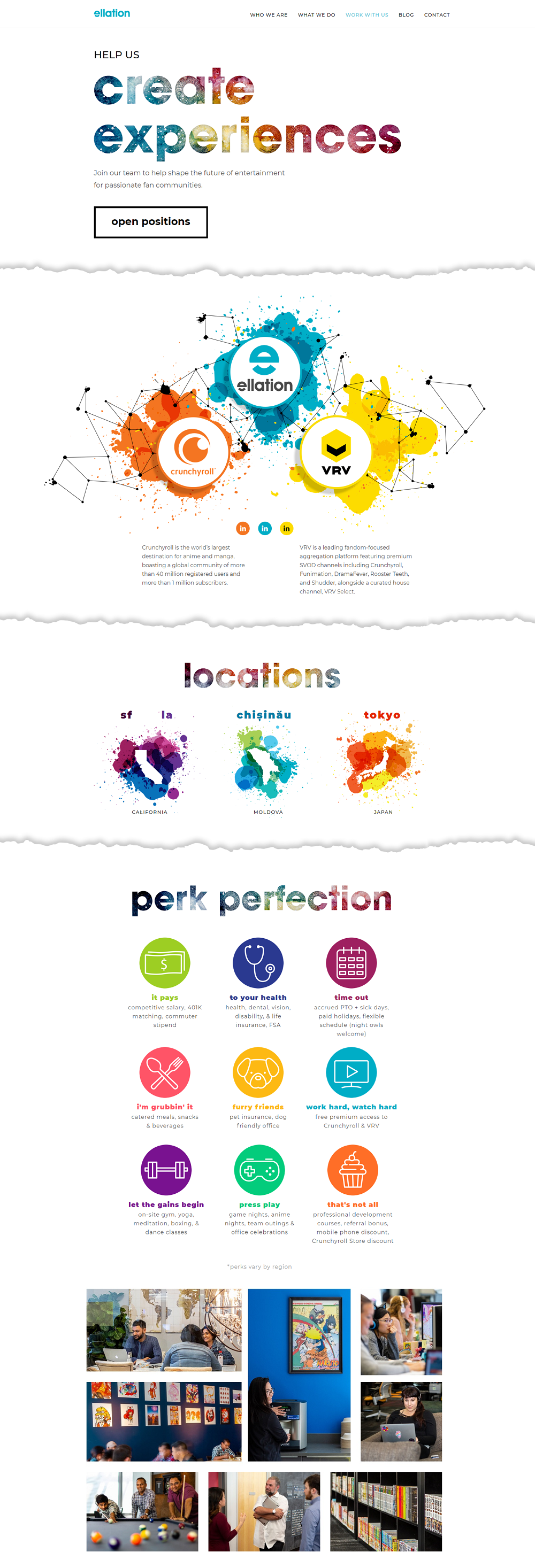
- Creative headline (makes you pause in a good way) — They state a clear benefit “create experiences” to pique their curiosity.
- “Open positions” button is front and center — It’s hard to find where job openings are on a lot of other career pages.
- Contrarian color scheme — A lot of career pages have crazy background colors with black or white text. Ellation goes contrarian with white background and crazy colored text.
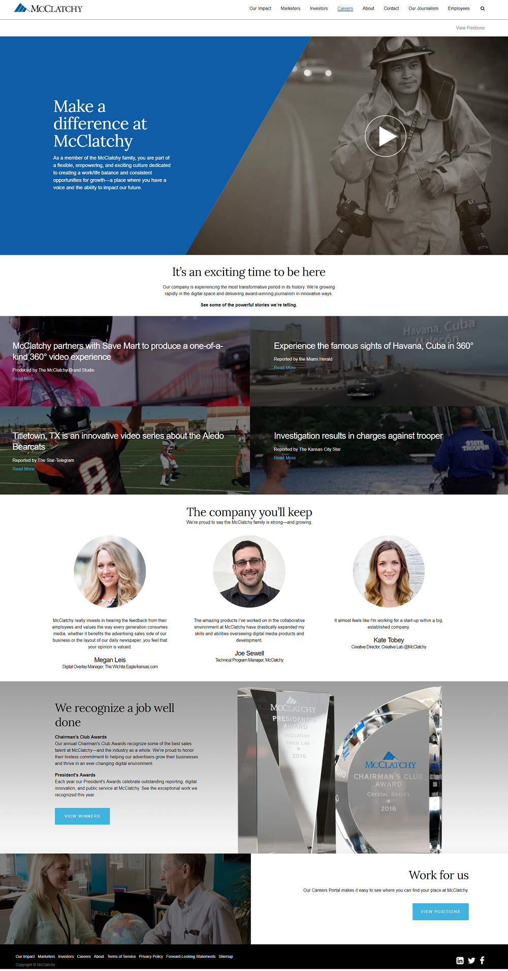
- Show Off Products/Technology — Some of your candidates are advocates. You want candidates that are enthused about the products/technology you’re building.
- Products/Technology — Just like Ellation (above) McClatchey features their product with 4 cool 360-view videos. A creative way to get their product upfront on the career page.
- Employer of Choice Awards-based careers page — Social proof works just about every time.
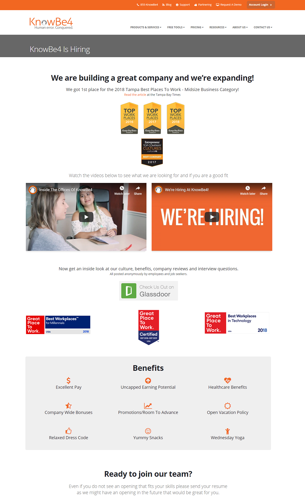
- Simple career page design — 3 sections: awards, video, benefits. They get right to what candidates want to see.
- Recruiting videos — They feature 2 videos, a good rule of thumb for company career pages.
Why I wrote this?
Ongig’s mission is to increase your quality applications through the best job ads ever. Our career site builder solution helps lead the way. If you want to learn more, ping us for a demo.
