- Top 10 Helpful Augmented Writing Tools for Job Descriptions (2026 Update) - March 9, 2026
- Top 18 Employer Reviews & Ratings Sites for 2026 - February 27, 2026
- 7 Examples of Awesome Employee Testimonials And Content (2026 Update) - January 20, 2026
Formatting is a top priority in job description writing because formatting affects readability which impacts the candidate experience.
Making a job description easier to read exponentially increases the probability of a job seeker reading the entire job description — and that increases the chance of an apply.
Note: Check out our free Job Descriptions Guide — it tells you everything we know about JDs, job ads and the like! And, for more tips on writing job descriptions, check out How to Write a Job Description — Best Practices & Examples.
Here are 3 common job description formatting mistakes:
1. Job Description Text Format
If your job descriptions are excruciatingly long you’re going to lose engagement. Some job seekers will look at a long job description and skip over them even if the job is a perfect match for them.
If it’s a must that you have a long, detailed job description, then break it up. This way it won’t look like a solid wall of text. Some strategies:
- Use of sub-headers
- Use of bullets or bulleted lists
- Use of media/visuals
See what we did there? Those bullets above just broke things up so that you didn’t have to read 3 paragraphs in a row.
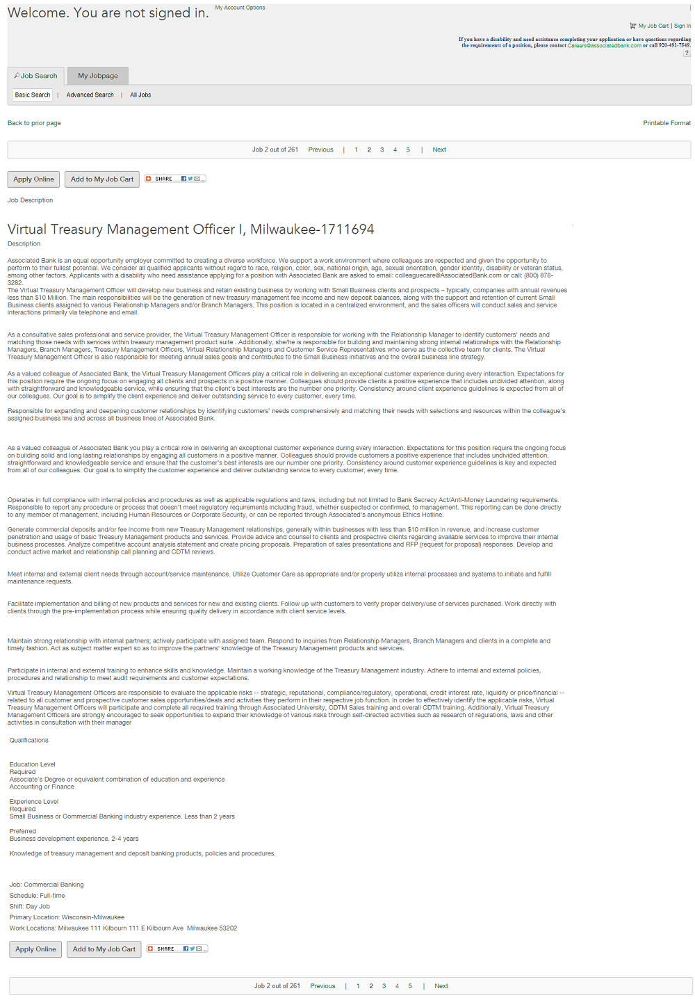
Here’s a job description that is pure text and could definitely benefit from the use of sub-headers, bullets, and visuals.

2. Font Size
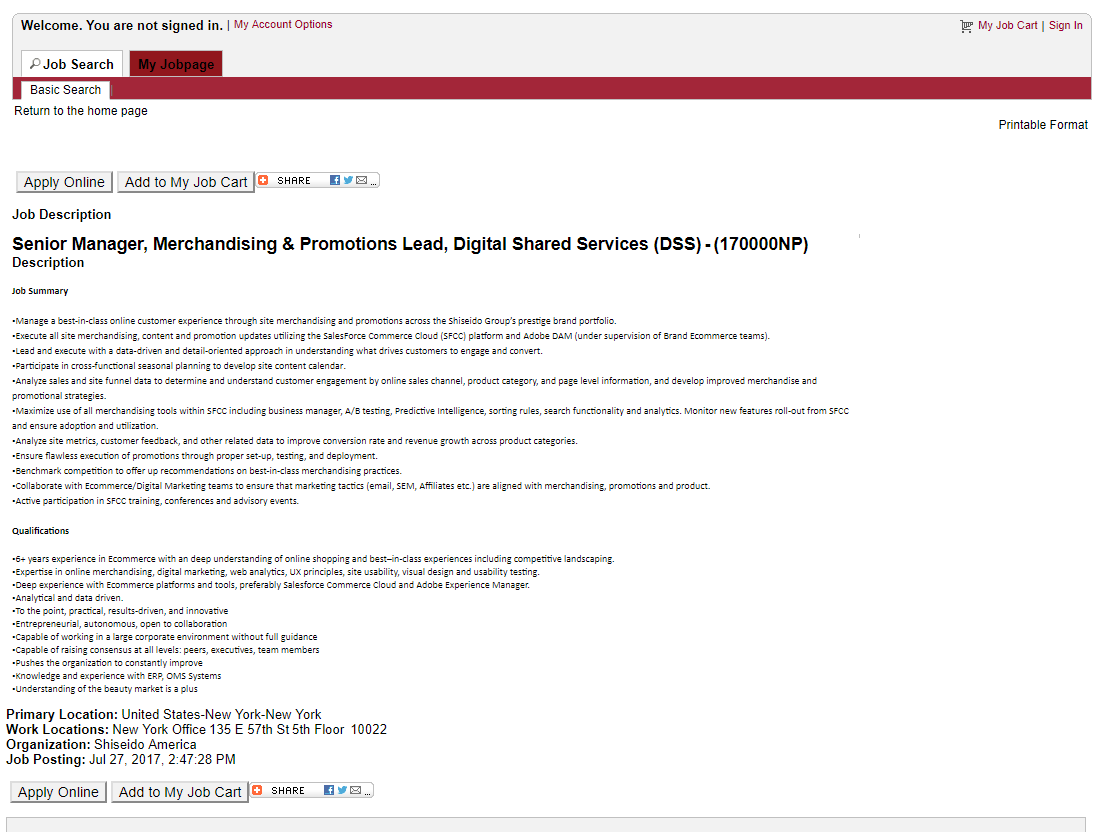
We’ve referred to the “squint” test for headlines — this can also be applicable to the body of the job description text.
When your job description text is much smaller than any other text/font on your job page it becomes another hurdle for easy readability.
If a job seeker has to give extra effort just to read your job description, there’s a good chance they’ll move onto the next.

3. Unnecessary Open Space
We see a lot of job descriptions with unnecessary open space either between paragraphs or near the bottom of the page.
Your job descriptions are an ad for a specific job. You should be utilizing any open space with content that will help convert your next apply.
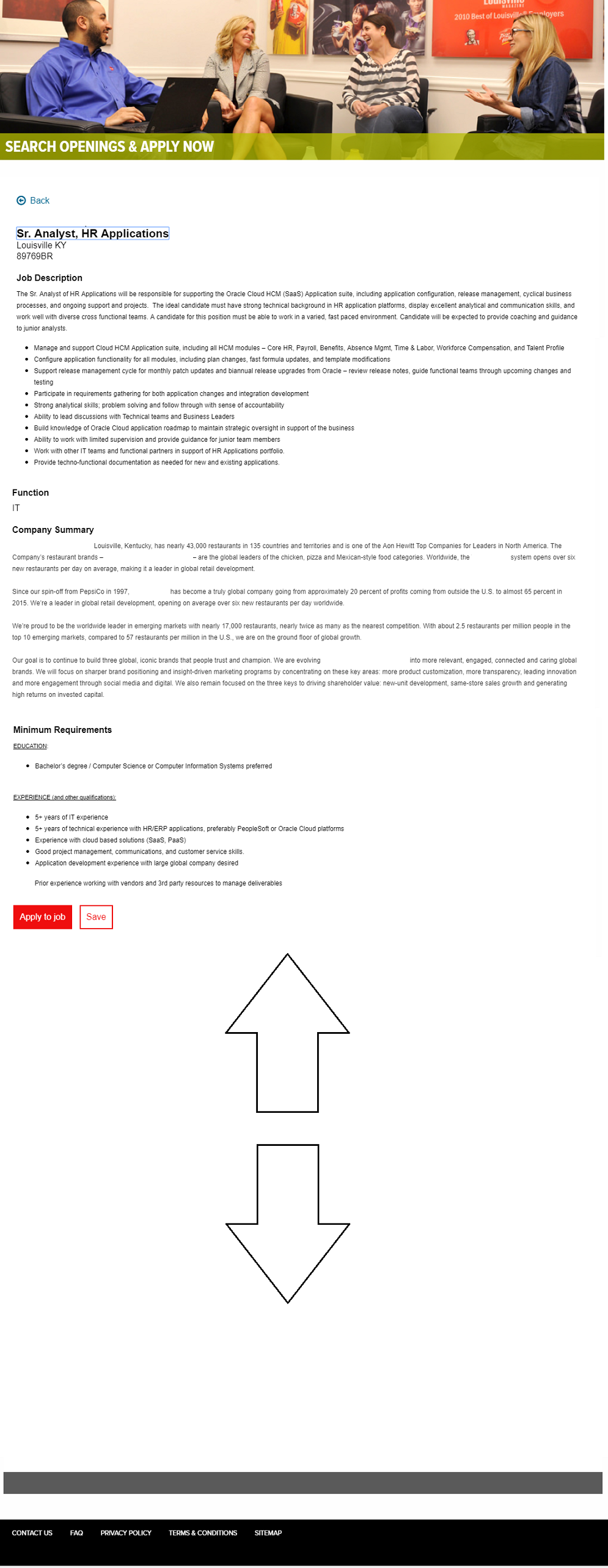
As you can see towards the bottom of the job description below there’s a huge amount of open space at the bottom. I’m not exaggerating — in fact, I had to shrink down the open space for the sake of this blog piece.
A candidate might miss the apply button while scrolling the endless white space.

