Latest posts by Nick Misa (see all)
- Top 10 Helpful Augmented Writing Tools for Job Descriptions (2026 Update) - March 9, 2026
- Top 18 Employer Reviews & Ratings Sites for 2026 - February 27, 2026
- 7 Examples of Awesome Employee Testimonials And Content (2026 Update) - January 20, 2026
Your career page is your front door for digital recruiting. It’s where you catch the attention of candidates and engage them.
The 2 top-level factors you want to consider are:
- Career page design
- Career page content
These 2 factors are something all 10 career page examples (below) do a great job with. Let’s dive in:
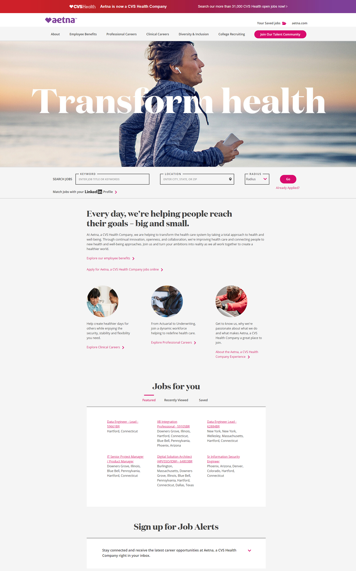
Aetna
- Headline: “Transform health” grabs the candidate’s attention and is superimposed on an authentic and professional feature image.
- Above-the-Fold job search: There’s no doubt the next step they want candidates to take is to search for jobs.
- Parent company (if applicable): Aetna makes it clear they are a CVS Health company, this magnifies the employer brand because candidates can make that connection to a more visible brand.
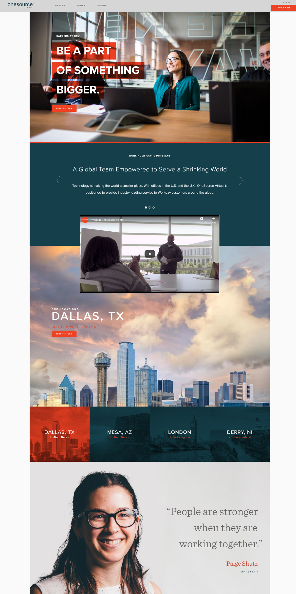
OneSource Virtual
- Headline: “Be a Part of Something Bigger” is a great one.
- Media for locations: Click on each location and see a spectacular pic of the setting. Clicking through the “join the team” button takes candidates to a specific set of jobs in that city/state.
- Employee testimonials: Large with full names and titles of employees. This promotes transparency and credibility.
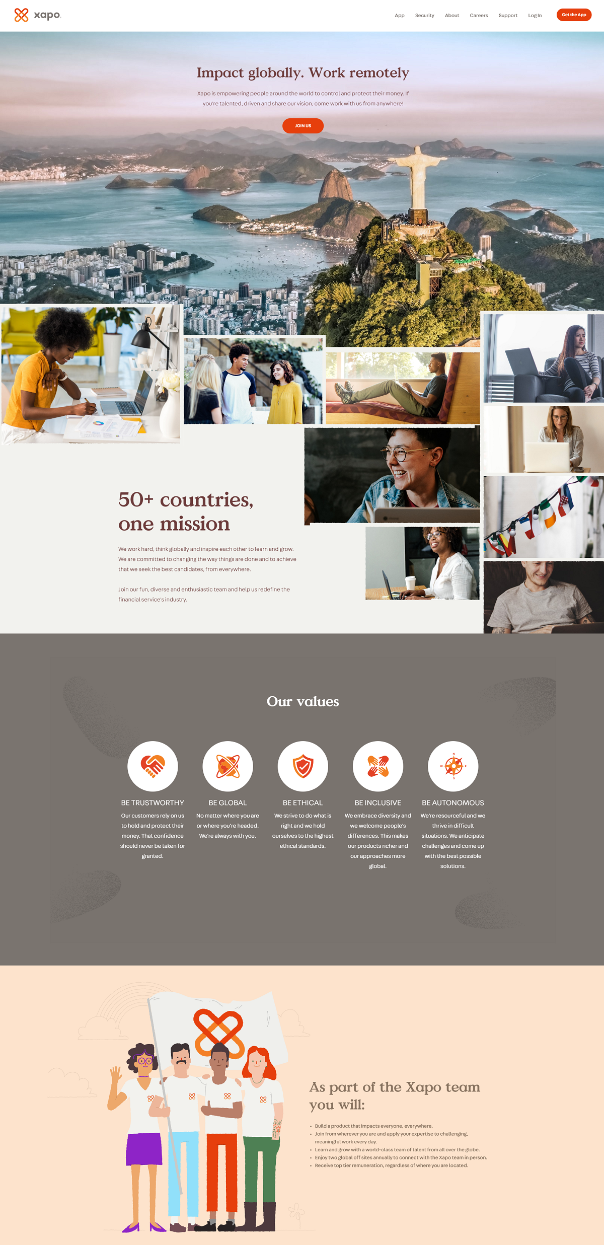
Xapo
- Great Headline and Sub-Headline: It’s plain good ‘ole copywriting yet not often used on career sites. Notice how they mention “work remotely” in the headline, this should automatically engage those looking for remote jobs (especially millennials).
- Awesome feature and supporting images: Support the values of a diverse company.
- Clear call-to-action: The “JOIN US” button is front and center above-the-fold.
- Mission: They mention their mission early on. It’s surprising how hard it is to find the mission statement on many career sites. Candidates love this!
Aptiv
- Call-To-Action: Above the fold/easy to find
- Quality pics of different offices/locations
- Multiple ways to get to a specific set of jobs::
- Through skill match
- Through location
- Through local pages (language-specific pages)
- Through competencies

RGP
- Above the fold job search
- Glassdoor Rating: Placed front and center, it shows transparency and that they are proud of the rating.
- Team member spotlights: Awesome career page section with great media that highlights the more human side of RGP. We think this section should be higher priority on their career page.

Rakuten
- Great feature image: We really like this one, it’s a crystal clear image, promotes diversity, and supports the headline.
- Key Figures section: The way the figures float across the screen is attention-grabbing.
- History section: Solid career page content and more fitting to have on your career page than your job pages.

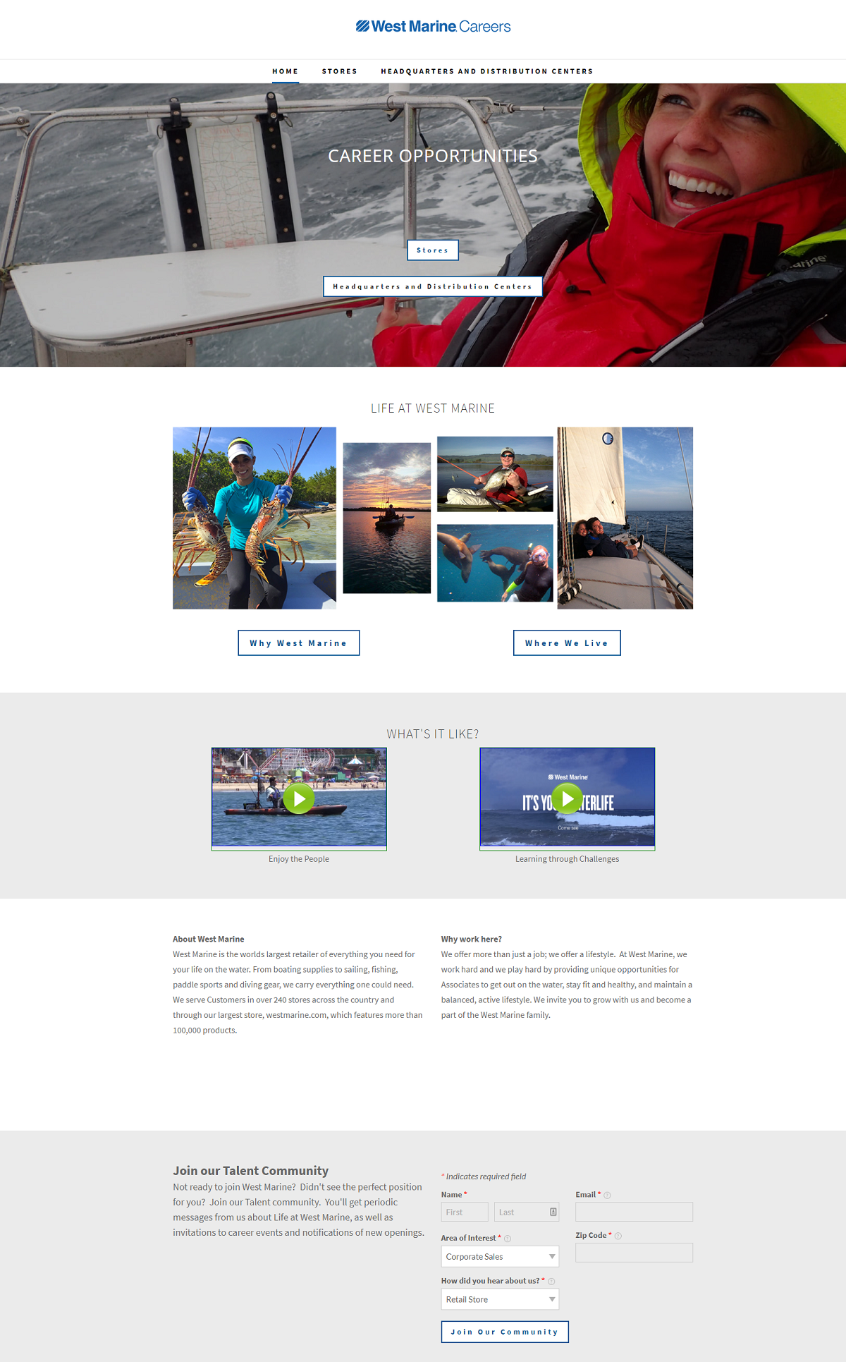
West Marine
- Simple career page design: It’s shorter in length and to the point. We always like to give at least one example of a career page like this.
- Fun hero media and other pics: The theme of the pictures match the theme of the company “life on the water”. Every picture also includes a smile!!
- Different entry to points Store and Headquarter jobs: One of the keys to delivering a targeted candidate experience.
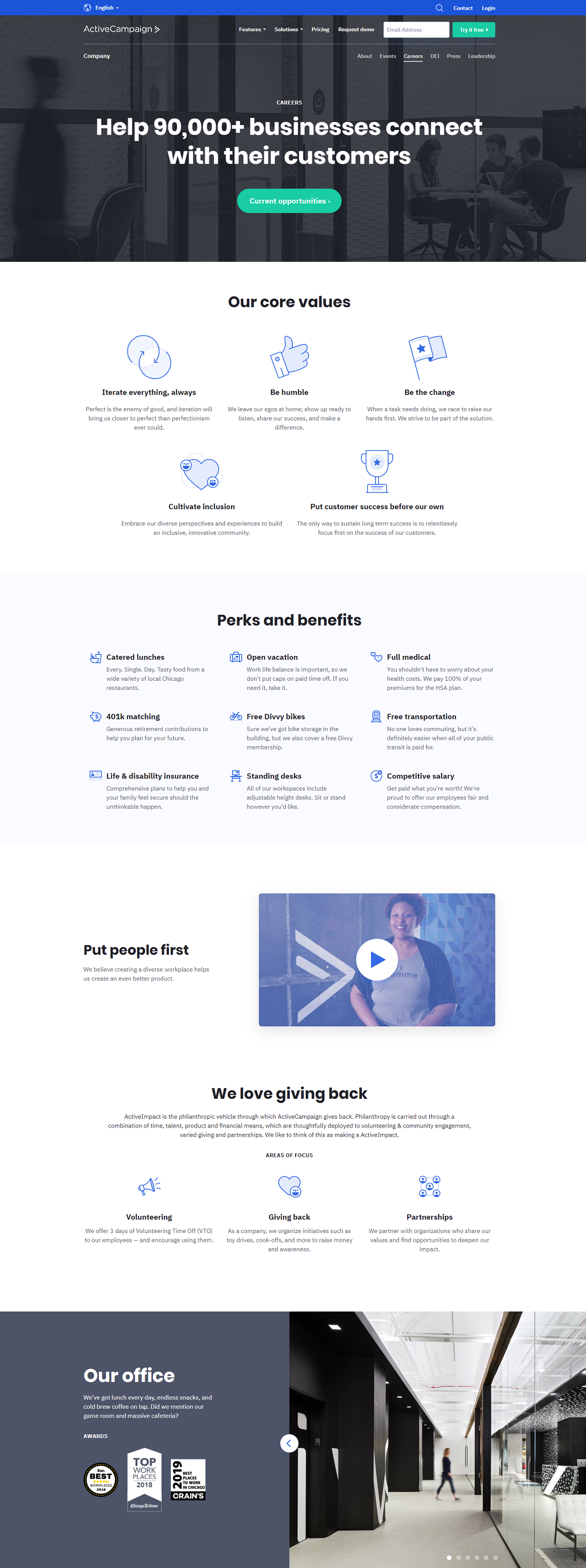
ActiveCampaign
- Strong number-driven headline: Numbers reach directly into our unconscious and say, “this message is important”.
- Exclusive button color for primary calls-to-action.
- Great career page sections: Values, perks, and benefits are the top things candidates want to know about.
- Nice tour of the office presented in a slideshow format (at the bottom of the page).
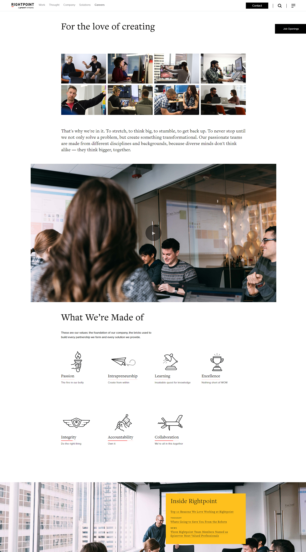
Rightpoint
- Highly readable overall: Easy to read black text on white background.
- Values: Creative values section that expand on each value when hovered over. hover over them.
- Employer branding links: They feature articles on top reasons employees like to work at Rightpoint.
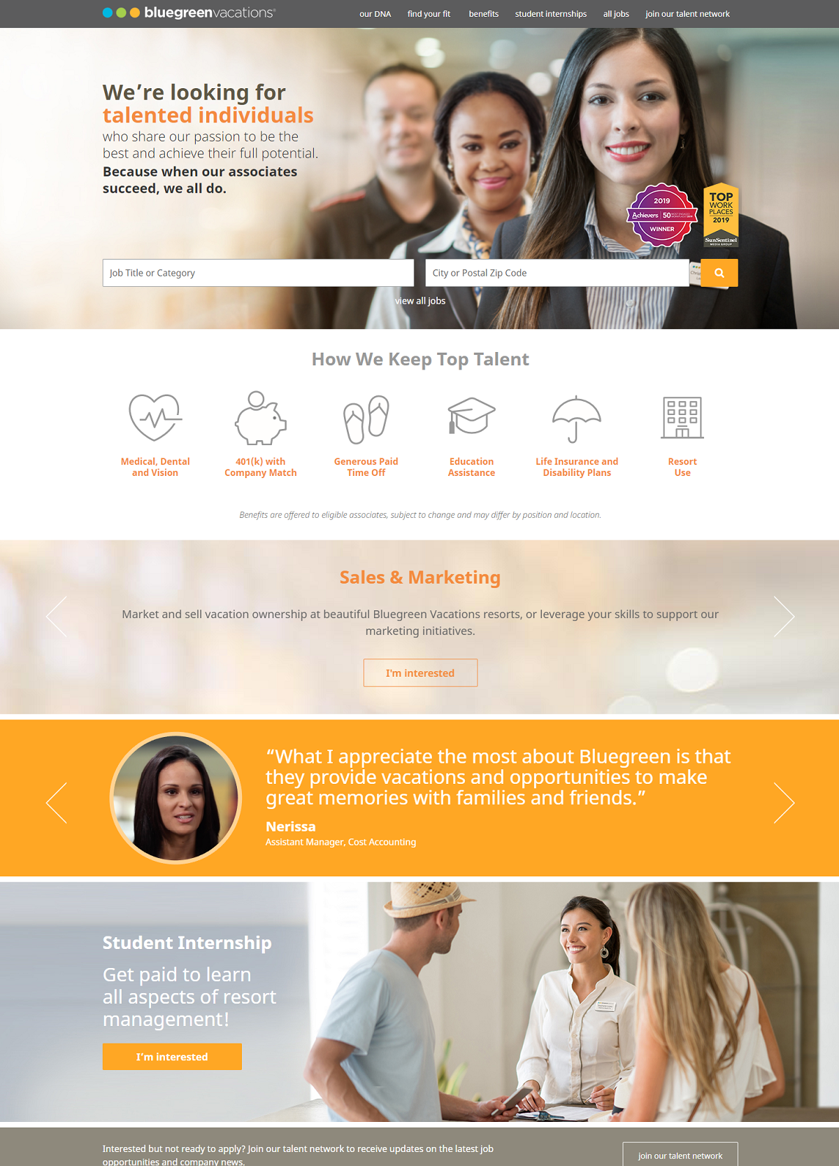
Bluegreen Vacations
- Feature image: Features employees of different ethnicities
- Employer of choice awards: It helps to showcase these and Bluegreen does it above-the-fold.
- Benefits are front and center.
- Employee quotes/testimonials with a link to specific job openings based on employee’s position: A great way to give a more targeted experience
Why I wrote this
Ongig’s Career Site Builder helps employers create a career page that is designed to attract and engage candidates.
These career page examples help highlight best practices for content and ideas.
