- 15 Great Tips on Job Posting Wording for 2026 - February 25, 2026
- 14 Best SEO Tips for Writing Job Descriptions (2026) - February 19, 2026
- A List of Common Offensive (Exclusionary) Words Used in Job Descriptions (2026) - February 16, 2026
Us consumers are now very used to a “one-click world.”
Shouldn’t we treat candidates the same?
As consumers, we go on Amazon and do a “one-click check-out”.
We go to Google, type a word or phrase…and voila…we get great results. I wake up and click my iPhone and ask for the weather.
Heck, my father-in-law just shouts out his questions to his Amazon Echo!.
He’s already in a ZERO-click world! Why then do we ask candidates to click so darn much? Here are 5 ways to give your candidates more of a “one-click” candidate experience:
1. Job Search — Have Just One Field
Most company career sites use anywhere from 2 to 7 search fields for their candidate search. Some ATS’s (including Greenhouse have no job search at all (the candidate clicks on category and location links instead.
The problem with all of those approaches is that each extra field requires one more extra click. In fact, some of them make you un-click the filters you already clicked. It’s common for a candidate to click 3 to 5 times just to get relevant results.
I recommend you use just one search box for your job search. That means that it has to be really good search. I call this “Intuitive Search”.
Basically, the candidate should be able to search abbreviations (“CSR” for customer service rep), concepts (“sales in NYC”) and even misspell their words and they should STILL get relevant results.
To get this single-field job search solution, I recommend you read the Ongig Job Search page as well this article I recently wrote: Your Company Career Site Job Search is Dead.
Intuitive job search is a must-have for a single-click candidate experience!
2. Don’t Make Candidates Open Up New Browser Tabs
Some employers open up a new browser tab every time a candidate clicks on a job listing from their career site.
A candidate searching ABInbev/Anheuser Busch’s jobs who clicks 5 different jobs to look at will then have 5 new tabs open on their browser. That means that the candidate has to click each one of those tabs to close them down.

This isn’t Anheuser Busch’s fault by the way. They use the Taleo ATS and unless AB opens up a new tab then the candidate gets what’s called a Confirm Form Re-submission (broken back button) error page (see 18% of ATS Cients Have Broken Back Button Pages).
If the King of Beer instead brought up each job description on the same page as the result then the candidate doesn’t have to click anything to get rid of the job (they can just do another search).
One-click world.
3. Provide Videos on Job Descriptions (not just Career Pages)
Most employers use videos on their career site. It might be a culture video or some other employer branding play.
That’s great…except for the candidates who land on your job descriptions directly (e.g. from job boards, Google, etc.).
Those candidates have to click off to your career page to find a useful video.
I recommend that you embed your employer branding videos directly on your job descriptions.
4. Embed More Location Content
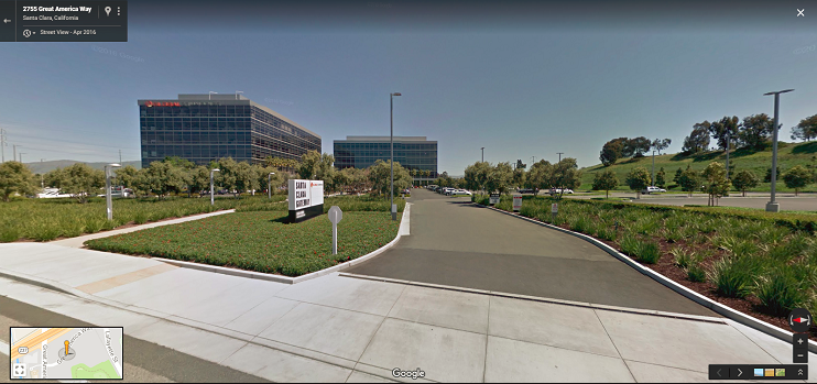
If a candidate is really interested in your job, then they are going to want the street address (not just the city name).
Most employers don’t provide the exact location on their job descriptions.
I believe that’s a mistake. You can now embed a map to your exact location RIGHT on your job description.
You just saved the candidate another click!

5. Embed Ratings, Reviews & Salary
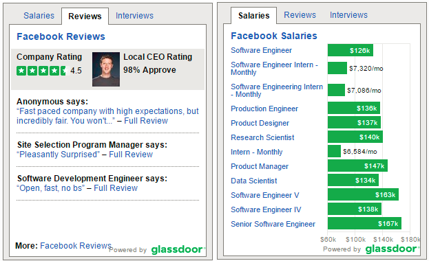
Any serious candidate will look you up on Glassdoor to see what other employees say and perhaps what your typical pay is (because most job descriptions don’t include pay).
I recommend that you embed ratings, reviews and salary information right on your job descriptions (see Make Your Job Descriptions More Sticky with Glassdoor Ratings & Reviews).

This will save them a trip to Glassdoor (where they might see your competitors — and they’re going there anyway!
Your candidate’s time is precious. Let them feel like you are the Amazon or Google of one-click candidate experience.
They will reward you with the saved time you gave them.
I care so much about a one-click world for candidates that my Ongig team and I have built every one of the 5 features above into our latest “Branded Candidate Experience” solution.
