- 10 Attractive Job Posting Examples - December 23, 2024
- Top 18 Employer Reviews & Ratings Sites for 2024 - September 20, 2024
- Recruiting Microsites: The Ultimate Guide for Better Recruiting - September 6, 2024
What makes some job posting examples stand out while others blend into the crowd?
According to Indeed, 52% of job seekers say the quality of a job description (e.g. spelling, grammar, role description, formatting) is “very” or “extremely influential” on their decision to apply for a job.
An effective job posting is the first impression a potential candidate has of a company. Therefore, it must reflect the company’s brand and culture.
A positive first impression can help you attract top talent easily, reducing the time, money, and effort spent on recruiting. You also improve your quality of hire, which also increases your employee engagement and retention.
What Makes a Job Posting Attractive?
1. Easy to read job descriptions – keeps candidates engaged
Tips:
- Use short sentences and paragraphs.
- Avoid excessive technical jargon unless essential to the role.
2. Bias-free language – attracts a diverse pool of candidates
Tips:
- Split qualifications into “Minimum” and “Preferred” categories
- Writing in second person (“You are…”) for a relatable tone
3. Transparency in compensation and role details – builds trust with candidates.
Tips:
- Indicate salary range and benefits directly in the job posting
- Provide links to detailed application process and job locations
4. Engaging visuals and branding – create a strong first impression and reinforce the company’s identity.
Tips:
- Feature photos of actual employees.
- Use distinct brand colors and themes throughout the page.
5. Clean and well-organized design – a clean layout with clear sections improves readability so candidates can quickly find relevant information.
Tips:
- Use of bullet points, headers, and white space for easy reading
- Auto-scroll navigation to specific sections like job description, benefits, and life at the company
6. User-friendly job search and application features – makes it easy for candidates to apply
Tips:
- Job search bar embedded in different areas of the job posts
- Quick apply options like pasting LinkedIn profiles
7. Highlighting perks and benefits – encourages more job seekers to apply
Tip:
- Offer benefits according to employee preferences and what the company can offer like remote work options or unlimited PTA
8. Showcasing company culture and values – entices qualified candidates with the same value to apply
Tips:
- Sections dedicated to company culture and values like employee testimonials and feedback
- Behind-the-scenes photos of employees and workplace activities
9. Career growth and opportunities – candidates value roles that offer clear career advancement and opportunities for professional growth
Tips:
- Potential career paths detailed with specific roles and progression steps
- Provide various learning opportunities like company workshops and training
10. Additional support for candidates – FAQs and application tips show that the company wants to give a good candidate experience
Tips:
- FAQs addressing common concerns
- Pop-up chatbots and career quizzes to guide candidates
Do you want to see what these qualities look like in job listings? Take a look at the examples below:
Note: I’ve made this table of contents/shortcut below for you to get to specific job postings faster.
Job Posting Examples:
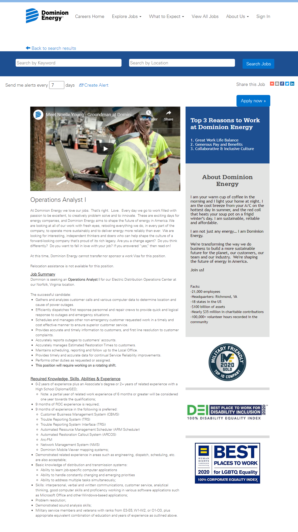
Dominion Energy
- Employee Video: Dominion starts off their job posting with a “day in the life” employee video.
- Top 3 Reasons to Work: Doesn’t go crazy in-depth but is at the top of the job posting and one of the first things you read.
- Employer of Choice Awards: Dominion also showcases their employer awards, which we recommend doing if you have them.
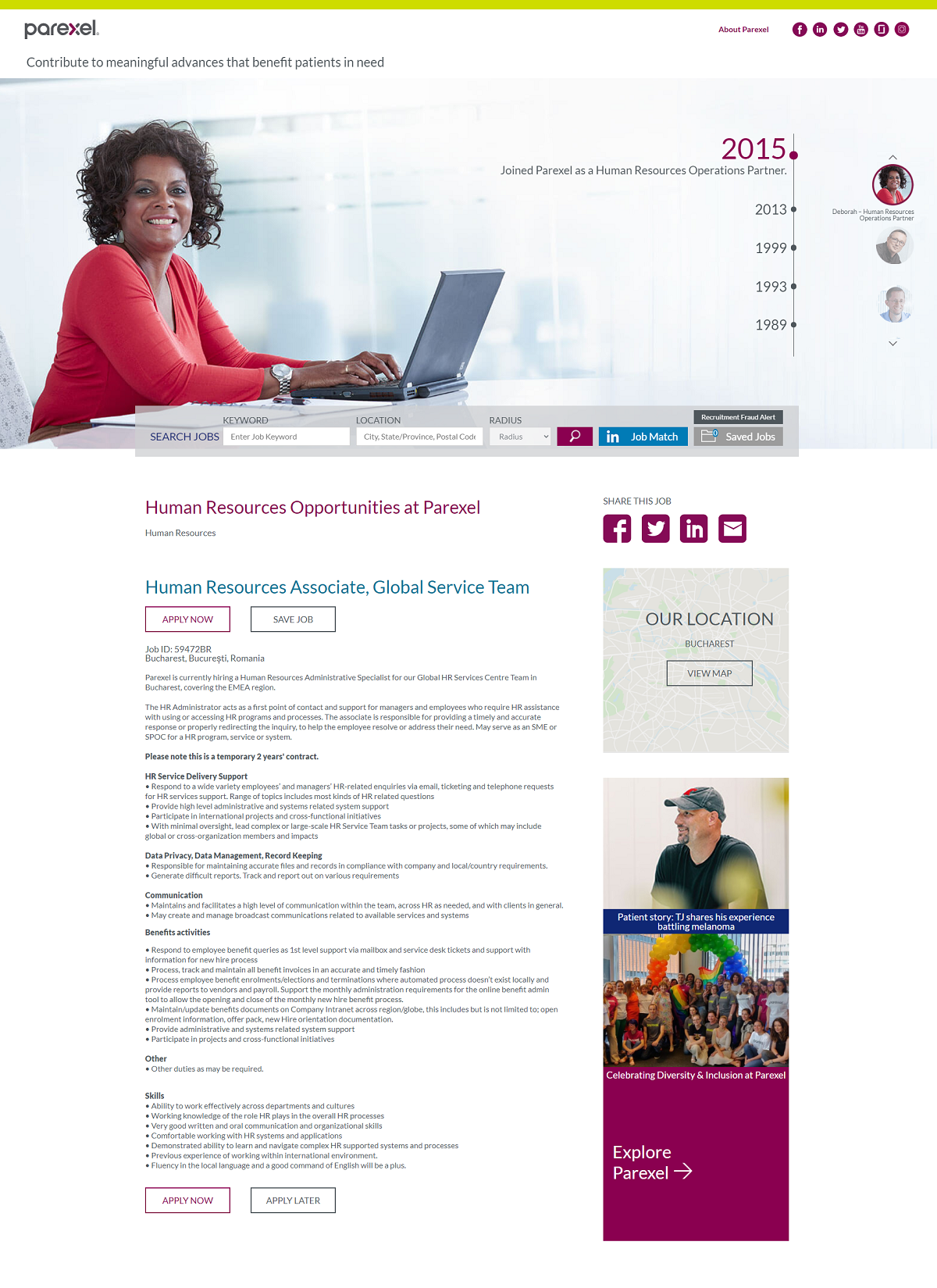
Parexel
- Feature Image: Parexel’s hero image shows actual image of an employee, not a stock photo
- Job Search: The job search bar at the top of every job posting makes it very convenient for candidates to search for more jobs via keyword, location, or radius (distance). So, they don’t have to find or retrace their steps back to a job search page. You can also easily search for remote jobs if you want to work offsite.
- Recruiting Content: It has more features that comprehensively explain the job posting in addition to the usual job responsibilities and qualifications information:
– Success Profile – enumerate the soft skills essential to the position: adaptable, communicator, collaborative, leadership, proactive, problem-solver
– Potential Career Path – the company offers a growth path with diverse therapeutic areas and clients so that candidates can grow according to their interests – Associate Project Leader, Project Leader, Senior Project Leader, Associate Project Director, Project Director, Director-Project Leadership, Senior Director – Project Leadership
-Employee Insights – short videos of staff showing what it’s like to work for Parexel
There are also sections showcasing the company values and culture.
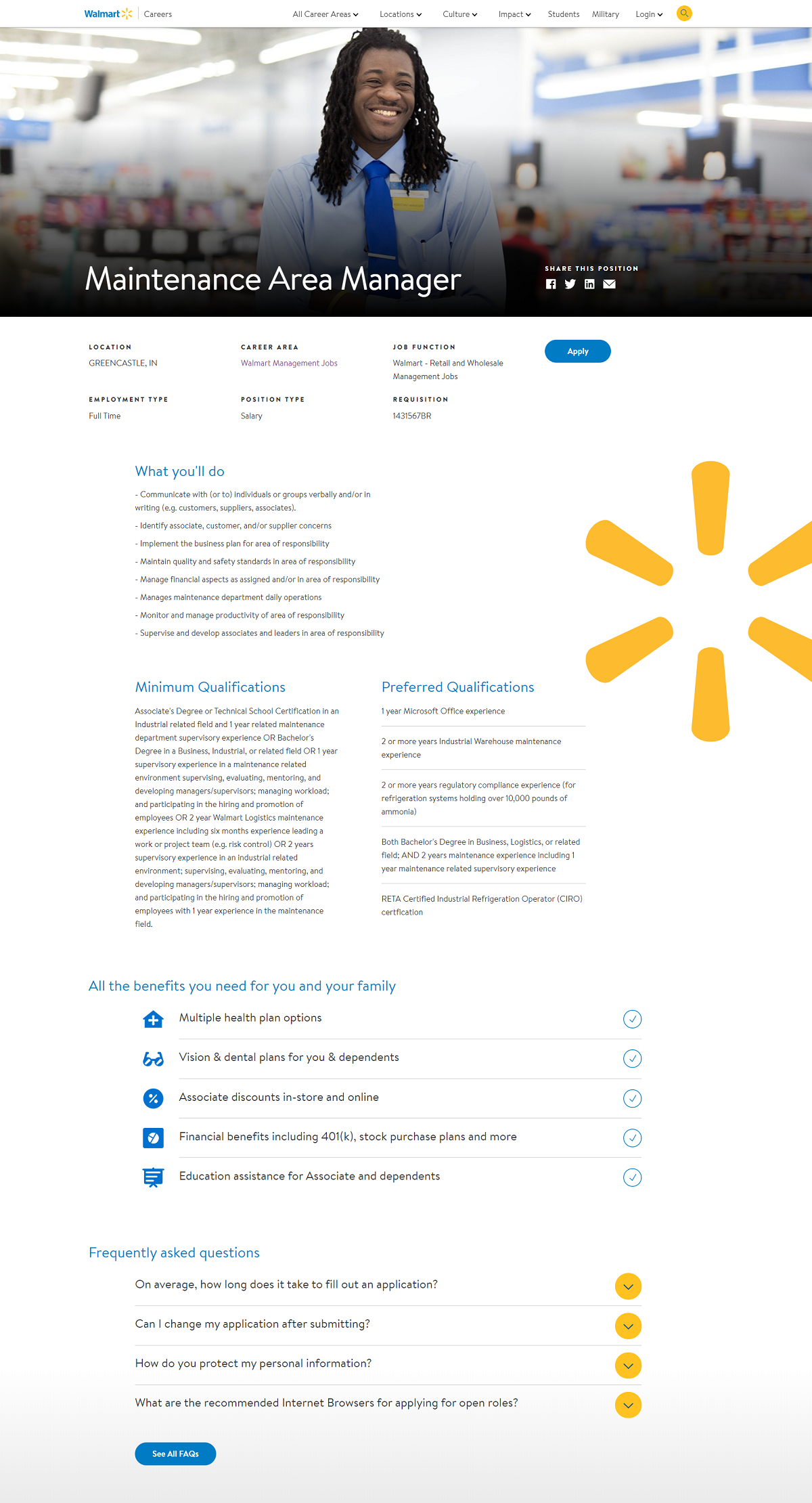
Walmart
- Awesome Branding: A Nice employee picture to start off: a close-up photo of the employee with green shading at the bottom
- Job Description Format: Consistent all around. Headers are a distinct size and color (blue), regular text is readable with a nice mix of bullets, lists, and paragraphs to break up the text.
- Benefits: benefits are extended to the family of the employee such as multiple health plan options, Free Membership, and discounts on fresh produce
- Candidate FAQ: A great idea for job postings. Addresses candidates’ common application concerns, especially how long does it take to fill out an application? (helpful for applicants in a hurry to get a job!). The dropdown answers also make efficient use of the space.
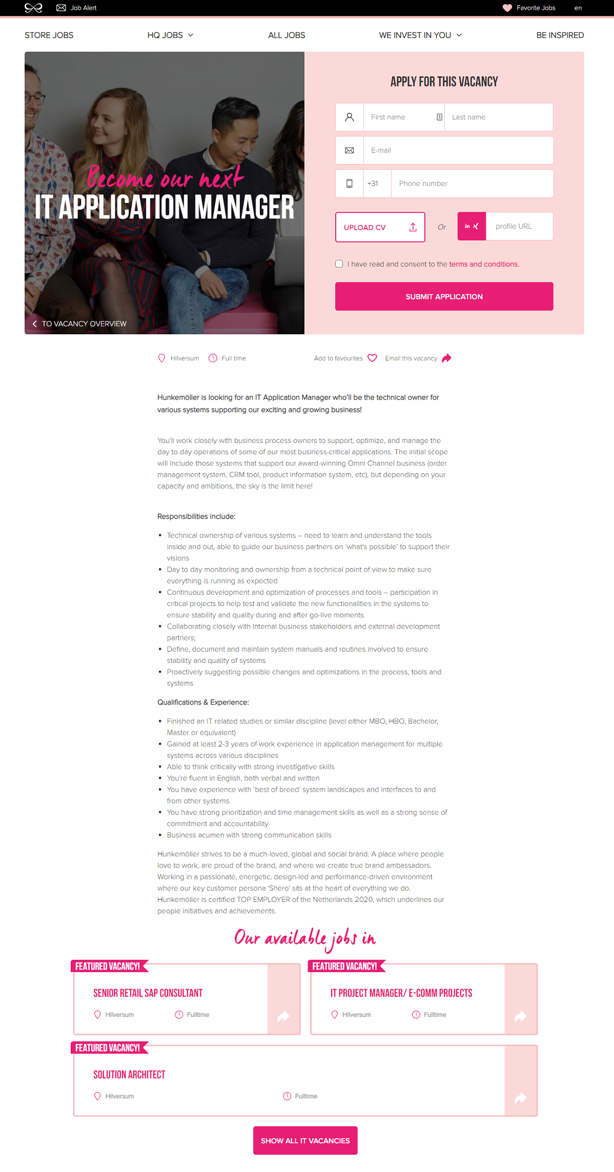
Hunkemöller
- Branding: Hunkemoller’s unique brand colors make for an appealing job posting.
- Big Apply Area: It’s not just a button; it’s the whole upper right portion of the page. I like this application method, which includes four quick fields and a resume upload. Alternatively, applicants can paste their LinkedIn profiles.
- “Become Our Next”: Cool headline with a unique font.
- Feature Image: shows employee picture at work
- Job Description Format: Great use of bulleted lists, it would look a lot more daunting if those lists were in paragraphs.
- Application Process: Candidates are given various options: a 10-second application, a video interview, or a live interview.
- Benefits/Perks and Values: A creative bottom of the section has a list of benefits/perks with cool little visuals such as staff discounts, travel expenses support, and lifestyle workshops
- You want to know more?: Candidates can also email their recruitment team directly if they have additional questions or concerns.
- Behind the scenes: pictures of actual employees and also their work life at Hunkemöller
Signify
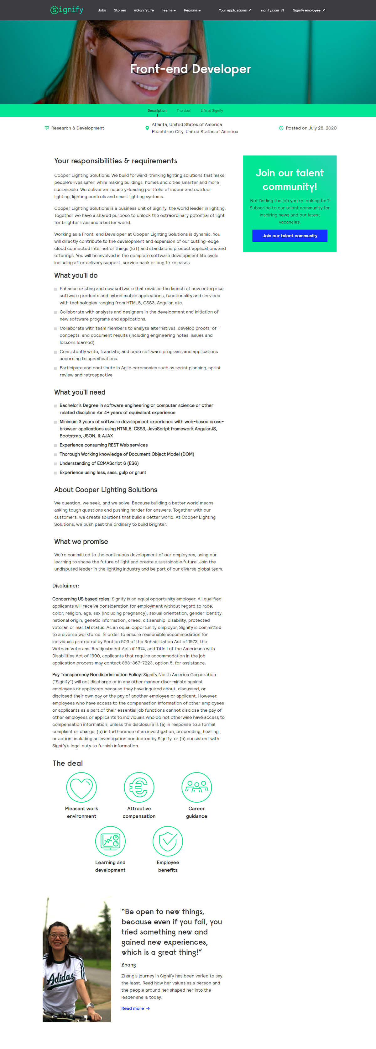
- Branding/Theme: Notice Signify has a specific theme throughout the page. Nice and simple color scheme and also a very distinct font.
- Auto-Scroll to Sections: Right below the feature image, you see “Description, The deal, and Life at Signify”. The Life of Signify shows the different facets employees experience during their stay with the company such as learning, the company’s supply chain, and how it conducts research You’ll also hear feedback from the company’s Account Managers. So, clicking those words will send you to that specific part of the job posting.
- Employee Testimonial: Candidates want to hear from employees so it’s always smart to feature these on your job postings.
Carmax
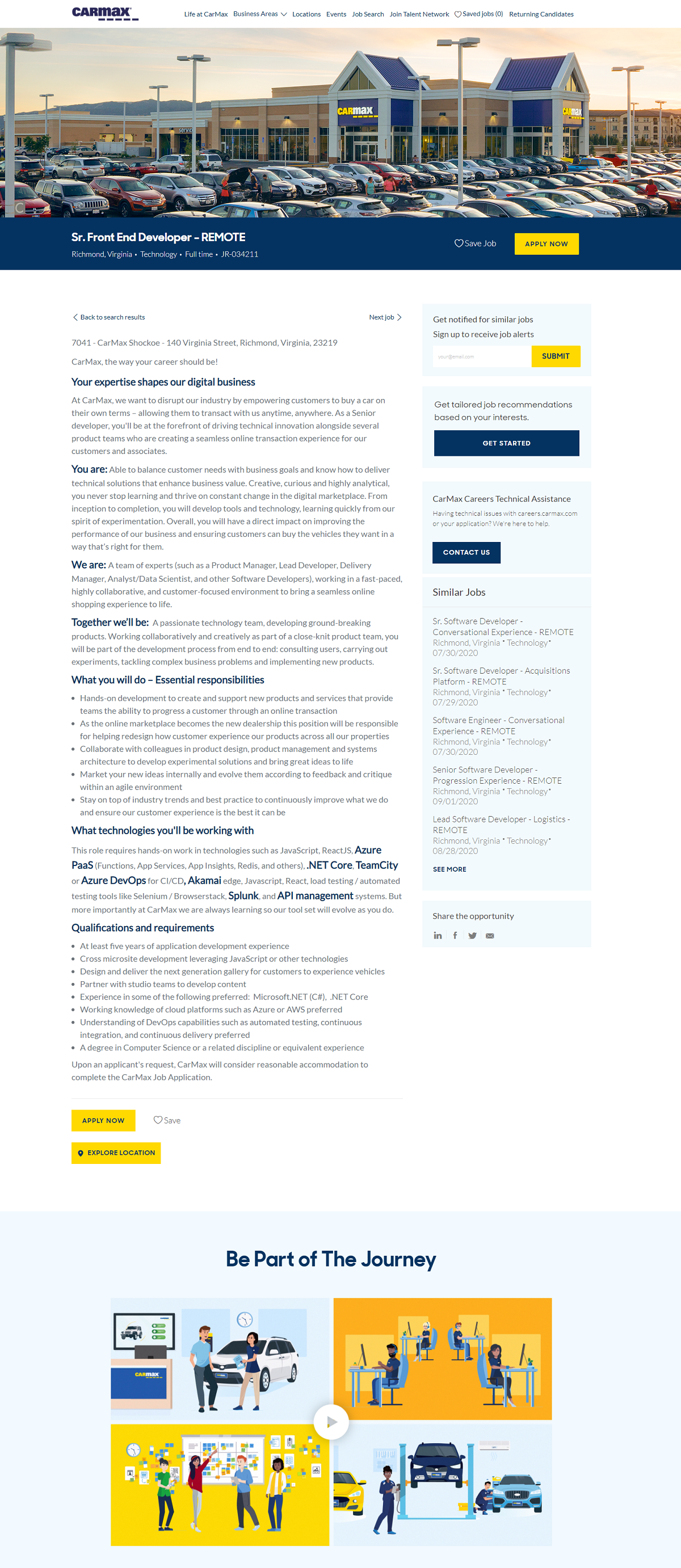
- Header: job seekers can simply enter the keywords or location on the search bar to look for jobs. Then, underneath the job title, it will suggest the area where the job is available
- Highlighted Words: A creative and unique way to emphasize keywords within job descriptions.
- Second-Person Writing: “Your expertise…”, “You Are…”. You can tell the job description text is well thought out and reads great.
“Take a career quiz’ – candidates are quizzed based on their assessment. Test results suggest job recommendations.Need help? – job seekers can simply click the button if they have additional questions or need technical assistance
Option to ‘Save the Job’ – if they aren’t decided yet to apply
Option to ‘Explore Location – to see other company offices or branches
Meta
- Though the job posting doesn’t have stunning visuals, the use of white space and the concise language of the job description makes it easy for job seekers to understand the role.
- Splitting the qualifications between the essential (“Minimum’) and optional (‘Preferred’) helps candidates self-select out, which narrows the talent pool to genuinely qualified candidates
- Start preparing – guides applicants in their application process with interview guides, tips, and also interactive experiences.
- Pop up candidate survey at the bottom – ask candidates’ opinions on how likely or unlikely they will apply at Meta so the company can improve their hiring procedures.

Shopify
Squeaky clean design – no fancy images or videos. Only essential details are covered: About the Company, About the Role, and About the Candidate. The job posting does not even require candidates to comply with basic requirements like educational background or previous work experience, following their statement ‘We hire people, not resumes.”
Shopify is more concerned with the candidate’s resilience, autonomy, passion, and resourcefulness. They need to possess all of these qualities before they are even allowed to send their applications.

Spotify
Another job posting with clean design – just solid light green color for the job title and white background for the position description.
The posting only indicates locations, job type, key responsibilities, and qualifications. The compensation and benefits package are also indicated so candidates are aware of how much the role pays.
There are also links to the application process, the job location (See our Office), and the team or department where the candidate will be working.

Mastercard
Starts the job posting with the Purpose Statement. Then gives Overview of the Role. Responsibilities and Qualifications are presented in bullet list, with plenty of white space which makes for easy reading.
There’s also a pop-up Career Bot at the bottom right that assists candidates with their application. After confirming your interest in the role, it will ask a few questions about your background and experience as prequalification.
The job posting also displays information about Similar Jobs. Plus a quick link to the Mastercard’s company culture.

The Role of Employer Branding in Job Postings
Why Employer Branding Matters
The first thing potential candidates notice about your job posting is often the tone and style of your message. Therefore, a strong employer brand can make your open position stand out among countless others on job boards. It’s also the best way to attract great candidates who align with your company’s culture and values. But here’s the good news: crafting a great job ad that reflects your employer brand isn’t as hard as it sounds.
Building Trust with a Strong Brand
When prospective candidates read your job description, they’re looking for more than just job requirements or work hours. They also want a better understanding of your work environment, your team’s dynamic, and how the job fits into their career goals. Therefore, including details about your company’s culture, great benefits like health insurance, and work-life balance can be a great way to build trust.
For example, a hiring manager looking to attract software engineers might emphasize flexible work hours, a competitive salary, and opportunities for growth. So, these details signal that your company values its team members and prioritizes their well-being.
Crafting Clear and Engaging Messages
A common mistake in job postings is using vague or overly formal language. Instead, focus on creating clear job descriptions with inclusive language. This is especially important when you’re targeting the right talent. So, a good job posting is straightforward and answers key questions like: What’s the pay range? What are the job requirements? What does the interview process look like?
Including creative ways to showcase your brand—like a short video featuring current employees sharing personal accounts—can make your job advertisement stand out. It’s also a great example of how to connect with potential hires on a personal level.
Using Branding as a Powerful Tool
Your employer brand should extend across all platforms—from social media job posts to your company website’s careers page. Therefore, effective communication is key. So, highlighting great benefits, such as health insurance or flexible work hours, can make a huge difference. Also, don’t forget to ensure your job advertisement examples comply with legal requirements.
Standing Out in Search Results
Search engines and job boards are often the first places candidates look for opportunities. Therefore, optimizing your hiring ad with the right information is one of the best practices to attract quality candidates. Keywords like “sales job posting,” “job opportunity,” and “effective job ads” can help your post appear in more search results.
Showcasing Your Company’s Culture
Your company’s culture should shine through in every hiring ad. So, highlight aspects like a team-player attitude, inclusive language, and opportunities for growth to show that you’re committed to finding the right people. Sharing job description examples or personal accounts from team members can also provide potential candidates with a better understanding of your work environment.
Challenges of Creating Engaging Job Postings
- When hiring managers or recruiters contribute to job postings, the formatting, tone, and structure often change. This inconsistency creates confusion for candidates and makes your employer brand look unprofessional. Best candidates may skip your job ad and check other companies’ job openings instead.
- Because there are too many people involved in the editing process, unconscious bias can unintentionally creep into your job descriptions. So, this usually happens in word choice or tone. Biased job postings also limit your talent pool by discouraging qualified candidates who can’t identify with the requirements. It can also harm your employer brand, as many job seekers now look for diversity and inclusion in their workplace.
- Manually updating job postings especially when you are volume hiring takes too much time and effort. This is especially true if you are hiring across multiple teams or locations. Therefore, changes in company branding, tone, or compliance requirements usually require edits to every posting. You are also prone to make errors when doing multiple edits.
When you are pressed for time, speed is a crucial factor. So, spending excessive time updating job postings can slow down your hiring process. You can also delay hiring for critical roles, negatively impacting your business.
How Ongig’s Text Analyzer Simplifies and Enhances Job Postings
Automated Smart Templating for Job Postings with Ongig’s Text Analyzer 🤖
At Ongig, our Text Analyzer uses generative AI to automate the application of smart templates to job postings. Thus, saving time and improving consistency. Instead of manually updating thousands of postings, you can create custom templates or use existing ones within Text Analyzer. The tool organizes your job postings into sections like responsibilities, skills, and salary. It also makes your job descriptions more inclusive by removing masculine, feminine, or other exclusionary language. It also shortens long sentences to make them more readable and make your job descriptions more consistent and compliant with labor laws.
Once the template is applied, Text Analyzer provides a revised and optimized draft. It includes a score showing improvements in readability and inclusivity. While AI does the heavy lifting, human review remains essential to ensure quality and alignment with your organization’s unique requirements. Therefore, reviewing ensures job postings are clear, inclusive, and aligned with your company’s values and goals. Thus, contributing to a more effective hiring process.
Why I Wrote This
Attractive job postings can help you hire top candidates for your organization. So, with Ongig’s Text Analyzer, you can easily create templates, improve inclusivity, and ensure consistency with your job postings. Contact us for more information.
Shoutouts
Survey: How to Improve Your Job Postings to Attract Better Candidates – Indeed
