- Top 10 Helpful Augmented Writing Tools for Job Descriptions (2026 Update) - March 9, 2026
- Top 18 Employer Reviews & Ratings Sites for 2026 - February 27, 2026
- 7 Examples of Awesome Employee Testimonials And Content (2026 Update) - January 20, 2026
Finding the right talent often starts with standing out from the crowd, and nothing grabs attention like creative job postings. In today’s competitive job market, a standard listing might not cut it. Candidates are drawn to opportunities that feel fresh, engaging, and reflective of a company’s unique culture.
This blog showcases some of the most inventive job postings out there, offering inspiration for crafting listings that capture interest and spark excitement. So, whether you’re looking to highlight your company’s personality or simply want to try something new, these examples of creative job postings are sure to inspire your next hiring strategy.
With that being said, I’ve been scouring the web again for creative job postings. Here are 7 examples I found. Enjoy!
Hopper
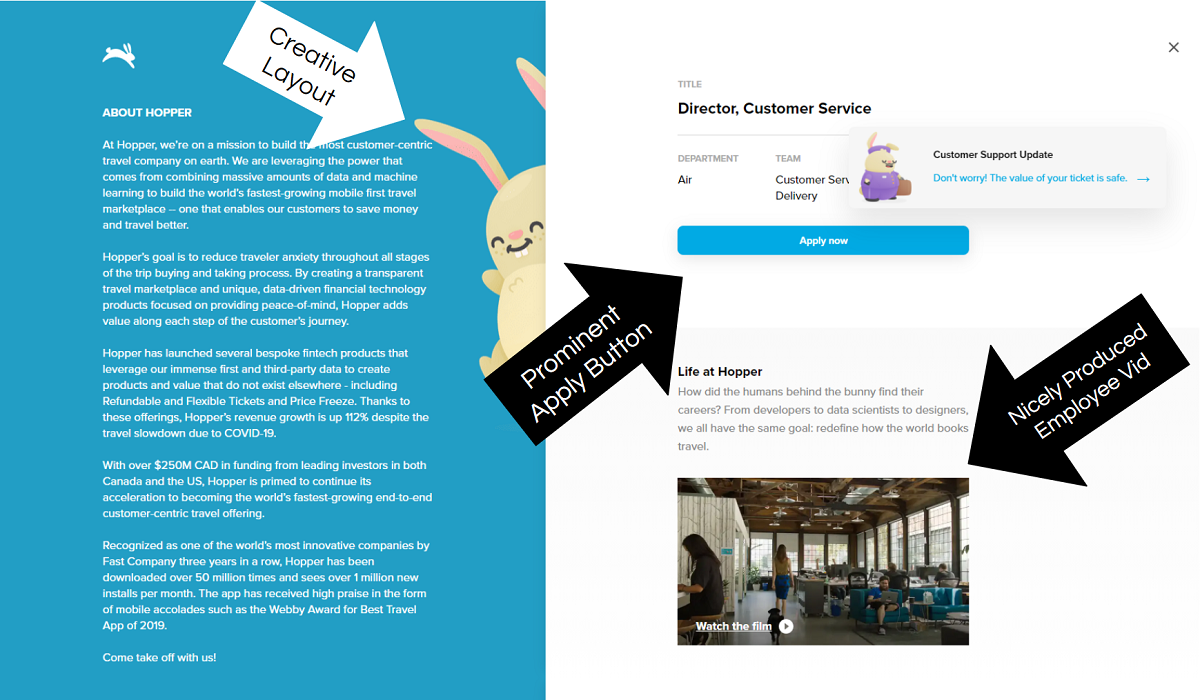
- Creative Layout — Efficient use of space with their 2-column job posting. The right side stays fixed while the left side scrolls with the job description.
- Prominent Apply Button — It’s the only blue button on the page so it sticks out.
- Employee Vid — One of the better produced employee videos I’ve seen on a job posting.
Massage Envy
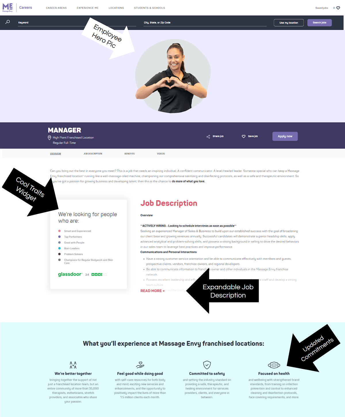
- Hero Pic — Cool employee pic, it almost looks like she’s coming out of the page.
- Traits Widget — Presenting things in a different way could catch some eyes. Instead of a bulleted list of traits inside the job description, they added a separate widget box with color-coded traits and Glassdoor rating.
- Expandable job description text — This is a great feature to help shorten up the page and not make the job description look so daunting to read.
- Commitments — They have updated commitments including COVID-19 safety.
GoPro
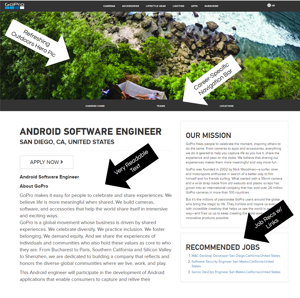
- Hero Pic — I don’t see too many hero pics like this on job postings, which is why I like it. The shift to remote work aligns with this hero pic.
- Readable Text — Definitely an underrated aspect of job postings. Sizeable font with black text on white background might not be the most exciting
- Career-Specific Nav Bar — It’s on every job posting so you can easily navigate to other pages on GoPro’s career site.
- Job Recommendations — These recommendations can help deter a one and done candidate visit if a job recommendation catches their eye.
Premise Health
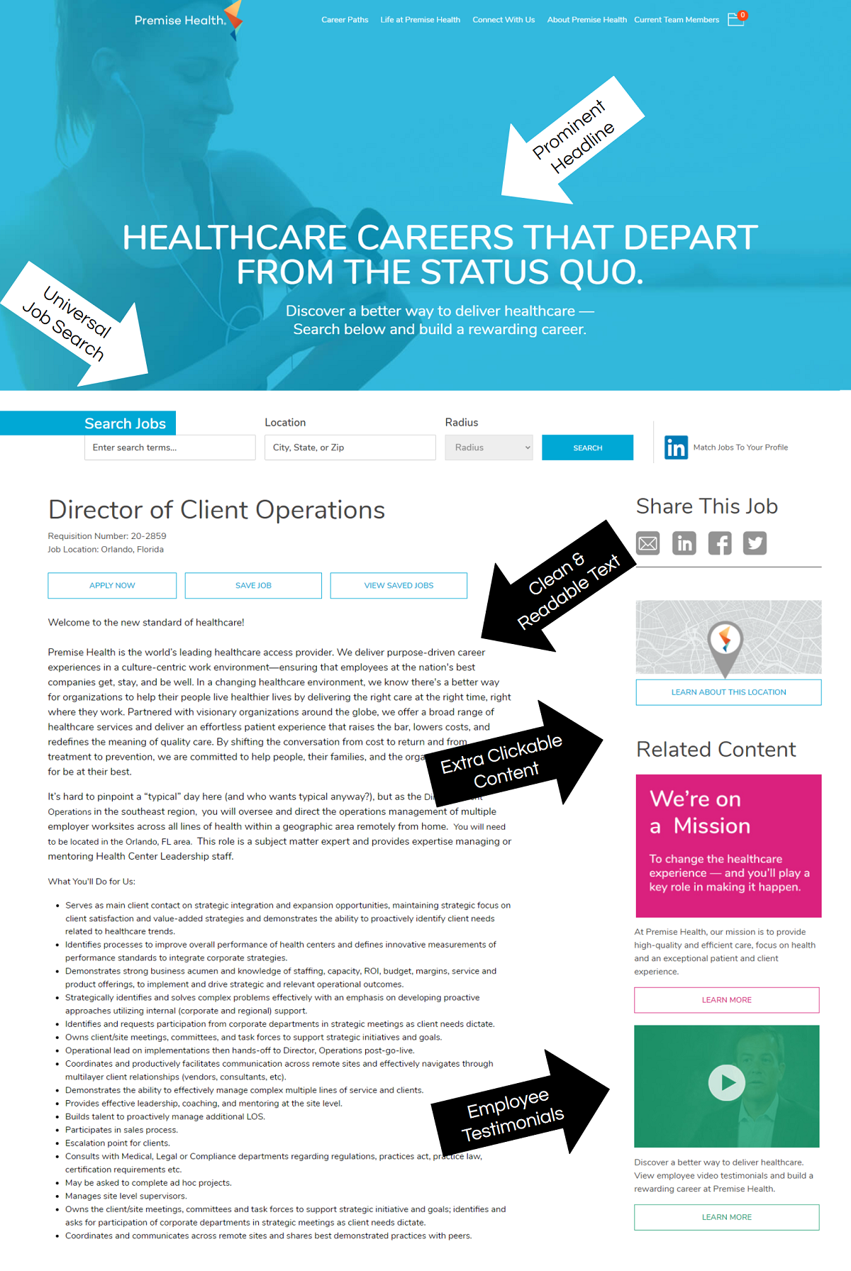
- Headline — Prominent and very readable. The headline also projects confidence “careers that depart from the status quo”.
- Job Search — A universal job search bar is incorporated into every job posting. Like I mentioned on GoPro above this makes navigation much easier.
- Recruiting Content — Supplemental content adds flavor to your job postings. Premise does a good job utilizing the real estate of their job page.
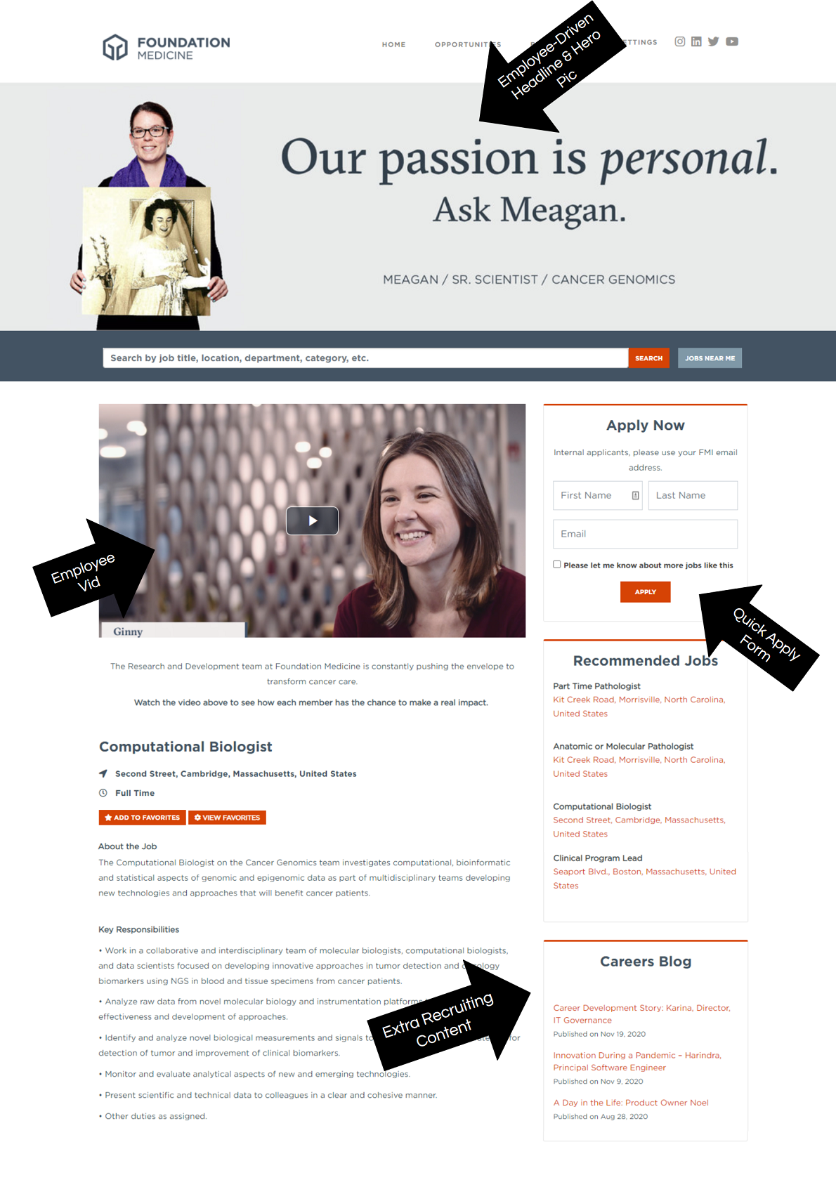
Foundation Medicine
- Headline and Hero Pic — Very personal and touching hero pic of an employee with a picture of Mom. The video also shares stories of employees who have been effected by cancer.
- Quick Apply Form — As we’ve noted before, length of apply form is a friction point between candidates and employers.
- Extra Recruiting Content — If you’ve put the effort into creating a career blog your job postings are a great place to leverage content.
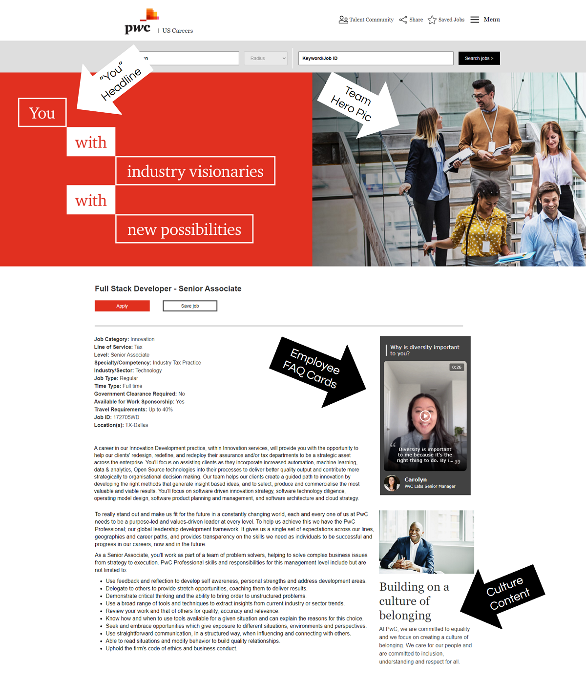
pwc
- Headline — “You” headline speaks right to the candidate. You really can’t miss it when you land on the page.
- Employee FAQ cards — These are interesting and will update when I find the name of the company who does them
- Culture Content — Candidates want to know more about your company culture. If they can’t find more info from you they’ll find it somewhere else.
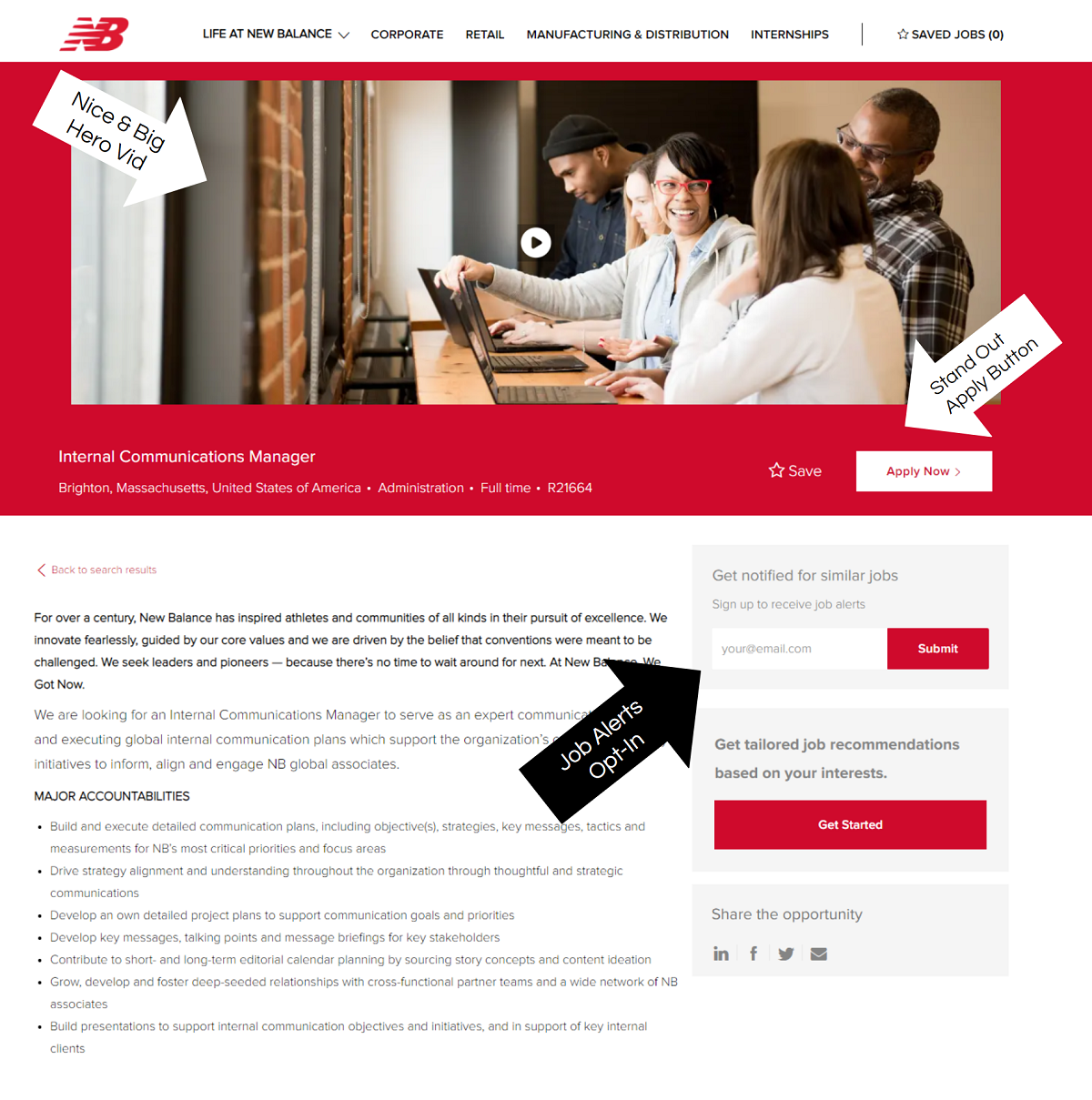
New Balance
- Hero Video — Nice employer branding video. New Balance does a great job leveraging their product brand as well.
- Apply Button — I always like when apply buttons have their own color because they stand out more.
- Job Alerts/Talent Community — Submit button stands out (red). If the candidate doesn’t apply an opt-in to job alerts is the 2nd best thing.
Why I Wrote This
Awesome job postings are key to recruiting candidates online. Ongig’s Career Site Builder is a tool to help you craft creative job postings.
