Latest posts by Rob Kelly (see all)
- 15 Great Tips on Job Posting Wording for 2026 - February 25, 2026
- 14 Best SEO Tips for Writing Job Descriptions (2026) - February 19, 2026
- A List of Common Offensive (Exclusionary) Words Used in Job Descriptions (2026) - February 16, 2026
If you look at the best job descriptions (below) you’ll notice a pattern. Most have:
- Multi-Column Format — Easier to read. That’s why most magazines and newspapers use them!
- Good Employer Branding — Consistent color, font and perhaps even corporate messaging (especially helpful if a candidate comes from a job board and hasn’t seen the rest of your career site yet!)
- Extra relevant Content (beyond the job description text) — Do you really want to bet the farm on just your JD text?
- Proven apply rate boosters (such as highlighting your benefits)
- Clear call-to-actions — This is an ad — make clear what you want the candidate to do!
Here are the 10 best job descriptions we’ve seen lately in no particular order. All are awesome. Enjoy!
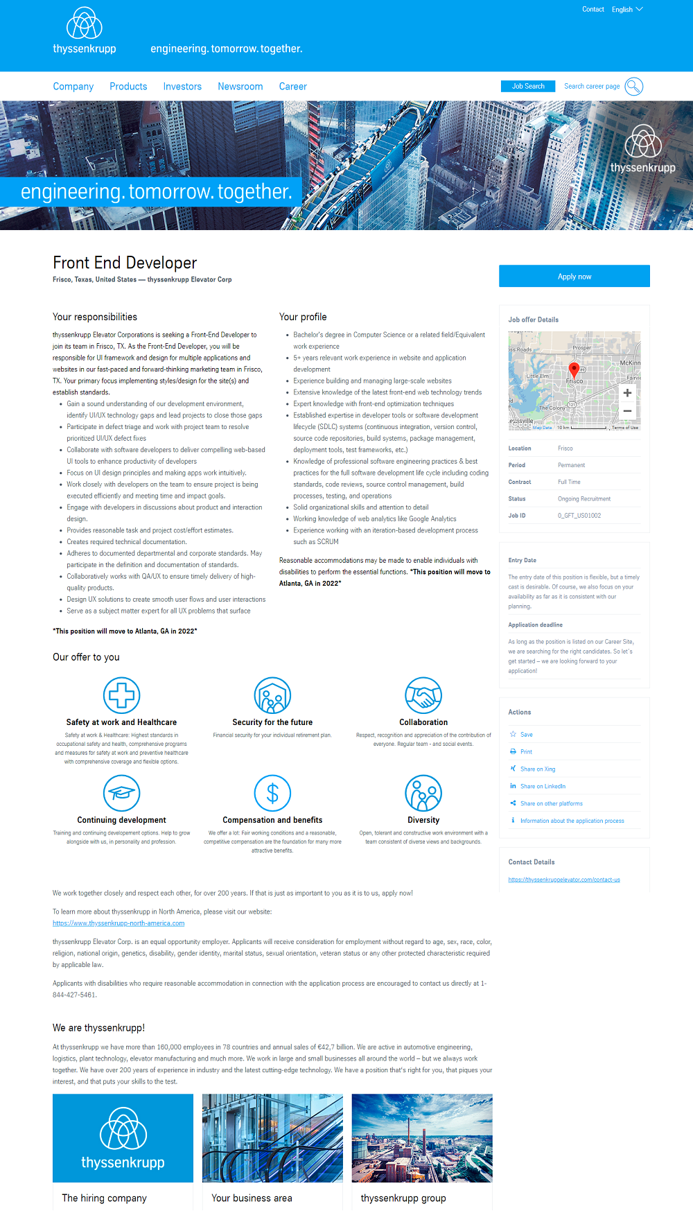
1) Commission Junction
- A gallery of hero media pics (great employer branding!)
- Dual-column format — easier to read
- An About Team text blurb
- A Walkscore showing how walkable, bikeable and transit-friendly the job is
2) Babbel
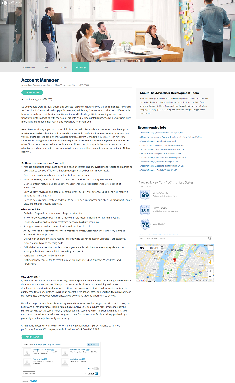
- Powerful hero media
- Headline over the hero media is slick
- Dual-column format is easier to read than single-column
- A bulleted list of benefits and why to work there in the right-hand rail (benefits increase apply rates)
3) Lindt
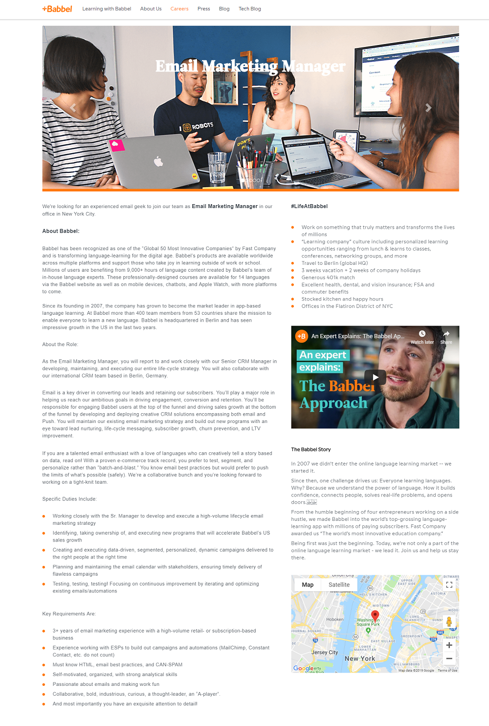
- Consistent Employment Branding — Notice the beige background and different shades of their caramel brown? They put some marketing/branding time into these job pages.
- A “Why”-oriented headline
- Right-hand rail with extra relevant content
4) ThyssenKrupp
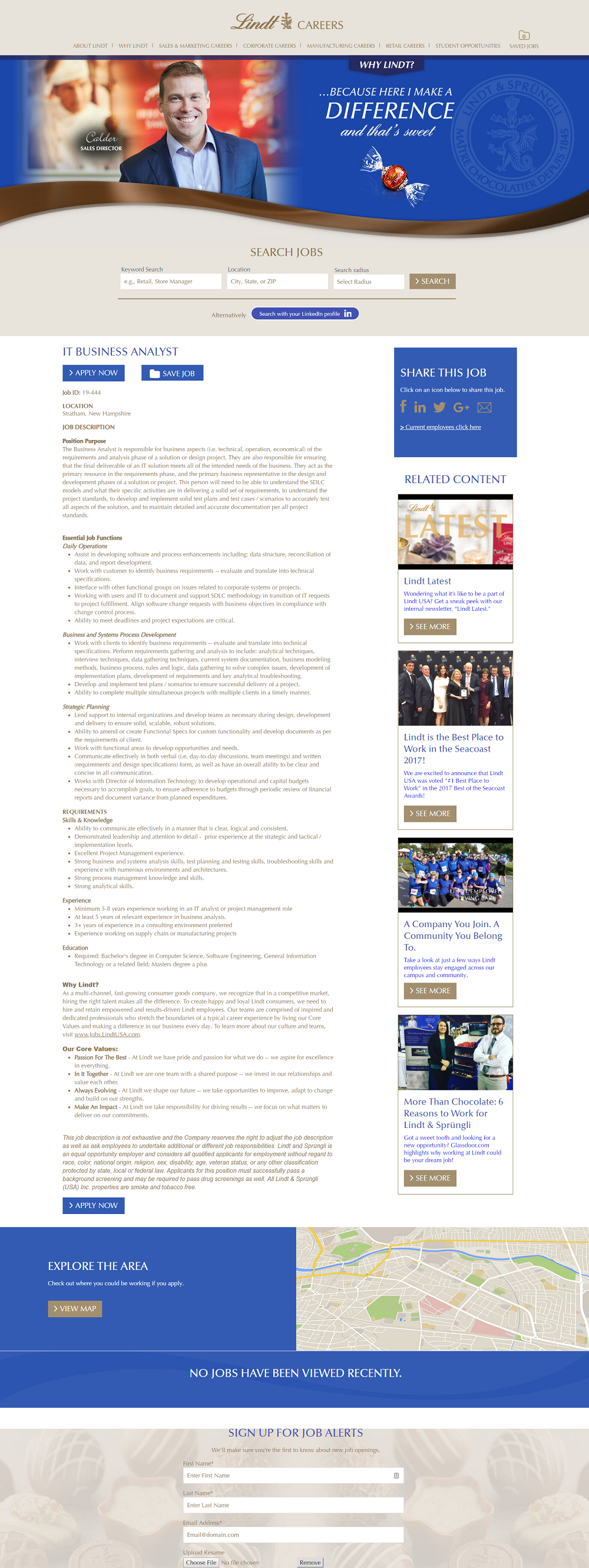
- Hero Media with a headline
- 3-Column format — sometimes 3 columns can be even easier to read than 2.
- A list of benefits at the bottom (with icons). Benefits increase apply rates so it’s usually worth stylizing if you can.

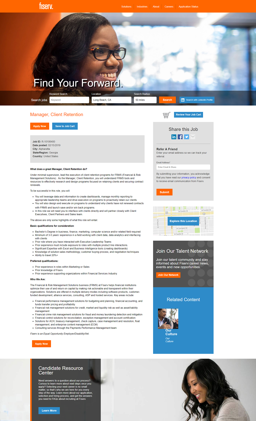
5) Fiserv
- Bold employer branding (color, fonts et al)
- Solid hero media
- A “find your forward” headline just for job opportunities
- The call-to-action (Apply button) pops
- Other relevant content (location, links to culture articles and a candidate resource center)
6) Zillow
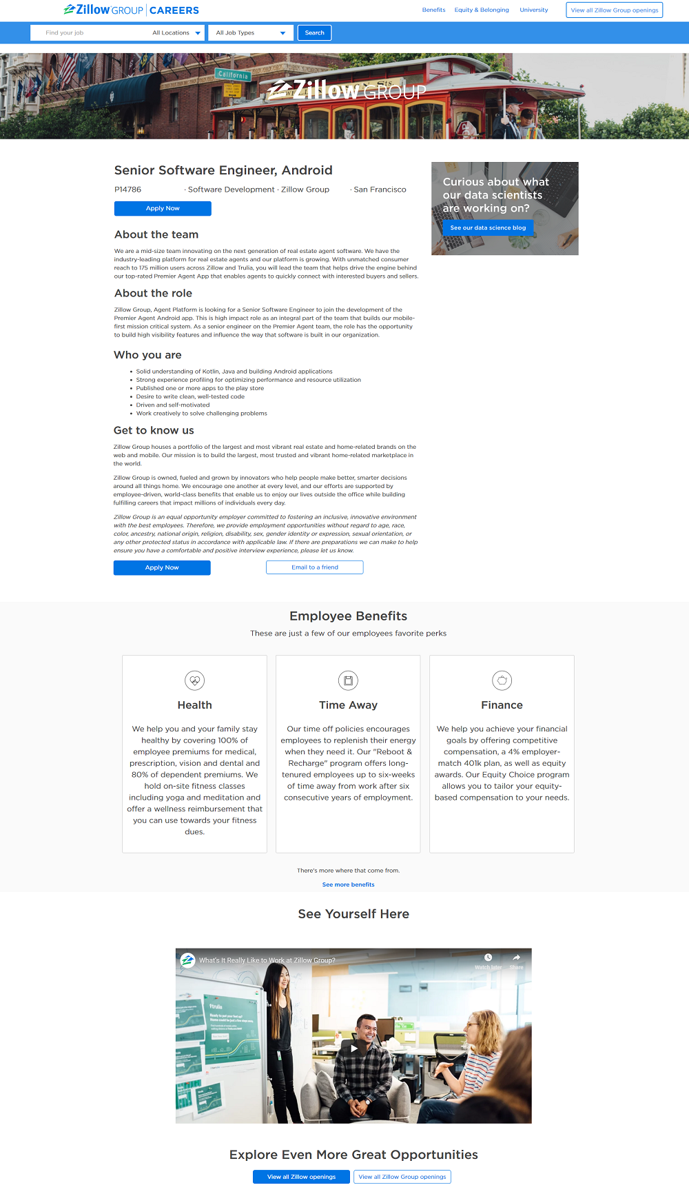
- Location-based Content — Check out the image. It’s a San Francisco pic for a San Francisco job.
- Relevant Blog Content — A link to content that the candidate might be interested in.
- Benefits — They stylize their benefits. A refreshing alternative compared to just listing out bullets in text.
- A “Picture Yourself Here” type video
7) Macy’s
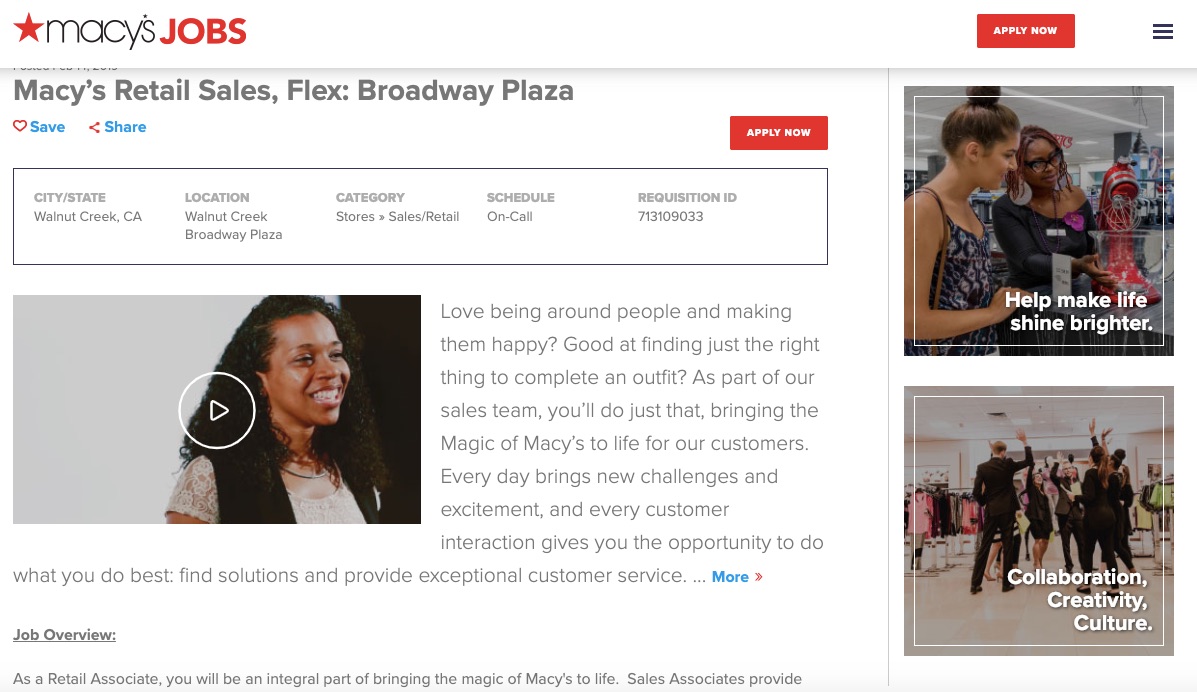
- Video as hero media
- Dual- Column — more readable
- Team-specific intro text
8) Jazz Pharmaceuticals
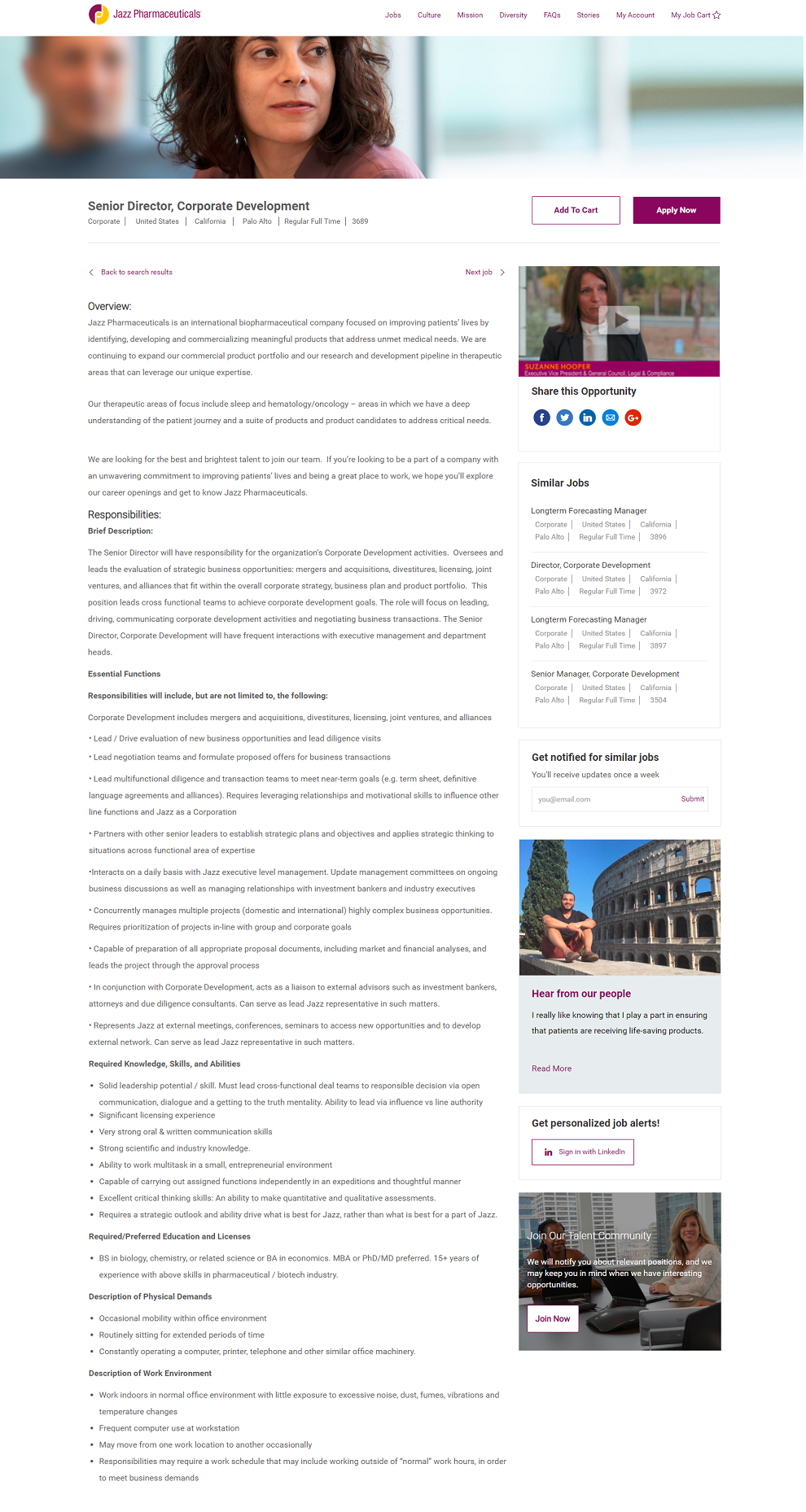
- Hero media
- Consistent color scheme on call-to-action buttons (Apply and email job alert).
- Dual-column with relevant content (video blog, related jobs, email job alert, talent community) in the right-hand
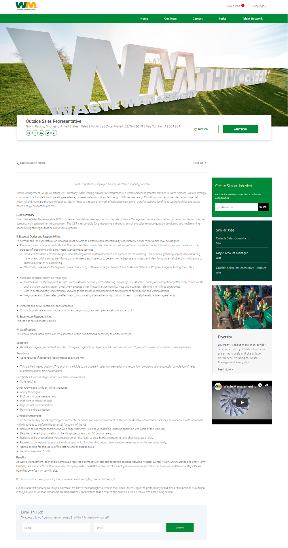
9) Waste Management
- Strong hero media
- Dual-column format for better readability
- Valuable content in right-hand rail (email job alert, diversity article, corporate video, etc.)
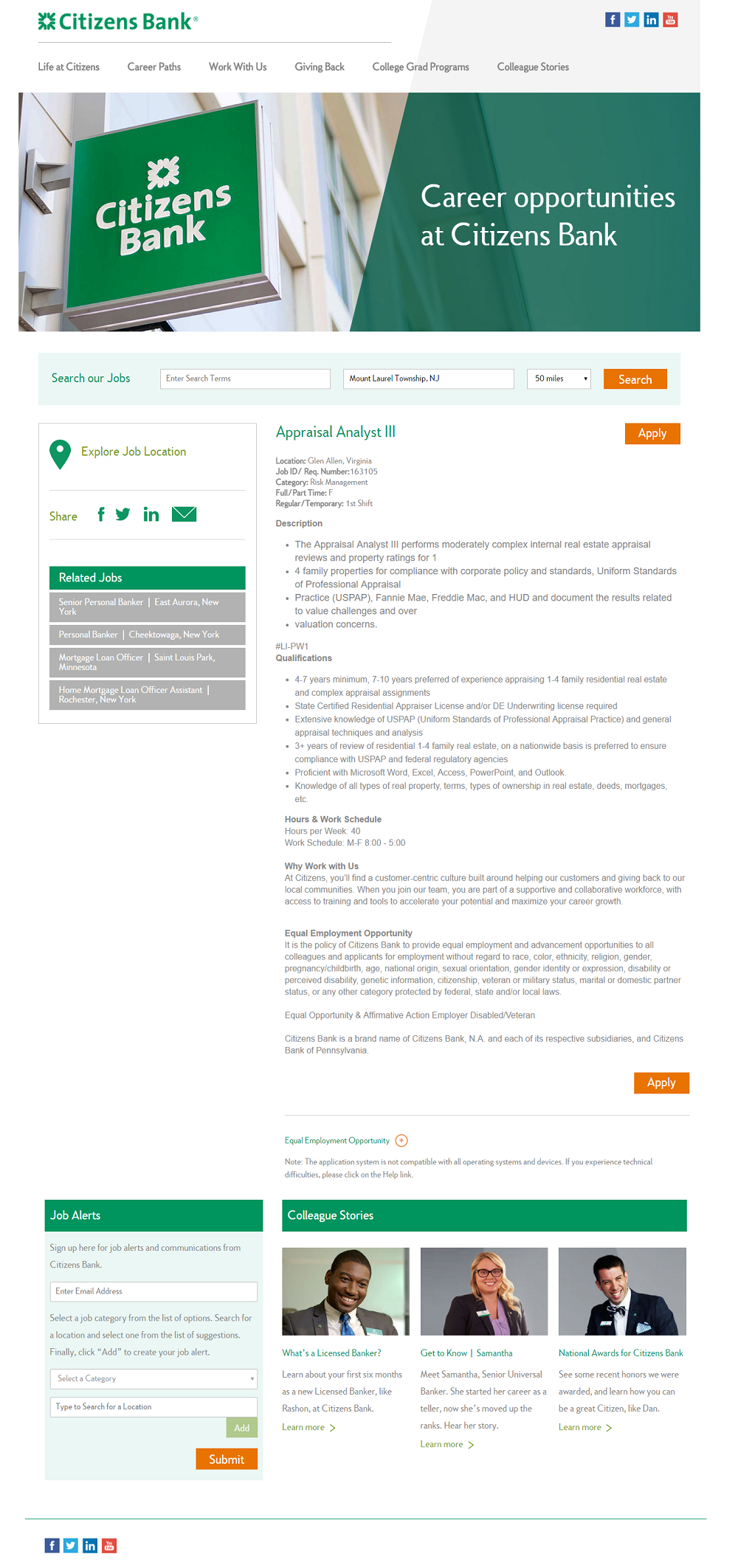
10) Citizens Bank
- Employment Brand — Consistent use of color
- Dual-Column — Job pages, like most pages, are easier to read with 2 or more columns.
- Related Jobs
For some tips on writing job descriptions, check out How to Write a Job Description — Best Practices & Examples.
Why I wrote this?
I wrote this because my team and I at Ongig are on a mission to give you the best job descriptions in the world. And we want you to get inspired! Ping us if you’d like to transform YOUR job descriptions.
