Latest posts by Nick Misa (see all)
- Top 10 Helpful Augmented Writing Tools for Job Descriptions (2026 Update) - March 9, 2026
- Top 18 Employer Reviews & Ratings Sites for 2026 - February 27, 2026
- 7 Examples of Awesome Employee Testimonials And Content (2026 Update) - January 20, 2026
Looking to improve your job ads? I put together a list of 10 examples of creative job ads for inspiration.
And now, during this COVID crisis, it’s a great time to audit your job description text and turn it into a compelling job ad.
You’re bound to find some great ideas from the job ad examples below:
Let’s get started!
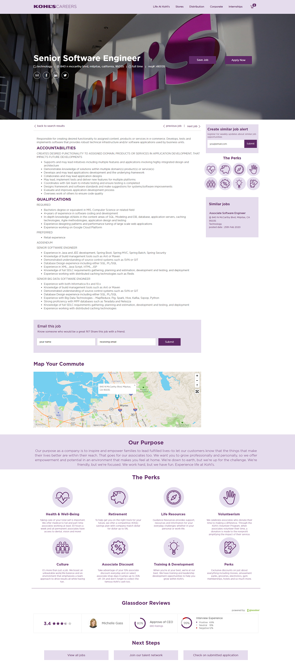
Kohl’s
- Great Branding — Creative feature image of their logo and a subtle purple theme throughout the job ad.
- Right Hand Rail — Great examples of recruitment content: Job alerts, perks, and similar jobs all presented in an engaging way.
- Perks and Glassdoor Reviews Section — Explanations of each perk and a great-looking Glassdoor widget that includes: company rating, CEO, CEO approval, and interview ratings.
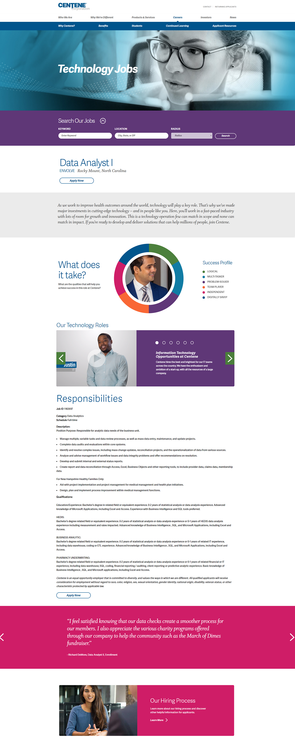
Centene Corporation
- Color Scheme — Awesome use of multiple colors helps sections stand out.
- Success Profile — This is a great example of a job ad graphic that breaks up text, is engaging, and leads into the job description.
- Employee Content — The video below the success profile showcases employees speaking about their role within the department. They also have employee testimonials at the bottom of each job ad (social proof).
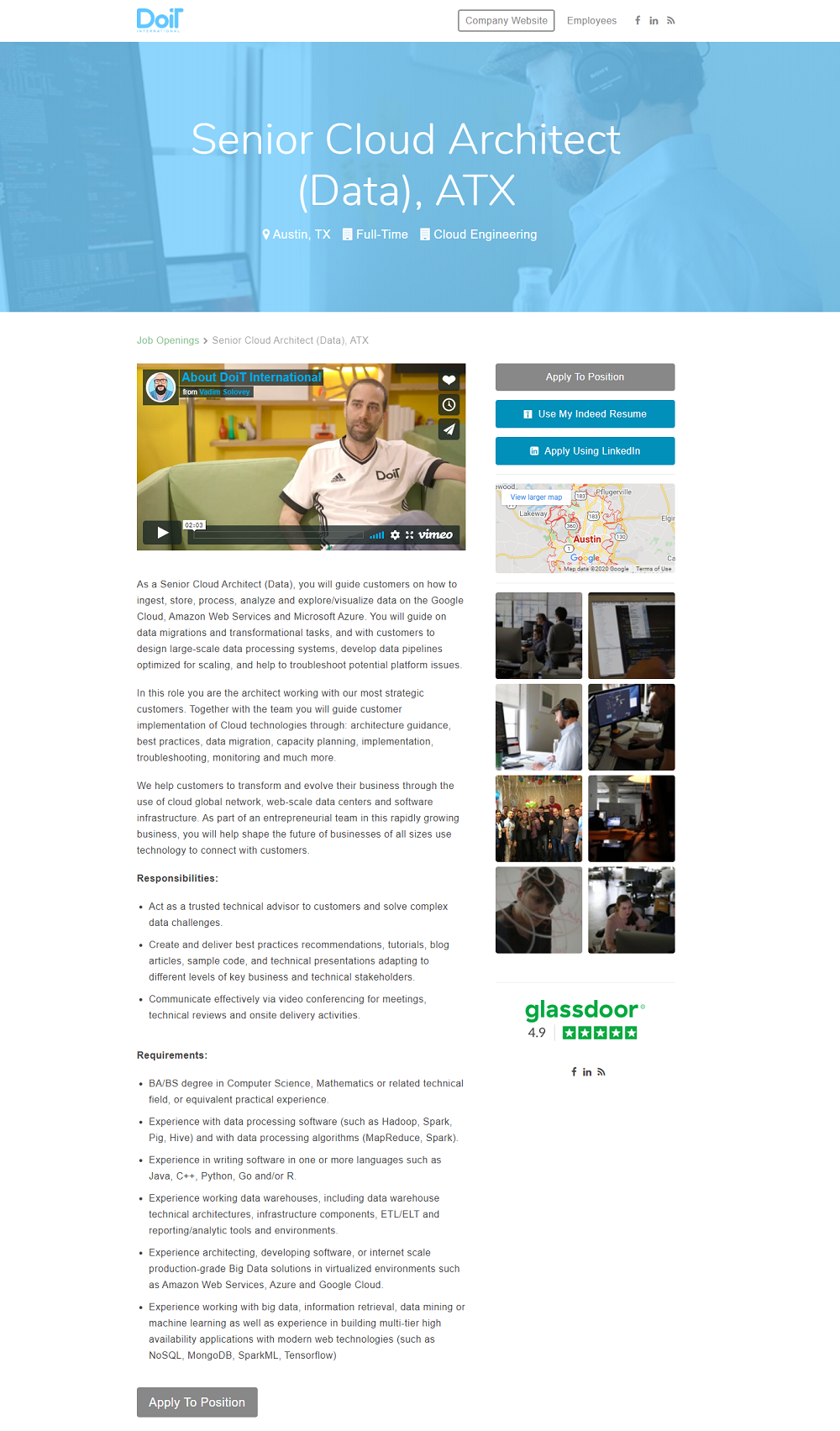
Doit International
- Video — An interview with the Chief Business Officer talking about the company and role in the industry. A creative example of how to kick off a job ad.
- Map — Give candidates a better idea of work location.
- Gallery of Pictures — Always a plus to have pictures for extra insight into employees and workplace.
- Glassdoor Rating — Less detailed than Centene’s Glassdoor widget (above), but still provides Glassdoor rating which shows “social proof” to the candidate.
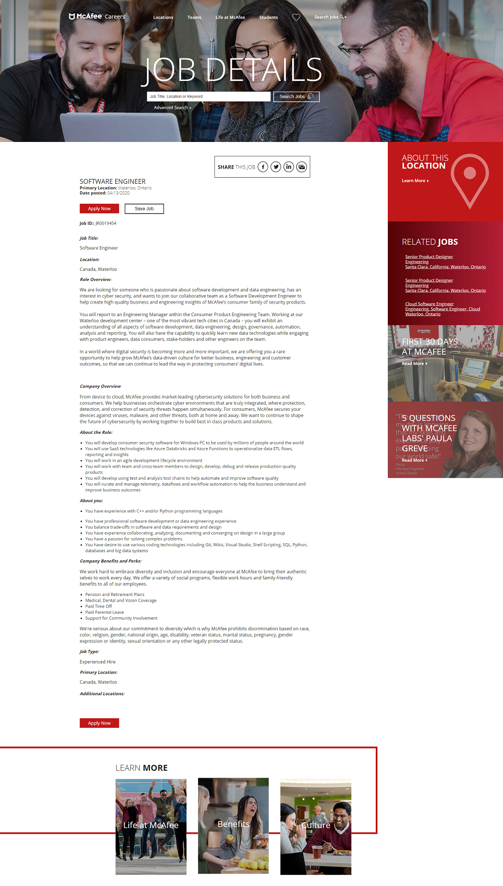
McAfee
- Color Scheme — Job Ad is anchored by McAfee’s red and utilize different shades for different sections.
- Great Recruiting Content — Features a “First 30 Days at McAfee” and a “5 Questions to Ask” article.
- Call-To-Actions — Red “Apply Now” button has nice contrast with the white background of the job ad. This is a great example of someone who gets the “contrast” element of design.
USAA
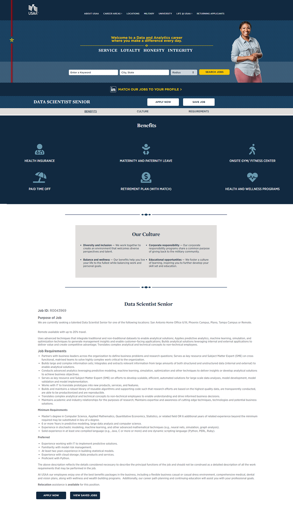
- Great Approach to the Above-the-Fold Section — A position-specific headline with company values. Also includes the job search option on every job ad. This keeps the candidate from having to navigate back to the job search page (which can be confusing).
- Benefits and Culture Section — Notice they put this before the actual job description. They give candidates what they want first.
- LinkedIn Profile Job Matcher — Improves candidate experience.
Roblox
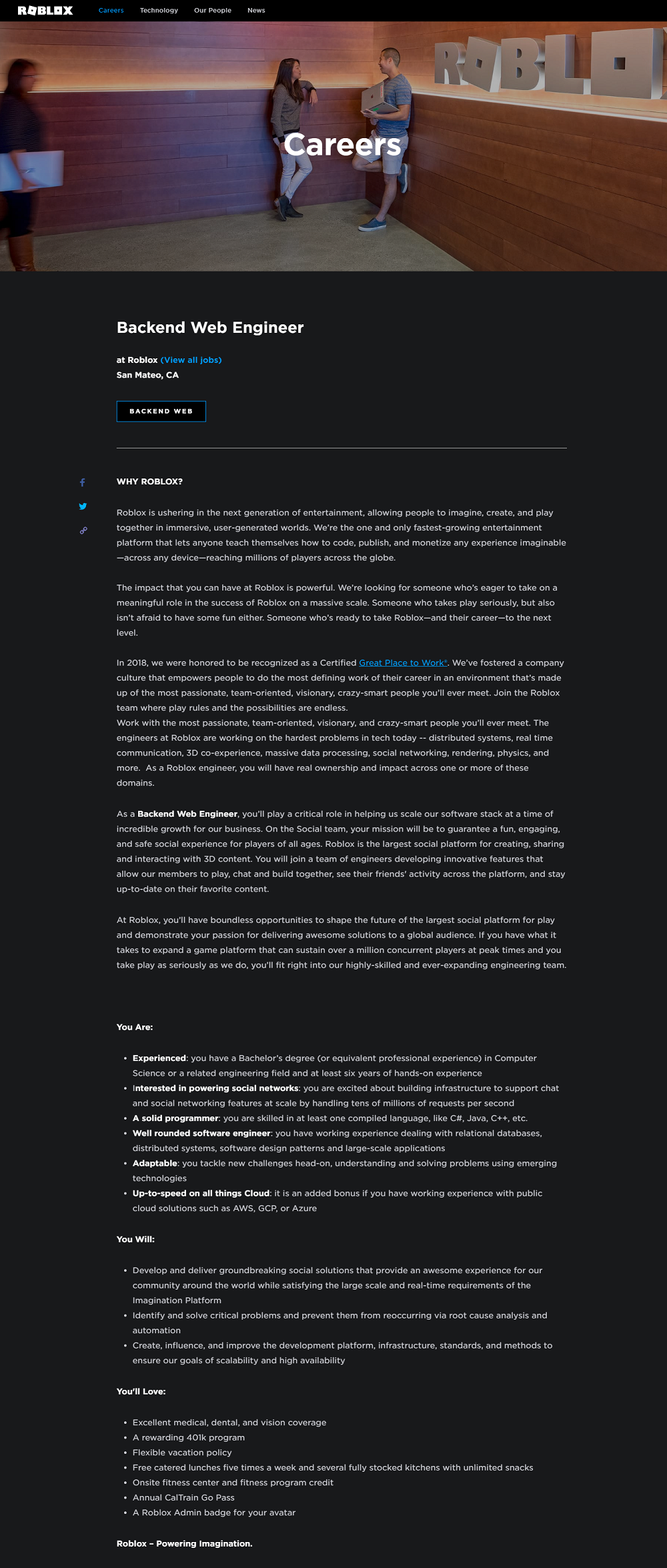
- Feature Image — Creative image of workplace and employees.
- Background and Text — Black background and white text is a refreshing change from the norm (white background, black text).
- Links Within the Job Ad — Very few employers use links within the text of the job description text. Adding a link to a 3rd party saying something great about you creates trust with the candidate!
Lab Corporation of America
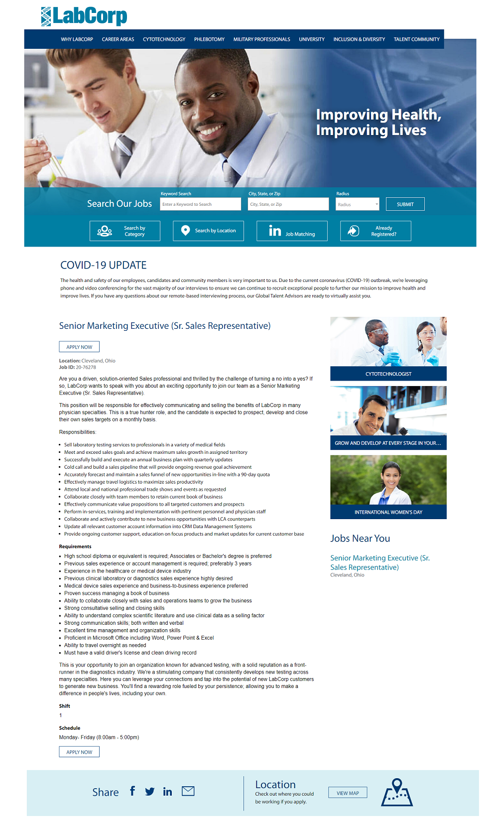
- Feature Image — Awesome image of smiling employees and solid headline: “Improving Health, Improving Lives”.
- Clickable Recruiting Content — Cover a nice variety of topics (Position-specific, career, and events).
- Career-specific Header Navigation Bar — Creates a better candidate experience opposed to having the same nav bar that’s on the corporate site.
Impossible Foods
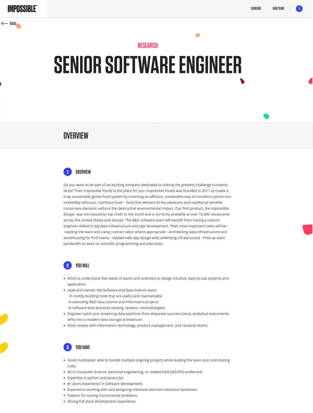
- Simplicity — I like the simplicity of this job ad, the first word that comes to mind is “clean”.
- Theme — Cool colorful specs/confetti add detail to the page but doesn’t take away from the text.
- Nice Job Ad Taxonomy — 3 simple sections that cover the basis of the job. Not overwhelming like some job ads that run on beyond 800, 1,000 or even 1,500 words.
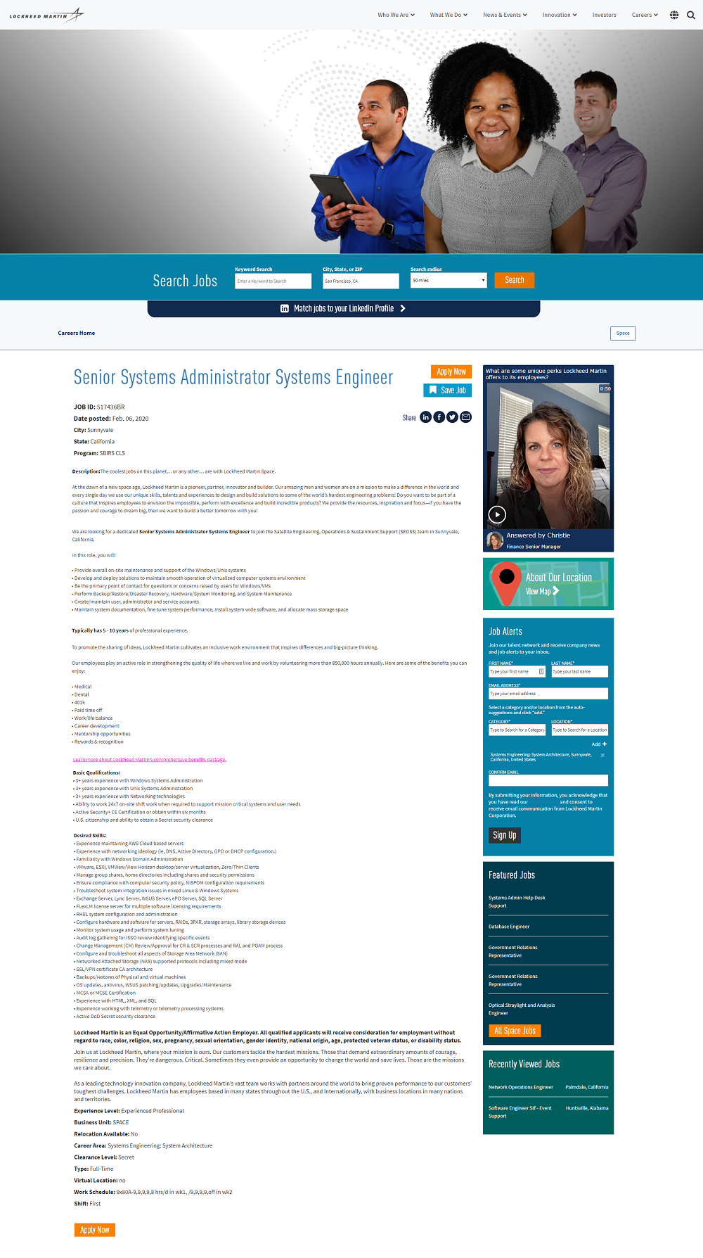
Lockheed Martin
- Feature Image — This diverse image of smiling employees is a great best practice with recruitment content.
- Employee Generated Video — A good job ad is conversational and what better way to converse than to have questions like Lockheed has:
- Why should someone join Lockheed Martin?
- What are some unique perks Lockheed Martin offers to employees?
- What’s a day in the life like for a ________ (insert role here) at Lockheed Martin?
- Job Alerts Opt-In — A prominent item in the right-hand rail of the job ad as it should be.
Freddie Mac
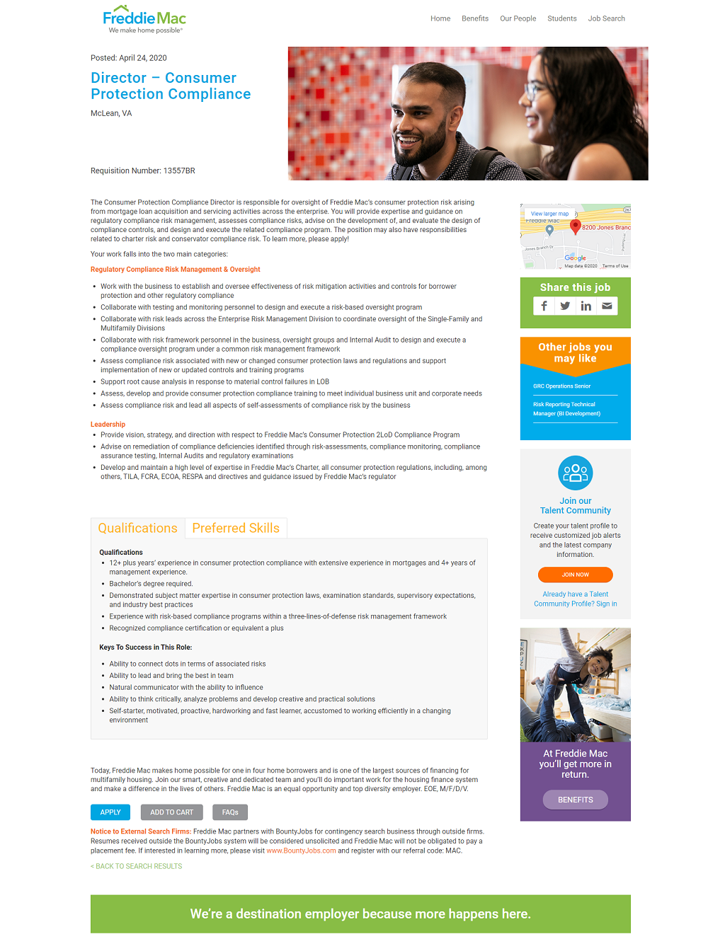
- Feature Image — “Job ad 101” — Freddie Mac uses smiling employees…because it works!
- Efficient Job Description Format — Notice the Qualifications and Preferred Skills section is “tabbed” so candidates can click back and forth. This helps make the job description look shorter and more digestible.
- Right Hand Rail — Creative use of bright colors in the job ad’s right-hand rail helps the recruitment content stand out.
Why I Wrote This
Creative job ads are a significant part of the pre-apply digital candidate experience. They are key to influencing candidates and convincing them to apply. Check out Ongig’s Career Site Builder to see examples of how our software furthers enhance your job ads.
