- 15 Great Tips on Job Posting Wording for 2026 - February 25, 2026
- 14 Best SEO Tips for Writing Job Descriptions (2026) - February 19, 2026
- A List of Common Offensive (Exclusionary) Words Used in Job Descriptions (2026) - February 16, 2026
If you ever feel like your job pages or employer branding are sub-par, don’t fret — just have a quick look at this:
I came across a major healthcare employer (500+ job openings!) and found 2 shocking things.
FYI –Mom and dad taught me not to kick someone when they’re down, so I’m keeping the name of this employer anonymous.
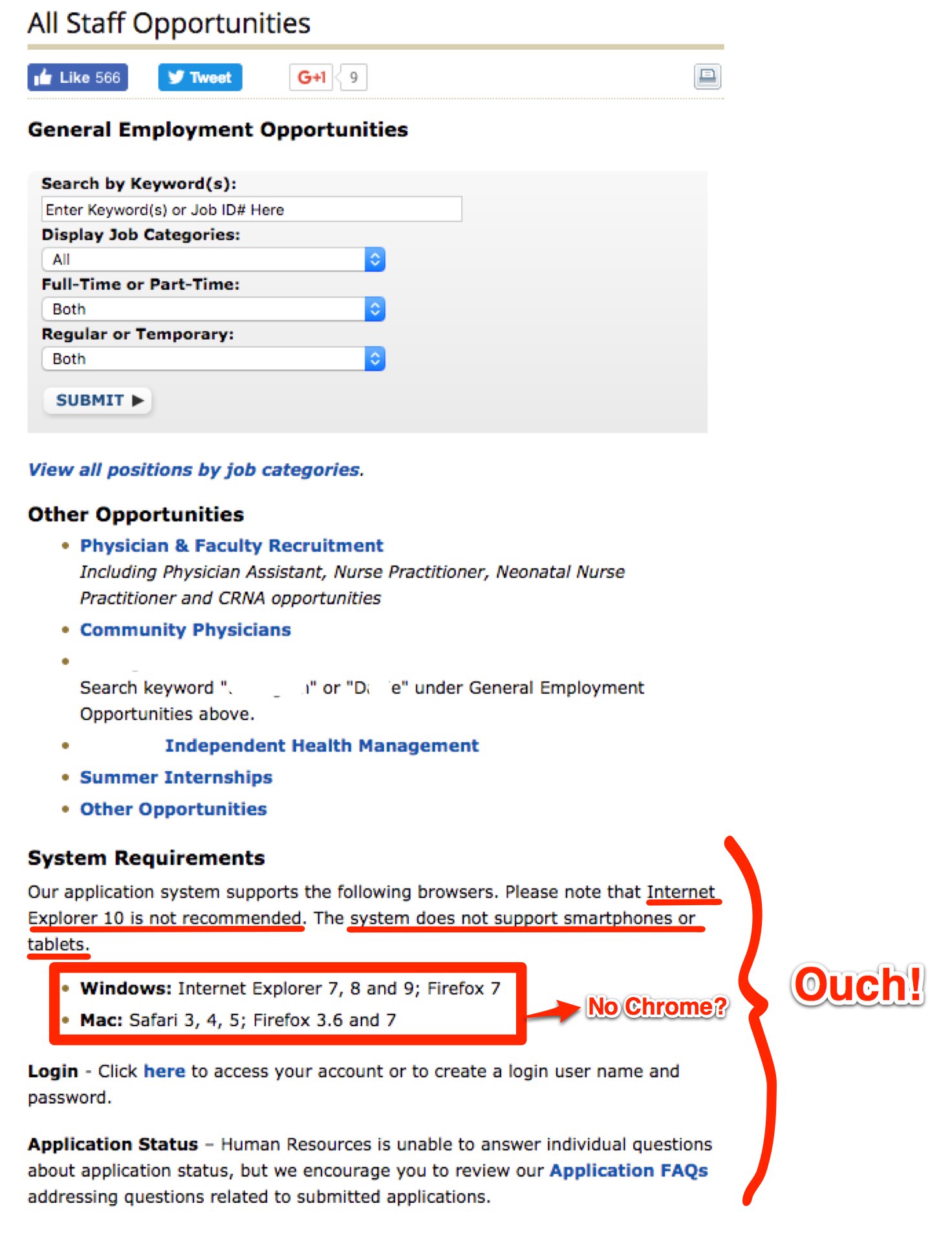
First, right there in the middle of the home page (underneath their job search box and “Other Opportunities”) is an archaic-looking set of “System Requirements”:

Are you reading these “System Requirements”?
Let met get this straight:
- You can use Internet Explorer, Firefox and Safari, but only the versions from 3 years ago (I won’t bore you with browser versions but let’s put it this way: Internet Explorer is up to version 11 right now and I’m using Safari version 10.0.3).
- If you’re on a tablet or smartphone then you are out of luck
- You can not use any version of Chrome (which our numbers show is the #1 browser for top candidates)
Could it get any worse?
Yes.
Who is this Employer?
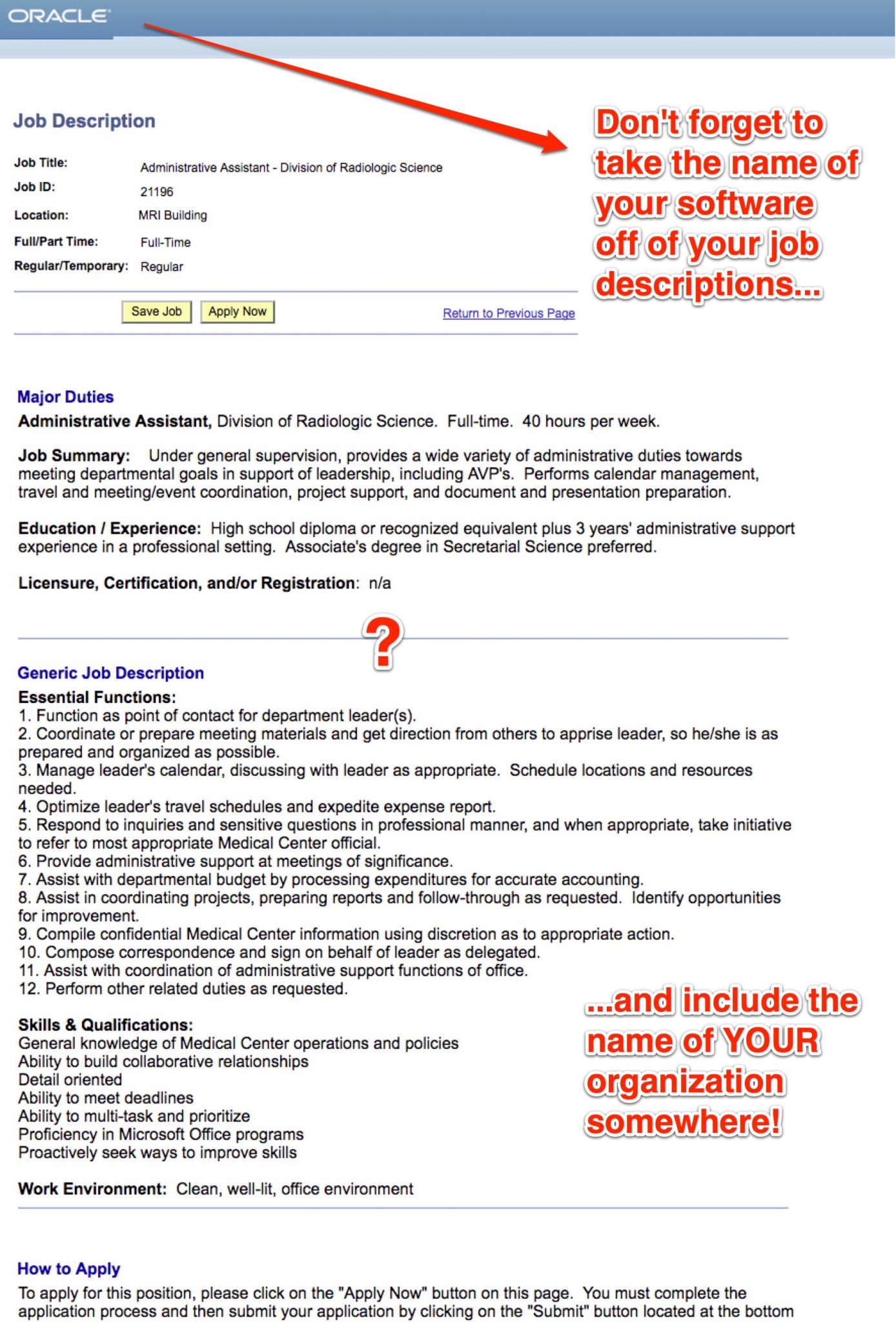
Check out the layout of the same employer’s job description.
Notice anything missing? How about the employer’s name?
Hint: It’s not Oracle — Oracle is the provider of the applicant tracking software behind it (looks like PeopleSoft) powering this JD.

It’s bad enough that Oracle’s name is at the top, but at least put your own employer name somewhere.
The employer’s name is nowhere on the page…literally.
I’ll be reaching out to this employer right about now to help!
[starbox]
