- Top 10 Helpful Augmented Writing Tools for Job Descriptions (2026 Update) - March 9, 2026
- Top 18 Employer Reviews & Ratings Sites for 2026 - February 27, 2026
- 7 Examples of Awesome Employee Testimonials And Content (2026 Update) - January 20, 2026
Your company career page is a vital piece of your digital recruiting strategy.
It’s where candidates go to find out about you and decide whether to look into your job openings (or move on to the next company).
With that in mind, if you want the best company career page the key is to focus on attracting and engaging candidates.

Today, I’m focusing on career sites to “Attract” and “Engage” your candidate. We have similar content on how to convert them through your actual job posting/job description on our Job Description Guide.
I’ve been reviewing some of the best company career pages and career page content. Here’s a list of 10 career pages that check the boxes for attraction and engagement.
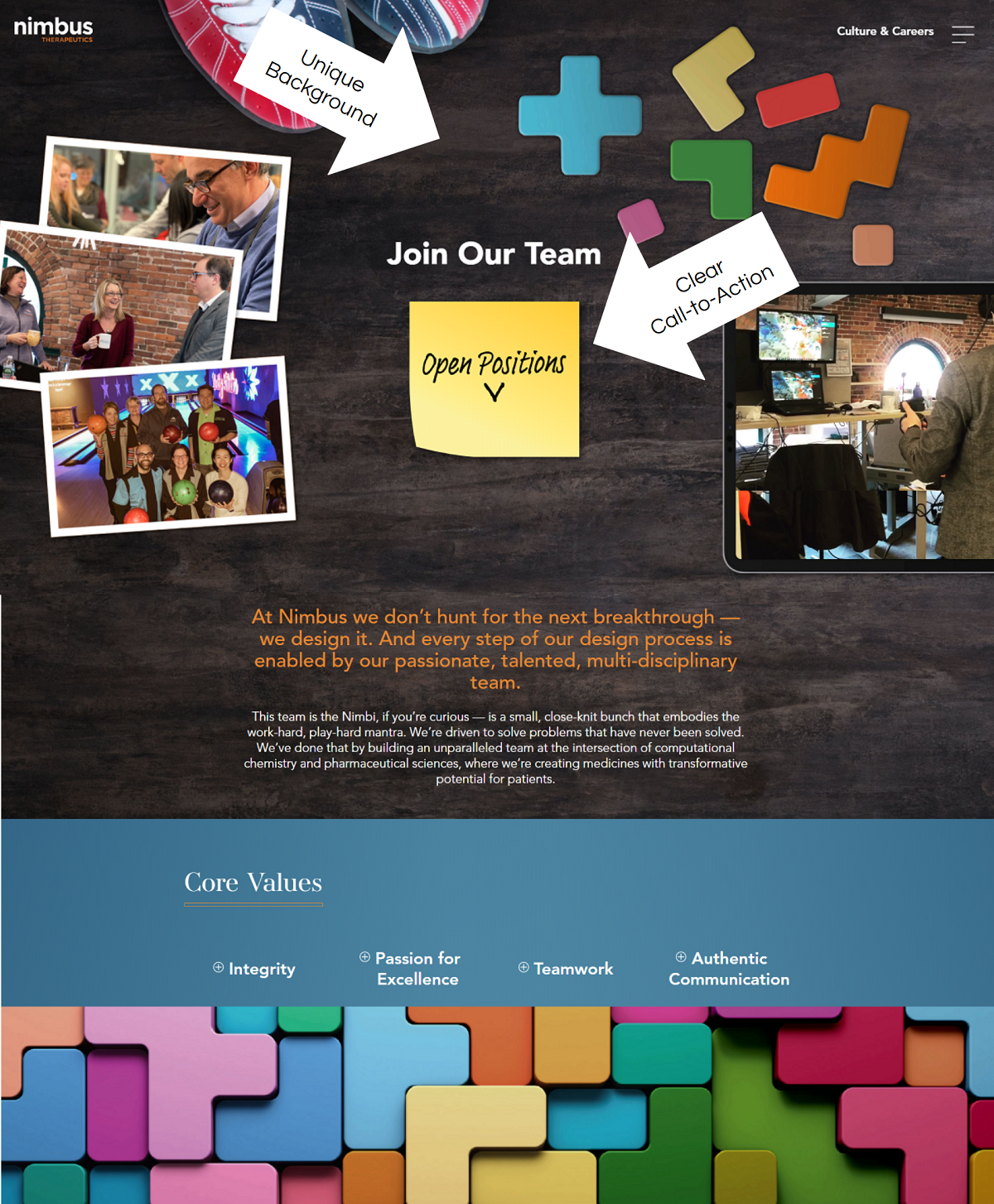
Nimbus Therapeutics
- Unique URL = Nimbus uses “culture-careers” instead of just “careers”. It’s subtle but different.
- Unique Background & Career Page Design — Notice how Nimbus uses a brownish background that looks like wood? It’s very hard to pull off a dark background because the text color needs to be a lighter color. They succeed with this and stand out because of it.
- Clear Call-to-Action — Their “Open Positions” primary call-to-action is nice and clear (center of the screen and above the fold on a yellow post-it note looking thing. Outstanding!).
Mastery Logistics
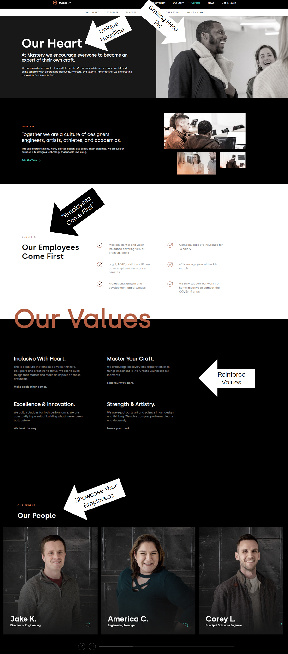
- Unique Headline — “Our Heart” is not something you see every day on a career home page. It does 2 things for the candidate:
- Gets their attention (the first step in any good marketing)
- Communicates their values
- Hero Pic — A picture of people smiling including a person of color is, if authentic, an effective use of media.
- “Our Employees Come First” — Most companies would list the section header “Benefits” but Mastery instead uses “Our Employees Come First” (with a little “Benefits” sub-header. This is effective in marketing because the benefits are the “What”, but most candidates care more about the “Why”.
- The “Values” and “Our People” sections after that reinforce that this is a values/people-centric organization.
Henkel
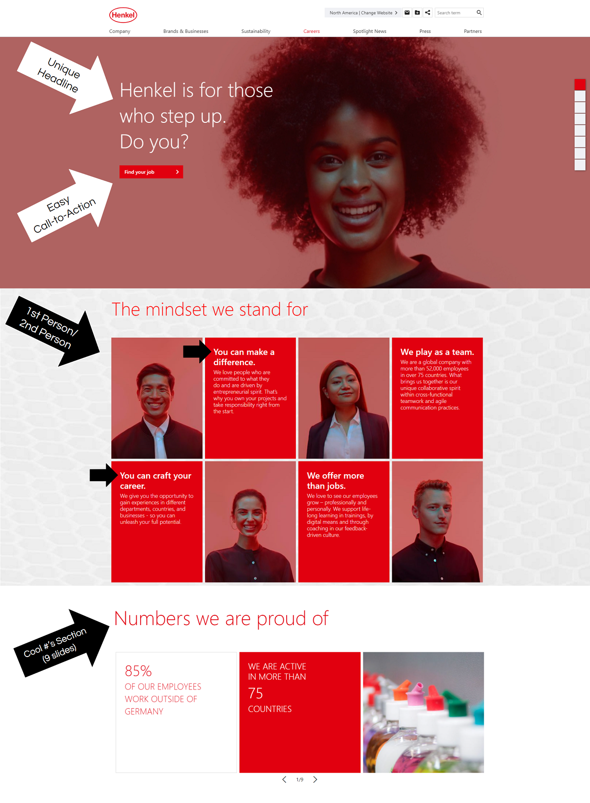
- Unique headline — “Henkel is for those who step up. Do you?”. This is effective because it:
- Stands out as unique. It’s bold. It’s saying “We are not for everyone”.
- It’s conversational. It starts with a statement about Henkel being a place to step up and then poses a question (conversational) which also acts as a challenge to the candidate. This is straight-up good marketing in a headline.
- Easy call-to-action — Notice that the “Find your job” is the primary call-to-action for the candidate and is front and center. They don’t mess around. If the headline grabbed you, it’s time for the candidate to search for jobs.
- 1st Person/2nd Person — Do you notice how the “”Mindset”” section is all about “We” (1st person) and “You” (2nd person)? This makes it more conversational.
- Numbers we are proud of — That’s a clever name for a #s section. They could have easily just said “Numbers” which wouldn’t be nearly as effective.”
Palo Alto Networks
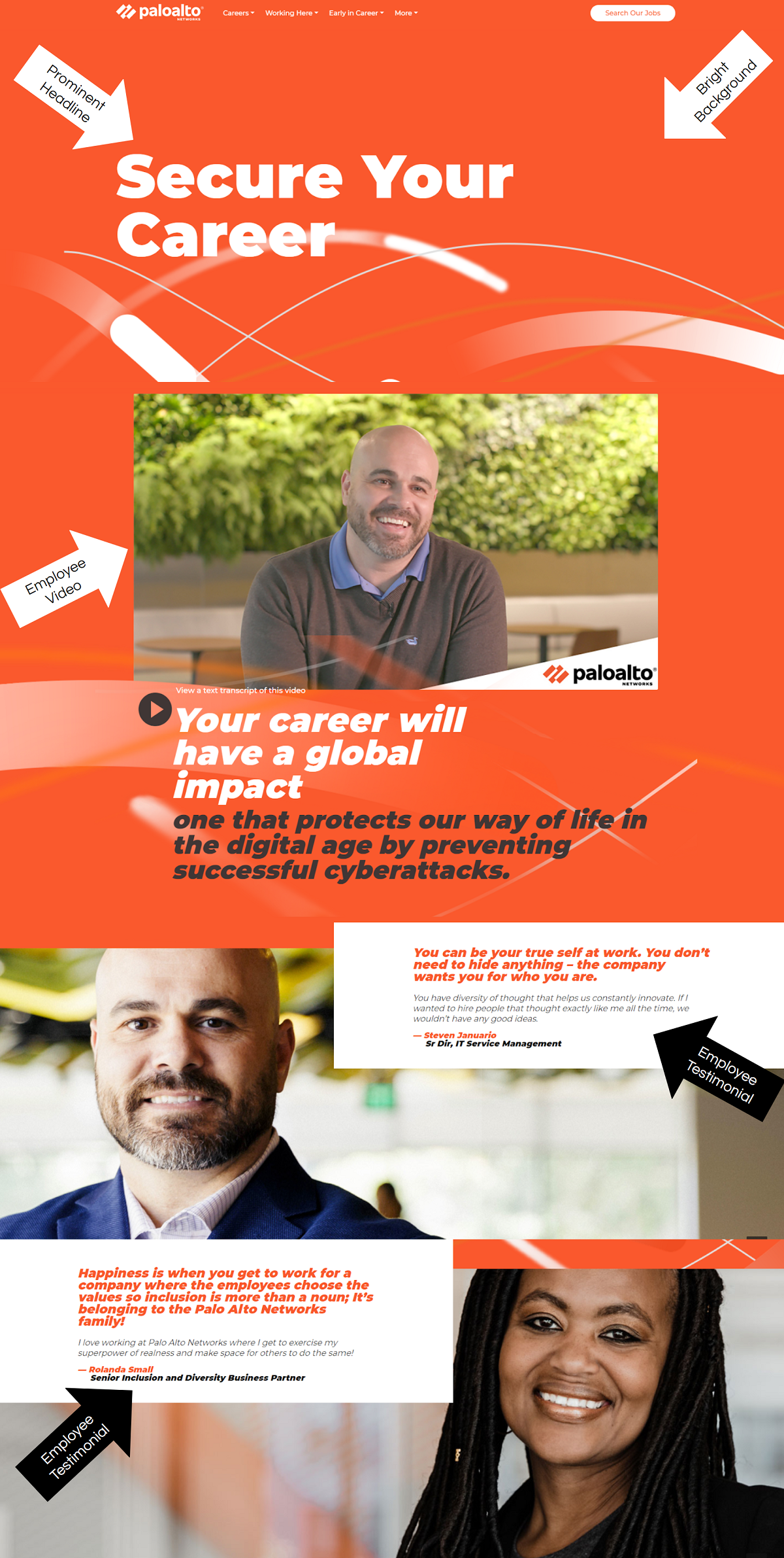
- Color Scheme — Their bright orange background catches your attention right away.
- Headline & Video — Once they catch your attention they engage you with a prominent headline and video of one of their Sr. Directors.
- Extensive Career Page — Their page is a lot more extensive than the screenshot below, but for the sake of space, we shortened it (view their full career page ). Some of their additional sections include: “Life at Palo Alto Networks”, “Veterans”, and “Join Talent Community”. These sections also link off to a dedicated page on their career site.
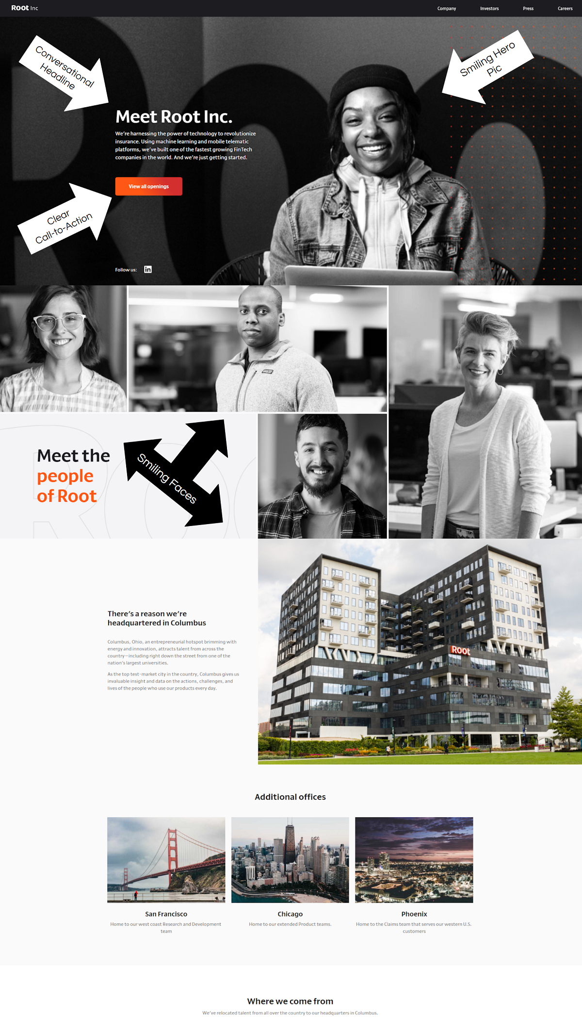
Root Inc.
- Awesome hero pic media — They do a great job of using their employees for the majority of the media on their career page.
- Conversational Headline — “Meet Root Inc.” is inviting and the sub-headline speaks to their focus “Challenging the $250 billion insurance industry”.
- Clear call-to-action — “View All Openings” is front and center and the button is the only orange button element on the page. This makes it stand out.
Vungle
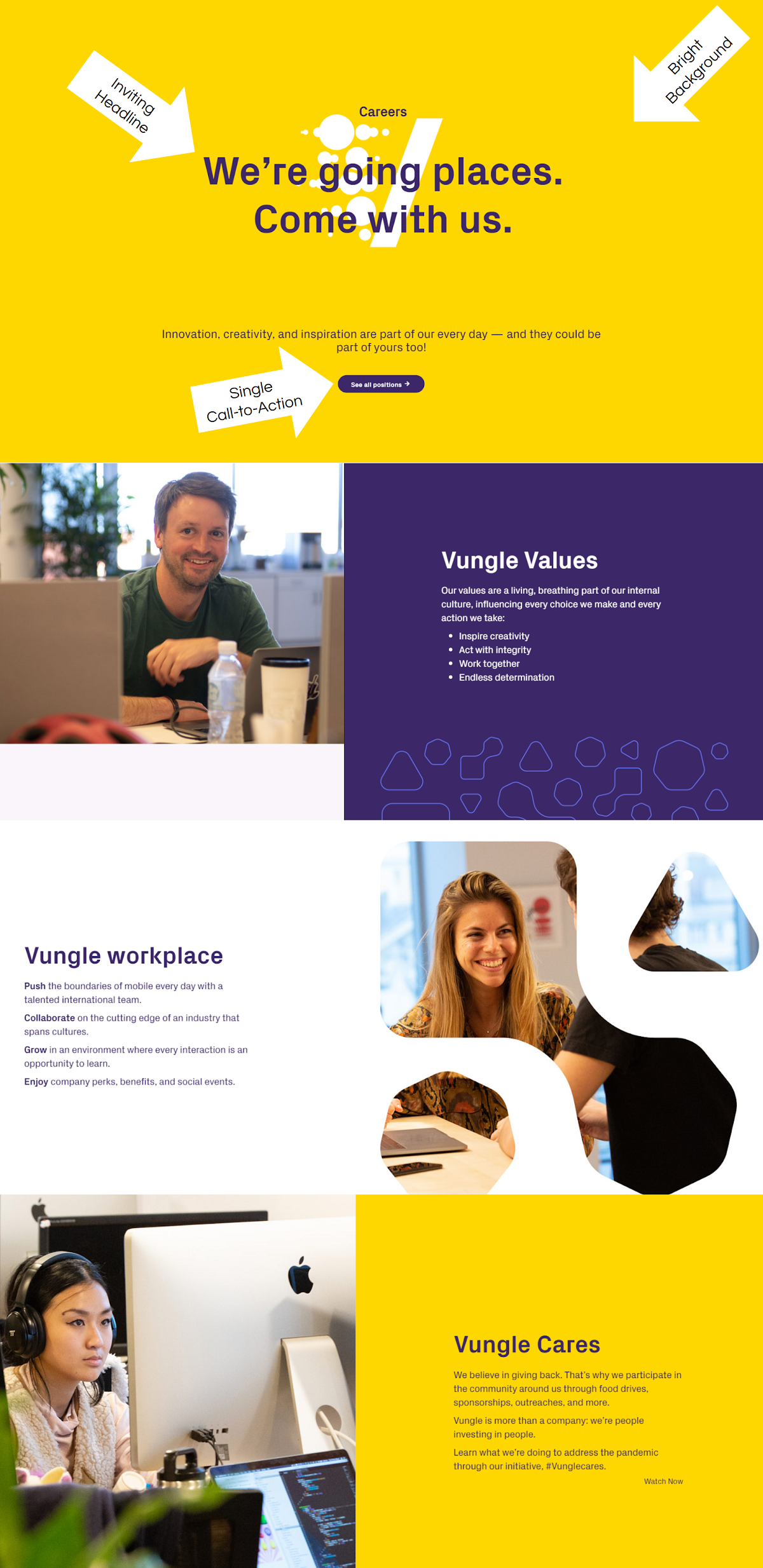
- Headline — Vungle shows confidence in their company with “We’re going places”, then invites the candidate “Come with us”.
- Color Scheme — Like Palo Alto Networks, Vungle has bright company colors and utilize them on their career page. This yellow/gold background catches your attention quick!
- Simplicity — I like the simplicity of this career page. Only 3 sections and a bit of text, in my opinion, this holds more weight than a career page packed with a ton of text.
- Single Call-to-Action/Button — For the most part if candidates are landing on your career page they’re looking for a job. You can tell Vungle knows this because they have a single button/call-to-action and it’s to “See all positions”.
Rapid 7
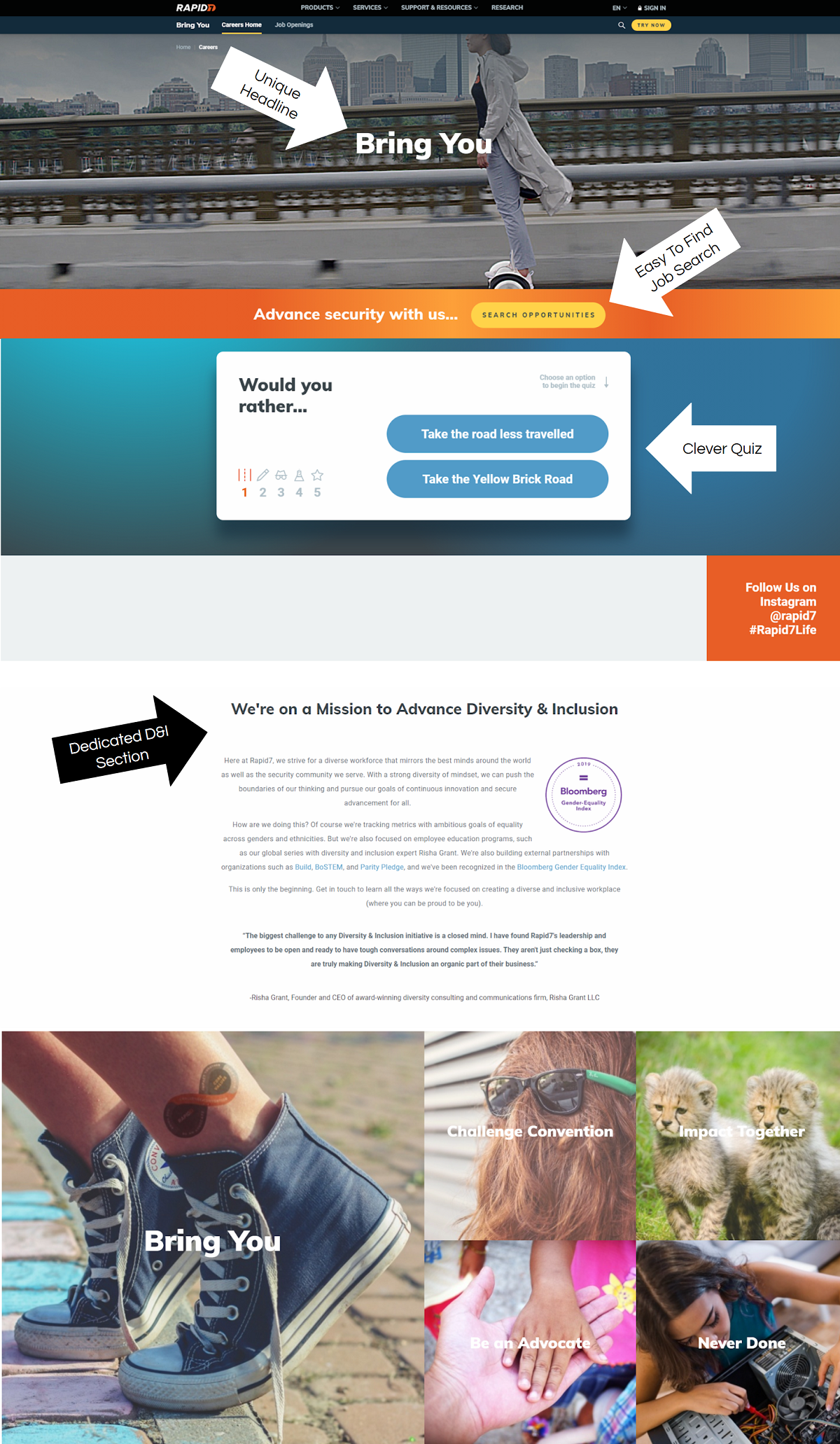
- Unique Headline — “Bring You” is short and speaks to the candidate (“you”).
- Easy Job Search — They immediately give you a link to dive into job openings. You’d be amazed at how many career pages make it hard to find the actual jobs.
- Clever Quiz — They prompt the candidate with a question of “Would you rather…Take the road less travelled or Take the Yellow Brick Road” that leads to a fun quiz.
- Diversity & Inclusion Section — Show candidates D&I matters to you by dedicating a section of your career page to it.
Nordstrom
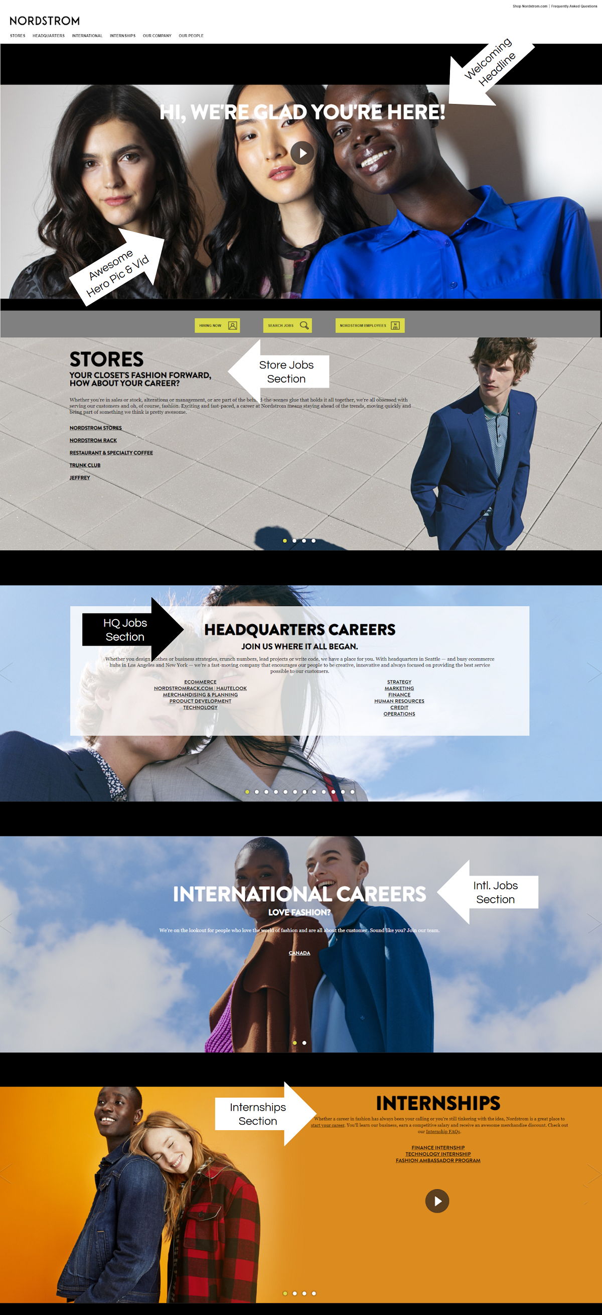
- Headline — Talks directly to the candidate “Hi, We’re glad you’re here!”
- Feature Image/Thumbnail — The feature video thumbnail doubles as an awesome feature image of 3 diverse employees from different backgrounds.
- Feature Video — A great employer branding video that gives insight into the workplace. You also get to hear from Nordstrom leaders.
- Career Page Layout — I like how they categorize candidates immediately. The sections on their career page link off to specific job categories (Stores, Headquarters, International, Internships) to create a more targeted candidate experience.
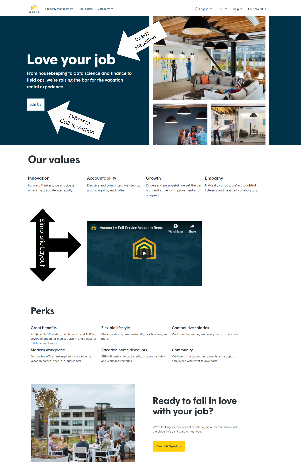
Vacasa
- Great headline — It starts with something every candidate wants, to love their job.
- Call-to-Action — Nice different action verb “Join Us”, we’re used to seeing “Apply Now” or “Job Openings”.
- Colorful Office Images & Smiling Faces — The rest of the career page is full of high-quality photos of the office and employees.
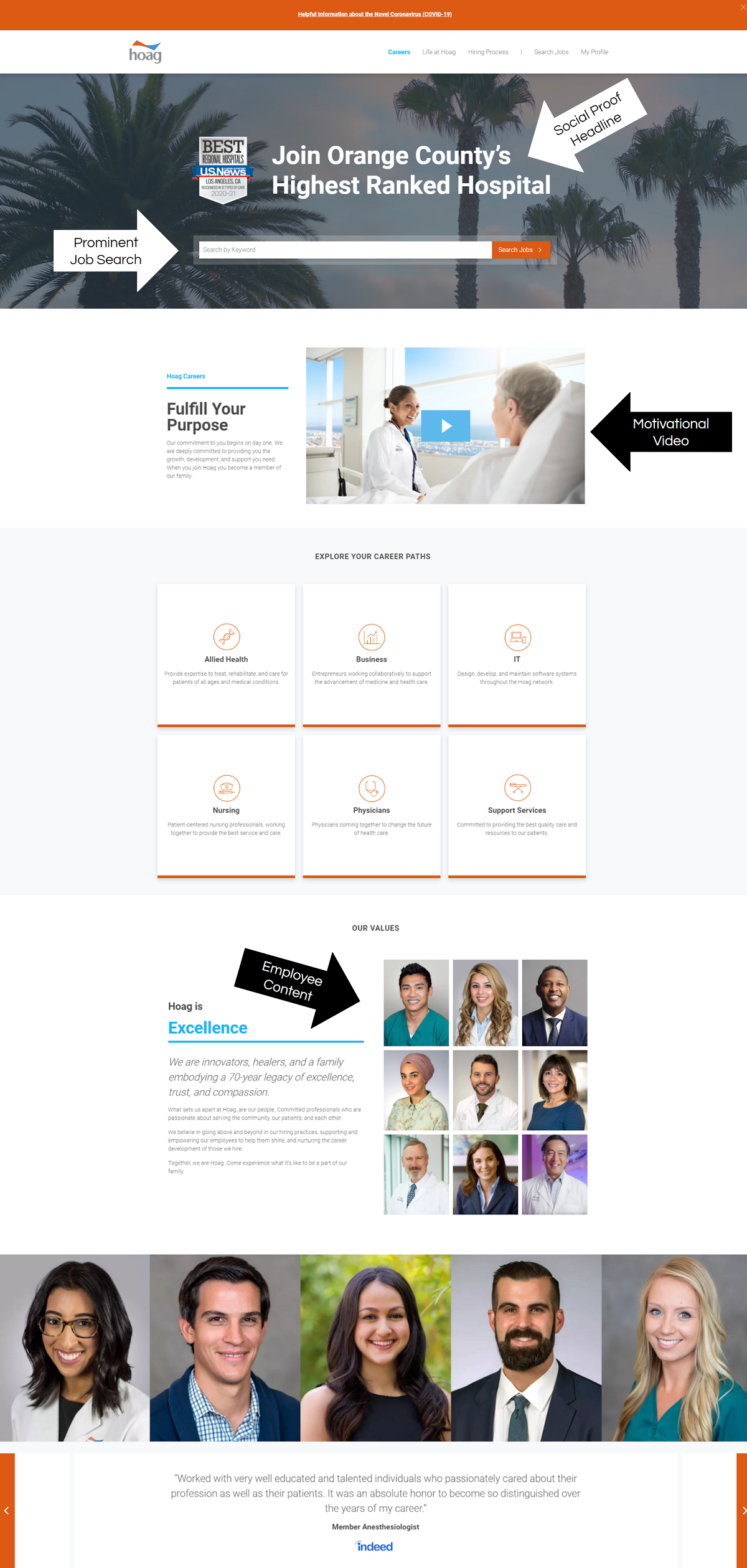
Hoag
- Great headline — Starts with an action verb (“Join”) and then is specific about the location (“Orange County”) and then uses social proof (“Orange County’s Highest Ranked Hospital”).
- Call-to-Action is Clear — A big search box for jobs above the fold makes it obvious what the candidate should do next.
- Smiling Faces — The rest of the career page is full of smiling/happy employees, something we always recommend incorporating.
WHY I WROTE THIS
Ongig’s Career Site Builder helps employers optimize their career pages with the goal of attracting and engaging candidates. These career page examples help articulate the best practices for content and ideas.
