Latest posts by Nick Misa (see all)
- 10 Attractive Job Posting Examples - December 23, 2024
- Top 18 Employer Reviews & Ratings Sites for 2024 - September 20, 2024
- Recruiting Microsites: The Ultimate Guide for Better Recruiting - September 6, 2024
Your career page is the front door for your online candidates.
When candidates knock on your door, will they be greeted with something creative or something boring?
If your answer is the latter, you might want to give your career page a makeover.
Check out this list of 10 career page examples of employers we’ve noticed lately:
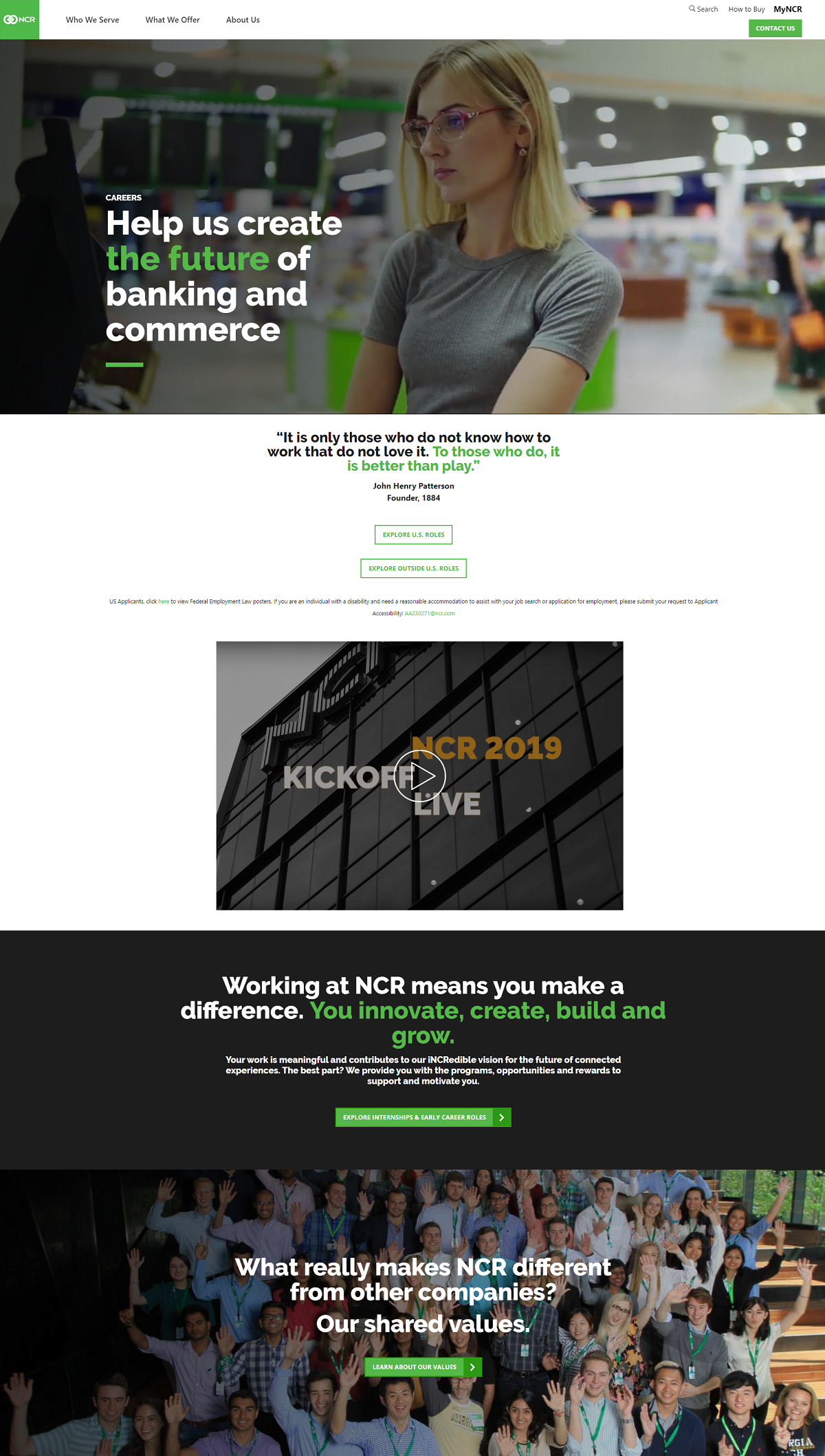
NCR
- Strong Headline and Feature Images: Great headline and also shows multiple images in slideshow format.
- Highlighted Text: NCR highlights certain keywords/phrases (in green) that they want to emphasize to candidates.
- Additional Career Page Sections: Employee Programs and Experiences, Total Rewards (Incentives, bonuses, health plans, allowances, etc.), Life at NCR.
- This is an extensive career page, view NCR’s full career page.
U.S. Xpress
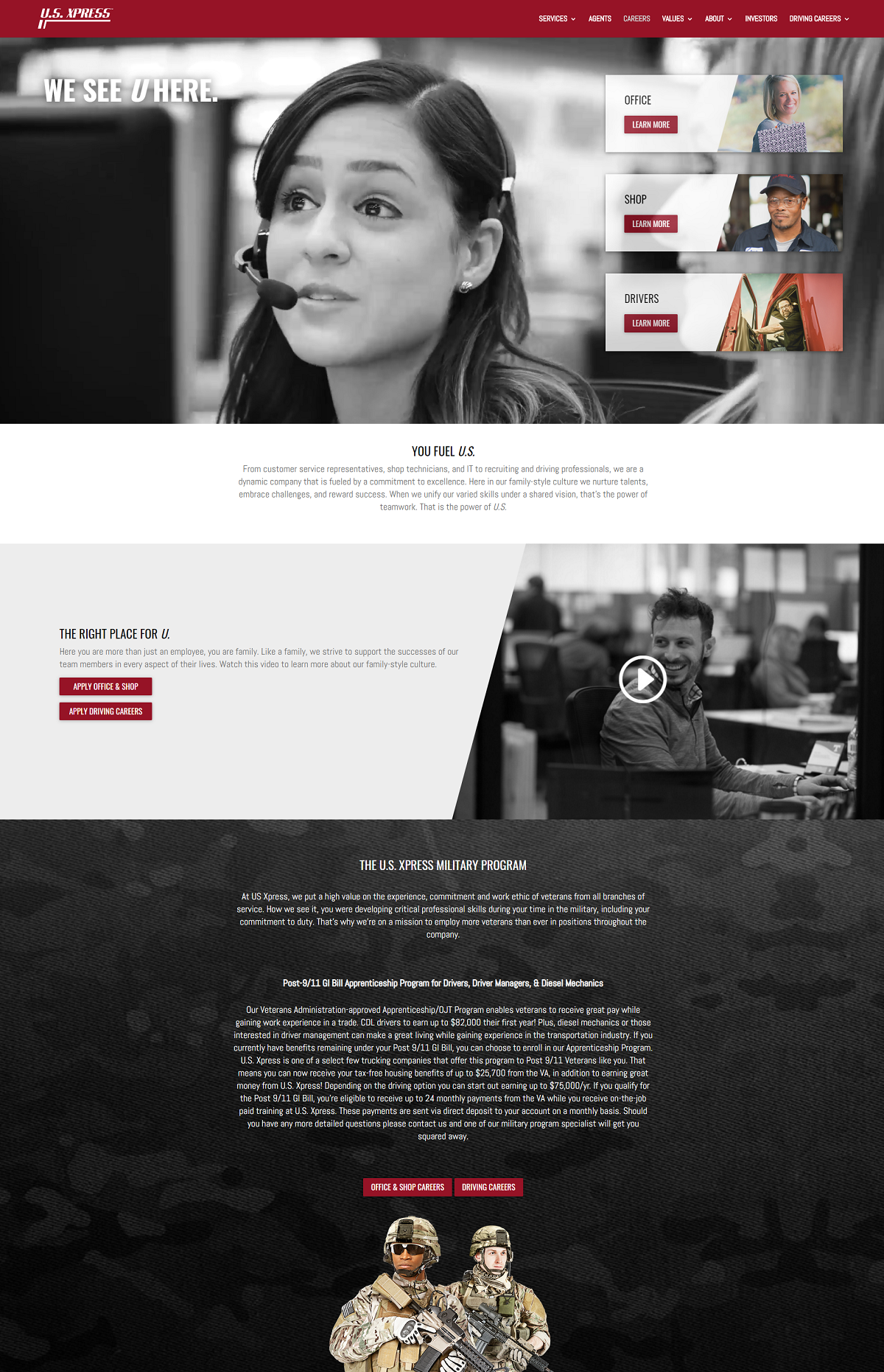
- Strong Branding: Consistent color scheme/bold look.
- Clear Call-to-Action: Apply button is front and center. Also has separate buttons for Office & Shop and Driving careers to create a more targeted experience for candidates.
- Addresses Main Pain point of Candidates: Candidates despise long application processes and USX makes it clear theirs is 2 min. or less.
- Nice Call Recruiter Pop-Up: The pop-up to call a recruiter with the phone # is a nice “secondary” call-to-action in case the candidate didn’t want to apply immediately or has extra questions.
Jones Lang LaSalle
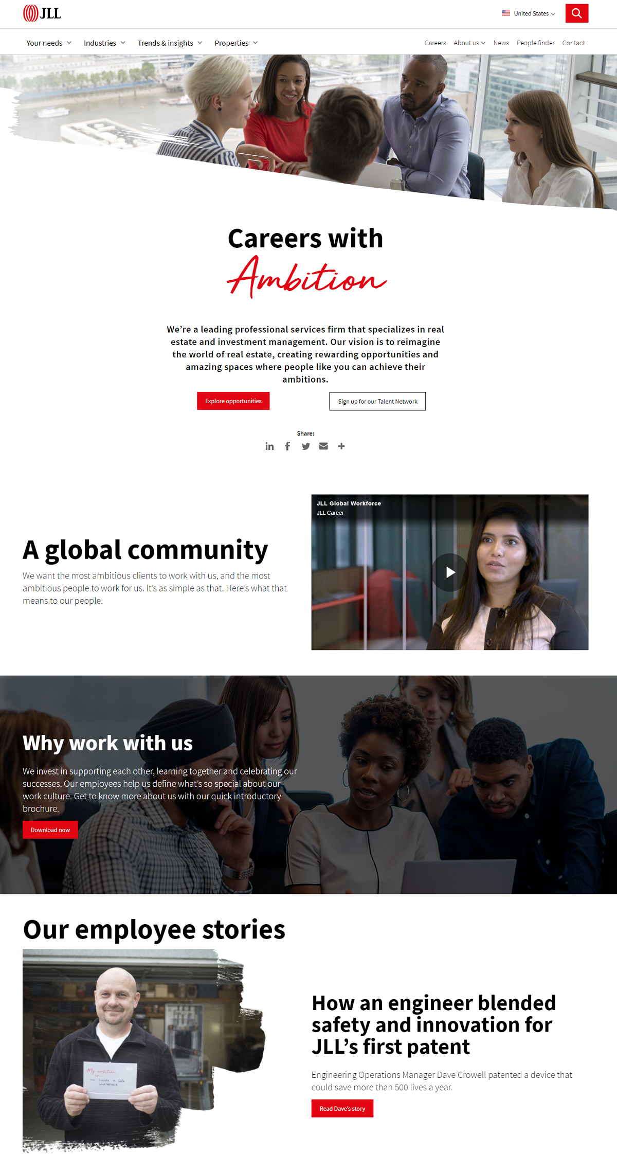
- Feature Image: A nice diverse team picture.
- Calls-to-Action: First 2 calls-to-action off the bat are “Explore Opportunities” and “Sign Up for our Talent Network”. It’s beneficial to get straight to the point.
- Employer Branding Video: Candidates get to hear from JLL employees about what JLL is all about.
- Employee Stories: Each employee story links off to a full page story.
OVO Energy
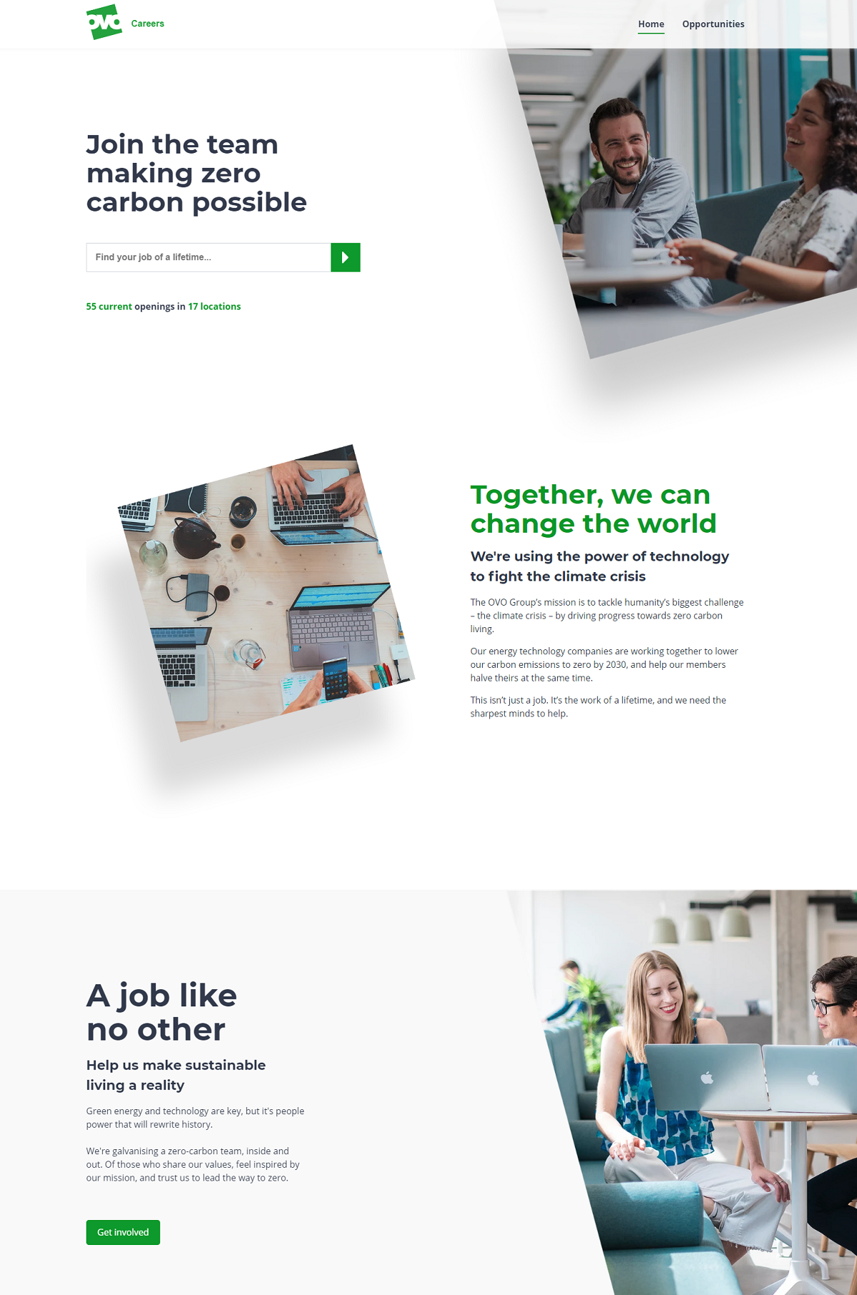
- Clear Headline: “Join the team making zero-carbon possible”. This answers the candidate question “why”
- Smiling Pic for Hero Media: That’s almost always effective
- Clear Call-to-Action: The search box for jobs is above the fold and easy to find. It’s amazing how many times the link to jobs on a career site is hard to find. This one is easy!
- Additional Career Page Sections Include: Meet the OVO Group (shows their full portfolio of companies), Values, Perks, and Cool office/location content.
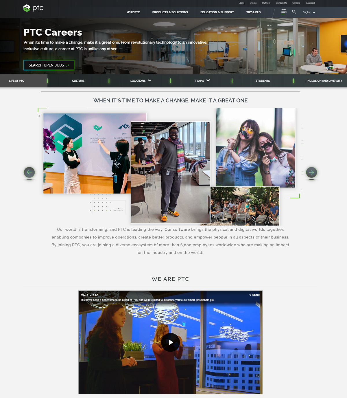
PTC
- Header Image: Great first impression with a clean pic of the office.
- Tagline: “When it’s time to make a change, make it a great one”. This is clever because it appeals to both passive candidates (who would have to change from their current employer) or to recently laid-off candidates (of which there are many (and great ones) due to COVID).
- Gallery of Pics: A fun mix of people working and playing.
- Additional Career Page Sections: Culture content, “Meet [name of employee]” videos, and Employee quotes.
Stanley Black & Decker
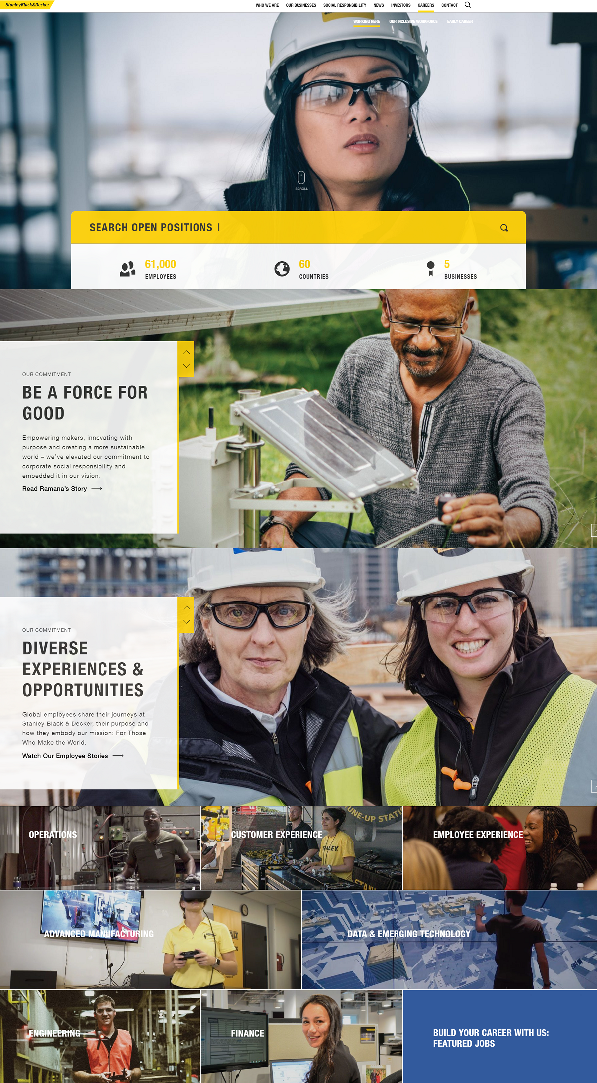
- Great Images: Visuals are the cornerstone of Black & Decker’s career page and they look great.
- Fixed Scrolling: Only allows you to scroll section to section and ensures candidates see every section of the career page.
- Employee Content: Most of their career page sections are dedicated to employees and their stories. This is the type of content candidates want to read about.
- Additional Career Page Content: Innovation Strategy of products, How We Operate, and List of Brands.
First American Financial
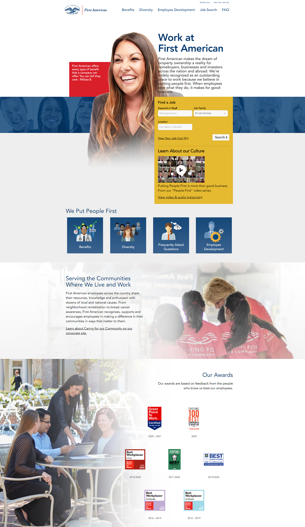
- Feature Image: Features an employee with a quote. Also has a cool blue-shaded bar behind the image that shows a row of employees.
- Culture Video : 3-minute video with words from leadership and employees.
- Clickable Elements: Benefits, Diversity, and FAQ images click through to topic dedicated pages.
- Employer of Choice Awards: Flaunt them if you got them. These will catch candidates’ eyes.
Sanofi Genzyme
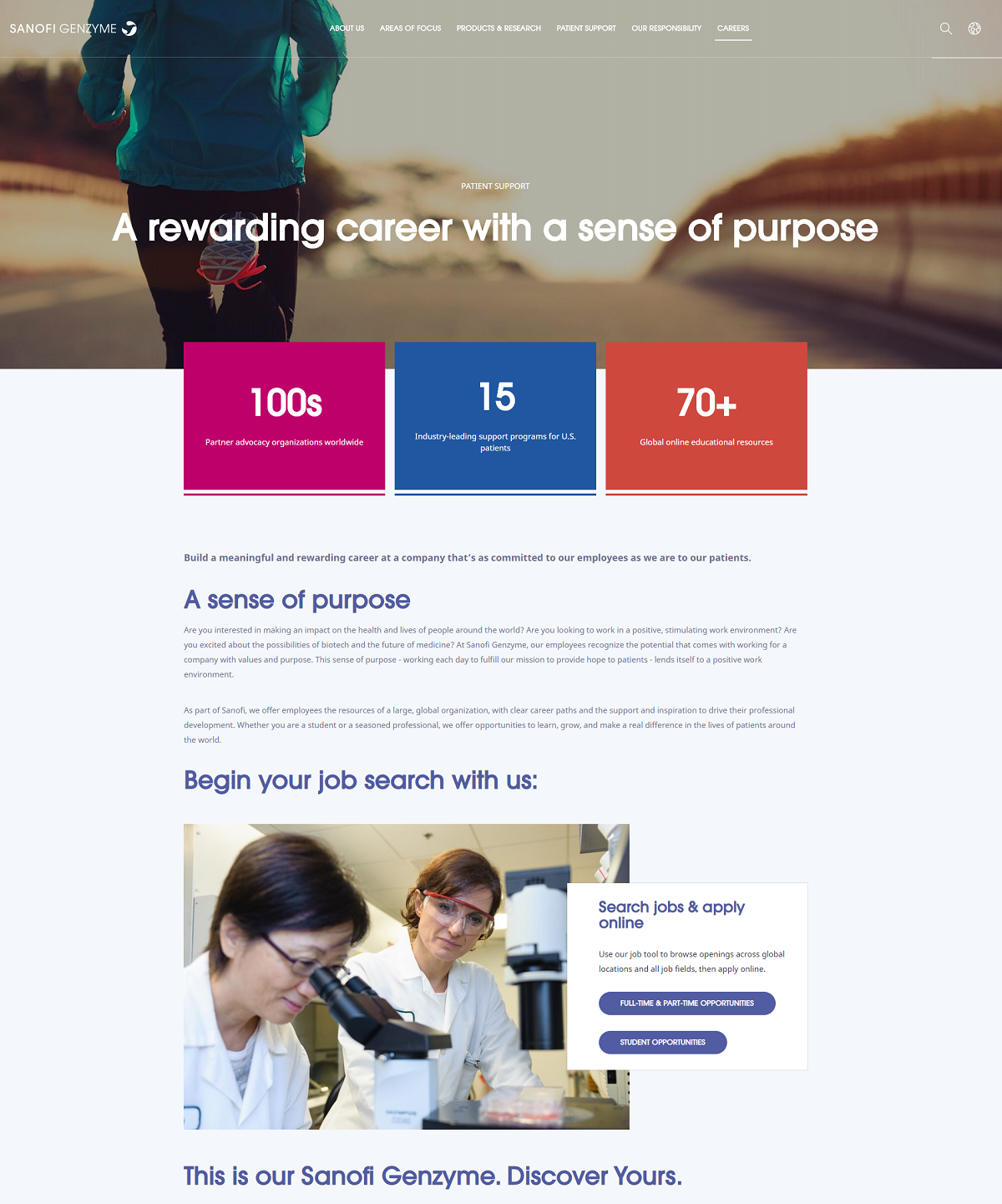
- Strong and Clear Headline: Short and to the point.
- Useful Data Points: Highlight how widespread their company is.
- Comforting/Easy To Read Fonts: It flat out looks better when your headers stand out and are differentiated from ordinary text.
- Additional Career Page Sections: Leadership profiles and EEO statement.
ABM Industries
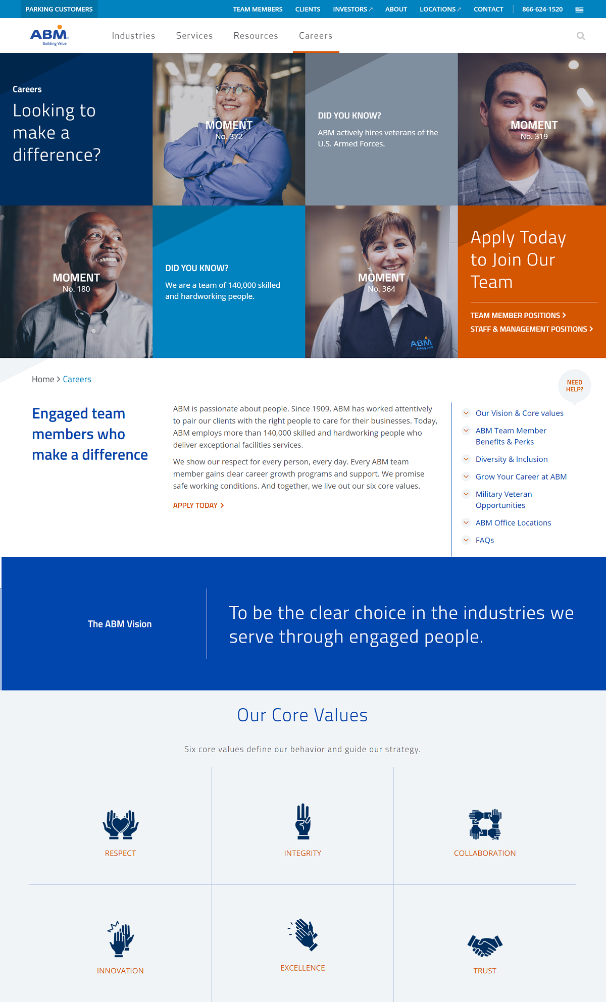
- Tile Style Feature Image: This is a cool above-the-fold setup. Each “Moment No.” tile clicks through to a video of the specific employee highlighted. They mix in a couple of cool facts on alternating tiles.
- Clear, Readable Text: When you see the text portion of the career page the text sticks out because it is big and very readable.
- Core Values: When each value is hovered over you get a quick sentence or two about that specific value.
- Additional Sections: Life at ABM (with employee-generated content), Team Member Benefits (Health, retirement, additional perks), and Diversity and Inclusion.
Luna Grill
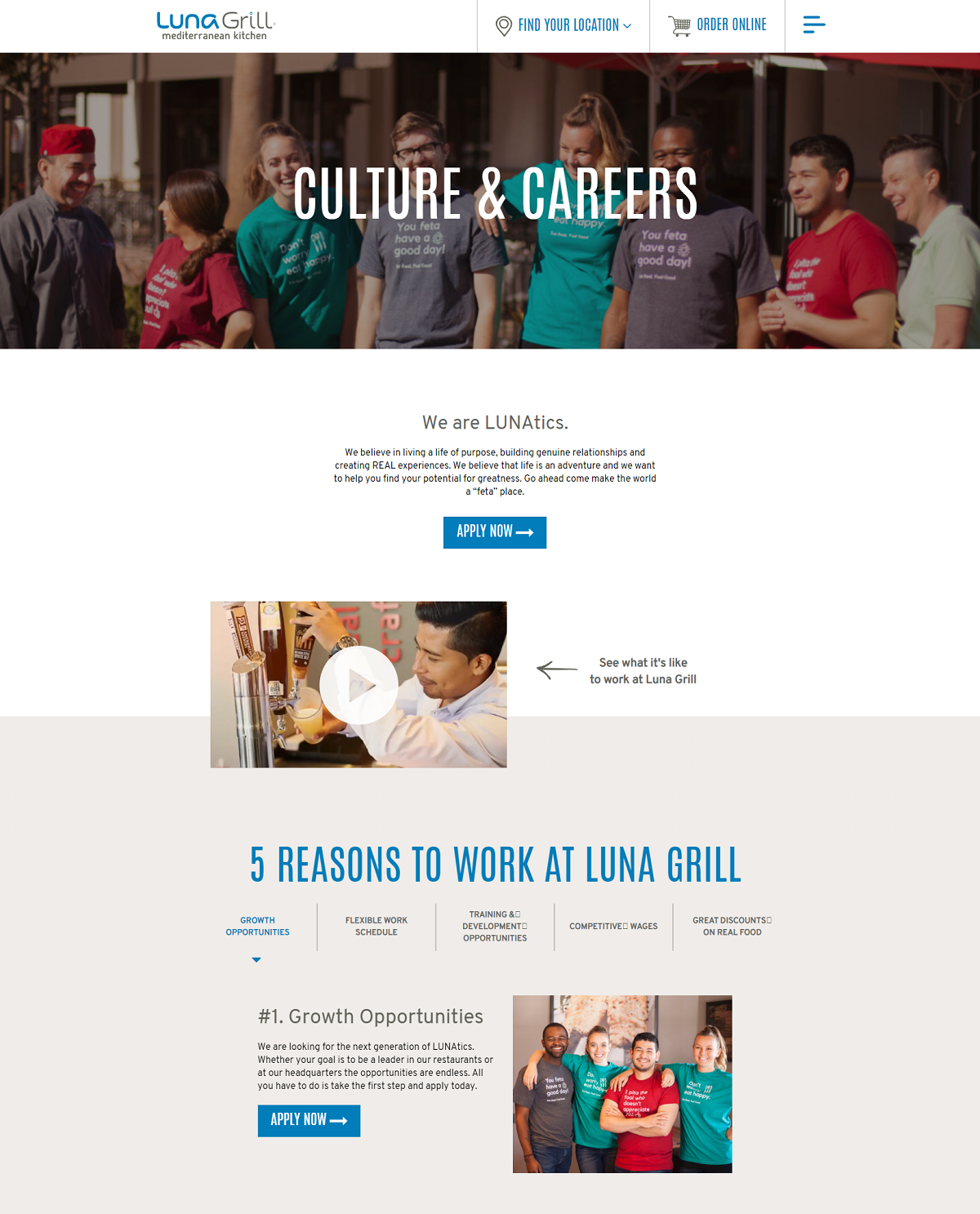
- Branding Your Employees: “Luna-Tics” is a fun draw to candidates.
- “5 Reasons”: Using a proven headline like “5 Reasons to Work at Luna Grill” is a unique way for candidates to consume the message you’d like to deliver. There’s a reason that the most popular articles in the world have headlines with numbers (5 Reasons, 7 Steps, etc) — they work!
- Multiple Apply Now Call-To-Actions: They have an Apply Now button in every section so candidates can’t miss it.
- Additional Career Page Sections: Core Values and Instagram content.
Why I wrote this
Career pages are critical for recruiting candidates online. Ongig’s Career Site Builder gives employers the ability to create career pages that are full of engaging content and media that attract candidates.
