- 15 Great Tips on Job Posting Wording for 2026 - February 25, 2026
- 14 Best SEO Tips for Writing Job Descriptions (2026) - February 19, 2026
- A List of Common Offensive (Exclusionary) Words Used in Job Descriptions (2026) - February 16, 2026
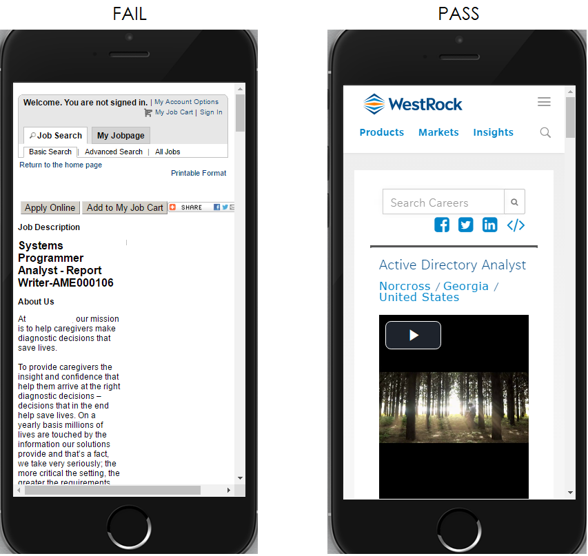
Many of you have job descriptions that fail the critical Google mobile test, negatively effecting your mobile recruiting strategy. We recently touched on this: Do Your Job Descriptions Pass the Google Mobile-Friendly Test? . The reason that you should care is that if you don’t fix these errors, Google will send more candidate traffic to your competitors who DO pass the Google Mobile test.

The 5 Most Common Reasons Your Job Descriptions Fail on Mobile
1. Your font is too small on your job description
Candidates shouldn’t have to zoom in through pinching. Some tips:
- Use a base font size of 16 CSS pixels and a range of 12 to 20 CSS pixels)
- Adjust the size of font based on properties of the font being used in the job description.
- The text on a mobile JD needs vertical space between its characters. Google recommends you use the browser default line-height of 1.2em.
- Restrict the number of fonts used and the typographic scale: too many fonts and font sizes lead to messy and overly complex page layouts.
For more details, check out Google’s recommendations here: Use Legible Font Sizes.
2. Your web pages don’t specify what’s called a “viewport”
We’re nerding out here a bit, but most of you make this mistake and it’s a simple fix. Basically, Google asks that you set what’s called a ‘viewport’ that matches the device that the candidate is on by width and scale.
Check out Google’s tips on their Set the Viewport page.
3) Your candidate has to scroll to the right on job pages
Candidates should never have to scroll to the right to see content on your job description. The main tip to avoid this is to use the meta viewport value width=device-width to match the screen’s width regardless of device (anywhere from a tiny phone screen to a large desktop monitor).
4) You use flash on your job pages
You might be using Flash to show animations or for navigation, but some bad news: most mobile browsers do not like Flash-based content — they can’t easily render it.
You should stick to using modern web technologies. If you are adding video to your job descriptions, here are some Video Tips from Google; and if you are using images, check out Images Tips from Google.
If you want a general primer on what modern technologies Google recommends to eliminate Flash, check out Google’s Web Fundamentals guide.
5) Your buttons and links are too close together on the mobile JD
If your buttons and links are too close together on your mobile job description, the candidate can’t easily tap those without accidentally tapping something eles near it.
Google has a bunch of tips on this over here: Size Tap Targets Appropriately.
And the earlier you can fix these mobile job description problems the better — Google rewards you for longevity. E.g. The longer your pages are passing their mobile test, the more of an edge they give you in search rankings over your rivals.
If you want a free mobile recruiting audit of your JDs, just give Ongig a holler. For tips on writing job descriptions, check out How to Write a Job Description — Best Practices & Examples.
