If you are redoing your company career site, check out the list below — it’s a list of 20 company career sites that have impressed us recently.
We included career pages from large publicly traded enterprises on down to smaller companies you’ve likely never heard of.
The 20 company career sites below are in alphabetical order and include a few bullets and features that make them great. You can get most features mentioned below through Ongig’s Candidate Experience Software. If you want to transform your job descriptions, make sure to check out Text Analyzer.
Enjoy!
***Update — If you enjoy this article, you might also value our these 2 recent posts: 15 Must-Haves for Your Company Career Site and 20 Creative Ideas for Your Company Career Site.
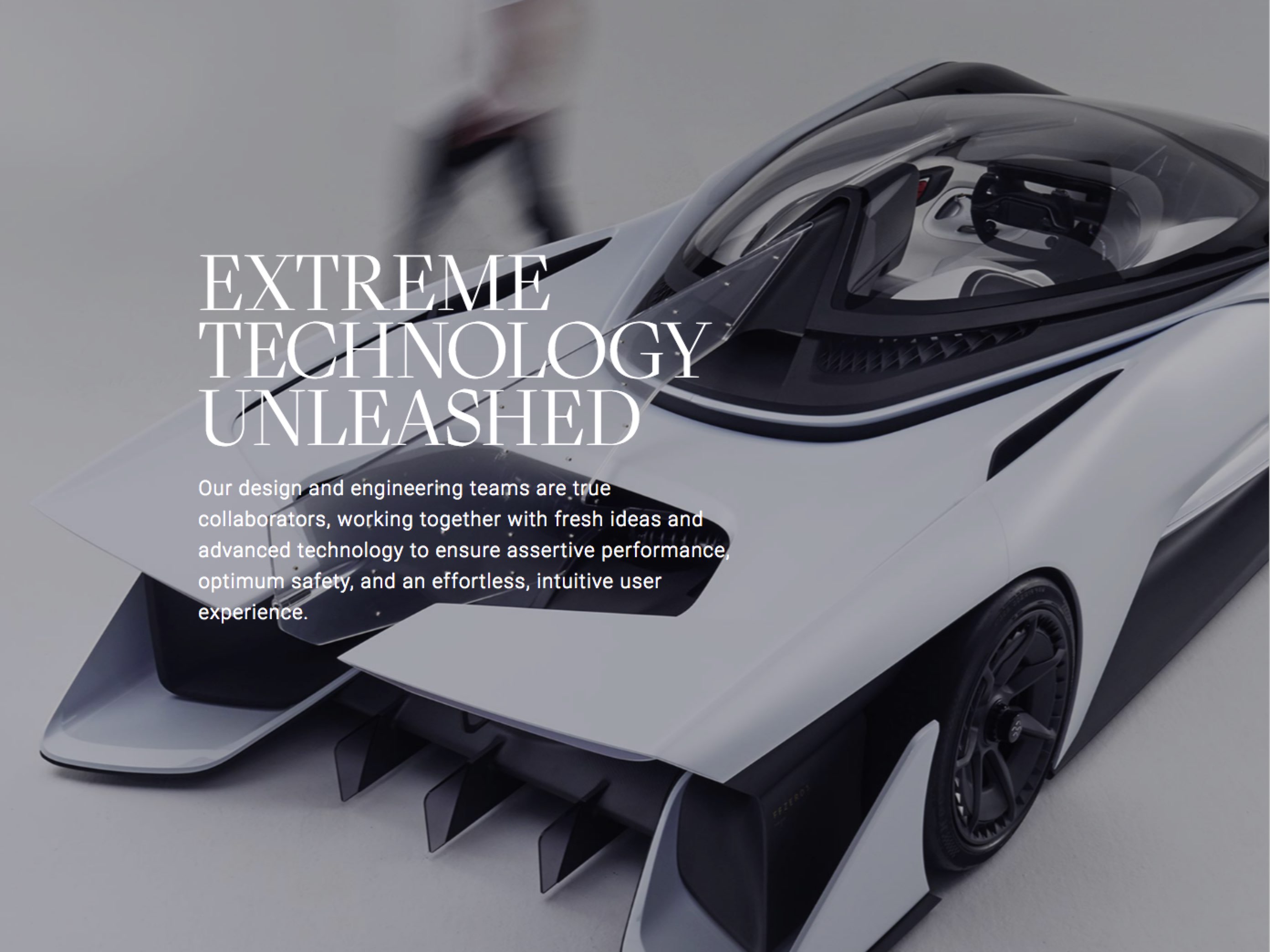
Faraday
If you believe “less is more”, than check out Faraday (a competitor to Tesla in electric cars) because they have perhaps the most minimalist company careers site we’ve seen. It consists of:
- Headline — A simple headline mentioning they are cutting edge
- One Hero Media Pic — It’s eye-catching and along with the headline gets your attention (marketing 101).
- Summary of Benefits — They include a simple list of Professional and Personal benefits hires receive.
- List of Jobs — They then list a handful of jobs. They use Lever which itself is the ATS with a minimalist design compared to other applicant tracking systems.
- Bat Car — Finally, at the bottom of the career home page, they include a slick photo of their futuristic car with a link to “Explore our Approach”
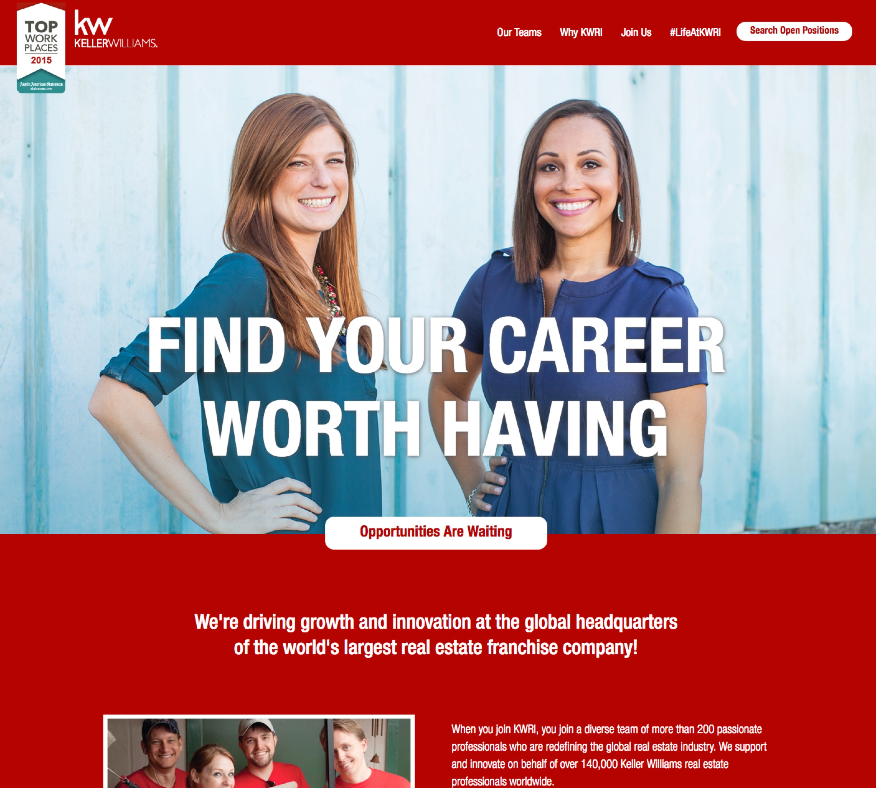
Keller Williams
Keller Williams has its main Careers portal but where they really shine is the “Recruiting Brand” called LifeAtKWRI that Holly Priestner and crew at KW created. Some highlights:
- Dedicated URL — They use a separate URL just for this recruiting brand, so they are not constrained by Keller Williams’ corporate web site navigation
- Great Headline/Hero Media — A picture of a smiling person with a large-type headline “Find Your Career Worth Having”
- Branding — The Keller Williams red is omnipresent.
- Primary Call-to-Action — The main call to action (squint your eyes and you’ll see) is the “Opportunities Are Waiting” and “Search Open Positions” (they are both the same thing — a search of the job openings.
- Explore Our Culture — They have an entire #LifeAtKWRI page dedicated to Tweets.
- Teams — Check out their Teams page which has the names of the different departments, a pic of each and the # of open positions.
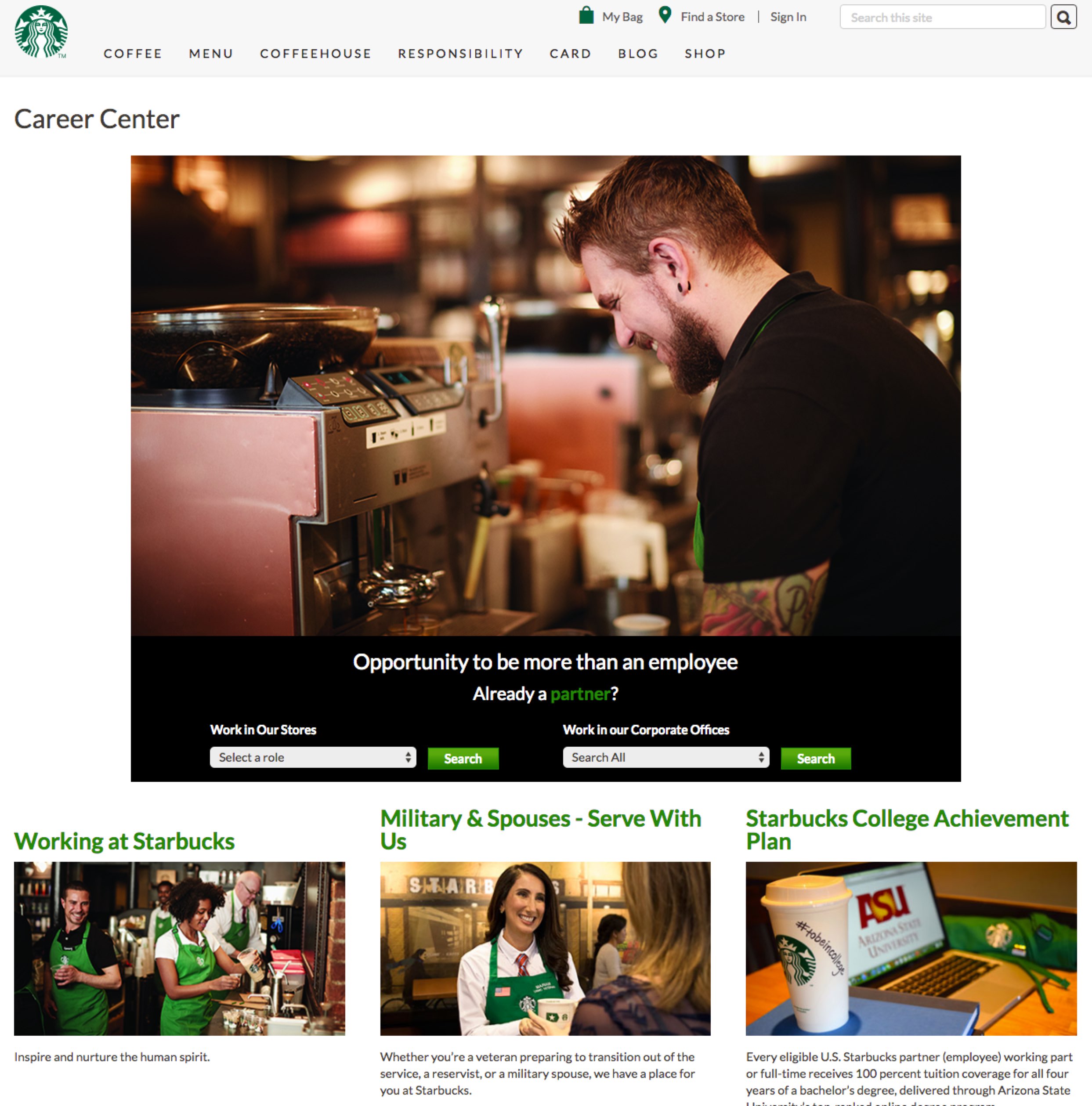
Starbucks
Starbucks makes this list because of their terrific career home page.
- Hero Media — Great pic of a tattoed barista smiling.
- Branding — They reinforce their brand with the black and green and white Starbucks colors in their headline, search button, background color of search box, the green text in “partner”
- Job Search Drop-Down — Very few company career sites have a job search function on the home page as comprehensive as Starbuck’s. You can search a drop down for either their Stores or Corporate. When most employers offer drop-downs, they force you to pick just one subset. Starbucks allows candidates to “Search All” of the Corporate jobs rather than force them to pick one category (they don’t offer this for their Store job search (likely because of the complexity of 10,000+ store job openings).
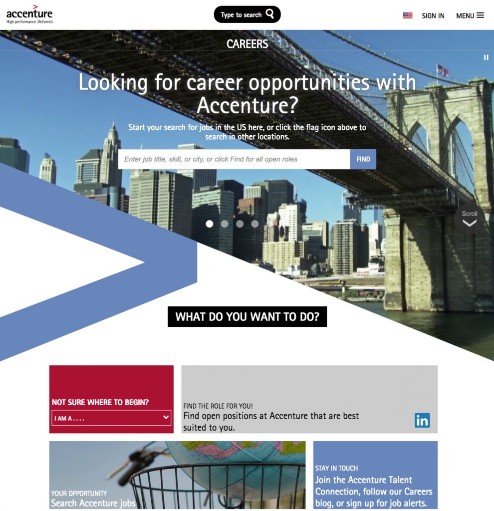
Accenture
- Full Screen Video — The hero media on their career home page is a full screen video playing in the background behind their job search box.
- “What Do You Want to Do?” — They then ask the candidate “What do you want to do?” with some sections like “Search Jobs”, “Stay in Touch (talent community) and a list of key teams/departments (Consulting, Tech, Operations, Corporate).
- Self-Selection — Accenture tells the candidate that if they’re “not sure where to begin” they can use an easy drop-down menu to self-identify as a student, intern, professional, veteran, or alumni.
- Employee Profile Timeline — They show employee profiles including a timeline of each employee’s journey – e.g. (Richard’s career journey).
- Accenture Alumni — have a dedicated AccentureAlumni page for Accenture Alumni. This says to new candidates that you will find benefits from Accenture even if you leave the company one day.
Amazon
- Job Search — Amazon’s careers home page begins with the job search and it’s one of the fastest and cleanest searches we’ve seen, especially when they’ve got 16,000+ job openings.
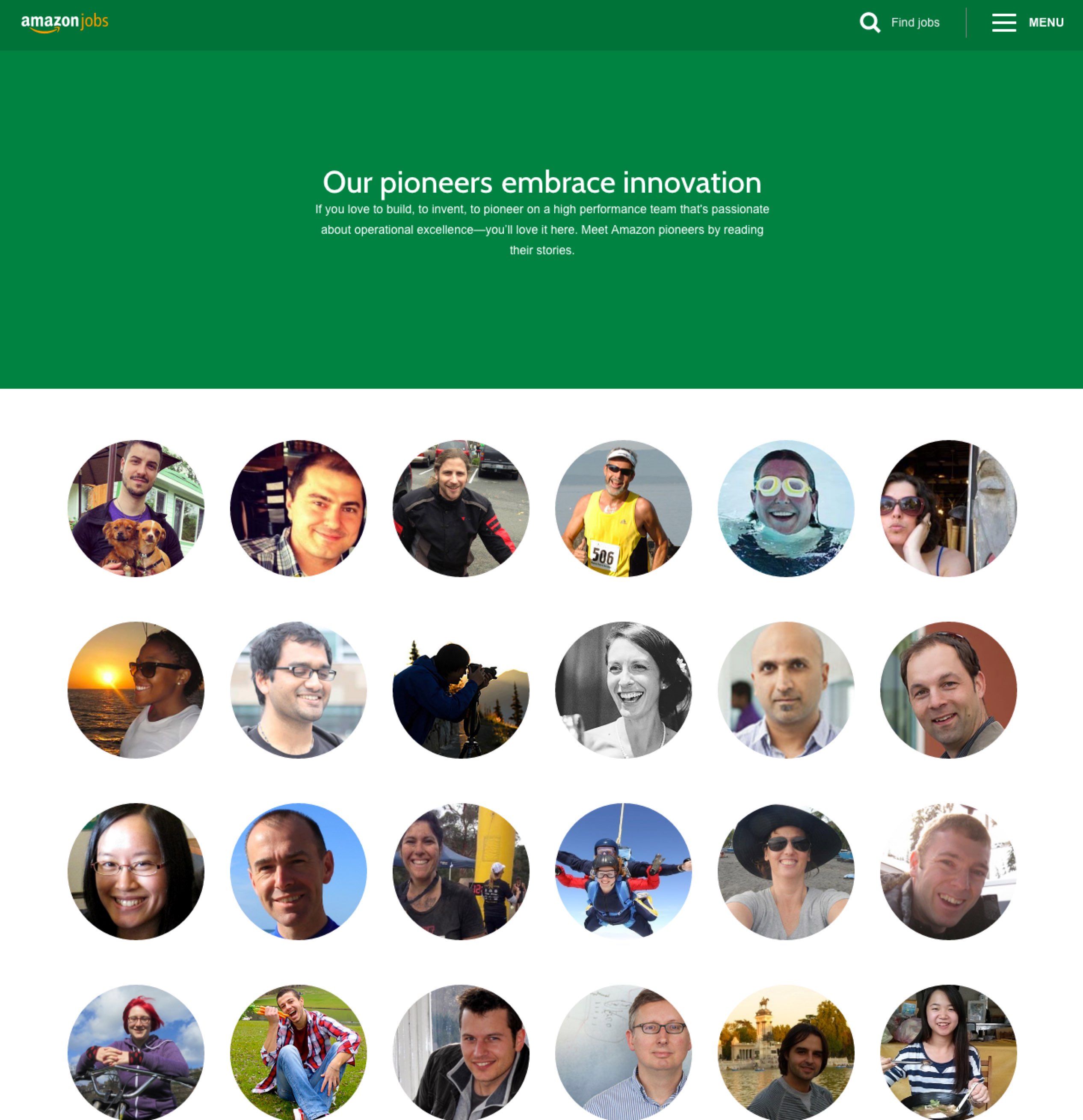
- Pioneers Section — They include a Pioneers section (pictured below) which briefly profiles 60+ Amazon employees such as Tiffany. That alone is impressive. But then each of those profiles leads to job families and job sub-families mentioned next.
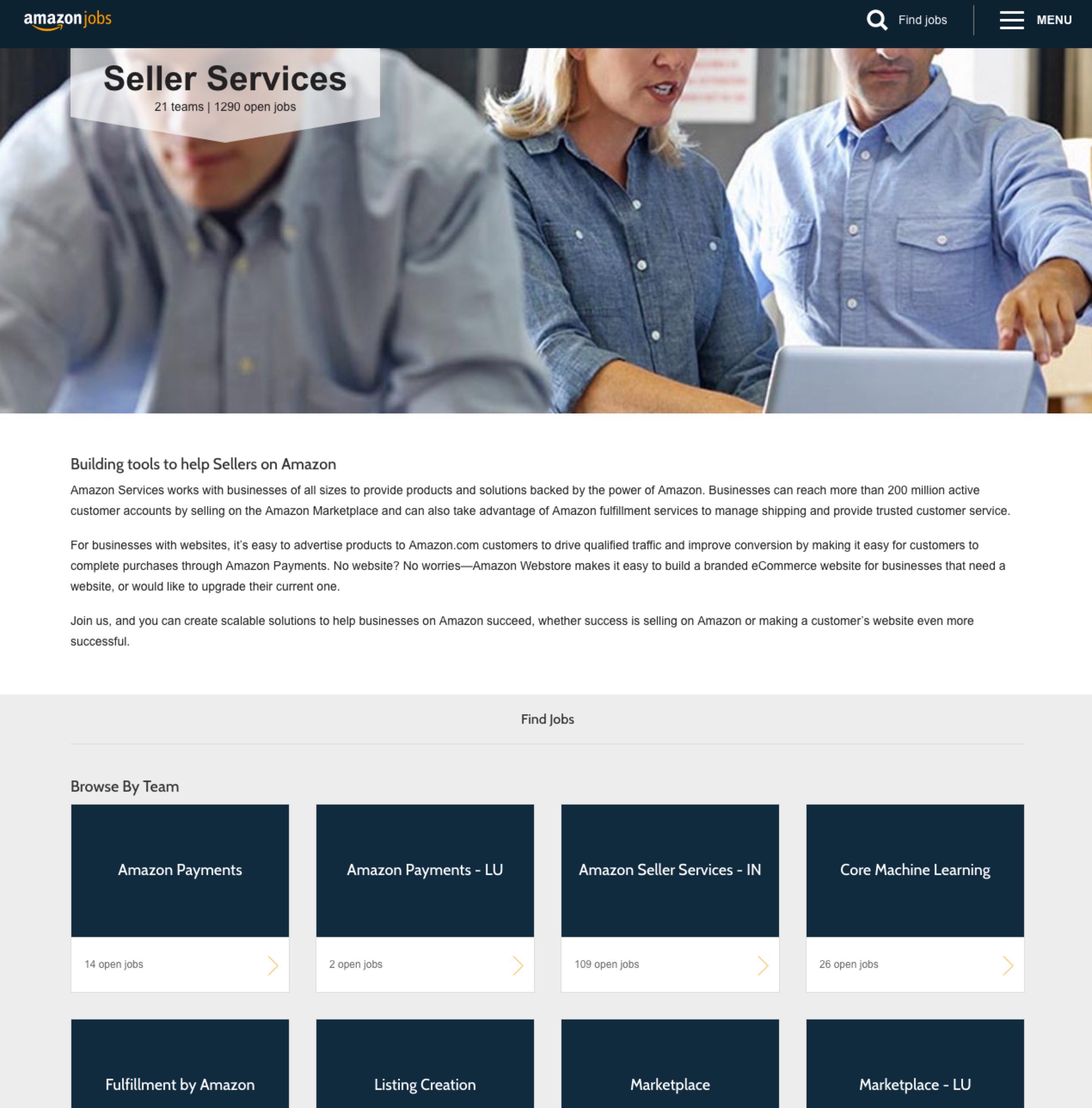
- Comprehensive Job Family and Sub-Job Family Microsites — Every department, team and location appears to be represented by its own pages. For example, if you view the Pioneer page for Tiffany, for example, you can see how this works as Tiffany holds a Project/Program/Product Management-Non-Tech position on the Seller Services team (pictured below) in Seattle. When you view those job family/microsite pages you will typically see a hero piece of media, description and list of job openings (with volume) related to the position, team or location. This is quite a feat and probably the most impressive execution of microsite/job family landing pages we’ve seen.
Bloomberg
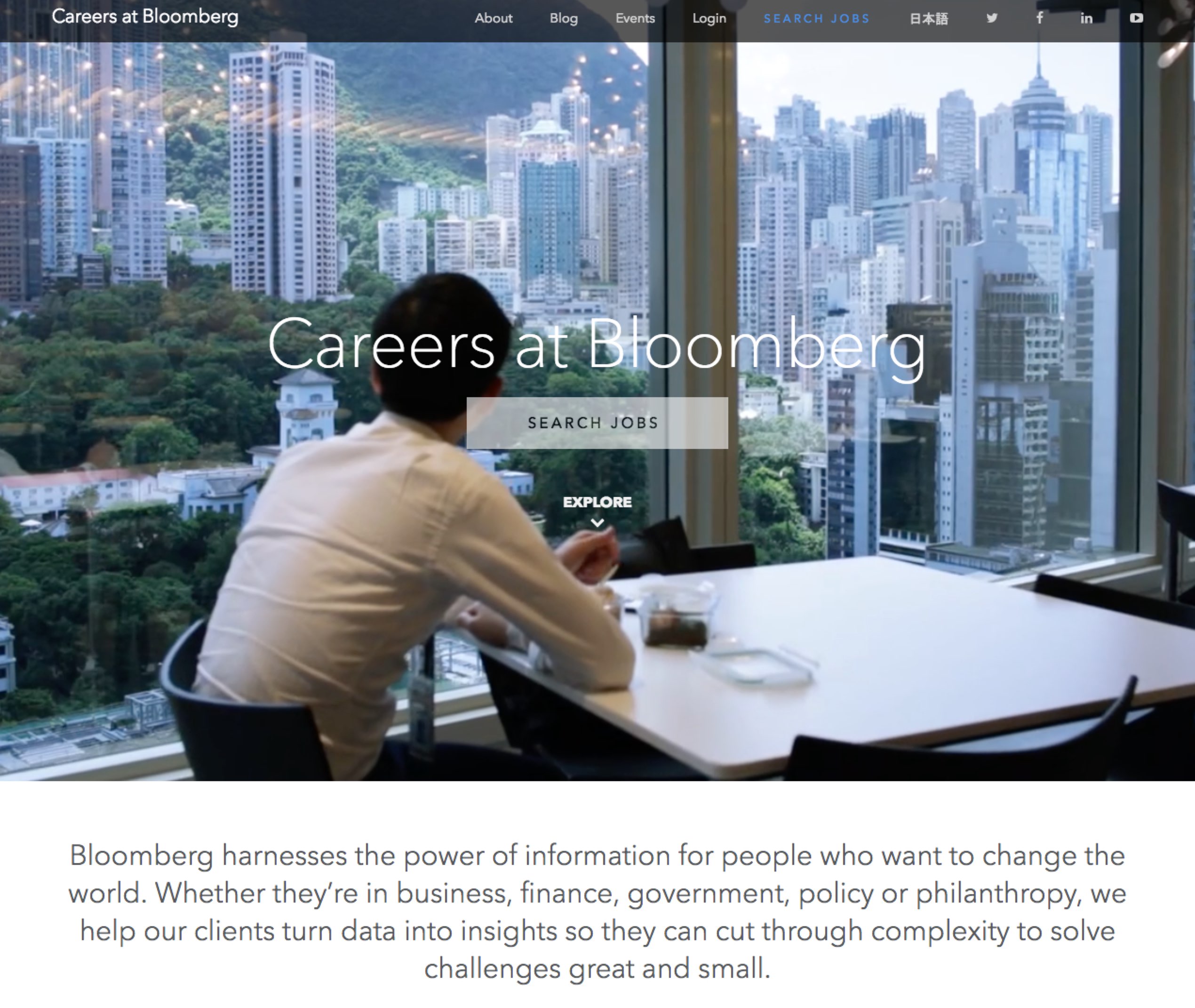
- Hero Media — A solid background video playing
- Primary Call to Action — Their “Search Jobs” is the clear call-to-action
- “Long-Form” Career Home Page — They use what some of us direct response marketers would call long-form copy on the home page. In other words, there is a lot to see if you keep scrolling down, including 4 recruiting videos (“What is Bloomberg”, “Diversity & Inclusion”, “Philanthropy” and “Our Business”).
- Dark Type on White Background — The easiest text to read is typically black text on white background (or some variation (dark gray on cream, etc.). Bloomberg uses this to make it clean and easy to read their careers home page.
- Disability’s Application Help Upfront — They offer up that if you have a disability and need help applying to email them directly (right off the home page).
Activision
Activision knows marketing and it shows on their company career site:
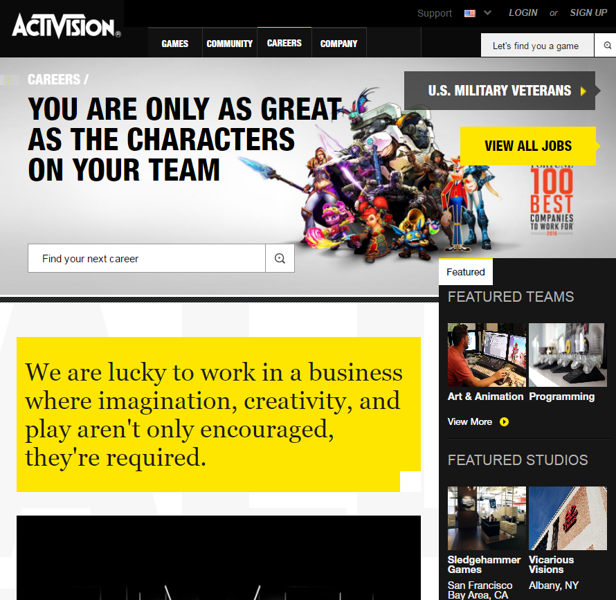
- Massive Value Above-the Fold — Activision’s career home page is chock full of value “above-the-fold” (items a candidate sees without scrolling): View All Jobs, Fortune 100 Best Companies to Work For (employer of choice awards), a video and more.
- Strong Headline/Hero Media — They use the double-entendre of “You Are Only As Great As The Characters On Your Team” and they show characters from their games.
- Hero Video — They have a solid recruiting video featuring employees and customers.
- Great Right-Hand Rail — The right-hand column (aka “the right-hand rail”) of their career home page includes “Featured Teams”, “Featured Studios” (i.e. locations), and a “Meet and Greet” video of a team member — that’s a lot of value in a quick-read for candidates.
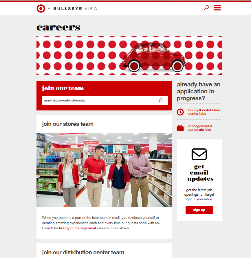
Target
- Branding — One look at Target’s career home page and you know they understand brand and advertising. Notice how much they use the Target red (in the hero pic, the job search, the text of career areas, the call-to-action buttons, etc.). If you have a solid brand, you should milk it throughout your career site.
- Hero Media — They have a killer hero image of people having fun in a tiny toy-like car.
- Careers Blog — Target has a careers blog called Pulse which seems written by a handful of employees from different departments with about one new post a month. In one post on their intern program, the head of interns talks about tips he recommends for the new intern class.
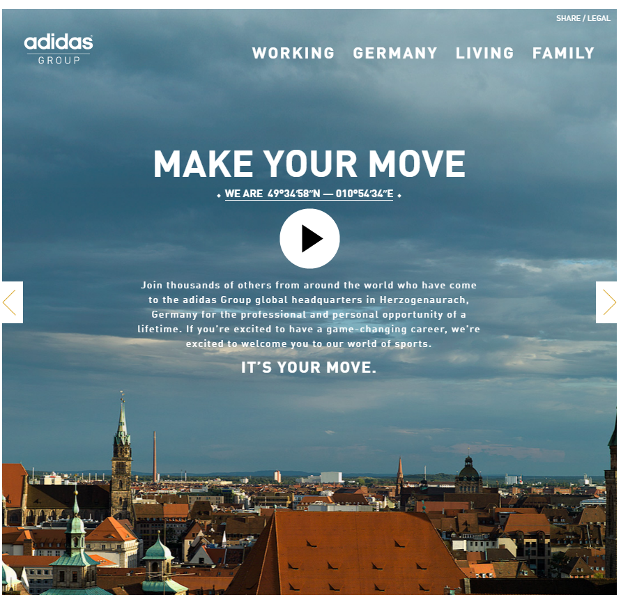
Adidas
- Eye-Catching Headline — It’s amazing how few career home pages obey one of the first bullets of writing good ad copy, which is to have a clear headline to hook and engage the reader. Adidas nails this one in 3 words: “Make Your Move”.
- Full Screen Video — There is one background pic and then a video to play over it that takes up the whole screen.
- Section Videos – -They use a separate video for each main section of their career site.
- Contrarian navigation — Candidates scroll left and right (not down) to navigate. If you want to show you’re different, this is one way to do it.
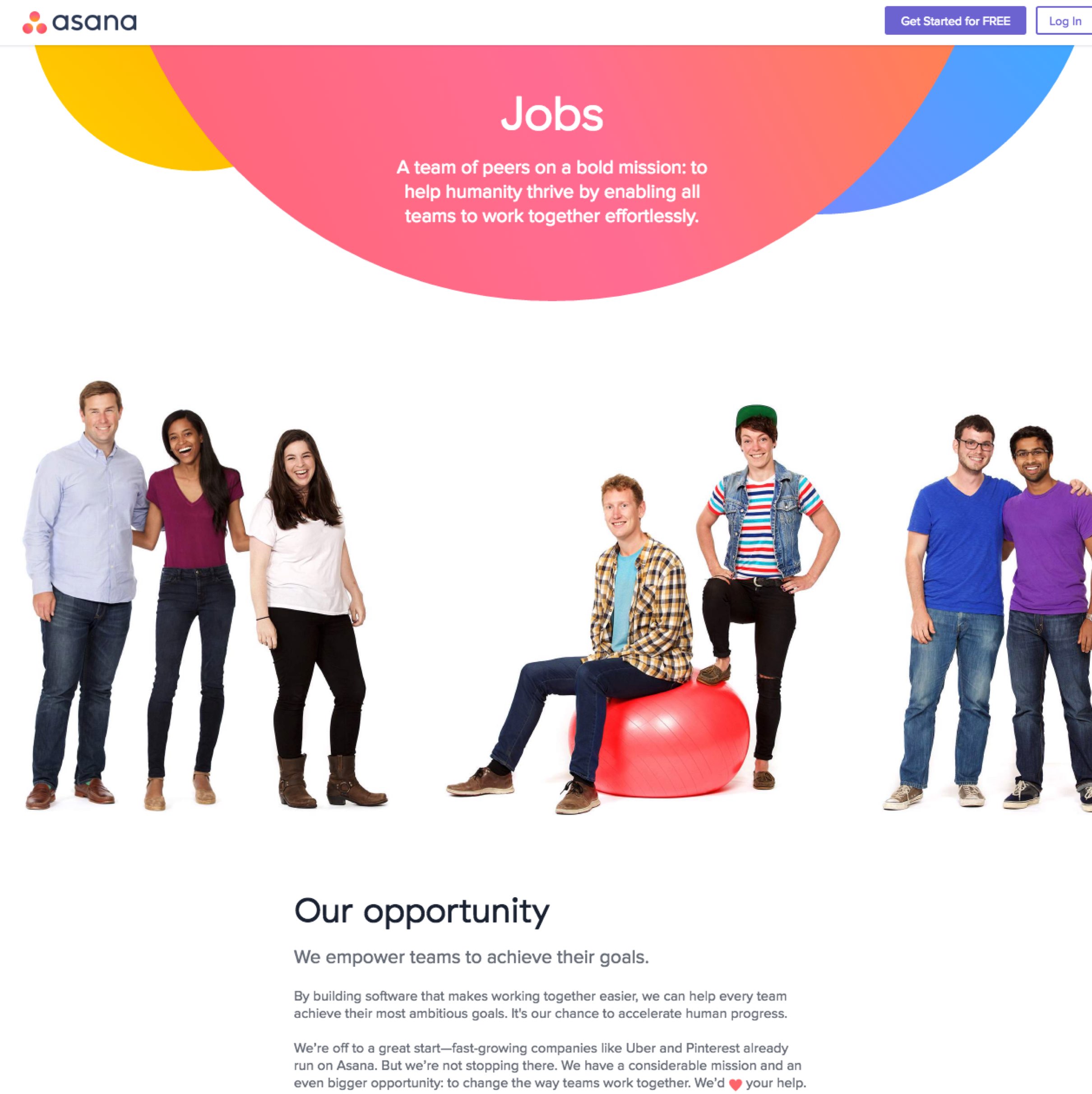
Asana
- Hero Media Left-to-Right Navigation — I had never seen this on a company career site: Asana’s first picture is viewable left and right so it’s like one long horizontal picture. Candidates get to see dozens of pictures of their team that seems more unified than if they had those pictures broken out individually/vertically.
- Department Pages — When you click a department, you see pics of actual people there with their names and when they joined Asana — this creates a more personal experience.
- Mission Video — The first video you see off their career home page is one talking about their mission.
- Instagram — They have a “See what it’s like to work at Asana” that links off to their Instagram career site with 100+ photos — that’s an efficient idea for showing lots of user-generated photos of an employer.
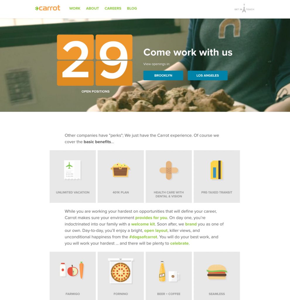
carrot
- # of Jobs — Their career home page includes the # of jobs in huge size font as well as their 2 locations on the backdrop of a running video.
- Free iPad with App — Each new employee is said to get a free iPad and “welcome kit” app.
- Avatar of Yourself – They point out that once you join carrot, you get a free avatar (illustration of you).
- Branding — You’ll notice that the carrot orange color is consistent throughout carrot’s career site.
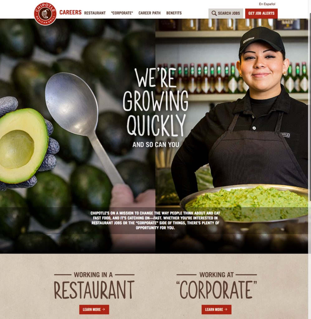
Chipotle
- Hero Media — Their career home page has a killer hero image with a smiling employee and a delicous bowl of Guacamole!
- Headline — Nice double entendre (“We’re growing (and so can you)”).
- Mission — The mission statement is above-the-fold (underneath the headline).
- Candidate Navigation — Easy fork for candidates to choose to work in restaurant or corporate.
- Career Path — Their career path is super-slick. Check out how you can click on each stage (Crew, Kitchen Manager, Service Manager, General Manager, Restaurateur) and the picture of the employee changes as does the column chart of compensation ($28K for crew versus $133K for a restaurateur).
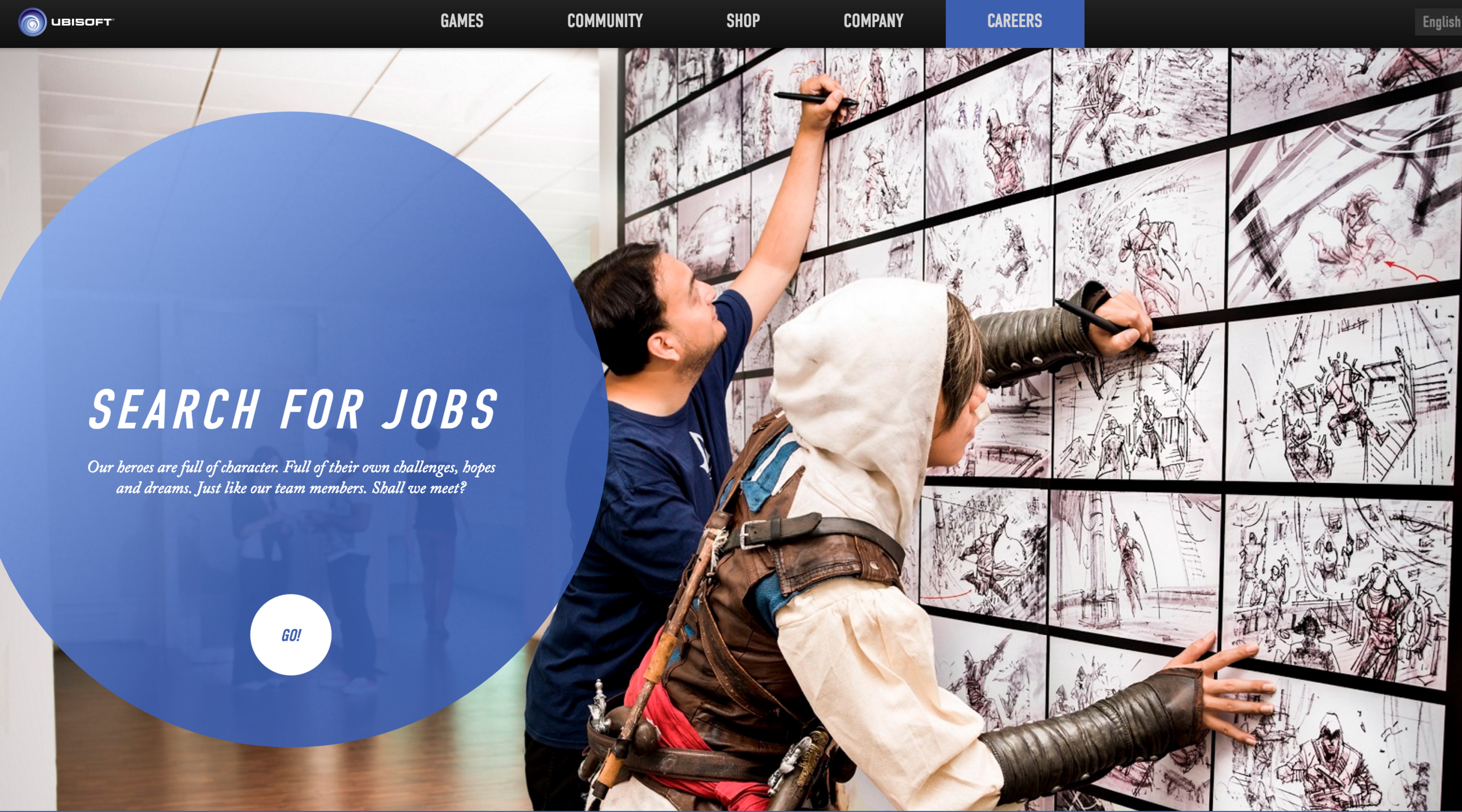
Ubisoft
- Hero Image — A solid one with 2 employees doing something creative.
- Round Job Search — They stand out here by using a giant circle to highlight the job search and a mini “Go!” round search button. There is a lot of designer debate about round buttons being better than square/rectangle ones because it’s easier for the brain to process.
- “A Year in the Life” Video — You’ve heard of a “Day in the Life” page or video. Ubisoft does a video on the entire year.
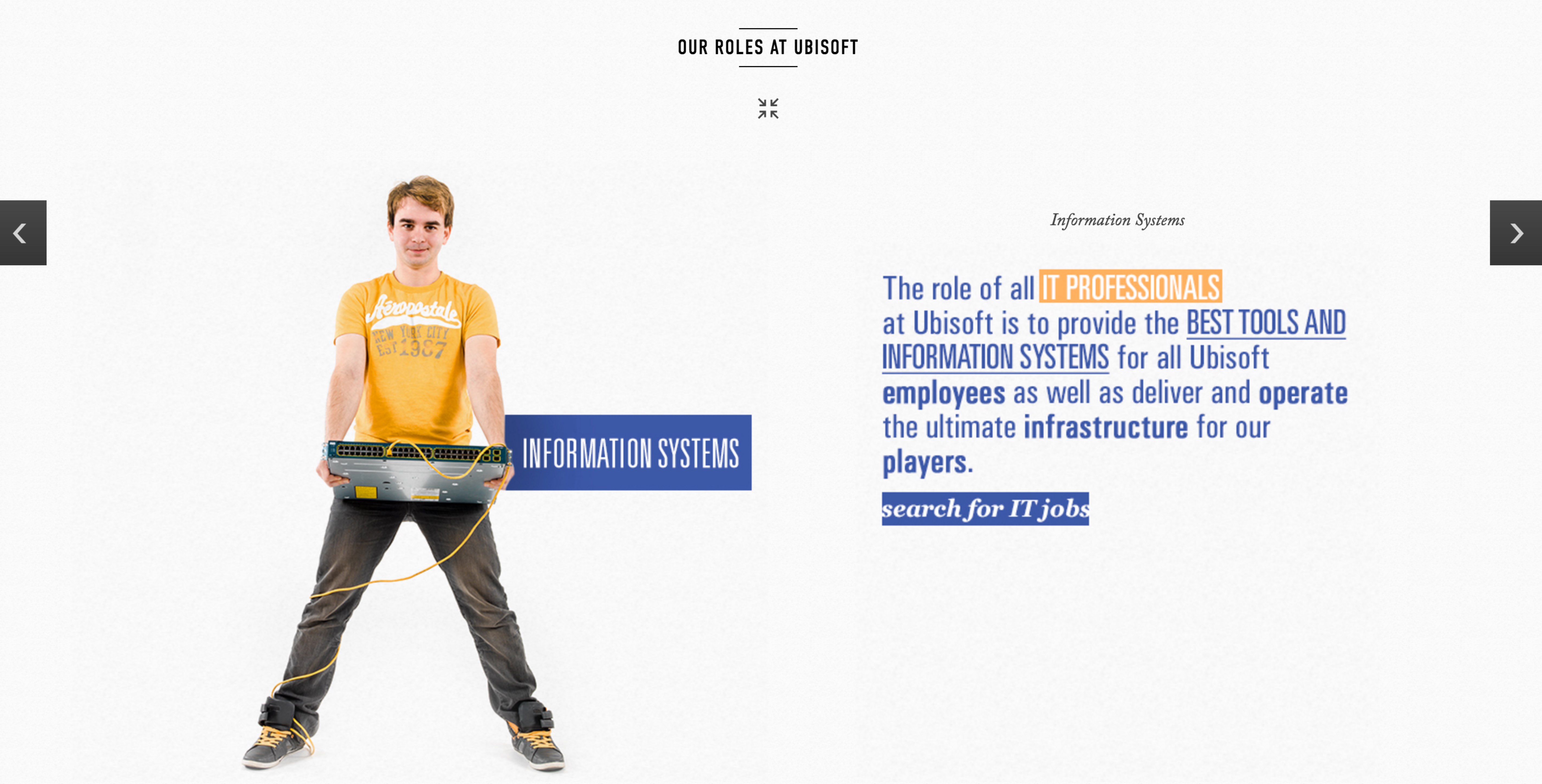
- “Our Roles” — They have”Our Roles at Ubisoft” with picture tiles for 5 different key roles. Click on them and you see a profile (e.g. “Information Systems” in 2nd below).
- Team Videos — They have videos and brief descriptions for 8 different teams.
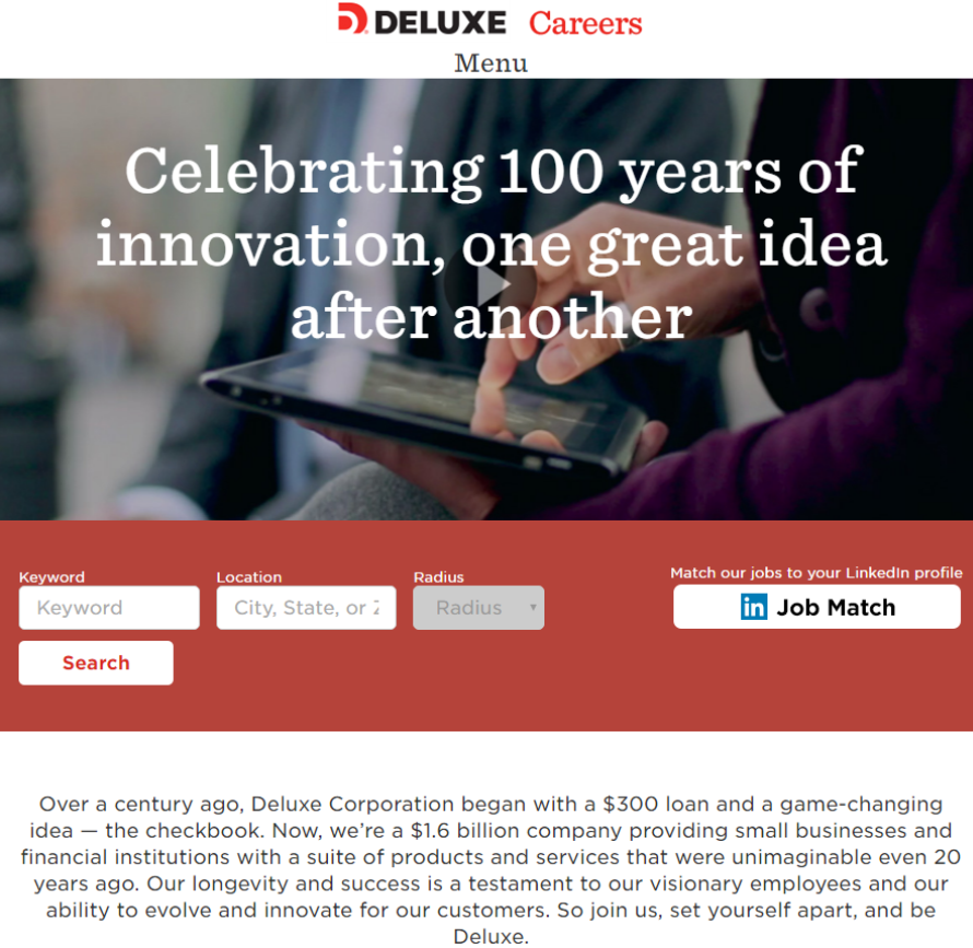
Deluxe
- Legacy/History — If you have a history you’re proud of, I recommend you point to it directly from your career home page. Deluxe has been around 100+ years and they highlight that in their headline (below) and also in the paragraph right below it in which they explain the early days. This is real effective if your business brand is unknown to many candidates (most business-to-business brands are not well-known).
- Good Search Filters — They provide a nice search by keyword, location (with radius) or by LinkedIn Job Match (which isn’t perfect but it did narrow down the results substantially in our test).
- Recruiter Profiles — Deluxe lists profiles of its recruiters (with name, domain, email, LinkedIn profile and even a video of each recruiter!) from a link off its home page.
- LinkedIn Job Match — They offer the LinkedIn Job Match directly from their home page and this was one of the few career sites for which it actually returned me results when I tried it (without asking me to log-in through LinkedIn).
Eventbrite
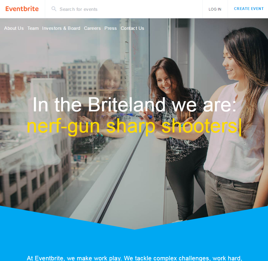
- Headline — They do an interesting effect in which they have the headline: “In the Briteland we are: [fill in the blank] and the answers are things like “mud runners”, “event organizers”, “bug busters”, “arcade enthusiasts”; “table tennis aficionados”, “poker world series champions”, “keg masters”, etc.
- Hero Media — It’s killer: two workers drawing on the glass window in Eventbrite’s headquarters offices.
- Calls-to-Action — The first 2 calls-to-action they offer are “View Open positions” and “Keep in Touch” (talent community) — those are likely the 2 most important things they want the candidate to do.
- Engineering Blog — If one department is really key for you, it makes sense to have a blog for it. Eventbrite does that for Engineers with new posts monthly that are in-depth.
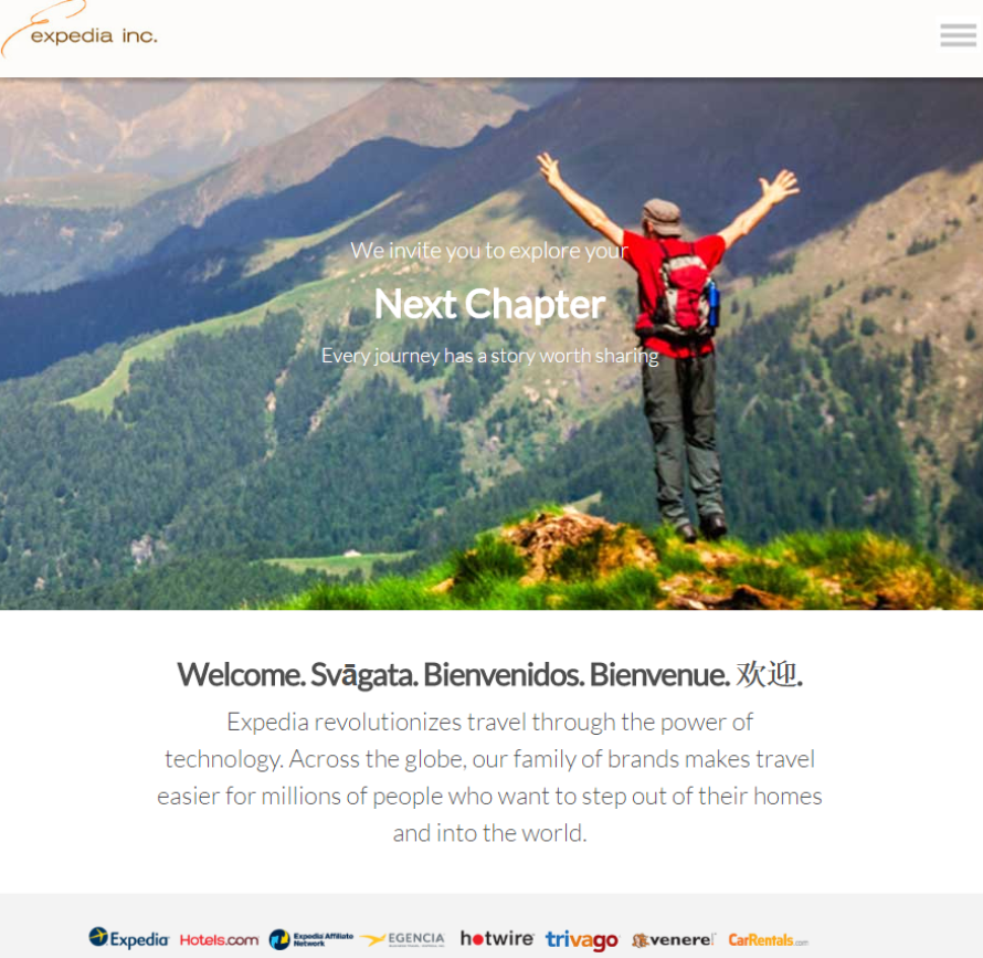
Expedia
- Dedicated URL (LifeatExpedia.com).
- Effective Theme — The theme of adventure/journey is consistent across their career site.
- Nice combo of pics and video with minimal text.
- Breakdown of brands (most people don’t know that Expedia owns hotwire, Hotels.com and CarRentals.co). Any one of those might draw a candidate in.
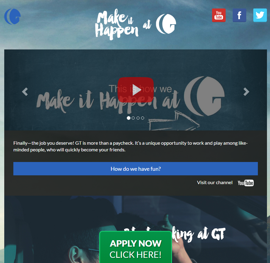
Global Telesourcing
GT (call center) does not have your typical company career site. Their uniqueness is easier to pull off with a business like a call center (e.g. a focus on one thing) but it may give you ideas.
- Dedicated URL — WorkAtGT.com — that shows candidates they are serious about investing in telling the story of working for GT.
- Short Video — The 38 second video is simple and even auto-plays when you visit the site — that’s annoying to some people but at least it forces the candidate to see what GT is all about.
- Video of Team Huddles — A key part of working at the GT call center is the team huddles and GT shows a video of these intense meetings. It’s not for everyone, but this is the Alienate.
- Alienate the Non-Prospect — Some candidates will find the rah-rah environment of GT to be too much for them (push-ups during meetings to the music of Rocky’s Eye of the Tiger but as you likely know, we believe it’s good to repel such “non-prospect” candidates).
- Call-to-Action — Their call-to-action Apply Now button leads to 2 choices: 1) Schedule an interview with a recruiter or 2) Interview now (through Sparkhire’s recruiting platform).
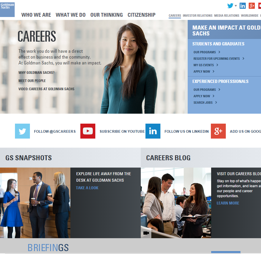
Goldman Sachs
- Social Media — Rather than just list their social media channels, Goldman has clear calls-to-action asking candidates to “follow” them on Twitter and LinkedIn, “subscribe” to them on YouTube and “Add Us” on Google+.
- Briefings — If you are a thought leader, why now show off your content on your career home page. Goldman offers up a weekly email called “Briefings” — while this is about their trends on the economy and business as a whole (it’s not career-centric), this is a terrific way to have a conversation with passive candidates. And all they ask for is an email address.
- Careers Quiz — Goldman offers a“Careers Quiz” (prominently link to from their careers home page) that promises that if a candidate answers a few questions (no wrong answers) then they will be suggested a “short list” of divisions that may suit their skills. Goldman says they’ve received positive feedback from university students and entry-level job seekers. The firm claims they never use it to identify the candidate’s identity.
- Mobile App — They also offer up a “Make an Impact” app designed to help candidates through the recruiting process from the early stages of researching the firm to preparing for a first interview.
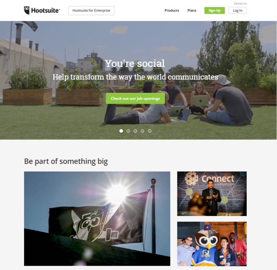
Hootsuite
- Easy to Find Job Descriptions — Your company career site needs to make it simple to find jobs and Hootsuite is among the best at this– their main call to action is a link to their job openings (and their 60+ job listings are actually on their career home page (at the bottom).
- 5 Themes/Video Vignettes — The first thing you see is a partial-screen video playing with part 1 of 5 things that Hootsuite is looking for in the candidate (the first is called “You’re social”) (Hootsuite is a social media platform). The next 4 qualities are “You’re proud to be quirky”, “You’re curious”, “You’re quick on your feet” and “You’re passionate”.
- 4 Quick-hit Videos — They have videos of 4 employees in different departments. The vids are each 16 seconds which is way shorter than most employer videos but just as effective in the data we’ve looked at. We recommend that career site videos should be less than 60 seconds because data shows nearly all candidates drop off after a minute.
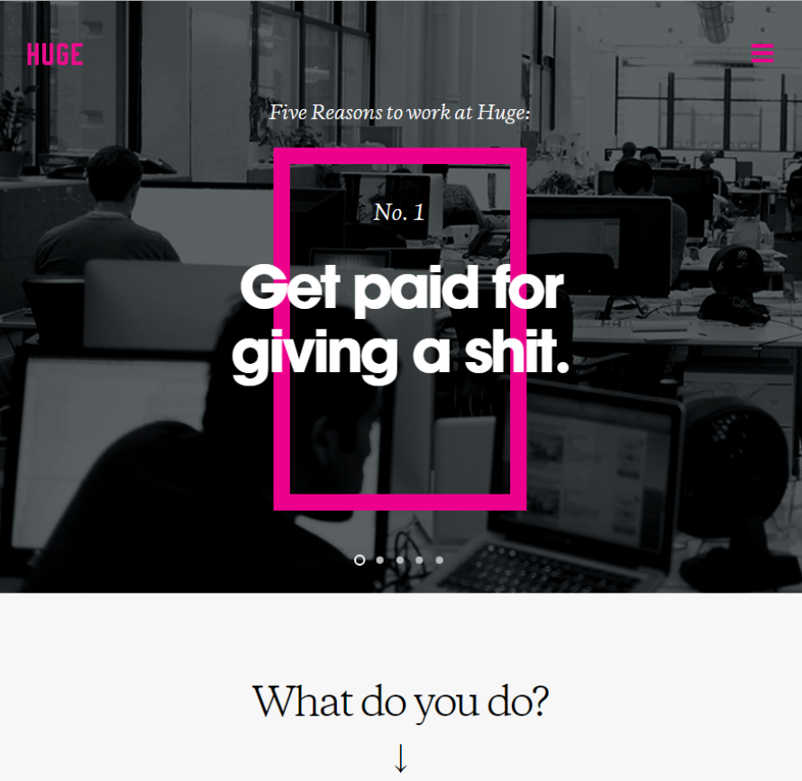
Huge
- Attention-Grabbing Headline — Company career sites need to grab the candidate’s attention and Huge (A Brooklyn-based ad agency) does this better than most with this headline: “Get paid for giving a shit.”
- Alienate the Non-Prospect — The powerful thing about them using “Get paid for giving a shit.” is that they are being bold about their personality/brand and so they may turn off a bunch of candidates who are conservative and don’t find curse words acceptable. I’m sure that’s just fine with Huge as they don’t want those candidates anyway — they would not be like-minded and supportive of Huge’s brand. Some of us marketing nerds call this concept “Alienate the non-prospect” which is what you want to do when you market anything (appeal to those you want to appeal to and “alienate” those prospects who you don’t want to sell to). In the recruiting world, some also call this “self-selection”.
- 5 Reasons to Join — They include 5 reasons to join Huge. Humans (candidates included!) love simple short lists of reasons why to do something.
- Killer Location Microsites — They have 13 different locations linked to from their careers home page; and each of these location microsites has a text description of the location (e.g. the history of it opening), images of the city, a clock showing the time zone and jobs listed just for that location.
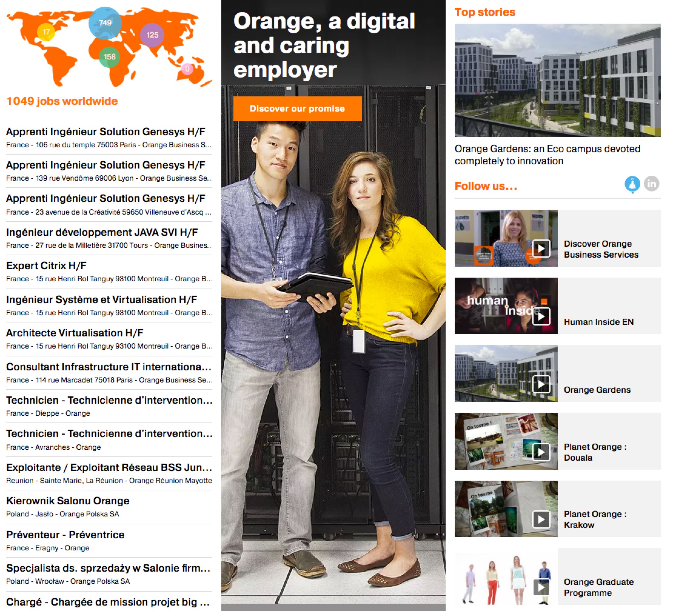
Orange
Orange does something interesting. It includes just 3 main things on its careers home page (below) and combined they give the impression that this company is active and engaging and hiring a bunch:
- # of Jobs — Orange’s career home page uses 3 main columns to organize their information it’s a good reminder that a candidate’s eye will tend to look at the upper left of a page first (see Understanding the Z-Layout in Web Design). In Orange’s case that means tht the candidate sees: “1,045 jobs worldwide” with a map of which cities those jobs are in. I think that tells a candidate a tremendous amount about Orange in the first second or two.
- Top Stories — They include a major news story about Orange in the middle column and another story in the upper right.
- Videos — They includes a dozen+ career videos (day in the life, etc.).
- Recruitment Process — We believe every company career site should include an overview of the hiring process. Orange’s “Recruitment process” is one of the best we’ve seen including promising that they will respond to all candidates.
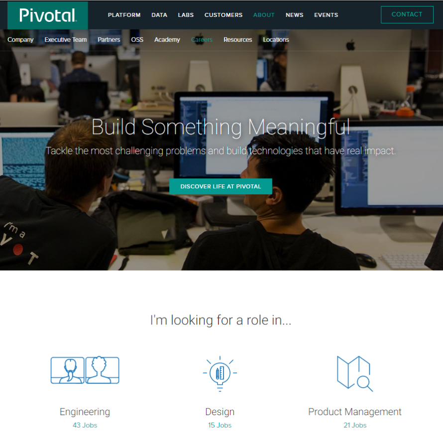
Pivotal
- Headline with Focus — Their headline and sub-headline emphasize the audience they are trying to attract: people who want to build technologies, solve problems (think: software engineers!).
- # of Jobs by Department — Again, a terrific thing to put on your career home page is the # of jobs you have. Pivotal takes this a step further and breaks down the # of jobs by department. This tells your candidate 2 important things A) which departments you have and B) which departments have the most opportunities (i.e. Engineering in this case).
- Principles & Practices– They list their Principles and Practices (Values) including the fact that every hire is “paired” with another person for most of the time in their work.
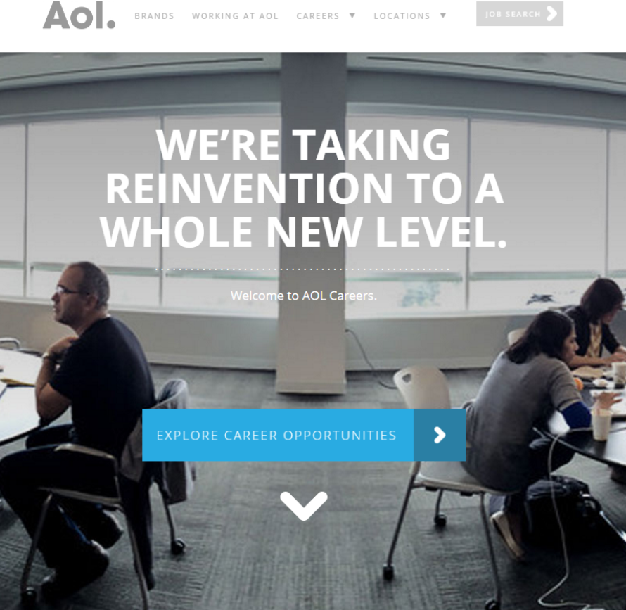
AOL
- Sub-Brands — Their career home page includes names of their 30 or so brands (most candidates will not know that AOL owns Huffington Post, TechCrunch, Moviefone, etc.) which boosts employer branding.
- They highlight their 6 main departments.
- They clearly show their 12 different locations.
- Work from Home — They make it clear that they have work-from-home positions. This is something valuable to candidates (including passives), however few employers make it clear to candidates. Working from home/remotely appeals to working moms, millennials, candidates with a family member they need to care for, etc.
Are you launching a new company career site?
If you’re launching a new career site, the Ongig Cloud can provide you with your job search, microsites/job family pages and the world’s best job descriptions. You can click here for a live demo.
